


vue实现渐变折线图
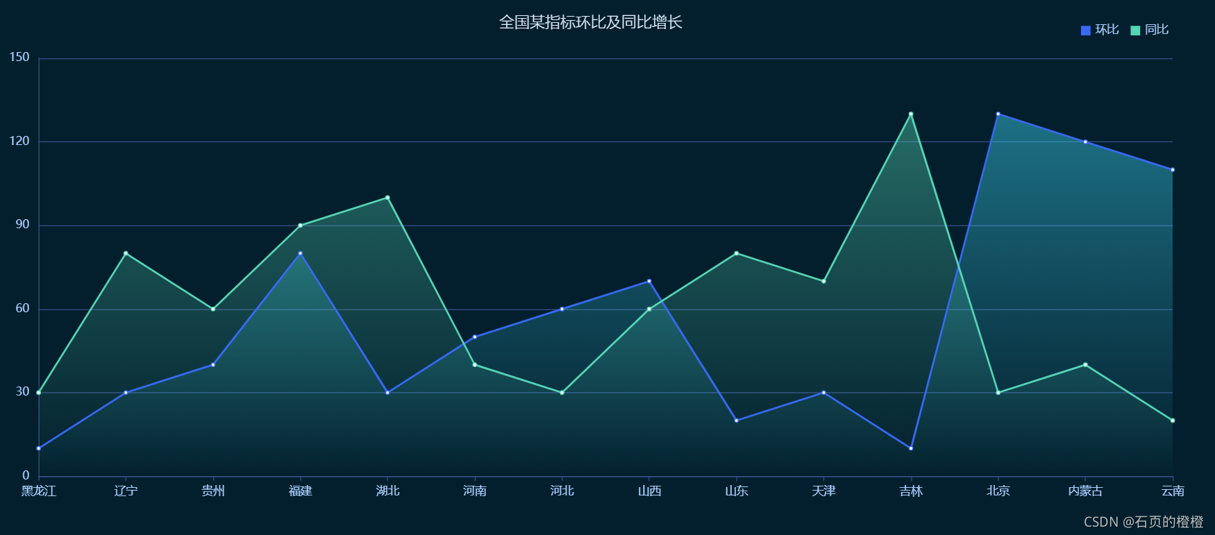
实现结果示例:共定义两个文件一个是lineChart.vue及index.vue,前者用于定义折线图,后者在前者基础上丰富组件和功能
首先是lineChart.vue文件:
<template>
  <div ref="LineChart" style="height: 600px; width: 100%"/>
</template>
<script>
import echarts from 'echarts'

export default {
  data() {
    return {
      chart: null,
      data: [], //数据
      xData: [], //x轴
      yBarData: [], //y轴
      yBarData1: [], //y轴
      yLable1: [],
      yLable: [],
      yBarData1: [],
      colorStops: [],
      chartLegend: [], //图例
      colorOptions: [ //图例以及柱形图颜色选择
        '#5ba2e4',
        '#f58510',
        '#afa5a5',
        '#facb3d',
        '#0854cf',
        '#48c611',
        '#73fcff'
      ]
    }
  },
  mounted() {
    this.fetchData()
    //图的大小自适应
    window.addEventListener('resize',()=>{
      if (this.chart){
        this.chart.resize()
      }
    })
  },
  beforeDestroy() { //实例销毁之前调用
    if (!this.chart) {
      return
    }
    this.chart.dispose()
    this.chart = null
  },
  methods: {
    fetchData() {
      this.xData = ["黑龙江",'辽宁','贵州','福建','湖北','河南','河北','山西','山东','天津','吉林','北京','内蒙古','云南']
      this.yLable = ['10','30','40','80','30','50','60','70','20','30','10','130','120','110']
      this.yLable1 = ['30','80','60','90','100','40','30','60','80','70','130','30','40','20']
      // 方法2 根据返回的数据获取日期 从而设置图例
      this.chartLegend = []
      const dateArr = []
      this.yLable.forEach((item, index) => {
        if (item !== null && item !== undefined) {
          dateArr.push(this.yLable[index])
        }
      })
      this.chartLegend = dateArr
      this.initData()
      this.initChart()
    },

    initData() {

      this.yBarData = this.yLable
      this.yBarData1 = this.yLable1
    },
    initChart() {
      this.chart = echarts.init(this.$refs.LineChart)
      this.chart.clear() // 清空当前实例

      this.chart.setOption({
        backgroundColor: '#031f2d',
        title: {
          text: '全国某指标环比及同比增长',
          x: 'center',
          top: "30",
          textStyle: {
            color: '#E2EEFF',
            fontSize: 16,
            fontWeight:200
          }
        },
        tooltip: {
          trigger: 'axis',
          axisPointer: {
            lineStyle: {
              color: '#57617B'
            }
          }
        },
        legend: {
          icon: 'rect',
          itemWidth: 10,
          itemHeight: 10,
          itemGap: 13,
          top: '40',
          data: ['环比', '同比'],
          right: '4%',
          textStyle: {
            fontSize: 12,
            color: '#ACCFFF'
          }
        },
        grid: {
          left: '4%',
          right: '4%',
          bottom: '10%',
          top: '80',
          containLabel: true
        },
        xAxis: [{
          type: 'category',
          boundaryGap: false,
          axisLine: {
            lineStyle: {
              color: '#344B83'
            }
          },
          axisLabel: {
            margin: 10,
            textStyle: {
              fontSize: 12,
              color: '#ACCFFF'
            }
          },
          data:this.xData
        }],
        yAxis: [{
          type: 'value',
          axisTick: {
            show: false
          },
          axisLine: {
            lineStyle: {
              color: '#344B83'
            }
          },
          axisLabel: {
            margin: 10,
            textStyle: {
              fontSize: 12,
              color: '#ACCFFF'
            }
          },
          splitLine: {
            lineStyle: {
              color: '#344B83'
            }
          }
        }],
        series: [{
          name: '环比',
          type: 'line',
          // smooth: true,
          itemStyle: {
            normal: {
              color: '#3769F4',
              areaStyle: {
                //color: '#94C9EC'
                color: new echarts.graphic.LinearGradient(0, 1, 0, 0, [{
                  offset: 0,
                  color: 'rgba(65,225,255,0)'
                }, {
                  offset: 1,
                  color: 'rgba(65,225,255,0.6)'
                }]),
              }
            }
          },
          data: this.yBarData
        }, {
          name: '同比',
          type: 'line',
          // smooth: true,
          itemStyle: {
            normal: {
              color: '#55D5B5',
              areaStyle: {
                //color: '#94C9EC'
                color: new echarts.graphic.LinearGradient(0, 1, 0, 0, [{
                  offset: 0,
                  color: 'rgba(85,213,181,0)'
                }, {
                  offset: 1,
                  color: 'rgba(85,213,181,0.6)'
                }]),
              }
            }
          },
          data: this.yBarData1
        }]
      }, true)
    }
  }
}
</script>
上述即可定义好折线图样式
接下来定义index.vue,可以在上述基础上丰富功能:
<template>
  <div class="app-container" style="background-color: #031f2d">
    <line-chart />
  </div>
</template>
<script>
import lineChart from "./components/lineChart"
export default {
  name: 'linechart',
  components: {  lineChart },
  data (){
    return {
    }
  }
}
</script>
参考链接:折线图


 1639
1639


 被折叠的 条评论
为什么被折叠?
被折叠的 条评论
为什么被折叠?
 到【灌水乐园】发言


