


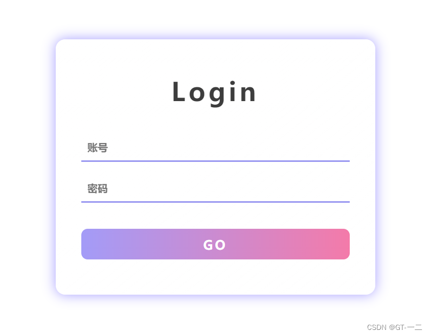
1 展示
2 代码
2.1 HTML
<!DOCTYPE html>
<html lang="en">
<head>
    <meta charset="UTF-8">
    <meta http-equiv="X-UA-Compatible" content="IE=edge">
    <meta name="viewport" content="width=device-width, initial-scale=1.0">
    <title>登录页面</title>
    <link rel="stylesheet" href="./index.css">
</head>
<body>
    <div class="login">
        <div class="box">
            <p class="table">Login</p>
            <br>
            <input type="text" placeholder="账号">
            <input type="password" placeholder="密码">
            <br>
            <a href="#" class="go">GO</a>
        </div>
    </div>

</body>
</html>
2.2 CSS
*{
    padding: 0;
    margin: 0;
    text-decoration: none;
}

body{
    height:700px;
    display: flex;
    justify-content: center;
    align-items: center;
    background-size: cover;
}
.login{
    width: 500px;
    height: 400px;
    display: flex;
    justify-content: center;
    align-items: center;
    background: linear-gradient(
        to right bottom,
        rgba(255,255,255,.7),
        rgba(255,255,255,.5),
        rgba(255,255,255,.4)
    );
    /* 使背景模糊化 */
    backdrop-filter: blur(10px);
    box-shadow: 0 0 20px #a29bfe;
    border-radius: 15px;
}

.table{
    font:900 40px '';
    text-align: center;
    letter-spacing: 5px;
    color: #3d3d3d;
}
.box{
    overflow: hidden;
    display: flex;
    flex-direction: column;
}

.box input{
    width: 400px;
    height: 100%;
    margin-top: 20px;
    outline: none;
    border: 0;
    padding: 10px;
    background-color: transparent;
    border-bottom: 3px solid rgb(150,150,240);
    font: 900 16px '';
}

.go{
    text-align: center;
    display: block;
    height: 24px;
    padding: 12px;
    font: 900 20px '';
    border-radius: 10px;
    margin-top: 20px;
    color: #fff;
    letter-spacing: 3px;
    background-image: linear-gradient(to left,
    #fd79a8,#a29bf6);
}
3 部分解释
3.1 linear-gradient()
CSS linear-gradient() 函数用于创建一个表示两种或多种颜色线性渐变的图片。
其结果属于数据类型,是一种特别的数据类型。
3.2 backdrop-filter
backdrop-filter CSS 属性可以让你为一个元素后面区域添加图形效果(如模糊或颜色偏移)。
因为它适用于元素背后的所有元素,为了看到效果,必须使元素或其背景至少部分透明。


 105
105


 被折叠的 条评论
为什么被折叠?
被折叠的 条评论
为什么被折叠?
 到【灌水乐园】发言


