


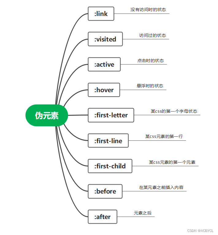
一.伪元素
含义:在选择器上添加特殊效果
<!DOCTYPE html>
<html lang="en">

<head>
    <meta charset="UTF-8">
    <meta http-equiv="X-UA-Compatible" content="IE=edge">
    <meta name="viewport" content="width=device-width, initial-scale=1.0">
    <title>Document</title>
    <style>
        a.ex1:hover,
        a.ex1:active {
            color: red;
        }

        a.ex2:hover,
        a.ex2:active {
            font-size: 150%;
        }

        a.ex3:hover,
        a.ex3:active {
            background: red;
        }

        a.ex4:hover,
        a.ex4:active {
            font-family: monospace;
        }

        a.ex5:visited,
        a.ex5:link {
            text-decoration: none;
        }

        a.ex5:hover,
        a.ex5:active {
            text-decoration: underline;
        }
    </style>
</head>

<body>
    <p>将鼠标移至链接上查看其样式改变.</p>

    <p><a class="ex1">这个链接改变颜色</a></p>
    <p><a class="ex2">这个链接改变字体大小</a></p>
    <p><a class="ex3">这个链接改变背景颜色</a></p>
    <p><a class="ex4">这个链接改变字体类型</a></p>
    <p><a class="ex5">这个链接改变文字修饰</a></p>
</body>

</html>
link visited hover active的使用
<!DOCTYPE html>
<html lang="en">

<head>
    <meta charset="UTF-8">
    <meta http-equiv="X-UA-Compatible" content="IE=edge">
    <meta name="viewport" content="width=device-width, initial-scale=1.0">
    <title>Document</title>
    <style>
        a:link    {color:green;}
        a:visited {color:green;}
        a:hover   {color:red;}
        a:active  {color:yellow;}
    </style>
</head>

<body>
    <p>将鼠标移上并点击此链接: <a href="http://www.baidu.com/">baidu.com</a></p>
</body>

</html>
before after 之类的使用
<!DOCTYPE html>
<html lang="en">

<head>
    <meta charset="UTF-8">
    <meta http-equiv="X-UA-Compatible" content="IE=edge">
    <meta name="viewport" content="width=device-width, initial-scale=1.0">
    <title>Document</title>
    <style>
        h1:before {content:"我可以向前插入";}
    </style>
</head>

<body>
    <h1>This is a heading</h1>
    <p>The :before pseudo-element inserts content before an element.</p>
    <h1>This is a heading</h1>
    <p><b>注意:</b>仅当 !DOCTYPE 已经声明 IE8 支持这个内容属性</p></body>

</html>
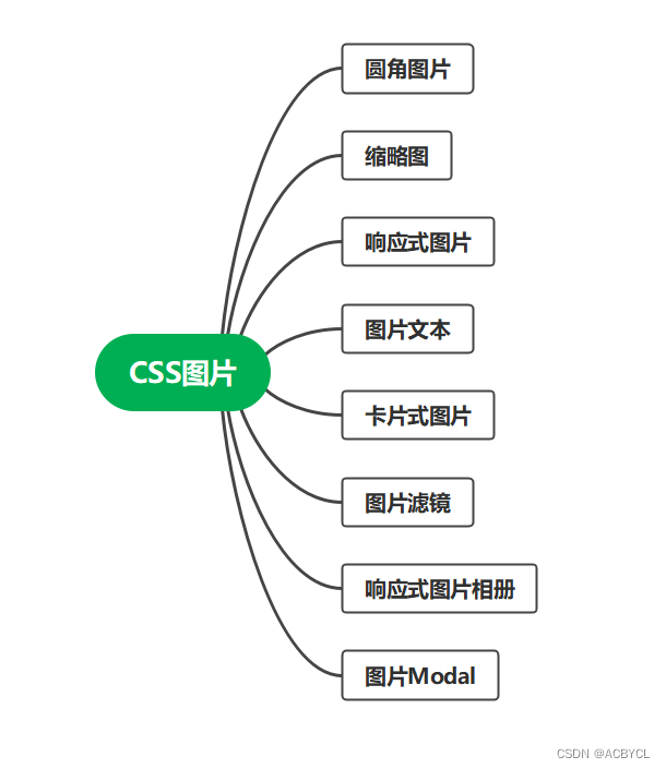
二.CSS图片
缩略图
素材
<!DOCTYPE html>
<html lang="en">
<head>
<meta charset="UTF-8">
<meta http-equiv="X-UA-Compatible" content="IE=edge">
<meta name="viewport" content="width=device-width, initial-scale=1.0">
<title>Document</title>
<style>
img {
border: 1px solid #ddd;
border-radius: 4px;
padding: 5px;
}
</style>
</head>
<body>
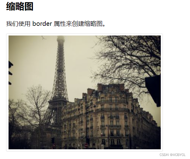
<h2>缩略图</h2>
<p>我们使用 border 属性来创建缩略图。</p>
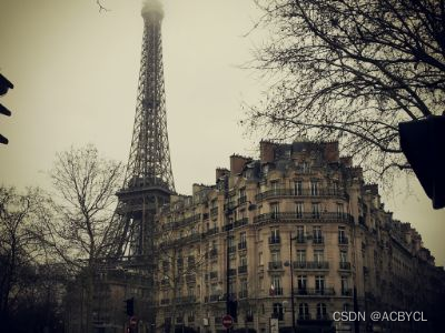
<img src="paris.jpg" alt="Paris" width="400" height="300">
</html>
效果展示
缩略图实例
<!DOCTYPE html>
<html lang="en">
<head>
<meta charset="UTF-8">
<meta http-equiv="X-UA-Compatible" content="IE=edge">
<meta name="viewport" content="width=device-width, initial-scale=1.0">
<title>Document</title>
<style>
a {
display: inline-block;
border: 1px solid #ddd;
border-radius: 4px;
padding: 5px;
transition: 0.3s;
}
a:hover {
box-shadow: 0 0 2px 1px rgba(0, 140, 186, 0.5);
}
</style>
</head>
<body>
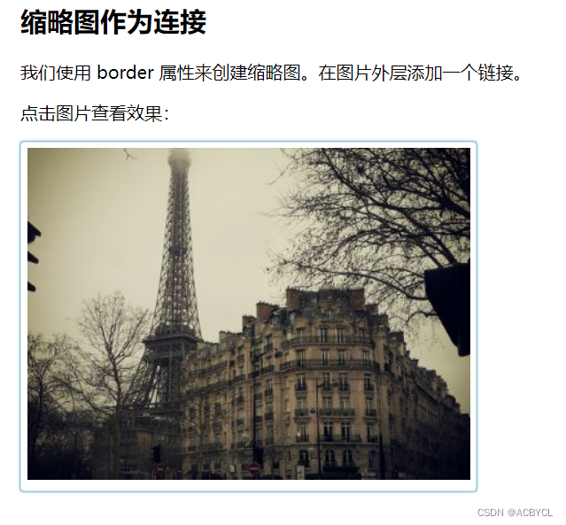
<h2>缩略图作为连接</h2>
<p>我们使用 border 属性来创建缩略图。在图片外层添加一个链接。</p>
<p>点击图片查看效果:</p>
<a target="_blank" href="paris.jpg">
<img src="paris.jpg" alt="Paris" width="400" height="300">
</a>
</html>
效果展示
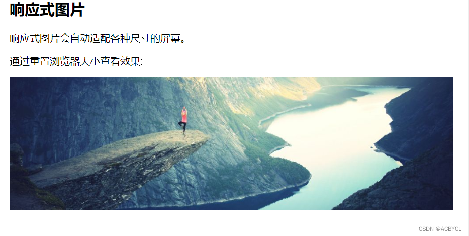
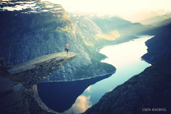
响应式图片
素材
<!DOCTYPE html>
<html lang="en">

<head>
    <meta charset="UTF-8">
    <meta http-equiv="X-UA-Compatible" content="IE=edge">
    <meta name="viewport" content="width=device-width, initial-scale=1.0">
    <title>Document</title>
    <style>
        img {
            max-width: 100%;
            height: auto;
        }
    </style>
</head>

<body>
    <img src="http://www.runoob.com/wp-content/uploads/2016/04/trolltunga.jpg" alt="Norway" width="1000" height="300">


</html>
展示效果
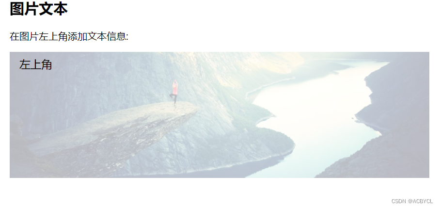
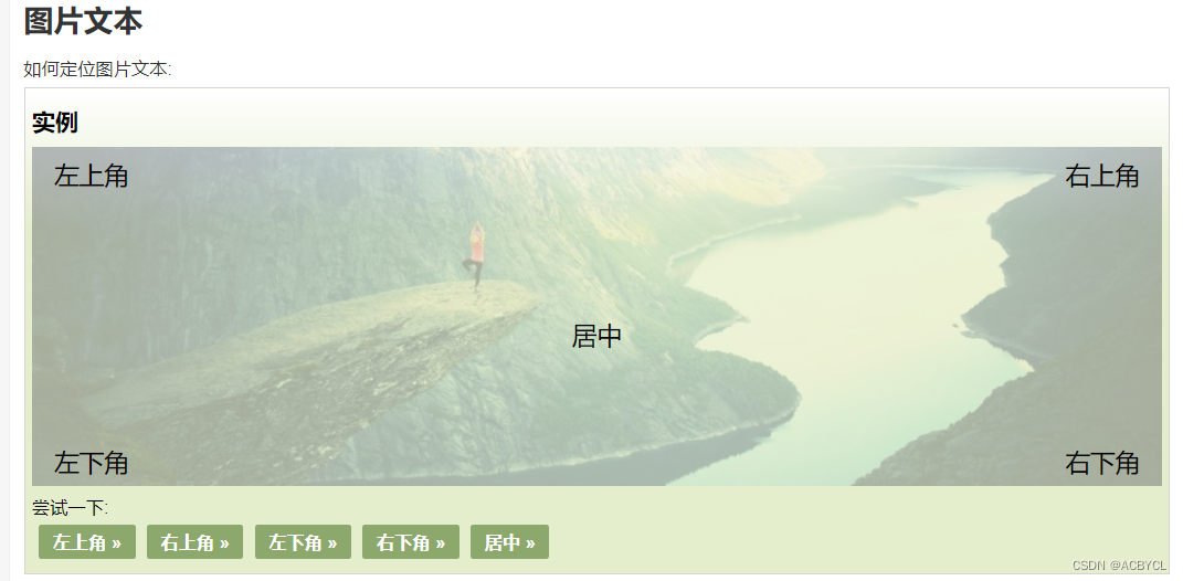
图片文本
定位图片文本
<!DOCTYPE html>
<html lang="en">

<head>
    <meta charset="UTF-8">
    <meta http-equiv="X-UA-Compatible" content="IE=edge">
    <meta name="viewport" content="width=device-width, initial-scale=1.0">
    <title>Document</title>
    <style>
        .container {
            position: relative;
        }

        .topleft {
            position: absolute;
            top: 8px;
            left: 16px;
            font-size: 18px;
        }

        img {
            width: 100%;
            height: auto;
            opacity: 0.3;
        }
    </style>
</head>

<body>
    <h2>图片文本</h2>
    <p>在图片左上角添加文本信息:</p>

    <div class="container">
      <img src="http://www.runoob.com/wp-content/uploads/2016/04/trolltunga.jpg" alt="Norway" width="1000" height="300">
      <div class="topleft">左上角</div>
    </div>
</html>
展示效果
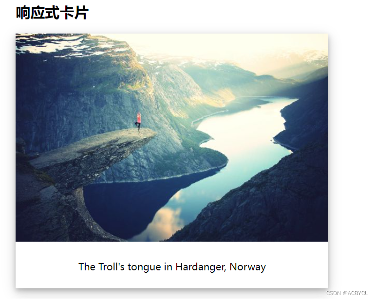
卡片式图片
图片素材
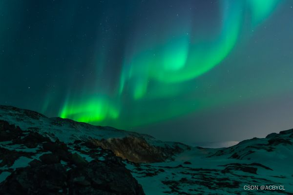
<!DOCTYPE html>
<html lang="en">

<head>
    <meta charset="UTF-8">
    <meta http-equiv="X-UA-Compatible" content="IE=edge">
    <meta name="viewport" content="width=device-width, initial-scale=1.0">
    <title>Document</title>
    <style>
        body {margin:25px;}

        div.polaroid {
        width: 80%;
        background-color: white;
        box-shadow: 0 4px 8px 0 rgba(0, 0, 0, 0.2), 0 6px 20px 0 rgba(0, 0, 0, 0.19);
        margin-bottom: 25px;
        }

        div.container {
        text-align: center;
        padding: 10px 20px;
        }
    </style>
</head>

<body>
    <h2>响应式卡片</h2>

    <div class="polaroid">
        <img src="rock600x400.jpg" alt="Norway" style="width:100%">
        <div class="container">
            <p>The Troll's tongue in Hardanger, Norway</p>
        </div>
    </div>

    <div class="polaroid">
        <img src="lights600x400.jpg" alt="Norway" style="width:100%">
        <div class="container">
            <p>Northern Lights in Norway</p>
        </div>
    </div>
</html>
展示效果
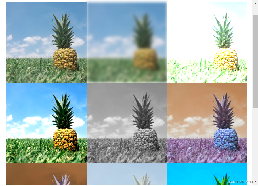
图片滤镜
CSS filter属性为元素添加可视效果(例如:模糊和饱和度)
<!DOCTYPE html>
<html lang="en">

<head>
    <meta charset="UTF-8">
    <meta http-equiv="X-UA-Compatible" content="IE=edge">
    <meta name="viewport" content="width=device-width, initial-scale=1.0">
    <title>Document</title>
    <style>
        img {
            width: 33%;
            height: auto;
            float: left;
            max-width: 235px;
        }

        .blur {-webkit-filter: blur(4px);filter: blur(4px);}
        .brightness {-webkit-filter: brightness(250%);filter: brightness(250%);}
        .contrast {-webkit-filter: contrast(180%);filter: contrast(180%);}
        .grayscale {-webkit-filter: grayscale(100%);filter: grayscale(100%);}
        .huerotate {-webkit-filter: hue-rotate(180deg);filter: hue-rotate(180deg);}
        .invert {-webkit-filter: invert(100%);filter: invert(100%);}
        .opacity {-webkit-filter: opacity(50%);filter: opacity(50%);}
        .saturate {-webkit-filter: saturate(7); filter: saturate(7);}
        .sepia {-webkit-filter: sepia(100%);filter: sepia(100%);}
        .shadow {-webkit-filter: drop-shadow(8px 8px 10px green);filter: drop-shadow(8px 8px 10px green);}
    </style>
</head>

<body>

    <p><strong>注意:</strong> Internet Explorer <span lang="no-bok">或 Safari 5.1 (及更早版本)</span> 不支持该属性。</p>

    <img src="pineapple.jpg" alt="Pineapple" width="300" height="300">
    <img class="blur" src="pineapple.jpg" alt="Pineapple" width="300" height="300">
    <img class="brightness" src="pineapple.jpg" alt="Pineapple" width="300" height="300">
    <img class="contrast" src="pineapple.jpg" alt="Pineapple" width="300" height="300">
    <img class="grayscale" src="pineapple.jpg" alt="Pineapple" width="300" height="300">
    <img class="huerotate" src="pineapple.jpg" alt="Pineapple" width="300" height="300">
    <img class="invert" src="pineapple.jpg" alt="Pineapple" width="300" height="300">
    <img class="opacity" src="pineapple.jpg" alt="Pineapple" width="300" height="300">
    <img class="saturate" src="pineapple.jpg" alt="Pineapple" width="300" height="300">
    <img class="sepia" src="pineapple.jpg" alt="Pineapple" width="300" height="300">
    <img class="shadow" src="pineapple.jpg" alt="Pineapple" width="300" height="300">
</body>
</html>
展示效果
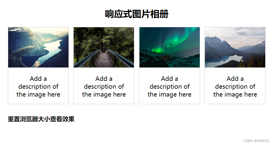
响应式图片相册
<!DOCTYPE html>
<html lang="en">

<head>
    <meta charset="UTF-8">
    <meta http-equiv="X-UA-Compatible" content="IE=edge">
    <meta name="viewport" content="width=device-width, initial-scale=1.0">
    <title>Document</title>
    <style>
        div.img {
            border: 1px solid #ccc;
        }

        div.img:hover {
            border: 1px solid #777;
        }

        div.img img {
            width: 100%;
            height: auto;
        }

        div.desc {
            padding: 15px;
            text-align: center;
        }

        * {
            box-sizing: border-box;
        }

        .responsive {
            padding: 0 6px;
            float: left;
            width: 24.99999%;
        }

        @media only screen and (max-width: 700px){
            .responsive {
                width: 49.99999%;
                margin: 6px 0;
            }
        }

        @media only screen and (max-width: 500px){
            .responsive {
                width: 100%;
            }
        }

        .clearfix:after {
            content: "";
            display: table;
            clear: both;
        }
    </style>
</head>

<body>
    <h2 style="text-align:center">响应式图片相册</h2>

    <div class="responsive">
      <div class="img">
        <a target="_blank" href="img_fjords.jpg">
          <img src="http://www.runoob.com/wp-content/uploads/2016/04/img_fjords.jpg" alt="Trolltunga Norway" width="300" height="200">
        </a>
        <div class="desc">Add a description of the image here</div>
      </div>
    </div>


    <div class="responsive">
      <div class="img">
        <a target="_blank" href="img_forest.jpg">
          <img src="http://www.runoob.com/wp-content/uploads/2016/04/img_forest.jpg" alt="Forest" width="600" height="400">
        </a>
        <div class="desc">Add a description of the image here</div>
      </div>
    </div>

    <div class="responsive">
      <div class="img">
        <a target="_blank" href="img_lights.jpg">
          <img src="http://www.runoob.com/wp-content/uploads/2016/04/img_lights.jpg" alt="Northern Lights" width="600" height="400">
        </a>
        <div class="desc">Add a description of the image here</div>
      </div>
    </div>

    <div class="responsive">
      <div class="img">
        <a target="_blank" href="img_mountains.jpg">
          <img src="http://www.runoob.com/wp-content/uploads/2016/04/img_mountains.jpg" alt="Mountains" width="600" height="400">
        </a>
        <div class="desc">Add a description of the image here</div>
      </div>
    </div>

    <div class="clearfix"></div>

    <div style="padding:6px;">

      <h4>重置浏览器大小查看效果</h4>
    </div>
</body>
</html>
展示效果
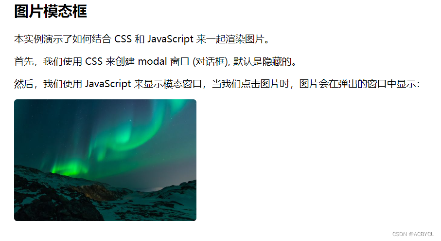
图片模态
<!DOCTYPE html>
<html lang="en">

<head>
    <meta charset="UTF-8">
    <meta http-equiv="X-UA-Compatible" content="IE=edge">
    <meta name="viewport" content="width=device-width, initial-scale=1.0">
    <title>Document</title>
    <style>
        #myImg {
            border-radius: 5px;
            cursor: pointer;
            transition: 0.3s;
        }

        #myImg:hover {opacity: 0.7;}

        /* The Modal (background) */
        .modal {
            display: none; /* Hidden by default */
            position: fixed; /* Stay in place */
            z-index: 1; /* Sit on top */
            padding-top: 100px; /* Location of the box */
            left: 0;
            top: 0;
            width: 100%; /* Full width */
            height: 100%; /* Full height */
            overflow: auto; /* Enable scroll if needed */
            background-color: rgb(0,0,0); /* Fallback color */
            background-color: rgba(0,0,0,0.9); /* Black w/ opacity */
        }

        /* Modal Content (image) */
        .modal-content {
            margin: auto;
            display: block;
            width: 80%;
            max-width: 700px;
        }

        /* Caption of Modal Image */
        #caption {
            margin: auto;
            display: block;
            width: 80%;
            max-width: 700px;
            text-align: center;
            color: #ccc;
            padding: 10px 0;
            height: 150px;
        }

        /* Add Animation */
        .modal-content, #caption {
            -webkit-animation-name: zoom;
            -webkit-animation-duration: 0.6s;
            animation-name: zoom;
            animation-duration: 0.6s;
        }

        @-webkit-keyframes zoom {
            from {-webkit-transform: scale(0)}
            to {-webkit-transform: scale(1)}
        }

        @keyframes zoom {
            from {transform: scale(0.1)}
            to {transform: scale(1)}
        }

        /* The Close Button */
        .close {
            position: absolute;
            top: 15px;
            right: 35px;
            color: #f1f1f1;
            font-size: 40px;
            font-weight: bold;
            transition: 0.3s;
        }

        .close:hover,
        .close:focus {
            color: #bbb;
            text-decoration: none;
            cursor: pointer;
        }

        /* 100% Image Width on Smaller Screens */
        @media only screen and (max-width: 700px){
            .modal-content {
                width: 100%;
            }
        }
    </style>
</head>

<body>
    <h2>图片模态框</h2>
    <p>本实例演示了如何结合 CSS 和 JavaScript 来一起渲染图片。</p><p>
    首先,我们使用 CSS 来创建 modal 窗口 (对话框), 默认是隐藏的。<p>
    <p>然后,我们使用 JavaScript 来显示模态窗口,当我们点击图片时,图片会在弹出的窗口中显示:</p>
    <img id="myImg" src="http://www.runoob.com/wp-content/uploads/2016/04/img_lights.jpg" alt="Northern Lights, Norway" width="300" height="200">

    <!-- The Modal -->
    <div id="myModal" class="modal">
    <span class="close">×</span>
    <img class="modal-content" id="img01">
    <div id="caption"></div>
    </div>

    <script>
    // 获取模态窗口
    var modal = document.getElementById('myModal');

    // 获取图片模态框,alt 属性作为图片弹出中文本描述
    var img = document.getElementById('myImg');
    var modalImg = document.getElementById("img01");
    var captionText = document.getElementById("caption");
    img.onclick = function(){
        modal.style.display = "block";
        modalImg.src = this.src;
        modalImg.alt = this.alt;
        captionText.innerHTML = this.alt;
    }

    // 获取 <span> 元素,设置关闭模态框按钮
    var span = document.getElementsByClassName("close")[0];

    // 点击 <span> 元素上的 (x), 关闭模态框
    span.onclick = function() {
        modal.style.display = "none";
    }
    </script>
</body>
</html>
展示效果


 2万+
2万+


 被折叠的 条评论
为什么被折叠?
被折叠的 条评论
为什么被折叠?
 到【灌水乐园】发言


