


目录
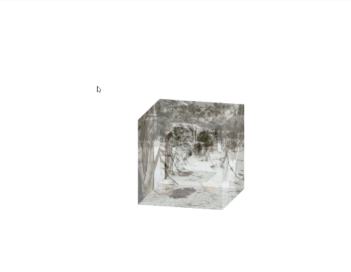
项目实现图片GIF
项目思想
使用6个div代表正方体6个面,通过absolute使小正方体和大正方体的12个面的中心重合在一起,通过preserve-3d使其具有3d效果,根据rotate、translate进行图片的平移和旋转得到小正方体,再将小正方体的平移值变为2倍即可得到大正方体,展开即设置为大正方体平移的2倍即可,最后给父元素.cube上设置旋转的自定义动画效果。
相关CSS样式解释(preserve-3d、perspective、perspective-origin、rotate、translate)
https://blog.csdn.net/AIWWY/article/details/116375851
详细版(带大量解释)
HTML代码
<!DOCTYPE html>
<html lang="en">

<head>
    <meta charset="UTF-8">
    <meta http-equiv="X-UA-Compatible" content="IE=edge">
    <meta name="viewport" content="width=device-width, initial-scale=1.0">
    <title>Document</title>
    <link rel="stylesheet" href="photoCube.css">
</head>

<body>
    <div class="wrap">
        <div class="cube">
            <!-- 小正方体的6面(背景图片) -->
            <div class="small front"></div>
            <div class="small back"></div>
            <div class="small left"></div>
            <div class="small right"></div>
            <div class="small top"></div>
            <div class="small buttom"></div>
            <!-- 大正方体的6面(背景图片) -->
            <div class="big front"></div>
            <div class="big back"></div>
            <div class="big left"></div>
            <div class="big right"></div>
            <div class="big top"></div>
            <div class="big buttom"></div>

        </div>

    </div>
</body>

</html>
CSS代码
*{
    margin: 0;
    padding: 0;
}
.wrap{
    position: relative;
    /* transform-style: 使子元素具有立体属性,preserve-3d;添加在此不会生效 */
    /* perspective: 2000px;因为旋转动画产生的近大远小不会在动画中改变。 */
    /* 写好后网页中调整,动画在网页中间 */
    margin-top: 244px;
    margin-left: 827px;
}
.cube{
    position: absolute;
    transform-style: preserve-3d;
    /* 使正方体初始状态能看见多个面 */
    transform: rotateX(-30deg) rotateY(-80deg);
    /* 绑定动画 匀速执行20s完成无线循环*/
    animation: rotate linear 20s infinite;
    /* 鼠标移入正方体展开过渡设置 */
    /* transition:all 2s;加在此处无效,需要添加在需要过渡的元素上 */
}
.big{
    position:absolute;
    /* 大正方体边长 */
    width: 200px;
    height: 200px;
    /* background-size: cover; 需要先设置好了背景图片,写在此处会失效*/
    opacity: 0.5;
    /* 鼠标移入,设置图片展开的过渡时长 */
    transition:all 2s;
}
.small{
    position:absolute;
    /* 小正方体边长 */
    width: 100px;
    height: 100px;
    /* 使所有图片的中心点重合,方便之后平移旋转成正方体 */
    left: 50px;
    top: 50px;
}

/* 小正方形的6面,先将小正方体形成后再写大正方体 */
.small.front{
    background: url(images/1.jpg);
    /* 将背景图片按比例拉伸成元素等高后截取部分图片 */
    background-size: cover;
    /* z轴前移50px */
    transform: translateZ(50px);
}
.small.back{
    background: url(images/2.jpg);
    background-size: cover;
    /* 先z轴移50px,在绕y轴旋转180度 */
    transform: rotateY(180deg) translateZ(50px);
}
.small.left{
    background: url(images/3.jpg);
    background-size: cover;
     /* 先z轴移50px,在绕y轴旋转-90度 */
    transform:rotateY(-90deg) translateZ(50px)
}
.small.right{
    background: url(images/4.jpg);
    background-size: cover;
     /* 先z轴移50px,在绕y轴旋转90度 */
    transform:rotateY(90deg) translateZ(50px)
}
.small.top{
    background: url(images/5.jpg);
    background-size: cover;
    /* 先z轴移50px,在绕x轴旋转90度 */
    transform: rotateX(90deg) translateZ(50px);
}
.small.buttom{
    background: url(images/6.jpg);
    background-size: cover;
     /* 先z轴移50px,在绕x轴旋转-90度 */
     transform: rotateX(-90deg) translateZ(50px);
}
/* 大正方体的6面,由于空间坐标中心重合,只需复制粘贴小正方体内容,将边长变为200px即translateZ变为100px。 */
.big.front{
    background: url(images/1.jpg);
    background-size: cover;
    transform: translateZ(100px);
}
.big.back{
    background: url(images/2.jpg);
    background-size: cover;
    transform: rotateY(180deg) translateZ(100px);
}
.big.left{
    background: url(images/3.jpg);
    background-size: cover;
    transform:rotateY(-90deg) translateZ(100px)
}
.big.right{
    background: url(images/4.jpg);
    background-size: cover;

    transform:rotateY(90deg) translateZ(100px)
}
.big.top{
    background: url(images/5.jpg);
    background-size: cover;
    transform: rotateX(90deg) translateZ(100px);
}
.big.buttom{
    background: url(images/6.jpg);
    background-size: cover;
     transform: rotateX(-90deg) translateZ(100px);
}
/* 设置当鼠标移入正方体时,每个面向外扩展100px,直接复制粘贴之前大正方体样式,将translateZ由100px改为200px即可 */
.cube:hover .big.front{
    transform: translateZ(200px);
}
.cube:hover .big.back{
    transform: rotateY(180deg) translateZ(200px);
}
.cube:hover .big.left{
    transform:rotateY(-90deg) translateZ(200px)
}
.cube:hover .big.right{
    transform:rotateY(90deg) translateZ(200px)
}
.cube:hover .big.top{
    transform: rotateX(90deg) translateZ(200px);
}
.cube:hover .big.buttom{
     transform: rotateX(-90deg) translateZ(200px);
}
/* 自定义正方体旋转动画 */
@keyframes rotate{
    /* 由于子元素的translate移动,绕的轴将不会是自身的轴 */
    from {
        transform: rotateX(0deg) rotateY(0deg)
    }
    to {
        transform: rotateX(360deg) rotateY(360deg)
    }
}
简洁版(不带解释)
HTML代码
<!DOCTYPE html>
<html lang="en">
<head>
  <meta charset="UTF-8">
  <meta name="viewport" content="width=device-width, initial-scale=1.0">
  <title>Document</title>
  <link rel="stylesheet" href="demo.css">
</head>
<body>
  <div class="xz">
        <div class="wrap">
            <div class="cube">
                <div class="out_front">
                    <img src="./images/1.jpg" class="pic">
                </div>
                <div class="out_back">
                    <img src="./images/2.jpg" class="pic">
                </div>
                <div class="out_left">
                    <img src="./images/3.jpg" class="pic">
                </div>
                <div class="out_right">
                    <img src="./images/4.jpg" class="pic">
                </div>
                <div class="out_top">
                    <img src="./images/5.jpg" class="pic">
                </div>
                <div class="out_bottom">
                    <img src="./images/6.jpg" class="pic">
                </div>
                <span class="in_front">
                    <img src="./images/1.jpg" class="in_pic">
                </span>
                <span class="in_back">
                    <img src="./images/2.jpg" class="in_pic">
                </span>
                <span class="in_left">
                    <img src="./images/3.jpg" class="in_pic">
                </span>
                <span class="in_right">
                    <img src="./images/4.jpg" class="in_pic">
                </span>
                <span class="in_top">
                    <img src="./images/5.jpg" class="in_pic">
                </span>
                <span class="in_bottom">
                    <img src="./images/6.jpg" class="in_pic">
                </span>
            </div>
        </div>
	</div>
</body>
</html>
CSS代码
.xz{
    position:absolute;
    top:100px;
    left:493px;
    width:100px;
    height:100px;
}
.wrap {
    width: 100px;
    height: 100px;
    margin: 150px 0 0 150px;
    position:absolute;
}
.cube {
    width: 50px;
    height: 50px;
    margin: 0 auto;
    transform-style: preserve-3d;
    transform: rotateX(-30deg) rotateY(-80deg);
    animation: rotate linear 20s infinite;
}
@keyframes rotate {
    from {
        transform: rotateX(0deg) rotateY(0deg);
    }
    to {
        transform: rotateX(360deg) rotateY(360deg);
    }
}
.cube div {
    position: absolute;
    width: 200px;
    height: 200px;
    opacity: 0.5;
    transition: all .4s;
}
.pic {
    width: 200px;
    height: 200px;
}
.cube .out_front {
    transform: rotateY(0deg) translateZ(100px);
}
.cube .out_back {
    transform: translateZ(-100px) rotateY(180deg);
}
.cube .out_left {
    transform: rotateY(-90deg) translateZ(100px);
}
.cube .out_right {
    transform: rotateY(90deg) translateZ(100px);
}
.cube .out_top {
    transform: rotateX(90deg) translateZ(100px);
}
.cube .out_bottom {
    transform: rotateX(-90deg) translateZ(100px);
}
.cube span {
    display: block;
    width: 100px;
    height: 100px;
    position: absolute;
    top: 50px;
    left: 50px;
}
.cube .in_pic {
    width: 100px;
    height: 100px;
}
.cube .in_front {
    transform: rotateY(0deg) translateZ(50px);
}
.cube .in_back {
    transform: translateZ(-50px) rotateY(180deg);
}
.cube .in_left {
    transform: rotateY(-90deg) translateZ(50px);
}
.cube .in_right {
    transform: rotateY(90deg) translateZ(50px);
}
.cube .in_top {
    transform: rotateX(90deg) translateZ(50px);
}
.cube .in_bottom {
    transform: rotateX(-90deg) translateZ(50px);
}
.cube:hover .out_front {
    transform: rotateY(0deg) translateZ(200px);
}
.cube:hover .out_back {
    transform: translateZ(-200px) rotateY(180deg);
}
.cube:hover .out_left {
    transform: rotateY(-90deg) translateZ(200px);
}
.cube:hover .out_right {
    transform: rotateY(90deg) translateZ(200px);
}
.cube:hover .out_top {
    transform: rotateX(90deg) translateZ(200px);
}
.cube:hover .out_bottom {
    transform: rotateX(-90deg) translateZ(200px);
}


 390
390


 被折叠的 条评论
为什么被折叠?
被折叠的 条评论
为什么被折叠?
 到【灌水乐园】发言


