


往期鸿蒙全套实战文章必看:
概述
对于使用ets声明式前端开发的应用,提供应用内组件的主题能力,支持局部深浅色、动态换肤功能。本功能不支持C-API和Node-API,不支持Ability和窗口的主题设置。
自定义品牌色
CustomTheme用于自定义主题,属性可选,只需要复写修改的部分,未修改内容继承于系统。请参考:
import { CustomColors, CustomTheme } from '@kit.ArkUI'

export class AppColors implements CustomColors {
//自定义品牌色
brand: ResourceColor = '#FF75D9';
}

export class AppTheme implements CustomTheme {
public colors: AppColors = new AppColors()
}

export let gAppTheme: CustomTheme = new AppTheme()
设置应用内组件自定义品牌色
-
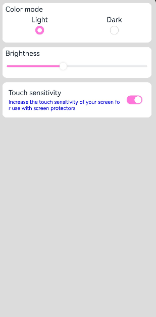
可在页面入口处统一设置,需要在页面build前执行ThemeControl。
其中,onWillApplyTheme回调函数用于自定义组件获取当前生效的Theme对象。
import { Theme, ThemeControl } from '@kit.ArkUI' import { gAppTheme } from './AppTheme' //在页面build前执行ThemeControl ThemeControl.setDefaultTheme(gAppTheme) @Entry @Component struct DisplayPage { @State menuItemColor: ResourceColor = $r('sys.color.background_primary') onWillApplyTheme(theme: Theme) { this.menuItemColor = theme.colors.backgroundPrimary; } build() { Column() { List({ space: 10 }) { ListItem() { Column({ space: '5vp' }) { Text('Color mode') .margin({ top: '5vp', left: '14fp' }) .width('100%') Row() { Column() { Text('Light') .fontSize('16fp') .textAlign(TextAlign.Start) .alignSelf(ItemAlign.Center) Radio({ group: 'light or dark', value: 'light' }) .checked(true) } .width('50%') Column() { Text('Dark') .fontSize('16fp') .textAlign(TextAlign.Start) .alignSelf(ItemAlign.Center) Radio({ group: 'light or dark', value: 'dark' }) } .width('50%') } } .width('100%') .height('90vp') .borderRadius('10vp') .backgroundColor(this.menuItemColor) } ListItem() { Column() { Text('Brightness') .width('100%') .margin({ top: '5vp', left: '14fp' }) Slider({ value: 40, max: 100 }) } .width('100%') .height('70vp') .borderRadius('10vp') .backgroundColor(this.menuItemColor) } ListItem() { Column() { Row() { Column({ space: '5vp' }) { Text('Touch sensitivity') .fontSize('16fp') .textAlign(TextAlign.Start) .width('100%') Text('Increase the touch sensitivity of your screen' + ' for use with screen protectors') .fontSize('12fp') .fontColor(Color.Blue) .textAlign(TextAlign.Start) .width('100%') } .alignSelf(ItemAlign.Center) .margin({ left: '14fp' }) .width('75%') Toggle({ type: ToggleType.Switch, isOn: true }) .margin({ right: '14fp' }) .alignSelf(ItemAlign.Center) } .width('100%') .height('80vp') } .width('100%') .borderRadius('10vp') .backgroundColor(this.menuItemColor) } } } .padding('10vp') .backgroundColor('#dcdcdc') .width('100%') .height('100%') } } -
在Ability中设置ThemeControl,需要在onWindowStageCreate()方法中setDefaultTheme。
import {AbilityConstant, UIAbility, Want } from '@kit.AbilityKit';
import { hilog } from '@kit.PerformanceAnalysisKit';
import { window, CustomColors, ThemeControl } from '@kit.ArkUI';

class AppColors implements CustomColors {
fontPrimary = 0xFFD53032
iconOnPrimary = 0xFFD53032
iconFourth = 0xFFD53032
}

const abilityThemeColors = new AppColors();

export default class EntryAbility extends UIAbility {
onCreate(want: Want, launchParam: AbilityConstant.LaunchParam) {
hilog.info(0x0000, 'testTag', '%{public}s', 'Ability onCreate');
}

onDestroy() {
hilog.info(0x0000, 'testTag', '%{public}s', 'Ability onDestroy');
}

onWindowStageCreate(windowStage: window.WindowStage) {
// Main window is created, set main page for this ability
hilog.info(0x0000, 'testTag', '%{public}s', 'Ability onWindowStageCreate');

windowStage.loadContent('pages/Index', (err, data) => {
if (err.code) {
hilog.error(0x0000, 'testTag', 'Failed to load the content. Cause: %{public}s', JSON.stringify(err) ?? '');
return;
}
hilog.info(0x0000, 'testTag', 'Succeeded in loading the content. Data: %{public}s', JSON.stringify(data) ?? '');
// 在onWindowStageCreate()方法中setDefaultTheme
ThemeControl.setDefaultTheme({ colors: abilityThemeColors })
hilog.info(0x0000, 'testTag', '%{public}s', 'ThemeControl.setDefaultTheme done');
});
}

}
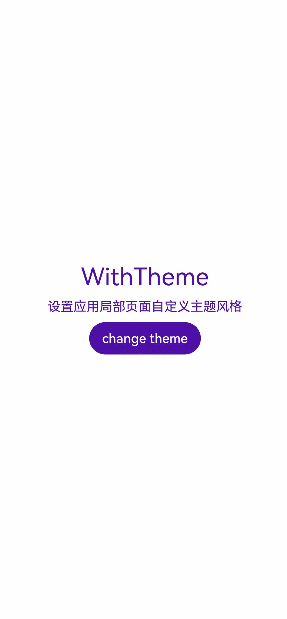
设置应用局部页面自定义主题风格
将自定义Theme的配色通过设置WithTheme作用于内组件缺省样式,WithTheme作用域内组件配色跟随Theme的配色生效。
在下面示例中,通过WithTheme({ theme: this.myTheme })将作用域内的组件配色设置为自定义主题风格。后续可通过更改this.myTheme更换主题风格。
onWillApplyTheme回调函数用于自定义组件获取当前生效的Theme对象。
import { CustomColors, CustomTheme, Theme } from '@kit.ArkUI'

class AppColors implements CustomColors {
fontPrimary: ResourceColor = $r('app.color.brand_purple')
backgroundEmphasize: ResourceColor = $r('app.color.brand_purple')
}

class AppColorsSec implements CustomColors {
fontPrimary: ResourceColor = $r('app.color.brand')
backgroundEmphasize: ResourceColor = $r('app.color.brand')
}

class AppTheme implements CustomTheme {
public colors: AppColors = new AppColors()
}

class AppThemeSec implements CustomTheme {
public colors: AppColors = new AppColorsSec()
}

@Entry
@Component
struct DisplayPage {
@State customTheme: CustomTheme = new AppTheme()
@State message: string = '设置应用局部页面自定义主题风格'
count = 0;

build() {
WithTheme({ theme: this.customTheme }) {
Row(){
Column() {
Text('WithTheme')
.fontSize(30)
.margin({bottom: 10})
Text(this.message)
.margin({bottom: 10})
Button('change theme').onClick(() => {
this.count++;
if (this.count > 1) {
this.count = 0;
}
switch (this.count) {
case 0:
this.customTheme = new AppTheme();
break;
case 1:
this.customTheme = new AppThemeSec();
break;
}
})
}
.width('100%')
}
.height('100%')
.width('100%')
}
}
}
设置应用页面局部深浅色
通过WithTheme可以设置深浅色模式,ThemeColorMode有三种模式,ThemeColorMode.SYSTEM模式表示跟随系统模式,ThemeColorMode.LIGHT模式表示浅色模式,ThemeColorMode.DARK模式表示深色模式。
在WithTheme作用域内,组件的样式资源取值跟随指定的模式读取对应的深浅色模式系统和应用资源值,WithTheme作用域内的组件配色跟随指定的深浅模式生效。
在下面的示例中,通过WithTheme({ colorMode: ThemeColorMode.DARK })将作用域内的组件设置为深色模式。
设置局部深浅色时,需要添加dark.json资源文件,深浅色模式才会生效。

dark.json数据示例:
{
"color": [
{
"name": "start_window_background",
"value": "#FFFFFF"
}
]
}
@Entry
@Component
struct DisplayPage {
@State message: string = 'Hello World';
@State colorMode: ThemeColorMode = ThemeColorMode.DARK;
build() {
WithTheme({ colorMode: this.colorMode }) {
Row() {
Column() {
Text(this.message)
.fontSize(50)
.fontWeight(FontWeight.Bold)
Button('Switch ColorMode').onClick(() => {
if (this.colorMode === ThemeColorMode.LIGHT) {
this.colorMode = ThemeColorMode.DARK;
} else if (this.colorMode === ThemeColorMode.DARK) {
this.colorMode = ThemeColorMode.LIGHT;
}
})
}
.width('100%')
}
.backgroundColor($r('sys.color.background_primary'))
.height('100%')
.expandSafeArea([SafeAreaType.SYSTEM], [SafeAreaEdge.TOP, SafeAreaEdge.END, SafeAreaEdge.BOTTOM, SafeAreaEdge.START])
}
}
}
系统缺省token色值
| Token | 场景类别 | Light | Dark | ||
|---|---|---|---|---|---|
| theme.colors.brand | 品牌色 | #ff0a59f7 |
| #ff317af7 |
|
| theme.colors.warning | 一级警示色 | #ffe84026 |
| #ffd94838 |
|
| theme.colors.alert | 二级警示色 | #ffed6f21 |
| #ffdb6b42 |
|
| theme.colors.confirm | 确认色 | #ff64bb5c |
| #ff5ba854 |
|
| theme.colors.fontPrimary | 一级文本 | #e5000000 |
| #e5ffffff |
|
| theme.colors.fontSecondary | 二级文本 | #99000000 |
| #99ffffff |
|
| theme.colors.fontTertiary | 三级文本 | #66000000 |
| #66ffffff |
|
| theme.colors.fontFourth | 四级文本 | #33000000 |
| #33ffffff |
|
| theme.colors.fontEmphasize | 高亮文本 | #ff0a59f7 |
| #ff317af7 |
|
| theme.colors.fontOnPrimary | 一级文本反色 | #ffffffff |
| #ff000000 |
|
| theme.colors.fontOnSecondary | 二级文本反色 | #99ffffff |
| #99000000 |
|
| theme.colors.fontOnTertiary | 三级文本反色 | #66ffffff |
| #66000000 |
|
| theme.colors.fontOnFourth | 四级文本反色 | #33ffffff |
| #33000000 |
|
| theme.colors.iconPrimary | 一级图标 | #e5000000 |
| #e5ffffff |
|
| theme.colors.iconSecondary | 二级图标 | #99000000 |
| #99ffffff |
|
| theme.colors.iconTertiary | 三级图标 | #66000000 |
| #66ffffff |
|
| theme.colors.iconFourth | 四级图标 | #33000000 |
| #33ffffff |
|
| theme.colors.iconEmphasize | 高亮图标 | #ff0a59f7 |
| #ff317af7 |
|
| theme.colors.iconSubEmphasize | 高亮辅助图标 | #660a59f7 |
| #66317af7 |
|
| theme.colors.iconOnPrimary | 一级图标反色 | #ffffffff |
| #ff000000 |
|
| theme.colors.iconOnSecondary | 二级图标反色 | #99ffffff |
| #99000000 |
|
| theme.colors.iconOnTertiary | 三级图标反色 | #66ffffff |
| #66000000 |
|
| theme.colors.iconOnFourth | 四级图标反色 | #33ffffff |
| #33000000 |
|
| theme.colors.backgroundPrimary | 一级背景(实色/不透明色) | #ffffffff |
| #ffe5e5e5 |
|
| theme.colors.backgroundSecondary | 二级背景(实色/不透明色) | #fff1f3f5 |
| #ff191a1c |
|
| theme.colors.backgroundTertiary | 三级背景(实色/不透明色) | #ffe5e5ea |
| #ff202224 |
|
| theme.colors.backgroundFourth | 四级背景(实色/不透明色) | #ffd1d1d6 |
| #ff2e3033 |
|
| theme.colors.backgroundEmphasize | 高亮背景(实色/不透明色) | #ff0a59f7 |
| #ff317af7 |
|
| theme.colors.compForegroundPrimary | 前背景 | #ff000000 |
| #ffe5e5e5 |
|
| theme.colors.compBackgroundPrimary | 白色背景 | #ffffffff |
| #ffffffff |
|
| theme.colors.compBackgroundPrimaryTran | 白色透明背景 | #ffffffff |
| #33ffffff |
|
| theme.colors.compBackgroundPrimaryContrary | 常亮背景 | #ffffffff |
| #ffe5e5e5 |
|
| theme.colors.compBackgroundGray | 灰色背景 | #fff1f3f5 |
| #ffe5e5ea |
|
| theme.colors.compBackgroundSecondary | 二级背景 | #19000000 |
| #19ffffff |
|
| theme.colors.compBackgroundTertiary | 三级背景 | #0c000000 |
| #0cffffff |
|
| theme.colors.compBackgroundEmphasize | 高亮背景 | #ff0a59f7 |
| #ff317af7 |
|
| theme.colors.compBackgroundNeutral | 黑色中性高亮背景 | #ff000000 |
| #ffffffff |
|
| theme.colors.compEmphasizeSecondary | 20%高亮背景 | #330a59f7 |
| #33317af7 |
|
| theme.colors.compEmphasizeTertiary | 10%高亮背景 | #190a59f7 |
| #19317af7 |
|
| theme.colors.compDivider | 分割线颜色 | #33000000 |
| #33ffffff |
|
| theme.colors.compCommonContrary | 通用反色 | #ffffffff |
| #ff000000 |
|
| theme.colors.compBackgroundFocus | 获焦态背景色 | #fff1f3f5 |
| #ff000000 |
|
| theme.colors.compFocusedPrimary | 获焦态一级反色 | #e5000000 |
| #e5ffffff |
|
| theme.colors.compFocusedSecondary | 获焦态二级反色 | #99000000 |
| #99ffffff |
|
| theme.colors.compFocusedTertiary | 获焦态三级反色 | #66000000 |
| #66ffffff |
|
| theme.colors.interactiveHover | 通用悬停交互式颜色 | #0c000000 |
| #0cffffff |
|
| theme.colors.interactivePressed | 通用按压交互式颜色 | #19000000 |
| #19ffffff |
|
| theme.colors.interactiveFocus | 通用获焦交互式颜色 | #ff0a59f7 |
| #ff317af7 |
|
| theme.colors.interactiveActive | 通用激活交互式颜色 | #ff0a59f7 |
| #ff317af7 |
|
| theme.colors.interactiveSelect | 通用选择交互式颜色 | #33000000 |
| #33ffffff |
|
| theme.colors.interactiveClick | 通用点击交互式颜色 | #19000000 |
| #19ffffff |
|


 扫一扫
扫一扫

 被折叠的 条评论
为什么被折叠?
被折叠的 条评论
为什么被折叠?
 到【灌水乐园】发言


