 Swift UIKit核心组件详解


十七、滚动视图组件:UIScrollView
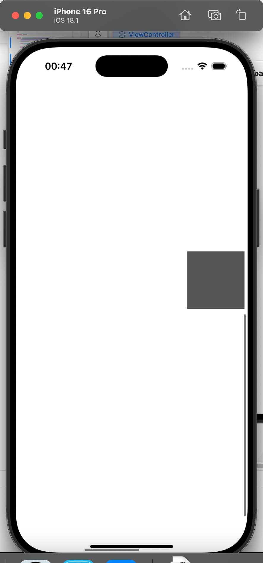
UIScrollView 是用于实现视图滚动与缩放的基础组件(继承自 UIView),核心是当子视图尺寸(contentSize)超过自身可见范围(frame)时,允许用户通过触摸滑动查看;同时支持子视图缩放(如图片放大缩小),适用于长文本、多图片展示、分页引导页等场景。
17.1 核心功能
场景1:基础滚动与缩放
- 支持水平/垂直滚动(需
contentSize宽/高大于frame宽/高); - 自定义滚动条样式(
indicatorStyle)与显示状态(showsHorizontalScrollIndicator); - 支持子视图缩放(需设置缩放范围与代理方法
viewForZooming(in:))。
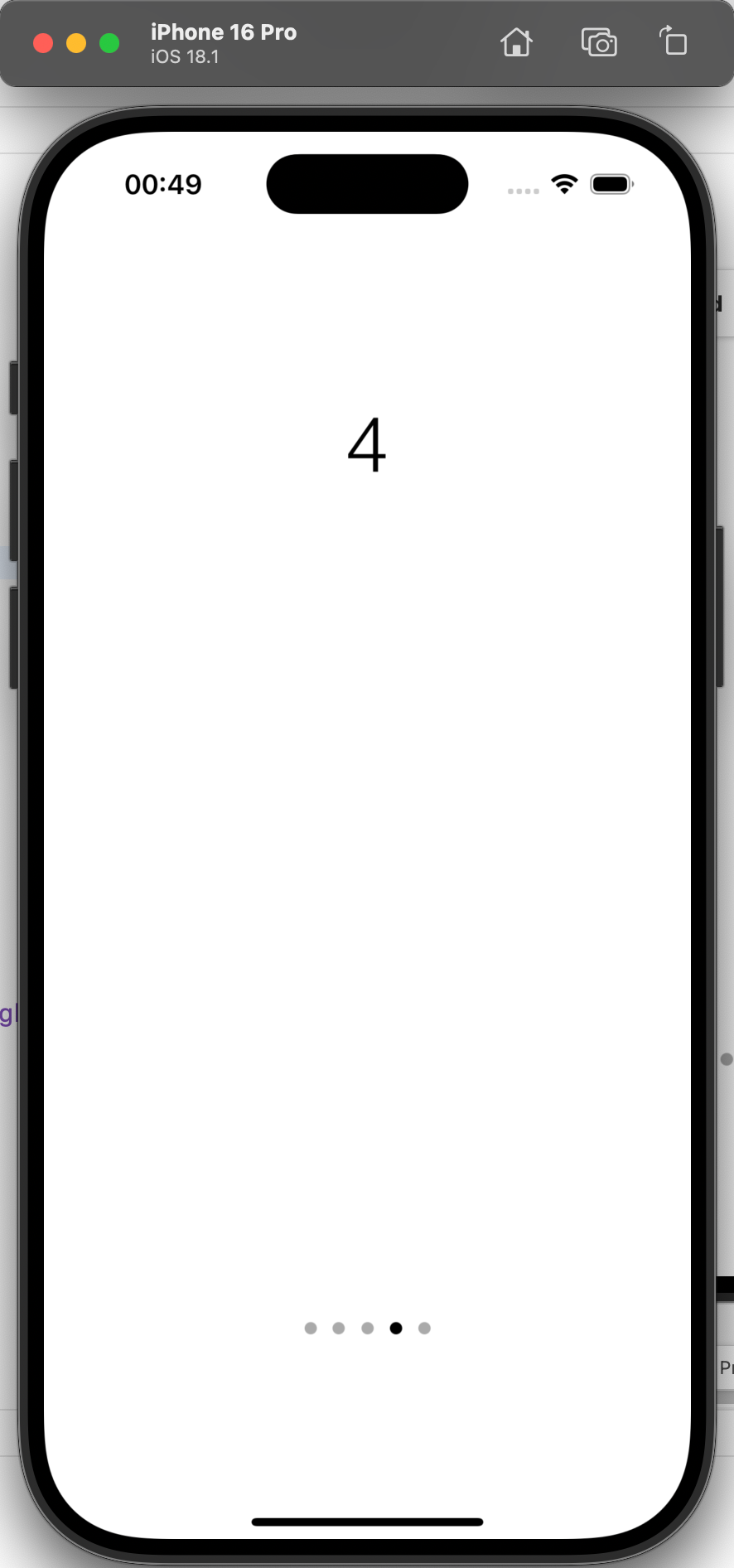
场景2:分页滚动
- 配合
UIPageControl实现“分步引导页”或“图片轮播”; - 支持按页滑动(
isPagingEnabled = true),滑动后自动更新页码; - 点击页码可快速跳转到对应页面。
17.2 关键属性与方法
| 类别 | 属性/方法 | 作用说明 |
|---|---|---|
| 滚动核心 | contentSize | 子视图的实际尺寸(必须大于 frame 才会滚动,如 CGSize(width: 3*屏宽, height: 2*屏高)) |
| 滚动控制 | isScrollEnabled | 是否允许滚动(true 允许,默认 true) |
isPagingEnabled | 是否按页滚动(true 时,滚动距离为 frame 宽度/高度,适用于分页场景) | |
contentOffset | 当前滚动的偏移量(CGPoint(x: 水平偏移, y: 垂直偏移),可手动设置跳转位置) | |
| 滚动条配置 | showsHorizontalScrollIndicator | 是否显示水平滚动条(true 显示,默认 true) |
showsVerticalScrollIndicator | 是否显示垂直滚动条(true 显示,默认 true) | |
indicatorStyle | 滚动条样式(.black/.white/.whiteLarge,控制颜色与大小) | |
| 缩放配置 | minimumZoomScale | 最小缩放比例(如 0.5,默认 1.0) |
maximumZoomScale | 最大缩放比例(如 2.0,默认 1.0) | |
zoomScale | 当前缩放比例(默认 1.0,需在 minimum~maximum 之间) | |
| 代理方法 | viewForZooming(in:) | 代理方法:返回需要缩放的子视图(如 return viewWithTag(1)) |
scrollViewDidEndDecelerating(_:) | 代理方法:滚动结束后触发(用于更新分页页码) | |
| 分页配合 | UIPageControl.numberOfPages | 页码指示器的总页数(如 5 表示 5 页) |
UIPageControl.currentPage | 当前选中的页码(用于同步滚动状态) |
17.3 代码逻辑解析
场景1:基础滚动与缩放
class ViewController: UIViewController, UIScrollViewDelegate {
    let fullSize = UIScreen.main.bounds.size
    var myScrollView: UIScrollView!

    override func viewDidLoad() {
        super.viewDidLoad()

        // 1. 初始化滚动视图:可见范围为屏幕(y=20 避开状态栏)
        myScrollView = UIScrollView(frame: CGRect(
            x: 0, y: 20,
            width: fullSize.width,
            height: fullSize.height - 20
        ))
        // 2. 设置实际内容尺寸(3倍屏宽 × 2倍屏高,大于可见范围才会滚动)
        myScrollView.contentSize = CGSize(width: fullSize.width * 3, height: fullSize.height * 2)
        // 3. 缩放配置:最小0.5倍,最大2倍,初始1倍
        myScrollView.minimumZoomScale = 0.5
        myScrollView.maximumZoomScale = 2.0
        myScrollView.zoomScale = 1.0
        myScrollView.bouncesZoom = true // 缩放超范围时弹回
        // 4. 滚动条配置:显示黑色滚动条
        myScrollView.showsHorizontalScrollIndicator = true
        myScrollView.showsVerticalScrollIndicator = true
        myScrollView.indicatorStyle = .black
        // 5. 绑定代理(用于缩放)
        myScrollView.delegate = self
        self.view.addSubview(myScrollView)

        // 6. 添加6个测试视图(分布在3×2的网格中,便于观察滚动)
        for i in 0...2 { // 水平3列
            for j in 0...1 { // 垂直2行
                let subView = UIView(frame: CGRect(x: 0, y: 0, width: 100, height: 100))
                subView.tag = i * 10 + j + 1 // 给视图打标签(1~6)
                // 视图居中位置:第i列×屏宽 + 屏宽/2,第j行×屏高 + 屏高/2
                subView.center = CGPoint(
                    x: fullSize.width * (0.5 + CGFloat(i)),
                    y: fullSize.height * (0.5 + CGFloat(j))
                )
                // 背景色随标签变化(区分不同视图)
                let grayScale = ((CGFloat(i) + 1) * (CGFloat(j) + 1)) / 12.0
                subView.backgroundColor = UIColor(red: grayScale, green: grayScale, blue: grayScale, alpha: 1)
                myScrollView.addSubview(subView)
            }
        }
    }

    // 7. 代理方法:指定缩放的视图(tag=1的视图,即左上角第一个)
    func viewForZooming(in scrollView: UIScrollView) -> UIView? {
        return self.view.viewWithTag(1)
    }

    // 8. 缩放结束后重置contentSize(避免缩放导致contentSize变小,无法滚动)
    func scrollViewDidEndZooming(_ scrollView: UIScrollView, with view: UIView?, atScale scale: CGFloat) {
        myScrollView.contentSize = CGSize(width: fullSize.width * 3, height: fullSize.height * 2)
    }
}
场景2:分页滚动
class ViewController: UIViewController, UIScrollViewDelegate {
    let fullSize = UIScreen.main.bounds.size
    var myScrollView: UIScrollView!
    var pageControl: UIPageControl!

    override func viewDidLoad() {
        super.viewDidLoad()

        // 1. 初始化滚动视图:可见范围为屏幕,关闭滚动条
        myScrollView = UIScrollView(frame: CGRect(
            x: 0, y: 20,
            width: fullSize.width,
            height: fullSize.height - 20
        ))
        // 2. 分页配置:按页滚动(每页宽度=屏宽)
        myScrollView.isPagingEnabled = true
        myScrollView.showsHorizontalScrollIndicator = false
        myScrollView.showsVerticalScrollIndicator = false
        // 3. 内容尺寸:5页 × 屏宽(垂直高度=可见高度,无垂直滚动)
        myScrollView.contentSize = CGSize(width: fullSize.width * 5, height: fullSize.height - 20)
        myScrollView.delegate = self
        self.view.addSubview(myScrollView)

        // 4. 初始化页码指示器(UIPageControl)
        pageControl = UIPageControl(frame: CGRect(x: 0, y: 0, width: fullSize.width * 0.85, height: 50))
        pageControl.center = CGPoint(x: fullSize.width * 0.5, y: fullSize.height * 0.85)
        pageControl.numberOfPages = 5 // 总页数5
        pageControl.currentPage = 0 // 默认选中第0页
        pageControl.currentPageIndicatorTintColor = .black // 当前页码颜色
        pageControl.pageIndicatorTintColor = .lightGray // 其他页码颜色
        // 5. 页码点击事件:跳转到对应页
        pageControl.addTarget(self, action: #selector(pageChanged), for: .valueChanged)
        self.view.addSubview(pageControl) // 加到父视图,覆盖在滚动视图上

        // 6. 添加5个页码标签(每个页面显示“1”~“5”)
        for i in 0...4 {
            let pageLabel = UILabel(frame: CGRect(x: 0, y: 0, width: fullSize.width, height: 40))
            pageLabel.text = "\(i + 1)"
            pageLabel.font = UIFont(name: "Helvetica-Light", size: 48)
            pageLabel.textAlignment = .center
            // 标签位置:第i页的水平中心 = i×屏宽 + 屏宽/2
            pageLabel.center = CGPoint(
                x: fullSize.width * (0.5 + CGFloat(i)),
                y: fullSize.height * 0.2
            )
            myScrollView.addSubview(pageLabel)
        }
    }

    // 7. 滚动结束后:更新页码指示器(同步当前页)
    func scrollViewDidEndDecelerating(_ scrollView: UIScrollView) {
        // 当前页码 = 水平偏移量 / 屏宽(整数)
        let currentPage = Int(scrollView.contentOffset.x / scrollView.frame.size.width)
        pageControl.currentPage = currentPage
    }

    // 8. 点击页码:滚动到对应页面
    @objc func pageChanged(_ sender: UIPageControl) {
        // 目标页面的frame:x = 页码×屏宽,y=0
        let targetFrame = CGRect(
            x: CGFloat(sender.currentPage) * myScrollView.frame.size.width,
            y: 0,
            width: myScrollView.frame.size.width,
            height: myScrollView.frame.size.height
        )
        // 滚动到目标frame(带动画)
        myScrollView.scrollRectToVisible(targetFrame, animated: true)
    }
}
17.4 注意事项
-
滚动前提:
contentSize必须大于UIScrollView的frame尺寸,否则不会触发滚动; -
缩放代理:实现缩放功能时,必须同时设置
minimumZoomScale/maximumZoomScale并实现viewForZooming(in:)代理方法,否则缩放无效; -
分页宽度:
isPagingEnabled = true时,分页宽度/高度默认等于UIScrollView的frame宽/高,如需自定义分页大小,需通过UIScrollViewDelegate的scrollViewWillEndDragging(_:withVelocity:targetContentOffset:)手动调整; -
UIPageControl 层级:
UIPageControl需添加到UIScrollView的父视图(而非子视图),否则会随滚动视图一起滚动,无法固定在底部。
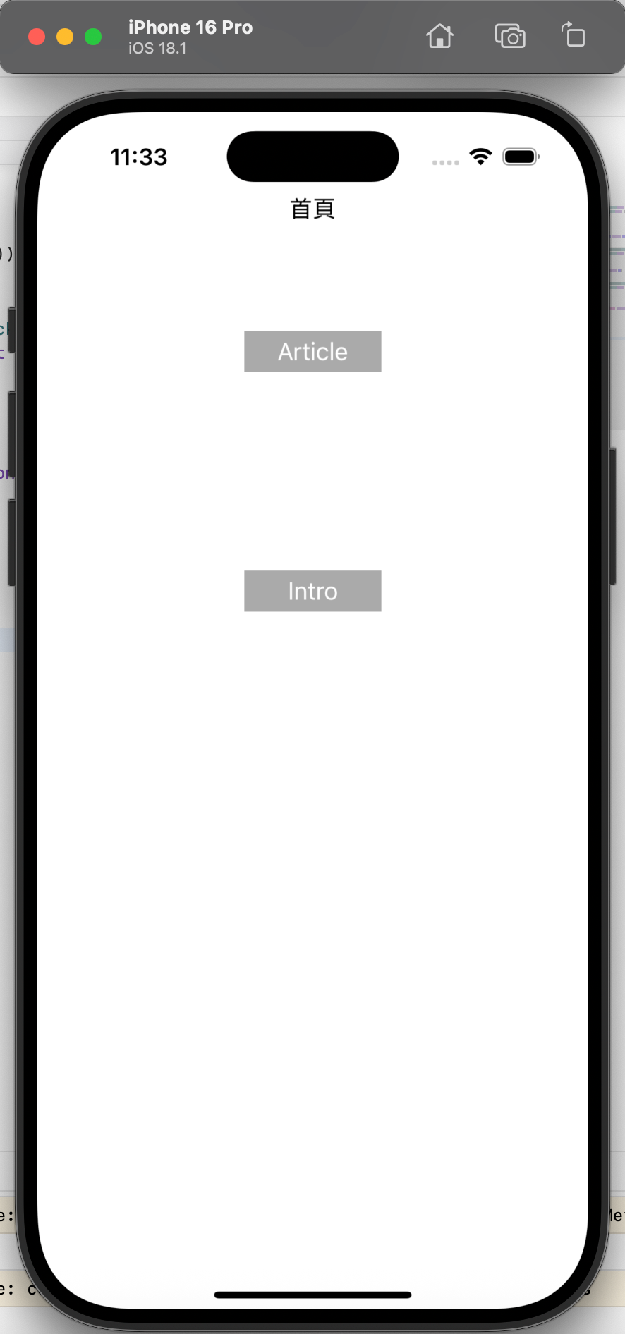
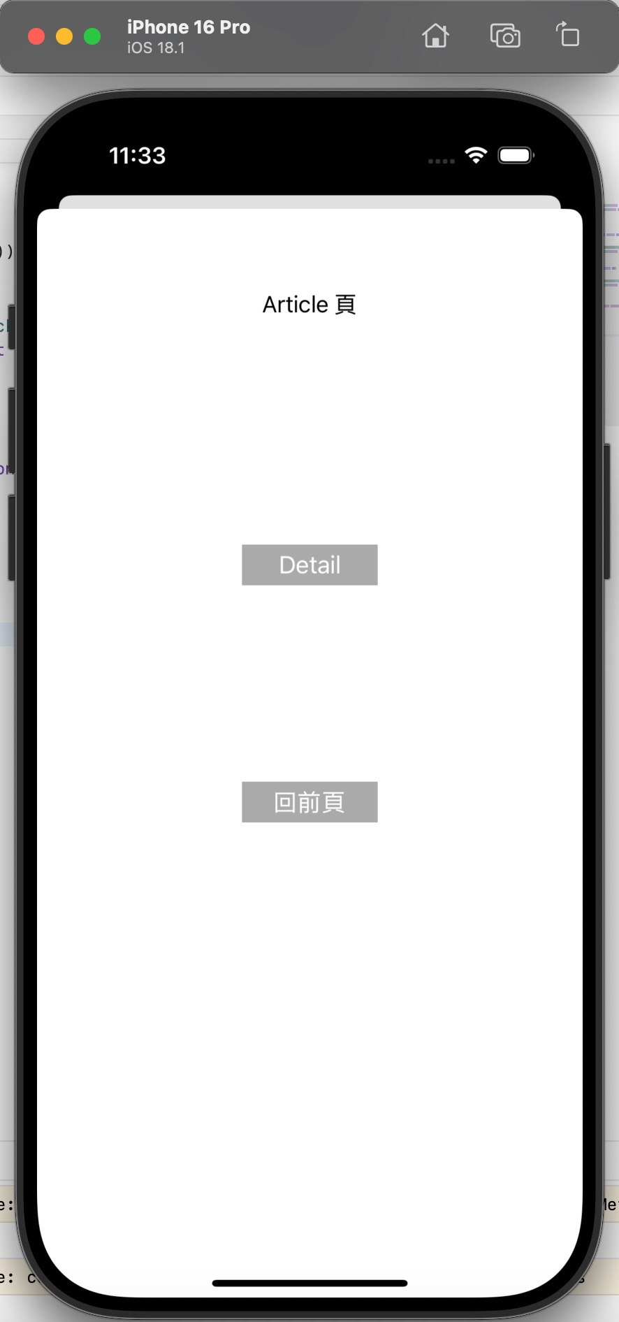
十八、模态页面跳转:MultiPage
MultiPage 并非独立组件,而是通过 UIViewController 的 模态跳转方法(present/dismiss)实现多页面切换,适用于临时弹窗、功能子页面(如登录页、详情页)等场景。核心是“跳转-返回”的栈管理,以及 UIViewController 生命周期方法的触发逻辑。
18.1 核心功能
- 模态跳转:通过
present(_:animated:completion:)从当前页面跳转到目标页面; - 模态返回:通过
dismiss(animated:completion:)从当前页面返回上一页面; - 生命周期监听:跳转过程中触发
viewWillAppear/viewWillDisappear等方法,可用于刷新数据或保存状态。
18.2 关键方法与生命周期
| 类别 | 方法/生命周期 | 作用说明 |
|---|---|---|
| 模态跳转 | present(_:animated:completion:) | 跳转到目标控制器(如 present(ArticleViewController(), animated: true)) |
| 模态返回 | dismiss(animated:completion:) | 返回上一控制器(如 dismiss(animated: true)) |
| 生命周期方法 | viewWillAppear(_:) | 控制器即将显示时触发(如返回当前页时刷新数据) |
viewDidAppear(_:) | 控制器已显示时触发 | |
viewWillDisappear(_:) | 控制器即将消失时触发(如跳走时保存数据) | |
viewDidDisappear(_:) | 控制器已消失时触发 |
18.3 代码逻辑解析
页面结构
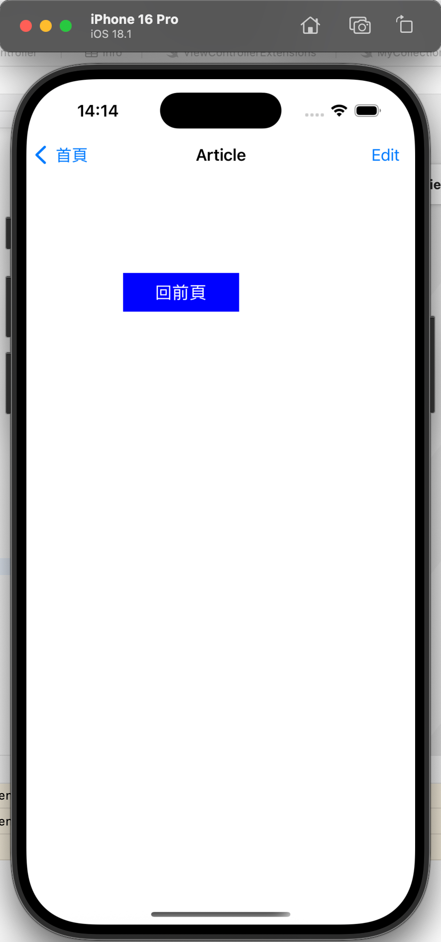
- 首页(ViewController):可跳转到 Article 页和 Intro 页;
- Article 页(ArticleViewController):可跳转到 Detail 页,也可返回首页;
- Detail 页(ArticleDetailViewController):仅可返回 Article 页;
- Intro 页(IntroViewController):仅可返回首页。
核心跳转代码
class ViewController: UIViewController {
let fullSize = UIScreen.main.bounds.size
override func viewDidLoad() {
super.viewDidLoad()
self.view.backgroundColor = .white
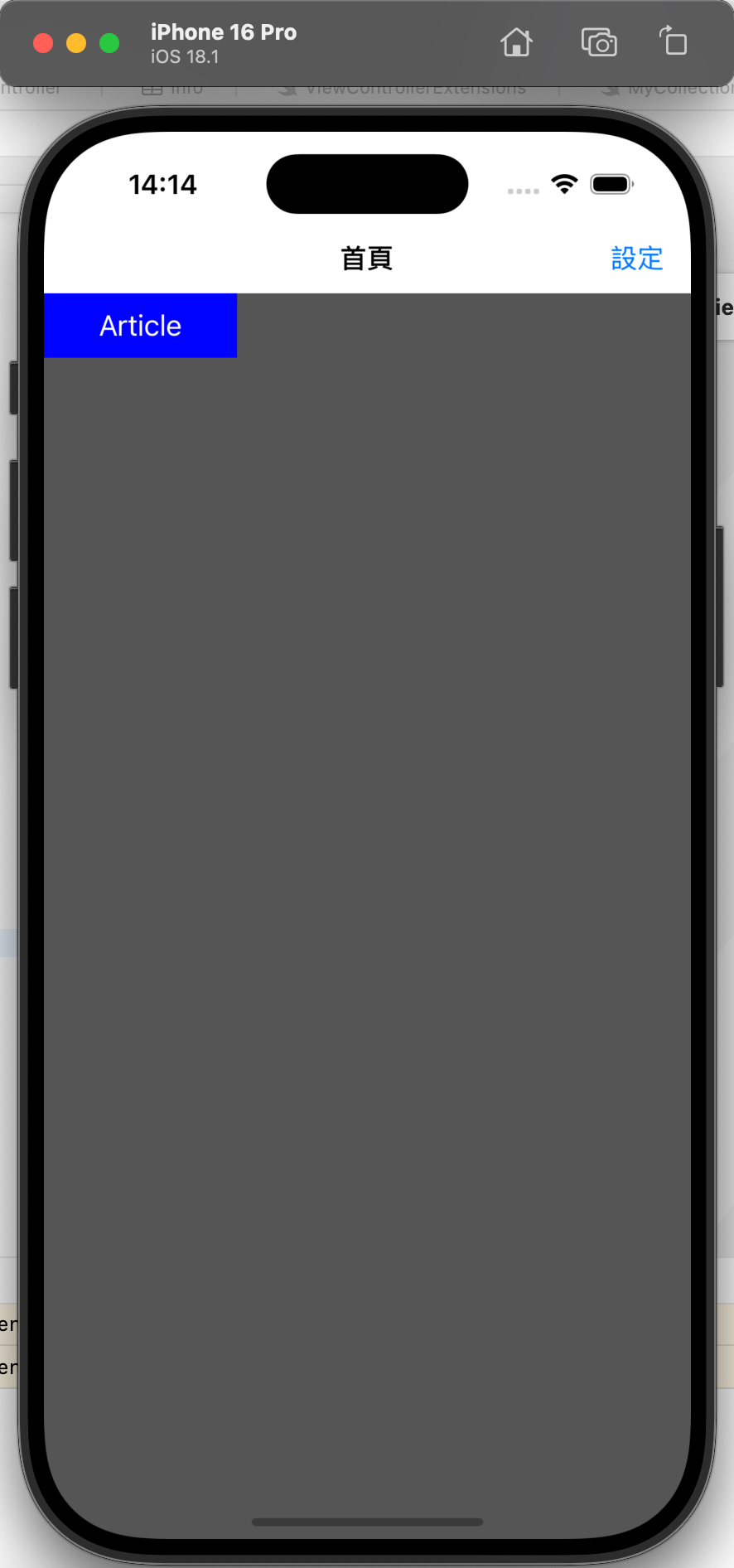
// 1. 页面标题
let titleLabel = UILabel(frame: CGRect(x: 0, y: 0, width: fullSize.width, height: 40))
titleLabel.text = "首頁"
titleLabel.textAlignment = .center
titleLabel.center = CGPoint(x: fullSize.width * 0.5, y: fullSize.height * 0.08)
self.view.addSubview(titleLabel)
// 2. 跳转到 Article 页的按钮
let articleBtn = UIButton(frame: CGRect(x: 0, y: 0, width: 100, height: 30))
articleBtn.setTitle("Article", for: .normal)
articleBtn.backgroundColor = .lightGray
articleBtn.addTarget(self, action: #selector(goArticle), for: .touchUpInside)
articleBtn.center = CGPoint(x: fullSize.width * 0.5, y: fullSize.height * 0.2)
self.view.addSubview(articleBtn)
// 3. 跳转到 Intro 页的按钮
let introBtn = UIButton(frame: CGRect(x: 0, y: 0, width: 100, height: 30))
introBtn.setTitle("Intro", for: .normal)
introBtn.backgroundColor = .lightGray
introBtn.addTarget(self, action: #selector(goIntro), for: .touchUpInside)
introBtn.center = CGPoint(x: fullSize.width * 0.5, y: fullSize.height * 0.4)
self.view.addSubview(introBtn)
print("viewDidLoad(首页初始化)")
}
// 4. 生命周期方法:首页即将显示
override func viewWillAppear(_ animated: Bool) {
super.viewWillAppear(animated)
print("viewWillAppear(首页即将显示)")
}
// 5. 生命周期方法:首页即将消失(跳转到其他页时)
override func viewWillDisappear(_ animated: Bool) {
super.viewWillDisappear(animated)
print("viewWillDisappear(首页即将消失)")
}
// 6. 跳转到 Article 页
@objc func goArticle() {
present(ArticleViewController(), animated: true) {
print("首页 → Article 页 跳转完成")
}
}
// 7. 跳转到 Intro 页
@objc func goIntro() {
present(IntroViewController(), animated: true) {
print("首页 → Intro 页 跳转完成")
}
}
}
// 8. Article 页返回首页的代码
class ArticleViewController: UIViewController {
@objc func goBack() {
dismiss(animated: true) {
print("Article 页 → 首页 返回完成")
}
}
}

18.4 注意事项
-
跳转栈顺序:模态跳转形成“栈”结构,如“首页→Article→Detail”,返回时需从 Detail 先返回到 Article,再返回到首页,无法直接从 Detail 跳回首页(需特殊处理,如
dismiss(to:completion:)); -
生命周期触发顺序:跳转到新页面时,原页面先触发
viewWillDisappear,新页面再触发viewWillAppear;返回时相反; -
动画与 completion:
animated设为true时带过渡动画(默认从下往上滑),completion闭包在跳转/返回完成后执行,可用于后续操作(如刷新数据); -
模态样式:可通过
modalPresentationStyle自定义模态样式(如pageSheet/formSheet),默认样式在不同设备(iPhone/iPad)上可能不同。
十九、导航控制器:UINavigationController
UINavigationController 是用于层级导航的控制器(继承自 UIViewController),核心是“导航栈”管理,通过 push 跳转新页面、pop 返回上一页面,同时提供顶部导航栏(UINavigationBar),支持标题、左右按钮、自定义样式,适用于大多数 App 的主页面导航(如“首页→列表→详情”)。
19.1 核心功能
- 导航栈管理:
pushViewController(入栈)、popViewController(出栈)、popToRootViewController(返回到根页面); - 导航栏配置:自定义标题、背景色、左右按钮(
UIBarButtonItem)、半透明状态; - 全局导航配置:在
SceneDelegate/AppDelegate中设置根控制器为导航控制器,统一管理所有页面。
19.2 关键属性与方法
| 类别 | 属性/方法 | 作用说明 |
|---|---|---|
| 初始化 | UINavigationController(rootViewController:) | 初始化导航控制器,rootViewController 为根页面(第一个显示的页面) |
| 导航栈操作 | pushViewController(_:animated:) | 跳转到新页面(入栈,带动画) |
popViewController(animated:) | 返回上一页面(出栈,带动画) | |
popToRootViewController(animated:) | 返回根页面(清空栈中除根页面外的所有页面) | |
| 导航栏配置 | navigationBar.barTintColor | 导航栏背景色(如 UIColor.lightGray) |
navigationBar.isTranslucent | 导航栏是否半透明(false 时,页面内容从导航栏下方开始;true 时重叠) | |
navigationItem.title | 当前页面的导航栏标题(在对应 UIViewController 中设置) | |
navigationItem.leftBarButtonItem | 导航栏左侧按钮(如返回按钮、菜单按钮) | |
navigationItem.rightBarButtonItem | 导航栏右侧按钮(如编辑、设置按钮) | |
| 根控制器设置 | window?.rootViewController | 在 SceneDelegate/AppDelegate 中设置导航控制器为窗口根控制器 |
19.3 代码逻辑解析
步骤1:设置导航控制器为根控制器(SceneDelegate)
class SceneDelegate: UIResponder, UIWindowSceneDelegate {
    var window: UIWindow?

    func scene(_ scene: UIScene, willConnectTo session: UISceneSession, options connectionOptions: UIScene.ConnectionOptions) {
        guard let windowScene = (scene as? UIWindowScene) else { return }

        // 1. 创建窗口
        window = UIWindow(windowScene: windowScene)
        // 2. 创建根页面(ViewController)
        let rootVC = ViewController()
        // 3. 创建导航控制器,将根页面传入
        let navVC = UINavigationController(rootViewController: rootVC)
        // 4. 设置窗口根控制器为导航控制器
        window?.rootViewController = navVC
        window?.backgroundColor = .white
        window?.makeKeyAndVisible() // 显示窗口
    }
}
步骤2:首页(根页面)配置导航栏与跳转
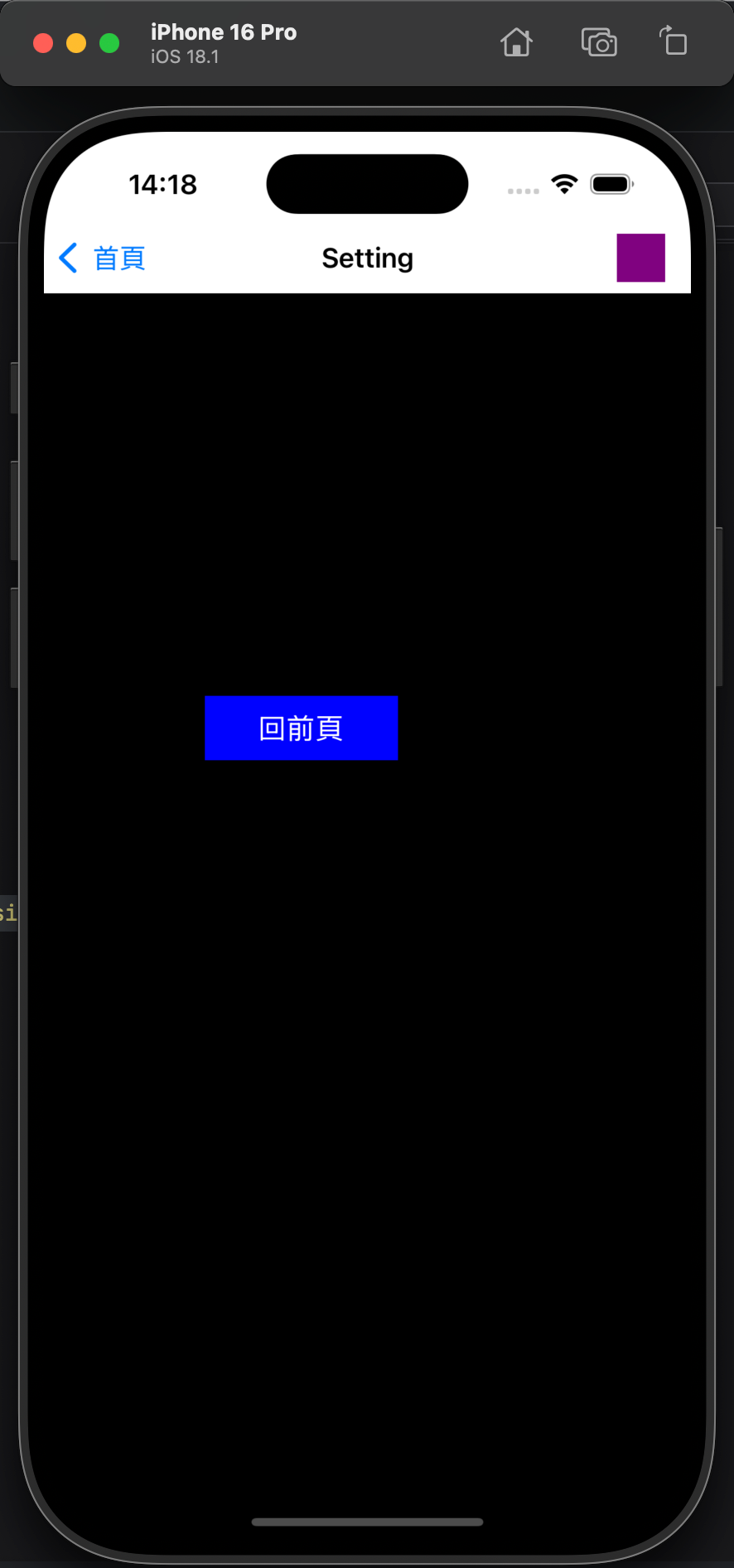
class ViewController: UIViewController {
    override func viewWillAppear(_ animated: Bool) {
        super.viewWillAppear(animated)
        // 跳转返回后,重置导航栏背景色(避免被其他页面修改)
        navigationController?.navigationBar.barTintColor = .lightGray
    }

    override func viewDidLoad() {
        super.viewDidLoad()
        view.backgroundColor = .darkGray

        // 1. 导航栏标题
        title = "首頁"

        // 2. 导航栏配置:不半透明,背景色浅灰
        navigationController?.navigationBar.isTranslucent = false
        navigationController?.navigationBar.barTintColor = .lightGray

        // 3. 导航栏左侧按钮(图片按钮:check.png)
        let leftBtn = UIBarButtonItem(
            image: UIImage(named: "check"),
            style: .plain,
            target: self,
            action: #selector(check)
        )
        navigationItem.leftBarButtonItem = leftBtn

        // 4. 导航栏右侧按钮(文字按钮:“設定”)
        let rightBtn = UIBarButtonItem(
            title: "設定",
            style: .plain,
            target: self,
            action: #selector(goSetting)
        )
        navigationItem.rightBarButtonItem = rightBtn

        // 5. 跳转到 Article 页的按钮
        let articleBtn = UIButton(frame: CGRect(x: 0, y: 0, width: 120, height: 40))
        articleBtn.setTitle("Article", for: .normal)
        articleBtn.backgroundColor = .blue
        articleBtn.addTarget(self, action: #selector(goArticle), for: .touchUpInside)
        // 按钮位置:因导航栏不半透明,y从导航栏高度(~44)下方开始
        articleBtn.center = CGPoint(x: view.frame.midX, y: 100)
        view.addSubview(articleBtn)
    }

    // 6. 左侧按钮点击事件
    @objc func check() {
        print("导航栏左侧「check」按钮点击")
    }

    // 7. 跳转到 Article 页(push 入栈)
    @objc func goArticle() {
        navigationController?.pushViewController(ArticleViewController(), animated: true)
    }

    // 8. 跳转到 Setting 页(push 入栈)
    @objc func goSetting() {
        navigationController?.pushViewController(SettingViewController(), animated: true)
    }
}

// 9. Article 页返回首页(pop 出栈)
class ArticleViewController: UIViewController {
    override func viewDidLoad() {
        super.viewDidLoad()
        view.backgroundColor = .white
        title = "Article" // 导航栏标题

        // 返回按钮
        let backBtn = UIButton(frame: CGRect(x: 100, y: 100, width: 120, height: 40))
        backBtn.setTitle("回前頁", for: .normal)
        backBtn.backgroundColor = .blue
        backBtn.addTarget(self, action: #selector(goBack), for: .touchUpInside)
        view.addSubview(backBtn)
    }

    // 返回上一页面(首页)
    @objc func goBack() {
        navigationController?.popViewController(animated: true)
    }
}
19.4 注意事项
-
导航栈管理:
push会将新页面加入栈顶,pop会移除栈顶页面;popToRootViewController会移除所有非根页面,直接返回首页; -
导航栏半透明影响:
isTranslucent = true(默认)时,页面的frame会从屏幕顶部开始(与导航栏重叠),需通过edgesForExtendedLayout或additionalSafeAreaInsets调整;isTranslucent = false时,页面从导航栏下方开始; -
导航栏按钮类型:
UIBarButtonItem支持图片、文字、系统图标(如.edit)、自定义视图(如UIView),可根据需求选择; -
全局导航样式:若需统一所有页面的导航栏样式(如背景色、字体),可在
UINavigationController的viewDidLoad中配置,避免在每个页面重复设置。
二十、标签控制器:UITabBarController
UITabBarController 是用于底部标签切换的控制器(继承自 UIViewController),核心是通过底部标签栏(UITabBar)管理多个并列页面,用户点击标签可切换不同功能模块(如“首页”“分类”“我的”),适用于 App 的主框架导航。
20.1 核心功能
- 标签管理:底部标签栏显示多个标签,每个标签对应一个
UIViewController; - 标签样式:支持系统图标、自定义图标(选中/未选中状态)、文字;
- 切换逻辑:点击标签直接切换页面(无跳转栈,页面常驻内存);
- 默认选中:通过
selectedIndex设置初始选中的标签。
20.2 关键属性与方法
| 类别 | 属性/方法 | 作用说明 |
|---|---|---|
| 初始化 | UITabBarController() | 初始化标签控制器 |
| 标签配置 | viewControllers | 标签对应的控制器数组(顺序与底部标签顺序一致) |
tabBarItem | 每个控制器的标签配置(如 UITabBarItem(tabBarSystemItem: .favorites)) | |
tabBarItem.image | 标签未选中时的图标 | |
tabBarItem.selectedImage | 标签选中时的图标 | |
tabBarItem.title | 标签文字(可与图标同时显示) | |
| 选中控制 | selectedIndex | 当前选中的标签索引(从 0 开始,如 2 表示选中第 3 个标签) |
| 标签栏样式 | tabBar.backgroundColor | 底部标签栏的背景色 |
tabBar.tintColor | 选中标签的颜色(默认蓝色,影响图标和文字) |
20.3 代码逻辑解析
步骤1:在 AppDelegate 中设置根控制器为 UITabBarController
@main
class AppDelegate: UIResponder, UIApplicationDelegate {
var window: UIWindow?
func application(_ application: UIApplication, didFinishLaunchingWithOptions launchOptions: [UIApplication.LaunchOptionsKey: Any]?) -> Bool {
// 1. 创建窗口
window = UIWindow(frame: UIScreen.main.bounds)
window?.backgroundColor = .white
// 2. 初始化标签控制器
let tabBarVC = UITabBarController()
tabBarVC.tabBar.backgroundColor = .clear // 标签栏背景透明(可自定义)
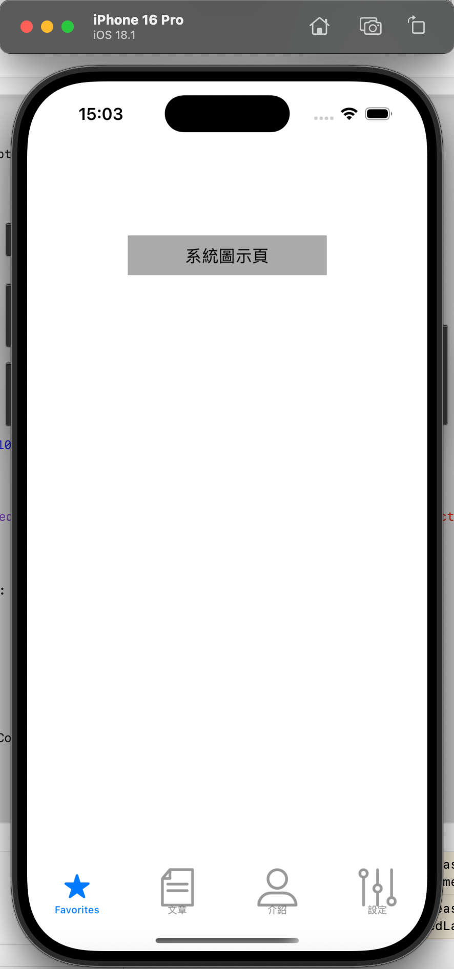
// 3. 创建4个标签对应的控制器
let mainVC = ViewController() // 系统图标标签
let articleVC = ArticleViewController() // 自定义图标+文字标签
let introVC = IntroViewController() // 自定义图标+文字标签
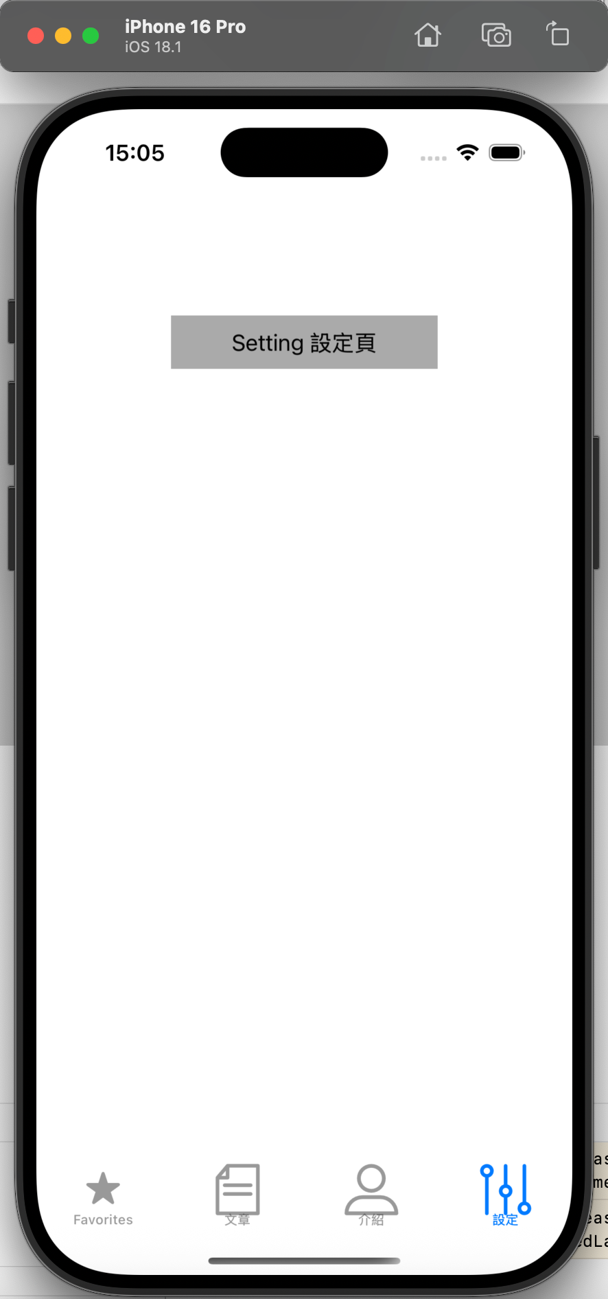
let settingVC = SettingViewController() // 自定义图标+文字标签
// 4. 配置每个控制器的标签(tabBarItem)
// 标签1:系统图标(.favorites,无需自定义图片)
mainVC.tabBarItem = UITabBarItem(tabBarSystemItem: .favorites, tag: 100)
// 标签2:自定义图标(未选中:article.png,选中:articleSelected.png)+ 文字“文章”
articleVC.tabBarItem = UITabBarItem(
title: "文章",
image: UIImage(named: "article"),
selectedImage: UIImage(named: "articleSelected")
)
// 标签3:自定义图标(仅未选中图)+ 文字“介紹”
introVC.tabBarItem = UITabBarItem(
title: "介紹",
image: UIImage(named: "profile"),
tag: 200
)
// 标签4:单独设置图标和文字
settingVC.tabBarItem.image = UIImage(named: "setting")
settingVC.tabBarItem.title = "設定"
// 5. 将控制器数组赋值给标签控制器(顺序=标签顺序)
tabBarVC.viewControllers = [mainVC, articleVC, introVC, settingVC]
// 6. 默认选中第3个标签(索引2,对应 Intro 页)
tabBarVC.selectedIndex = 2
// 7. 设置窗口根控制器为标签控制器
window?.rootViewController = tabBarVC
window?.makeKeyAndVisible()
return true
}
}
// 8. 每个标签对应的控制器(示例:Intro 页)
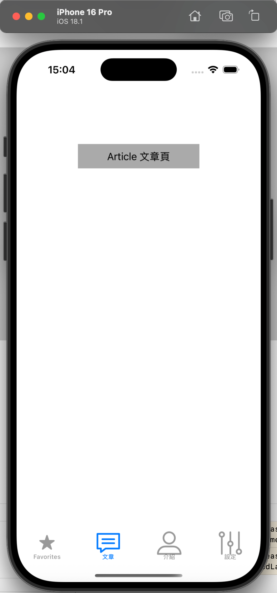
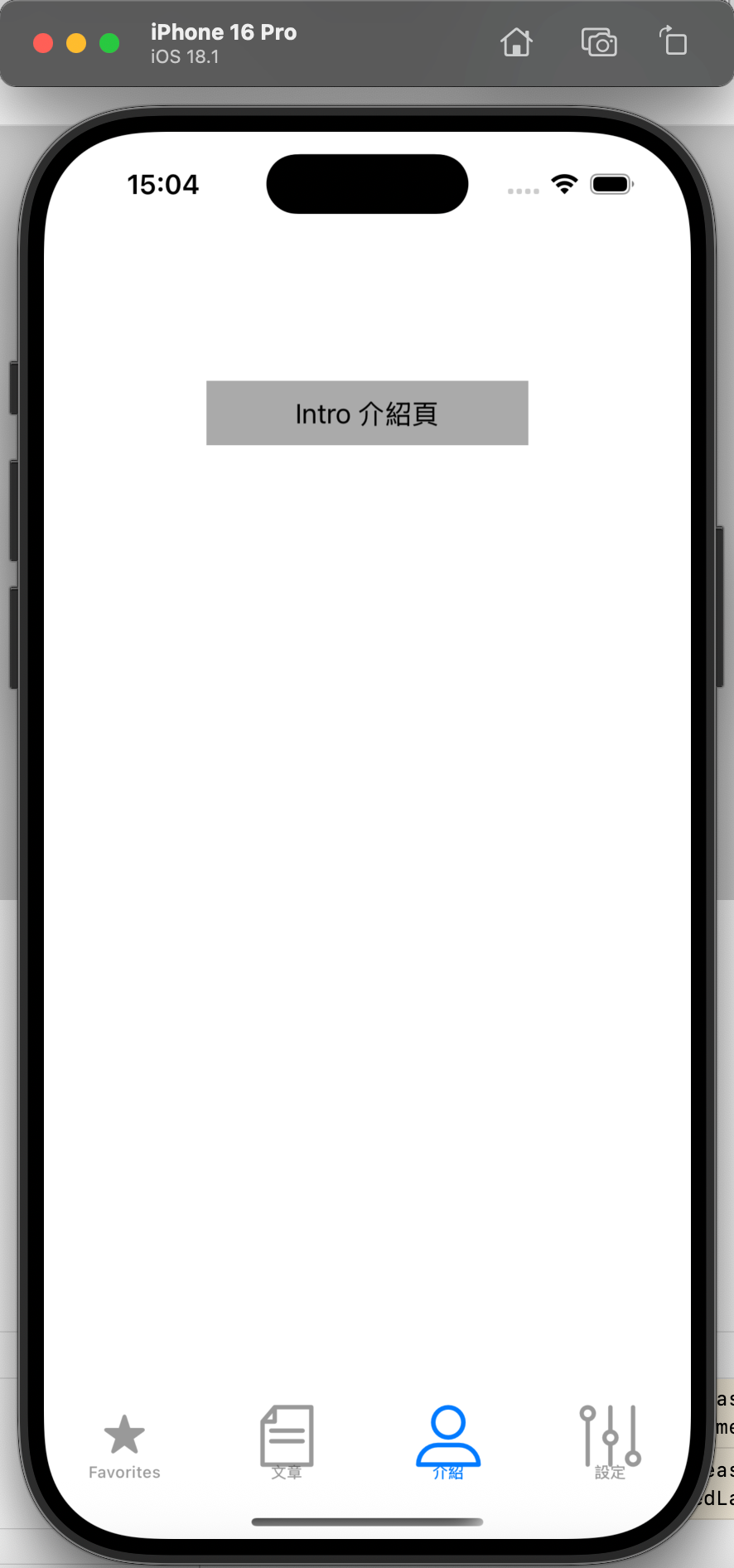
class IntroViewController: UIViewController {
override func viewDidLoad() {
super.viewDidLoad()
view.backgroundColor = .white
// 页面内容:标签提示
let label = UILabel(frame: CGRect(x: 0, y: 0, width: 200, height: 40))
label.text = "Intro 介紹頁"
label.backgroundColor = .lightGray
label.textAlignment = .center
label.center = CGPoint(x: view.frame.midX, y: 100)
view.addSubview(label)
}
}
步骤2:每个标签页的个性化配置
// 示例:优化 ArticleViewController 的标签配置(避免图标颜色异常)
class ArticleViewController: UIViewController {
    override func viewDidLoad() {
        super.viewDidLoad()
        view.backgroundColor = .white

        // 1. 自定义标签图标:处理渲染模式(避免系统 tint 色覆盖原图标颜色)
        let normalImage = UIImage(named: "article")?.withRenderingMode(.alwaysOriginal) // 保持原图标颜色
        let selectedImage = UIImage(named: "articleSelected")?.withRenderingMode(.alwaysOriginal)

        // 2. 配置标签 Item(含图标、文字、文字样式)
        let tabBarItem = UITabBarItem(
            title: "文章",
            image: normalImage,
            selectedImage: selectedImage
        )
        // 3. 调整标签文字样式(选中/未选中状态)
        let normalAttrs: [NSAttributedString.Key: Any] = [
            .font: UIFont.systemFont(ofSize: 12), // 未选中文字字号
            .foregroundColor: UIColor.gray // 未选中文字颜色
        ]
        let selectedAttrs: [NSAttributedString.Key: Any] = [
            .font: UIFont.systemFont(ofSize: 12, weight: .medium), // 选中文字加粗
            .foregroundColor: UIColor.blue // 选中文字颜色
        ]
        tabBarItem.setTitleTextAttributes(normalAttrs, for: .normal)
        tabBarItem.setTitleTextAttributes(selectedAttrs, for: .selected)

        // 4. 图标与文字的间距(默认间距较大,可缩小)
        tabBarItem.imageInsets = UIEdgeInsets(top: 6, left: 0, bottom: -6, right: 0)

        self.tabBarItem = tabBarItem
    }
}
步骤3:监听标签切换事件
通过 UITabBarControllerDelegate 监听标签切换,实现“切换时刷新数据”“初始化页面”等需求:
// 在 AppDelegate 中设置代理,或单独创建 TabBarController 子类
class CustomTabBarController: UITabBarController, UITabBarControllerDelegate {
    override func viewDidLoad() {
        super.viewDidLoad()
        self.delegate = self // 绑定代理
    }

    // 标签即将切换时触发(返回 true 允许切换,false 禁止)
    func tabBarController(_ tabBarController: UITabBarController, shouldSelect viewController: UIViewController) -> Bool {
        // 示例:禁止频繁切换到同一标签(避免重复初始化)
        guard let currentIndex = tabBarController.selectedIndex,
              let targetIndex = tabBarController.viewControllers?.firstIndex(of: viewController) else {
            return true
        }
        return currentIndex != targetIndex // 同一标签点击不触发切换
    }

    // 标签切换完成后触发(可执行刷新数据等逻辑)
    func tabBarController(_ tabBarController: UITabBarController, didSelect viewController: UIViewController) {
        // 示例:如果切换到“设置页”,执行初始化逻辑
        if viewController is SettingViewController {
            let settingVC = viewController as! SettingViewController
            settingVC.initUserInfo() // 调用设置页的自定义方法
        }
    }
}

// 在 AppDelegate 中替换为自定义 TabBarController
func application(_ application: UIApplication, didFinishLaunchingWithOptions launchOptions: [UIApplication.LaunchOptionsKey: Any]?) -> Bool {
    // ... 其他代码 ...
    let tabBarVC = CustomTabBarController() // 改用自定义子类
    tabBarVC.viewControllers = [mainVC, articleVC, introVC, settingVC]
    // ... 其他代码 ...
}
20.4 注意事项
-
标签顺序与数量:
viewControllers数组的顺序即为底部标签的显示顺序,建议标签数量控制在 3~5 个(超过 5 个会显示“更多”按钮); -
自定义图标适配:图标建议使用 PNG 格式,尺寸建议为 25×25(@2x)、38×38(@3x),避免拉伸变形;选中与未选中图标建议颜色区分(如蓝色/灰色);
-
标签文字位置:默认图标在上、文字在下,可通过
UITabBarItem的imageInsets调整图标与文字的间距; -
标签栏层级:
UITabBar始终在屏幕底部,若页面有底部操作栏,需避免与标签栏重叠(可通过safeAreaInsets适配); -
页面生命周期:标签对应的控制器在首次点击时触发
viewDidLoad,之后切换时仅触发viewWillAppear/viewWillDisappear,不会重复初始化。


 扫一扫
扫一扫


 5168
5168

 被折叠的 条评论
为什么被折叠?
被折叠的 条评论
为什么被折叠?
 到【灌水乐园】发言


