


<!DOCTYPE html PUBLIC "-//W3C//DTD XHTML 1.0 Transitional//EN" "http://www.w3.org/TR/xhtml1/DTD/xhtml1-transitional.dtd">
<html xmlns="http://www.w3.org/1999/xhtml">
<head>
<meta http-equiv="Content-Type" content="text/html;charset=utf-8" />
<title>明镜止水</title>
<style type="text/css">
.cube {
position: fixed;
left: 50%;
top:12px;
}
.cube.one {
top: 200px;
left: 50%;
margin-left: -200px;
}
.rightFace, .leftFace, .topFace div {
padding: 0px;
width: 180px;
height: 180px;
border: solid 1px #ddd;
}
.cube img {
width: 180px;
height: 180px;
}
.rightFace, .leftFace, .topFace { position: absolute;}
.cube:hover .rightFace, .cube:hover .leftFace, .cube:hover .topFace div { background-color: #ffc;}
.cube:hover .rightFace:hover, .cube:hover .leftFace:hover, .cube:hover .topFace:hover div { background-color: #ffa;}
.leftFace {
-webkit-transform: skew(0deg,30deg);
background-color: #ccc;
}
.rightFace {
-webkit-transform: skew(0deg,-30deg);
background-color: #ddd;
left: 180px;
}
.topFace div {
-webkit-transform: skew(0deg,-30deg) scale(1,1.16);
background-color: #eee;
font-size: 0.862em;
}
.topFace {
-webkit-transform: rotate(60deg);
top: -142px;
left: 89px;
}
.cube.{ -webkit-transition: -webkit-transform 1s linear;}
.cube:hover { -webkit-transform: translate(202px,115px);}
</style>
</head>
<body>
<div class="cube one">
<div class="topFace">
<div>
<img src="../images/luoma.jpg"/>
</div>
</div>
<div class="leftFace">
<div>
<img src="../images/MEico.jpg"/>
</div>
</div>
<div class="rightFace">
<div>
<img src="../images/罗马.jpg"/>
</div>
</div>
</div>
</body>
</html>
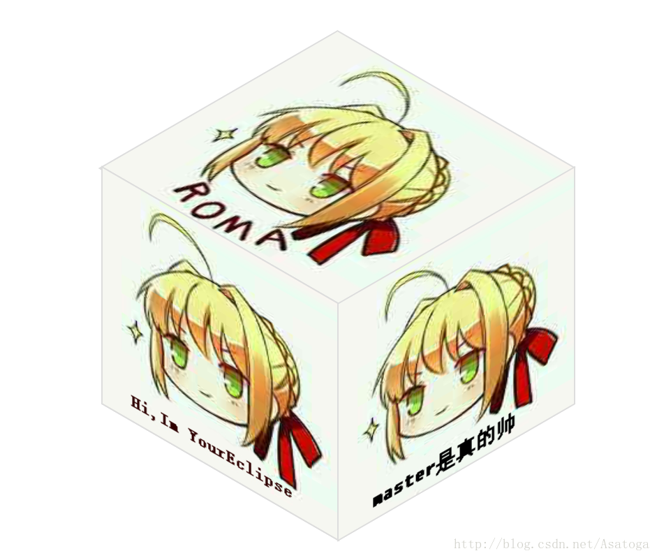
效果如下


 409
409


 被折叠的 条评论
为什么被折叠?
被折叠的 条评论
为什么被折叠?
 到【灌水乐园】发言


