一、绘制折线图
#导入Matplotlib库中的pyplot模块
import matplotlib.pyplot as plt
#构造函数
class LineChart:
def __init__(self, x_data, y_data, title, x_label, y_label):
#变量
self.x_data = x_data
self.y_data = y_data
self.title = title
self.x_label = x_label
self.y_label = y_label
#方法
def plot(self):
fig, ax = plt.subplots()
ax.plot(self.x_data, self.y_data)
ax.set_title(self.title)
ax.set_xlabel(self.x_label)
ax.set_ylabel(self.y_label)
plt.show()
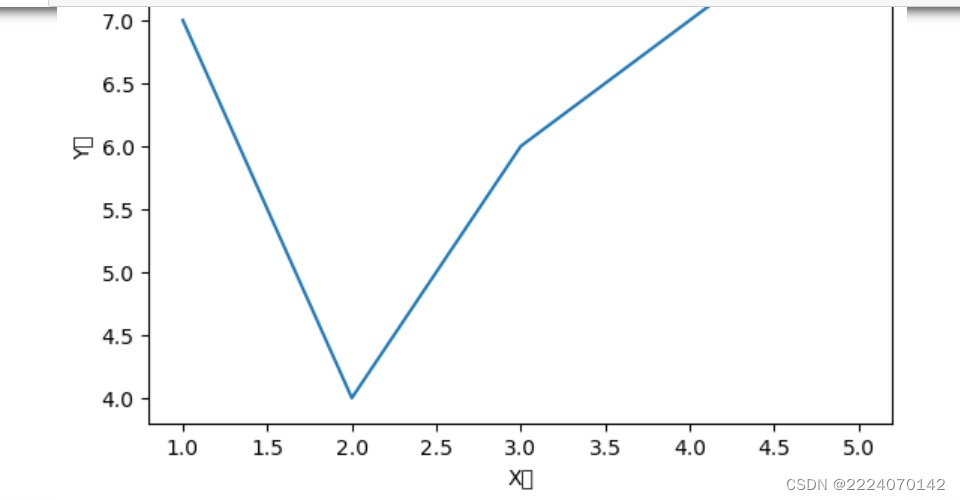
# 示例用法
x_data = [1, 2, 3, 4, 5,6]
y_data = [7, 11, 15, 10, 8,12]
chart = LineChart(x_data, y_data, "折线图示例", "X轴", "Y轴")
chart.plot()
import matplotlib.pyplot as plt
二、绘制柱形图
#导入Matplotlib库中的pyplot模块
import matplotlib.pyplot as plt
#构造函数
class BarChart:
def __init__(self, x_data, y_data, title, x_label, y_label):
#变量
self.x_data = x_data
self.y_data = y_data
self.title = title
self.x_label = x_label
self.y_label = y_label
#方法
def plot(self):
fig, ax = plt.subplots()
ax.bar(self.x_data, self.y_data)
ax.set_title(self.title)
ax.set_xlabel(self.x_label)
ax.set_ylabel(self.y_label)
plt.show()
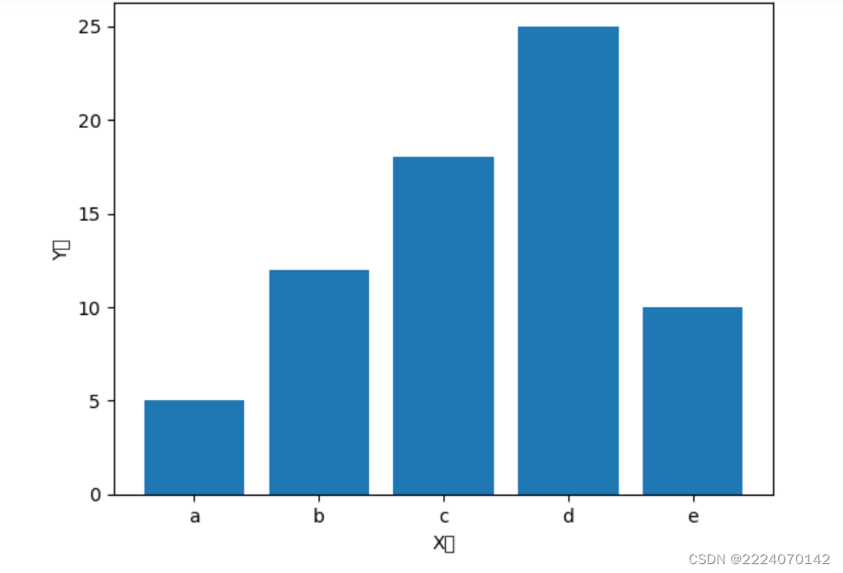
# 示例用法
x_data = ['a', 'b', 'c', 'd', 'e']
y_data = [5, 12, 18, 25,10]
chart = BarChart(x_data, y_data, "柱形图示例", "X轴", "Y轴")
chart.plot()


 1703
1703


 被折叠的 条评论
为什么被折叠?
被折叠的 条评论
为什么被折叠?
 到【灌水乐园】发言


