


echarts折线图line动态显示阈值警戒线markLine
业务需求:需要根据实时数据变换markLine的展示效果。比如温度超过设置的警戒线,就会出现警报效果
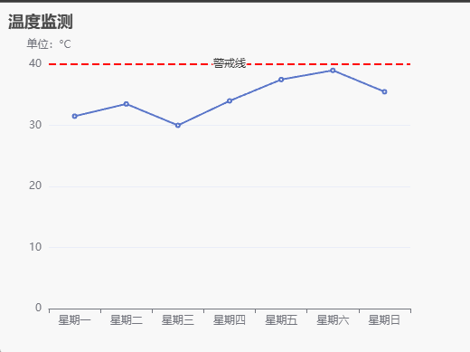
展示效果
- 当温度超过40度时,警戒线就会出现闪烁的报警效果;
- 当温度没有高于40度时,则警戒线没有闪烁效果;
代码实现
实现逻辑:
- 定时生成随机模拟数据
- 监听数据变化;
- 当数据出现大于40的数据时,开启改变markline的颜色的定时任务,从而实现闪烁效果;
- 改变markline颜色通过setOption来实现;
- 当没有大于40的数据时,关闭改色的定时任务
<script setup>
import * as echart from 'echarts'
import {onMounted, ref, watch} from "vue";

const chart = ref()

// 折线图温度数据
const data = ref([31.5, 33.5, 30, 34, 37.5, 39, 35.5])

let myChart
onMounted(() => {
  // 初始化折线图
  myChart = echart.init(chart.value)
  myChart.setOption({
    title: {
      text: '温度监测'
    },
    xAxis: {
      type: 'category',
      data: ['星期一', '星期二', '星期三', '星期四', '星期五', '星期六', '星期日']
    },
    yAxis: {
      type: 'value',
      name: '单位:°C'
    },
    series: [
      {
        data: data.value,
        type: 'line',
        markLine: {
          data: [{
            name: '警戒线',
            yAxis: 40,
            label: {
              formatter: '{b}',
              position: 'insideMiddle'
            }
          }],
          lineStyle: {
            color: 'red',
            width: 2
          },
          symbol: 'none',
          label: {
            distance: [20, 8]
          }
        }
      }
    ]
  })
  // 开启模拟数据变化的interval
  updateData()
})

// 模拟数据变化
const updateData = () => {
  setInterval(() => {
    data.value = data.value.map(i => parseFloat((Math.random()*10 + 31).toFixed(1)))
    myChart.setOption({
      series: [
        {
          data: data.value
        }
      ]
    })
  }, 3000)
}

// 监听数据变化
watch(data, n => {
  // 查询大于40数据
  const r = n.find(item => item >= 40)
  // 当存在大于40的数据时开启颜色变化,否则关闭颜色变化
  if (r) {
    updateMarkLineColor()
  }else {
    updateColorInterval.value && clearInterval(updateColorInterval.value)
    updateColorInterval.value = undefined
    setMarkLineColor('#ff0000')
  }
})

// 保存颜色闪烁的interval
const updateColorInterval = ref()
// 开启循环变色
const updateMarkLineColor = () => {
  // 如果已开启变色则不需再次开启变色
  if (updateColorInterval.value) return
  let color = '#ff0000'
  updateColorInterval.value = setInterval(() => {
    color = color === '#ff0000' ? '#ffd500' : '#ff0000'
    setMarkLineColor(color)
  }, 500)
}


// 设置警戒线颜色
const setMarkLineColor = color => {
  myChart.setOption({
    series: [
      {
        markLine: {
          lineStyle: {
            color: color
          }
        }
      }
    ]
  })
}

</script>

<template>
  <div ref="chart" style="width: 500px;height: 400px"></div>
</template>

<style scoped>

</style>


 7326
7326


 被折叠的 条评论
为什么被折叠?
被折叠的 条评论
为什么被折叠?
 到【灌水乐园】发言


