


文章说明
本文是我上个学期选修的一门人工智能与交通运输课程的一个小作业的实验报告的示例代码部分,源文件为 Jupyter Notebook 格式。这份实验报告是关于对一组微观交通流量数据应用数据分析方法进行简单的研究的,实现了多种不同的交通预测模型并进行了对比。
报告内容详见我的博客文章:我的人工智能与交通运输课程作业:交通流数据分析报告
文章目录
交通流分析示例代码
由于交通流分析研究的需要,交通流模型应当是可微的,同时模型的预测要尽可能与经验观测的结果相符合。
一个好的交通流模型通常具有以下特点:
- 函数形式简单
- 模型函数在整个密度范围内均有定义
- 模型参数具有实际的物理意义
- 与经验观测的结果在统计学上具有较好的符合性
导入库
numpy、pandas、matplotlib,常用的数据分析库,称之为 “数据分析三巨头”或者“御三家”。
- numpy 通常用于数学计算、矩阵运算、线性数学
- pandas 用于处理数据二维表,用于数据挖掘、数据分析
- matplotlib 用于数据可视化绘图
import numpy as np
import pandas as pd
import matplotlib.pyplot as plt
import seaborn as sns
如下代码可以用于解决 MatPlotLib 中文显示的乱码问题。
plt.rcParams.update({
    "figure.dpi":100,           # 设置图片清晰度
    "font.sans-serif":'SimHei', # 字体为黑体,否则会出现中文乱码
    "axes.unicode_minus":False, # 解决负号不显示的问题
})
在 Jupyter Notebook 使用中发现,未添加 %matplotlib inline 时,所有的图片均不在 Jupyter 中自动显示;而如果在代码框中加入 plt.show(),会打开额外的 tk 窗口,窗口显示均为空白。
疑似本地 matplotlib 故障。多次重装 matplotlib 及 matplotlib-inline,均未果。
import matplotlib
matplotlib.use('TkAgg')  # 或者其他合适的GUI库名称
%matplotlib inline
数据处理部分
读取数据,使用方法 pandas.read_csv()
df = pd.read_csv("./data/M_SE.csv")
df
| Time | Week | Dis | Flow | Speed | |
|---|---|---|---|---|---|
| 0 | 0 | 1 | 0.00 | 72 | 73.5 |
| 1 | 1 | 1 | 0.00 | 54 | 74.3 |
| 2 | 2 | 1 | 0.00 | 49 | 73.1 |
| 3 | 3 | 1 | 0.00 | 62 | 73.0 |
| 4 | 4 | 1 | 0.00 | 47 | 70.7 |
| ... | ... | ... | ... | ... | ... |
| 8059 | 283 | 7 | 2.69 | 119 | 73.2 |
| 8060 | 284 | 7 | 2.69 | 139 | 72.2 |
| 8061 | 285 | 7 | 2.69 | 121 | 74.6 |
| 8062 | 286 | 7 | 2.69 | 102 | 74.0 |
| 8063 | 287 | 7 | 2.69 | 93 | 73.9 |
8064 rows × 5 columns
缺少密度数据。根据 流量 - 密度 - 速度之间的关系:
k = q v k = \dfrac{q}{v} k=vq
可以计算出车流密度的大小。
df["Density"] = df["Flow"] / df["Speed"]
df["Density"]
0       0.979592
1       0.726783
2       0.670315
3       0.849315
4       0.664781
          ...
8059    1.625683
8060    1.925208
8061    1.621984
8062    1.378378
8063    1.258457
Name: Density, Length: 8064, dtype: float64
df
| Time | Week | Dis | Flow | Speed | Density | |
|---|---|---|---|---|---|---|
| 0 | 0 | 1 | 0.00 | 72 | 73.5 | 0.979592 |
| 1 | 1 | 1 | 0.00 | 54 | 74.3 | 0.726783 |
| 2 | 2 | 1 | 0.00 | 49 | 73.1 | 0.670315 |
| 3 | 3 | 1 | 0.00 | 62 | 73.0 | 0.849315 |
| 4 | 4 | 1 | 0.00 | 47 | 70.7 | 0.664781 |
| ... | ... | ... | ... | ... | ... | ... |
| 8059 | 283 | 7 | 2.69 | 119 | 73.2 | 1.625683 |
| 8060 | 284 | 7 | 2.69 | 139 | 72.2 | 1.925208 |
| 8061 | 285 | 7 | 2.69 | 121 | 74.6 | 1.621984 |
| 8062 | 286 | 7 | 2.69 | 102 | 74.0 | 1.378378 |
| 8063 | 287 | 7 | 2.69 | 93 | 73.9 | 1.258457 |
8064 rows × 6 columns
数据的统计分布特征
在开始进行数据的处理和分析之前,需要对数据分布的统计学特征有所了解。
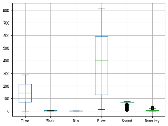
查看数据的统计特征。
可以看见原始数据的密度在 6.152 左右,密度整体较高。
df[["Flow", "Speed", "Density"]].describe()
| Flow | Speed | Density | |
|---|---|---|---|
| count | 8064.000000 | 8064.000000 | 8064.000000 |
| mean | 376.938244 | 66.836297 | 6.152005 |
| std | 236.932452 | 9.715159 | 4.613613 |
| min | 13.000000 | 8.000000 | 0.194444 |
| 25% | 129.000000 | 65.775000 | 1.795225 |
| 50% | 403.000000 | 70.400000 | 5.768694 |
| 75% | 591.000000 | 72.400000 | 9.193952 |
| max | 815.000000 | 76.800000 | 31.458333 |
绘制箱线图,对数据样本点统计分布情况进行可视化。
df.boxplot()
<AxesSubplot: >
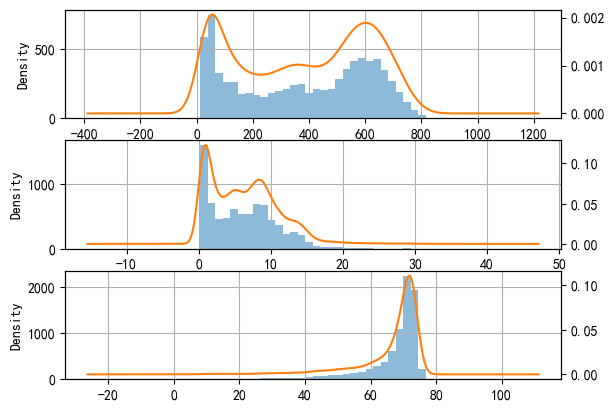
检验数据的分布是否符合正态性特征。
from scipy.stats import kstest
alpha = 0.05
for cols in df[["Flow", "Density", "Speed"]]:
    data_to_KS = df[cols].values
    u = data_to_KS.mean() # 计算均值
    std = data_to_KS.std() # 计算标准差
    result = kstest( data_to_KS, 'norm', (u, std) )
    print(str(cols), '是否正态:', result[1] > alpha,
        "; k 检验值:", result[1])
Flow 是否正态: False ; k 检验值: 8.095684176144447e-81
Density 是否正态: False ; k 检验值: 2.198859154425868e-70
Speed 是否正态: False ; k 检验值: 0.0
发现数据样本不具有正态性,这说明原始数据采样不均匀。
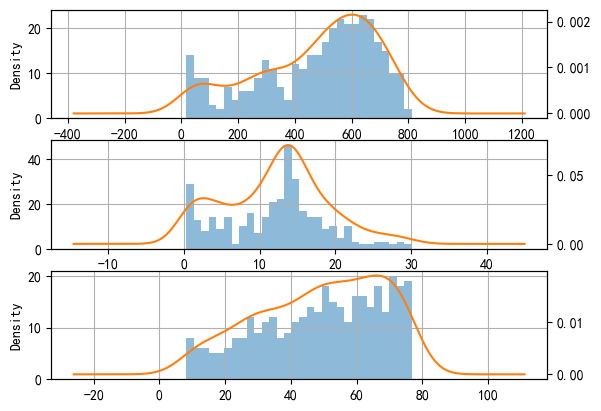
fig, axes = plt.subplots(3, 1)
df["Flow"].hist(bins=30, alpha=0.5, ax=axes[0])
df["Flow"].plot(kind='kde', secondary_y=True, ax=axes[0])
df["Density"].hist(bins=30, alpha=0.5, ax=axes[1])
df["Density"].plot(kind='kde', secondary_y=True, ax=axes[1])
df["Speed"].hist(bins=30, alpha=0.5, ax=axes[2])
df["Speed"].plot(kind='kde', secondary_y=True, ax=axes[2])
<AxesSubplot: >
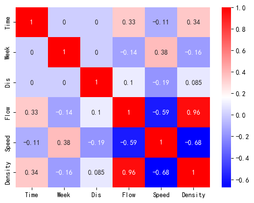
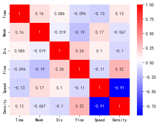
检验数据样本中两两变量之间的相关性。由于数据不具有正态性,因此采用斯皮尔曼相关性方法。
corr = df.corr(method='spearman')
sns.heatmap(corr, cmap="bwr", annot=True)
#显示对脚线下面部分图
<AxesSubplot: >
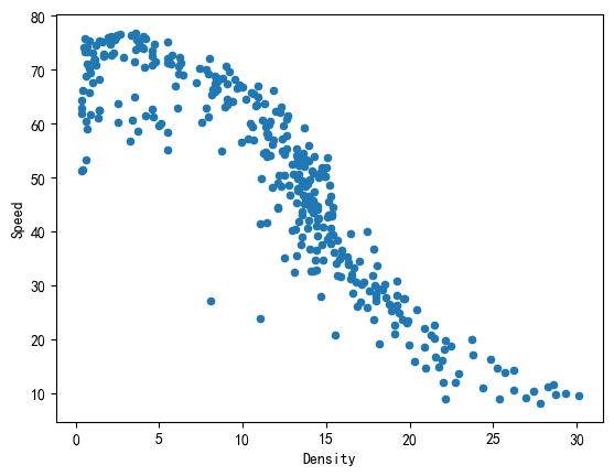
接下来,绘制数据样本点在各个速度下的分布情况,查看采样是否均匀:
counts = df['Speed'].value_counts()
counts = counts.sort_index()
plt.bar(counts.index, counts.values)
plt.title("Sample Counts at each Speed")
Text(0.5, 1.0, 'Sample Counts at each Speed')
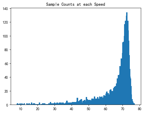
通过对不同速度下的车流的计数绘制柱状图可以看出,车流的样本点几乎完全集中在 65 到 75 这个区间之内。这就意味着,如果直接利用梯度下降算法对模型进行拟合,就会导致对数据点进行拟合的时候梯度下降法为追求整体残差最小,会优先照顾到这些数据量较大的点而忽略其他存在的点。
- 当前情形属于数据分析中,遇到数据点采样不均、回归方法优先照顾样本数量较多的数据点而忽略采样数量较少、但是对于解决实际问题很重要的数据点,以致模型拟合结果不理想的情况。
需要根据具体情况重新采样,或者根据数据的分布特征划分数据集。
对于上述数据分布不均的情况,通常采用以下几种方法:
- 过采样:对少数类重新采样,使得数据点较少的区域也能拥有较多样本
- 欠采样:筛选数据点密集区域的数据点,使这些数据点减少,与数据点较少区域的数据点的数量保持一致。
- 使用权重的梯度下降:在计算梯度时,考虑每个数据点的频率或者密度,对数量较少的点给予更大的权重。
- 通过变换方法,对数据点进行消偏操作
- 选择对样本点分布情况不敏感的模型进行回归
数据的欠采样
此处数据重采样的方法是对数据点进行筛选,检查并删除具有相等的速度或密度或流量值的样本点,只保留其中的一个。
- 这样做的效果是,可以使得同速度、密度、流量下的样本点只保留一个。
匿名函数使用 sample() 方法从每个分组中随机选择指定数量(即 sample_size)的样本点。最终得到一个包含均匀筛选采样结果的新 DataFrame。
通过改变 col_names 列表中的列名,可以选择性删除重复的特定列具有重复值的样本点。
resampled_df = df
col_names = ['Density', 'Speed', 'Flow'] # 按列名采样
sample_size = 1 # 每个值都取相同数量的样本点

for name in col_names:
    target_count = resampled_df[name].value_counts()
    # 对每个值进行均匀筛选采样
    resampled_df = resampled_df.groupby(name).apply(
        lambda x: x.sample(n=sample_size)
        )
    # 重置索引并删除多余的索引列
    resampled_df.reset_index(drop=True, inplace=True)
resampled_df
| Time | Week | Dis | Flow | Speed | Density | |
|---|---|---|---|---|---|---|
| 0 | 32 | 1 | 0.00 | 18 | 51.2 | 0.351562 |
| 1 | 31 | 1 | 2.69 | 20 | 51.4 | 0.389105 |
| 2 | 26 | 3 | 0.00 | 21 | 64.4 | 0.326087 |
| 3 | 24 | 1 | 2.69 | 22 | 62.8 | 0.350318 |
| 4 | 36 | 1 | 0.00 | 23 | 61.9 | 0.371567 |
| ... | ... | ... | ... | ... | ... | ... |
| 350 | 82 | 4 | 2.69 | 780 | 61.5 | 12.682927 |
| 351 | 205 | 1 | 2.69 | 781 | 55.9 | 13.971377 |
| 352 | 79 | 2 | 2.69 | 784 | 66.2 | 11.842900 |
| 353 | 94 | 4 | 2.69 | 808 | 53.7 | 15.046555 |
| 354 | 86 | 1 | 2.69 | 812 | 59.2 | 13.716216 |
355 rows × 6 columns
绘制出筛选后的数据如下图所示:
resampled_df.plot.scatter( x = "Density", y = "Speed" )
<AxesSubplot: xlabel='Density', ylabel='Speed'>
由于是随机筛选数据点,每一次执行代码之后正态性检验的结果均不同。但是相较之前其 k 检验值置信度已经大大增加。
from scipy.stats import kstest
alpha = 0.05
for cols in resampled_df[["Flow", "Density", "Speed"]]:
    data_to_KS = resampled_df[cols].values
    u = data_to_KS.mean() # 计算均值
    std = data_to_KS.std() # 计算标准差
    result = kstest( data_to_KS, 'norm', (u, std) )
    print(str(cols), '是否正态: ', result[1] > alpha,
        '; k 检验值:', result[1])
Flow 是否正态:  False ; k 检验值: 0.0006183747274011923
Density 是否正态:  False ; k 检验值: 0.03517473477505051
Speed 是否正态:  False ; k 检验值: 0.02217574066080618
fig, axes = plt.subplots(3, 1)
resampled_df["Flow"].hist(
    bins = 30, alpha = 0.5, ax=axes[0])
resampled_df["Flow"].plot(
    kind = 'kde', secondary_y = True, ax=axes[0])
resampled_df["Density"].hist(
    bins = 30, alpha = 0.5, ax=axes[1])
resampled_df["Density"].plot(
    kind = 'kde', secondary_y = True, ax=axes[1])
resampled_df["Speed"].hist(
    bins = 30, alpha = 0.5, ax=axes[2])
resampled_df["Speed"].plot(
    kind = 'kde', secondary_y = True, ax=axes[2])
<AxesSubplot: >
常见的定义在密度 - 速度关系上的交通流模型有:
- 格林希尔兹(Greenshields)线性模型
- 迪克(Dick. A. C)折线图模型
- 格林伯格(Greenberg)对数(扩展)模型
- 安德伍德(Underwood)指数模型
通过比较多个模型的拟合效果,发现重采样后的格林希尔兹模型的拟合效果最好。
格林希尔茨(Greenshields)线性模型
假设速度 - 密度模型为线性模型,当交通密度升高时,速度就呈现下降的趋势。
v = v f − [ v f k j ] ⋅ k v = v_f - \left[ \dfrac{v_f}{k_j} \right] \cdot k v=vf−[kjvf]⋅k
- u f u_f uf 是畅行速度,也就是车流密度趋于零车辆可以畅行无阻的平均速度
- k j k_j kj 是阻塞密度,也就是车流密集到所有车辆都无法移动时的速度
也就相当于线性模型为:
v = a − b k v = a - bk \\ v=a−bk
其中, { a = v f , b = [ v f k j ] \begin{cases}a = v_f, \\ b = \left[ \dfrac{v_f}{k_j} \right] \end{cases} ⎩ ⎨ ⎧a=vf,b=[kjvf]。通过对模型进行一元线性拟合,我们可以求解出 a a a 与 b b b,从而推到就可以知道 u f u_f uf 与 k j k_j kj 的值。
对筛选的数据进行相关性检验:
corr = resampled_df.corr(method='spearman')
sns.heatmap(corr, cmap="bwr", annot=True)
#显示对脚线下面部分图
<AxesSubplot: >
可以看到,这样对数据点的筛选方法导致了流量和速度以及密度的相关性的损失,但是提高了速度和密度之间的相关性,由原来的 -0.76 提升到了 -0.92 左右。
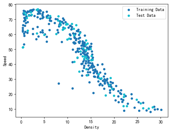
在已经划分出的两段数据集中,我们可以进一步划分出学习集和测试集。
由于交通流密度数据没有时序性,采用直接取数据点末段为测试集的做法不严谨。
sklearn.model 模块提供了函数 train_test_seperate() 用于划分训练集和测试集。测试集的尺寸可以用参数 test_size 控制。
sklearn.model_selection.train_test_split(*arrays, test_size=None, train_size=None, random_state=None, shuffle=True, stratify=None)[source]Split arrays or matrices into random train and test subsets.
Quick utility that wraps input validation,
next(ShuffleSplit().split(X, y)), and application to input data into a single call for splitting (and optionally subsampling) data into a one-liner.
具体的用法可以参考 sklearn.model_selection.train_test_split
我们这里取原始数据长度的 20% 为测试集数据长度,即 test_size = 0.2
from sklearn.model_selection import train_test_split
rs_train_df, rs_test_df = train_test_split(
    resampled_df, test_size=0.2)
rs_train_X = rs_train_df[["Density"]].values
rs_train_Y = rs_train_df[["Speed"]].values
rs_test_X = rs_test_df[["Density"]].values
rs_test_Y = rs_test_df[["Speed"]].values
下图展示了学习机和测试集的划分结果:
fig, ax = plt.subplots()
rs_train_df.plot.scatter( x = "Density", y = "Speed",
    label = "Training Data", c = "C0", ax = ax )
rs_test_df.plot.scatter( x = "Density", y = "Speed",
    label = "Test Data", c = "C9", ax = ax )
<AxesSubplot: xlabel='Density', ylabel='Speed'>
一元线性回归
Python 中常见的一元线性回归的实现方法是 sklearn.linear_model.LinearRegression(),这是一个专用的一元线性回归方法。具有使用便捷灵活的优点,但是缺点是无法输出模型的 Summary 统计信息等。
我们这里选择 statsmodels.api 中的 OLS 工具包。用法如下:
statsmodels.formula.api.ols(formula, data, subset=None, drop_cols=None, *args, **kwargs)¶Create a Model from a formula and dataframe.
具体的用法可以参考 statsmodels.formula.api.ols
OLS 法通过一系列的预测变量来预测响应变量(也可以说是在预测变量上回归响应变量)。
线性回归是指对参数 β \beta β 为线性的一种回归(即参数只以一次方的形式出现)模型:
Y t = α + β x t + μ t , ( t = 1...... n ) Y_t = \alpha + \beta x_t + \mu_t, (t = 1...... n) Yt=α+βxt+μt,(t=1......n) 表示观测数。
- Y t Y_t Yt 被称作因变量
- x t x_t xt 被称作自变量
- α , β \alpha, \beta α,β 为需要最小二乘法去确定的参数,或称回归系数
- μ t \mu_t μt 为随机误差项
import statsmodels.api as sm
# 加入截距
rs_train_X_with_bias = sm.add_constant(rs_train_X)
Greenshields_model = sm.OLS( # 注意参数排列的顺序
    rs_train_Y, rs_train_X_with_bias
).fit()
# 输出结果到屏幕
Greenshields_model.summary()
| Dep. Variable: | y | R-squared: | 0.814 |
|---|---|---|---|
| Model: | OLS | Adj. R-squared: | 0.813 |
| Method: | Least Squares | F-statistic: | 1235. |
| Date: | Mon, 16 Oct 2023 | Prob (F-statistic): | 4.89e-105 |
| Time: | 16:36:25 | Log-Likelihood: | -991.86 |
| No. Observations: | 284 | AIC: | 1988. |
| Df Residuals: | 282 | BIC: | 1995. |
| Df Model: | 1 | ||
| Covariance Type: | nonrobust |
| coef | std err | t | P>|t| | [0.025 | 0.975] | |
|---|---|---|---|---|---|---|
| const | 79.0400 | 0.975 | 81.049 | 0.000 | 77.120 | 80.960 |
| x1 | -2.5123 | 0.071 | -35.142 | 0.000 | -2.653 | -2.372 |
| Omnibus: | 14.058 | Durbin-Watson: | 2.109 |
|---|---|---|---|
| Prob(Omnibus): | 0.001 | Jarque-Bera (JB): | 14.765 |
| Skew: | -0.516 | Prob(JB): | 0.000622 |
| Kurtosis: | 3.427 | Cond. No. | 28.2 |
Notes:
[1] Standard Errors assume that the covariance matrix of the errors is correctly specified.
fig, ax = plt.subplots()
# 画出训练集和测试集数据点
rs_train_df.plot.scatter( x = "Density", y = "Speed",
    label = "Training Data", c = "C0", ax = ax )
rs_test_df.plot.scatter( x = "Density", y = "Speed",
    label = "Test Data", c = "C9", ax = ax )

# 第一段模型
plot_X = np.arange( 0, df[["Density"]].values.max(), 0.01 )
plot_X_with_bias = sm.add_constant(plot_X)
plot_Y = Greenshields_model.predict(plot_X_with_bias)
ax.plot(plot_X, plot_Y, label = "reg plot",
    color = "red")

plt.title("Greenshields' Model")
plt.legend()
<matplotlib.legend.Legend at 0x1fbf80f7f70>
查看模型拟合的参数:
coef = Greenshields_model.params[1]
intercept = Greenshields_model.params[0]
coef, intercept
(-2.512260086391756, 79.0399551935032)
格林希尔兹模型精度评价
使用 Python 的机器学习库 scikit-learn(sklearn)时,可以使用 sklearn.metrics 库来进行模型评估和性能度量。sklearn.metrics 库提供了多种函数和指标,可以直接调用。
对于回归分析,最常用的指标如:
mean_squared_error,均方误差mean_absolute_error,平均绝对误差r2_score,回归的决定系数
除此之外,均方根误差可以对均方误差取绝对值获得。
R2(回归决定系数) 是回归模型中用来衡量模型拟合优良程度的指标,它的值介于 0 和1之间。R2 越接近 1,表示模型的拟合度越好。
R 2 = SSR SST = ∑ i = 1 n ( y ^ i − y ˉ ) 2 ∑ i = 1 n ( y i − y ˉ ) 2 R^2= \dfrac{\text{SSR}}{\text{SST}} = \dfrac{\sum_{i=1}^{n}{ \left( \hat y_i - \bar y\right)^2}}{\sum_{i=1}^{n}{ \left(y_i - \bar y \right)^2}} R2=SSTSSR=∑i=1n(yi−yˉ)2∑i=1n(y^i−yˉ)2
其中 SSR \text{SSR} SSR 是模型解释的平方和, SST \text{SST} SST 是总的平方和。
MSE 是衡量模型预测误差大小的指标,值越小表示模型的预测精度越高。
MSE = 1 n ∑ i = 1 n ( y i − y ^ i ) 2 \text{MSE}=\frac{1}{n}\sum_{i=1}^{n}\left( y_i - \hat y_i \right)^{2} MSE=n1i=1∑n(yi−y^i)2
其中n是样本数量, y i y_i yi 是实际观测值, y ^ i \hat y_i y^i 是模型预测值。
RMSE 是 MSE 的平方根,即: RMSE = MSE \text{RMSE} = \sqrt{\text{MSE}} RMSE=MSE,它和 MSE 一样都是用来衡量模型预测误差大小的指标,值越小表示模型的预测精度越高。
MAE是用来衡量模型预测误差大小的另一个指标,它计算的是模型预测值与实际观测值之间的绝对差的平均值。它的latex表达式为:
MAE = 1 n ∑ i = 1 n ∣ y i − y ^ i ∣ \text{MAE}=\frac{1}{n}\sum_{i=1}^{n}{\left| y_i - \hat y_i\right|} MAE=n1i=1∑n∣yi−y^i∣
MAE 对异常值更敏感,它的计算方式可能导致异常值对最终结果产生较大的影响。
from sklearn.metrics import mean_squared_error, mean_absolute_error, r2_score
# m用这个模型预测
rs_test_X_with_bias = sm.add_constant(rs_test_X)
y_pred = Greenshields_model.predict(rs_test_X_with_bias)

# 计算误差值
dist = {
    'R2 回归决定系数': r2_score(rs_test_Y, y_pred),
    'MSE 均方误差': mean_squared_error(rs_test_Y, y_pred),
    'RMSE 均方根误差': np.sqrt(mean_squared_error(rs_test_Y, y_pred)),
    'MAE 平均绝对误差': mean_absolute_error(rs_test_Y, y_pred),
}
pd.DataFrame(dist, index=['结果']).transpose()
| 结果 | |
|---|---|
| R2 回归决定系数 | 0.789087 |
| MSE 均方误差 | 81.391103 |
| RMSE 均方根误差 | 9.021702 |
| MAE 平均绝对误差 | 7.106664 |
检验线性关系的显著性:
对于格林谢尔兹模型 v = v f − [ v f k j ] ⋅ k v = v_f - \left[ \dfrac{v_f}{k_j} \right] \cdot k v=vf−[kjvf]⋅k,有: q = k j v − [ k j v f ] v 2 q = k_j v - \left[ \dfrac{k_j}{v_f} \right] v^2 q=kjv−[vfkj]v2
令 { a = v f , b = [ v f k j ] \begin{cases}a = v_f, \\ b = \left[ \dfrac{v_f}{k_j} \right] \end{cases} ⎩ ⎨ ⎧a=vf,b=[kjvf],则有: { q = a k − b k 2 q = a v − v 2 b \begin{cases} q = ak - bk^2 \\ q = \dfrac{a v - v^2}{b} \end{cases} ⎩ ⎨ ⎧q=ak−bk2q=bav−v2。
根据上述关系,画出模型的流量 - 密度和速度 - 流量曲线如下图所示:
fig, axes = plt.subplots(1, 2, figsize=(12, 4))
# 密度 - 流量关系图
df.plot.scatter( x = 'Density', y = 'Flow', ax = axes[0] )
plot_X = np.arange(0, df[['Density']].values.max(), 0.01 )
plot_Y = intercept * plot_X + coef * ( plot_X **2 )
axes[0].plot( plot_X, plot_Y, c = 'red' )
# 流量 - 速度关系图
df.plot.scatter( x='Flow', y='Speed', ax=axes[1])
plot_Y = np.arange(0, df[['Speed']].values.max(), 0.01 )
plot_X = (intercept * plot_Y - plot_Y **2 ) / ( -coef )
axes[1].plot( plot_X, plot_Y, c='red')
[<matplotlib.lines.Line2D at 0x1fbf83000a0>]
三角图模型
三角图模型是交通流分析中一种常见的 密度 - 流量模型。。
三角图模型认为:流量 q q q 和密度 k k k 呈现两段式的线性关系,即:
q = { v f k , k ≤ k m w k − w ⋅ k j , k m ≤ k < k j q = \begin{cases} v_f k, & k \le k_m \\ w k - w \cdot k_j, & k_m \le k \lt k_j \\ \end{cases} q={vfk,wk−w⋅kj,k≤kmkm≤k<kj
其中, v f v_f vf 为自由流速度, k j k_j kj 为拥塞密度。两直线交点处对应的密度值 k m k_m km 为最大流量密度。
下图展示了原始数据中密度和流量的散点图关系。
fig = plt.figure()
ax = fig.gca()
df.plot.scatter(
    x = "Density", y = "Flow",
    ax = ax)
<AxesSubplot: xlabel='Density', ylabel='Flow'>
根据上图的信息,我们可以筛选用于学习的数据。
选择数据集中流量最大的车流的 Density 值作为划分数据集的依据。
通过 pandas.DataFrame 的布尔索引进行查找,则有:
max_flow_sample = df[
    df["Flow"] == df["Flow"].values.max()
]
max_flow_sample
| Time | Week | Dis | Flow | Speed | Density | |
|---|---|---|---|---|---|---|
| 4695 | 87 | 3 | 2.69 | 815 | 61.7 | 13.209076 |
可以认为:车流阻塞密度 k j = 13.20907618 k_j = 13.20907618 kj=13.20907618
max_flow_sample["Density"].values
array([13.20907618])
划分出两段数据集
df_1 = df[
    df["Density"] <= max_flow_sample["Density"].values[0]]
df_2 = df[
    df["Density"] > max_flow_sample["Density"].values[0]]
可以在图中画出划分的两段数据:
fig, ax = plt.subplots()
ax.scatter(df_1[['Density']], df_1[['Flow']],
    facecolors='none', edgecolors='C0')
ax.scatter(df_2[['Density']], df_2[['Flow']],
    facecolors='none', edgecolors='C8')
<matplotlib.collections.PathCollection at 0x1fbf820c9a0>
检验两段数据的正态性:
from scipy.stats import kstest
alpha = 0.05
print("\n第一段数据:\n")
for cols in df_1[["Flow", "Density", "Speed"]]:
    data_to_KS = df_1[cols].values
    u = data_to_KS.mean() # 计算均值
    std = data_to_KS.std() # 计算标准差
    result = kstest( data_to_KS, 'norm', (u, std) )
    print(str(cols), '是否正态: ', result[1] > alpha,
        '; k 检验值:', result[1])

print("\n第二段数据:\n")
for cols in df_2[["Flow", "Density", "Speed"]]:
    data_to_KS = df_2[cols].values
    u = data_to_KS.mean() # 计算均值
    std = data_to_KS.std() # 计算标准差
    result = kstest( data_to_KS, 'norm', (u, std) )
    print(str(cols), '是否正态: ', result[1] > alpha,
        '; k 检验值:', result[1])
第一段数据:

Flow 是否正态:  False ; k 检验值: 1.2168013674798825e-79
Density 是否正态:  False ; k 检验值: 5.9609132134836165e-74
Speed 是否正态:  False ; k 检验值: 1.5487599808266252e-187

第二段数据:

Flow 是否正态:  False ; k 检验值: 5.416601428442127e-05
Density 是否正态:  False ; k 检验值: 9.118215063885701e-29
Speed 是否正态:  False ; k 检验值: 2.5510983772550485e-07
import seaborn as sns

fig, axes = plt.subplots(1, 2, figsize=(12, 4.5))

axes[0].set_title("plot 1 corr")
corr = df_1.corr(method='spearman')
sns.heatmap(corr, cmap="bwr", ax = axes[0], annot=True)

axes[1].set_title("plot 2 corr")
corr = df_2.corr(method='spearman')
sns.heatmap(corr, cmap="bwr", ax = axes[1], annot=True)
<AxesSubplot: title={'center': 'plot 2 corr'}>
划分第一段数据
import statsmodels.api as sm
from sklearn.model_selection import train_test_split

train_df_1, test_df_1 = train_test_split(df_1, test_size = 0.2)
train_X_1 = train_df_1[["Density"]].values
train_Y_1 = train_df_1[["Flow"]].values
test_X_1 = test_df_1[["Density"]].values
test_Y_1 = test_df_1[["Flow"]].values
划分第二段数据
import statsmodels.api as sm
from sklearn.model_selection import train_test_split

train_df_2, test_df_2 = train_test_split(df_2, test_size = 0.2)
train_X_2 = train_df_2[["Density"]].values
train_Y_2 = train_df_2[["Flow"]].values
test_X_2 = test_df_2[["Density"]].values
test_Y_2 = test_df_2[["Flow"]].values
这里要注意的一个点是 sm.OLS() 中,数据的输入顺序是 Y 在前 X 在后。和一般习惯是相反的。
第一段数据:
import statsmodels.api as sm
# formular: Y = beta0 + beta1*X
# 线性回归模型
# 加入截距
# 注意参数排列的顺序
model_1 = sm.OLS(
    train_Y_1, train_X_1
).fit()
# 输出结果到屏幕
model_1.summary()
| Dep. Variable: | y | R-squared (uncentered): | 0.988 |
|---|---|---|---|
| Model: | OLS | Adj. R-squared (uncentered): | 0.988 |
| Method: | Least Squares | F-statistic: | 4.913e+05 |
| Date: | Mon, 16 Oct 2023 | Prob (F-statistic): | 0.00 |
| Time: | 16:36:27 | Log-Likelihood: | -31402. |
| No. Observations: | 5963 | AIC: | 6.281e+04 |
| Df Residuals: | 5962 | BIC: | 6.281e+04 |
| Df Model: | 1 | ||
| Covariance Type: | nonrobust |
| coef | std err | t | P>|t| | [0.025 | 0.975] | |
|---|---|---|---|---|---|---|
| x1 | 64.9438 | 0.093 | 700.899 | 0.000 | 64.762 | 65.125 |
| Omnibus: | 4780.874 | Durbin-Watson: | 1.897 |
|---|---|---|---|
| Prob(Omnibus): | 0.000 | Jarque-Bera (JB): | 120432.628 |
| Skew: | -3.734 | Prob(JB): | 0.00 |
| Kurtosis: | 23.711 | Cond. No. | 1.00 |
Notes:
[1] R² is computed without centering (uncentered) since the model does not contain a constant.
[2] Standard Errors assume that the covariance matrix of the errors is correctly specified.
from sklearn.metrics import mean_squared_error, mean_absolute_error, r2_score
# make the predictions by the model 用这个模型预测
y_pred = model_1.predict(test_X_1)

# 计算误差值
dist = {
    'R2 回归决定系数': r2_score(test_Y_1, y_pred),
    'MSE 均方误差': mean_squared_error(test_Y_1, y_pred),
    'RMSE 均方根误差': np.sqrt(mean_squared_error(test_Y_1, y_pred)),
    'MAE 平均绝对误差': mean_absolute_error(test_Y_1, y_pred),
}
pd.DataFrame(dist, index=['结果']).transpose()
| 结果 | |
|---|---|
| R2 回归决定系数 | 0.962100 |
| MSE 均方误差 | 2081.450969 |
| RMSE 均方根误差 | 45.622922 |
| MAE 平均绝对误差 | 30.412174 |
第二段数据:
import statsmodels.api as sm
# formular: Y = beta0 + beta1*X
# 线性回归模型
# 加入截距
train_X_2 = sm.add_constant(train_X_2)
# 注意参数排列的顺序
model_2 = sm.OLS(
    train_Y_2, train_X_2
).fit()
# 输出结果到屏幕
model_2.summary()
| Dep. Variable: | y | R-squared: | 0.576 |
|---|---|---|---|
| Model: | OLS | Adj. R-squared: | 0.575 |
| Method: | Least Squares | F-statistic: | 658.9 |
| Date: | Mon, 16 Oct 2023 | Prob (F-statistic): | 1.77e-92 |
| Time: | 16:36:27 | Log-Likelihood: | -2823.6 |
| No. Observations: | 488 | AIC: | 5651. |
| Df Residuals: | 486 | BIC: | 5660. |
| Df Model: | 1 | ||
| Covariance Type: | nonrobust |
| coef | std err | t | P>|t| | [0.025 | 0.975] | |
|---|---|---|---|---|---|---|
| const | 1081.8249 | 18.783 | 57.596 | 0.000 | 1044.919 | 1118.731 |
| x1 | -30.1653 | 1.175 | -25.669 | 0.000 | -32.474 | -27.856 |
| Omnibus: | 26.007 | Durbin-Watson: | 2.027 |
|---|---|---|---|
| Prob(Omnibus): | 0.000 | Jarque-Bera (JB): | 29.220 |
| Skew: | -0.540 | Prob(JB): | 4.52e-07 |
| Kurtosis: | 3.518 | Cond. No. | 84.3 |
Notes:
[1] Standard Errors assume that the covariance matrix of the errors is correctly specified.
from sklearn.metrics import mean_squared_error, mean_absolute_error, r2_score
# 用这个模型预测
test_X_2_with_bias = sm.add_constant(test_X_2)
y_pred = model_2.predict(test_X_2_with_bias)

# 计算误差值
dist = {
    'R2 回归决定系数': r2_score(test_Y_2, y_pred),
    'MSE 均方误差': mean_squared_error(test_Y_2, y_pred),
    'RMSE 均方根误差': np.sqrt(mean_squared_error(test_Y_2, y_pred)),
    'MAE 平均绝对误差': mean_absolute_error(test_Y_2, y_pred),
}
pd.DataFrame(dist, index=['结果']).transpose()
| 结果 | |
|---|---|
| R2 回归决定系数 | 0.637521 |
| MSE 均方误差 | 5667.229912 |
| RMSE 均方根误差 | 75.281006 |
| MAE 平均绝对误差 | 59.346431 |
画出拟合线段
fig, ax = plt.subplots()
ax.scatter(df[['Density']], df[['Flow']],
    facecolors='none', edgecolors='C0')

# 第一段模型
plot_X_1 = np.arange( 0, 15, 0.01 )
plot_Y_1 = model_1.predict(plot_X_1)
ax.plot(plot_X_1, plot_Y_1,
    color = "red")

# 第二段模型
plot_X_2 = np.arange( 5, 35, 0.01 )
plot_X_2_with_bias = sm.add_constant(plot_X_2)
plot_Y_2 = model_2.predict(plot_X_2_with_bias)
ax.plot(plot_X_2, plot_Y_2,
    color = "green",)
[<matplotlib.lines.Line2D at 0x1fbe4bac100>]
将线性模型参数转化为交通流模型参数:
vf = model_1.params[0]
w = model_2.params[1]
k_j = - ( model_2.params[0] / w )
vf, w, k_j
(64.94384137558185, -30.165280423323722, 35.86324554666523)
计算最大流量密度和最大车流:
k_m = (model_2.params[0]) / (model_1.params[0] - model_2.params[1])
q_max = (model_2.params[1] * k_m + model_2.params[0] )
print("最大流量密度:", k_m)
print("最大车流:", q_max)
最大流量密度: 11.374564693100982
最大车流: 738.7079251450441
由于已经知道: q = k v q = kv q=kv,故可知道 v v v 与 k k k 之间的关系为:
v = { v f , k ≤ k m w − w ⋅ k j k , k m ≤ k < k j v = \begin{cases} v_f, & k \le k_m \\ w - \dfrac{w \cdot k_j}{k}, & k_m \le k \lt k_j \\ \end{cases} v=⎩ ⎨ ⎧vf,w−kw⋅kj,k≤kmkm≤k<kj
fig, ax = plt.subplots()
ax.scatter(df[['Density']], df[['Speed']],
    facecolors='none', edgecolors='C0')

plot_X_1 = np.arange( k_m, k_j, 0.01 )
plot_Y_1 = w - ((w*k_j) / plot_X_1)
ax.plot( plot_X_1, plot_Y_1,
    label = 'reg plot 1', c = 'red' )

plot_X_2 = np.arange( 0, k_m, 0.01 )
plot_Y_2 = vf + 0*plot_X_2
ax.plot( plot_X_2, plot_Y_2,
    label = 'reg plot 2', c = 'green' )

ax.legend()
<matplotlib.legend.Legend at 0x1fbe4c1af10>
S3 模型
- 参考论文 Logistic modeling of the equilibrium speed–density relationship
模型的函数形式为:
v = v f [ 1 + ( k k c ) m ] 2 m v = \dfrac{v_f}{ \left[1 + \left(\dfrac{k}{k_c} \right)^m \right]^{\frac{2}{m}} } v=[1+(kck)m]m2vf
其中 v f v_f vf 是自由流速度, k c k_c kc 是可导致最大交通流量的临界密度, m m m 是待确定的正参数。
参数 m m m 可以解释为 最大流量惯性系数。它反映了当密度偏离 k c k_c kc 值(即其对密度变化的抵抗程度)时,交通系统保持满负荷状态的能力;不同的 m m m 值可以表示沿速度 - 密度曲线的不同平滑度。
首先筛选数据点。
S3 模型是一个对数据分布不敏感的模型,因此不需要减少数据点来保证数据均匀分布。可以直接在原始数据中划分训练集和测试集。
from sklearn.model_selection import train_test_split
train_df, test_df = train_test_split(df, test_size = 0.1)
train_X = train_df[["Density"]].values
train_Y = train_df[["Speed"]].values
test_X = test_df[["Density"]].values
test_Y = test_df[["Speed"]].values
通过函数形式定义模型:
def S3_Model(x, vf, kc, m):
    return vf / ( ( 1 + ( x / kc )**m )**(2/m) )
通过 scipy.optimize 中的 curve_fit() 函数工具拟合自定义的函数并得到模型的参数:
from scipy.optimize import curve_fit
popt, pcov = curve_fit(
    S3_Model,
    train_X.flatten(), train_Y.flatten() )
popt, pcov
C:\Users\asus\AppData\Local\Temp\ipykernel_13904\206827447.py:2: RuntimeWarning: overflow encountered in power
  return vf / ( ( 1 + ( x / kc )**m )**(2/m) )
C:\Users\asus\AppData\Local\Temp\ipykernel_13904\206827447.py:2: RuntimeWarning: divide by zero encountered in divide
  return vf / ( ( 1 + ( x / kc )**m )**(2/m) )


(array([71.27162496, 11.91753285,  6.31300456]),
 array([[ 0.00328001,  0.00032221, -0.00260432],
        [ 0.00032221,  0.00151838, -0.00327198],
        [-0.00260432, -0.00327198,  0.01023309]]))
拟合出来的参数 popt 是一个包含两个元素的数组。每个元素对应模型函数中的一个参数。
至于返回值中的协方差矩阵 pcov,它提供了拟合参数估计值的不确定性。对角线上的元素表示对应参数估计值的方差。非对角线上的元素表示两个参数之间的协方差。
vf, kc, m = tuple(popt)
vf, kc, m
(71.27162496102929, 11.917532852789654, 6.313004558127913)
from sklearn.metrics import mean_squared_error, mean_absolute_error, r2_score
y_pred = vf / ( ( 1 + ( test_X / kc )**m )**(2/m) )

# calculate the performance metrics 计算误差值
dist = {
    'R2 回归决定系数': r2_score(test_Y, y_pred),
    'MSE 均方误差': mean_squared_error(test_Y, y_pred),
    'RMSE 均方根误差': np.sqrt(mean_squared_error(test_Y, y_pred)),
    'MAE 平均绝对误差': mean_absolute_error(test_Y, y_pred),
}
pd.DataFrame(dist, index=['结果']).transpose()
| 结果 | |
|---|---|
| R2 回归决定系数 | 0.862163 |
| MSE 均方误差 | 12.117290 |
| RMSE 均方根误差 | 3.480990 |
| MAE 平均绝对误差 | 2.402587 |
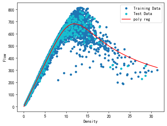
fig, ax = plt.subplots()
plot_X = np.arange(0.01, df[['Density']].values.max(), 0.01)
plot_Y = popt[0] / (
    ( 1 + ( plot_X / popt[1] )**popt[2] )**(2/popt[2])
)
train_df.plot.scatter( x = "Density", y = "Speed",
    label = "Training Data", c = "C0", ax = ax )
test_df.plot.scatter( x = "Density", y = "Speed",
    label = "Test Data", c = "C9", ax = ax )
ax.plot( plot_X, plot_Y, c = "red", label = "poly reg")
ax.legend()
<matplotlib.legend.Legend at 0x1fbe4bd6cd0>
考虑守恒定律 q = k v q=kv q=kv,并通过将等式的两侧乘以密度 k k k,可以得到流量 - 密度的公式:
q = v f ⋅ k [ 1 + ( k k c ) m ] 2 m q = \dfrac{v_f \cdot k}{ \left[1 + \left(\dfrac{k}{k_c} \right)^m \right]^{\frac{2}{m}} } q=[1+(kck)m]m2vf⋅k
可以根据公式画出拟合图线。
fig, ax = plt.subplots()
plot_X = np.arange(0.01, df[['Density']].values.max(), 0.01)
plot_Y = popt[0] * plot_X / (
    ( 1 + ( plot_X / popt[1] )**popt[2] )**(2/popt[2])
)
train_df.plot.scatter( x = "Density", y = "Flow",
    label = "Training Data", c = "C0", ax = ax )
test_df.plot.scatter( x = "Density", y = "Flow",
    label = "Test Data", c = "C9", ax = ax )
ax.plot( plot_X, plot_Y, c = "red", label = "poly reg")
ax.legend()
<matplotlib.legend.Legend at 0x1fbe4ee2be0>
模型具有以下优势:
- 速度是一个相对于密度严格单调递减的函数
- 在自由流动状态下,密度从零增加到一个低值(如 10veh/ km/ ln)
- 速度保持相对较慢,但在严重拥堵的条件下(或:在高密度范围内)不会达到零
- 平滑地捕捉不同交通状态之间的转换
- 描述速度 - 密度关系的参数少
- 在 q = k v q=kv q=kv 守恒条件下,保持流密度和速度流平面之间的重要一致性
Multilayer Feed-forward Neural Network 多层前馈神经网络
前馈神经网络,是一种最简单的神经网络,各神经元分层排列,每个神经元只与前一层的神经元相连。接收前一层的输出,并输出给下一层,各层间没有反馈。是应用最广泛、发展最迅速的人工神经网络之一。
该方法属于非参数驱动的机器学习方法。
重新划分数据集
这里的学习集和测试集选择原始数据中的 ['Time', 'Dis', 'Week'] 作为 X 数据,选择 Flow 作为 Y 数据。
from sklearn.model_selection import train_test_split
train_df, test_df = train_test_split(df, test_size = 0.1)
train_X = train_df[['Time', 'Dis', 'Week']].values
train_Y = train_df[["Flow"]].values
test_X = test_df[['Time', 'Dis', 'Week']].values
test_Y = test_df[["Flow"]].values
训练神经网络
神经网络各个参数如下:
| 参数名 | 含义 | 解释 |
|---|---|---|
learning_rate_init | 初始学习率 | 每次权重更新时的步长 |
batch_size | 批量大小 | 每次迭代中用于更新权重的样本数量 |
tol | 容差值 | 当损失函数减少的程度小于容差值时训练停止。 |
hidden_layer_sizes | 隐藏层大小 | 指定了隐藏层中神经元的数量和层数 |
max_iter | 最大迭代次数 | 训练过程中允许的最大迭代次数。 |
这些参数用于配置 MLPRegressor 类的实例,即前馈神经网络模型。通过调整这些参数的值,可以对模型的训练过程和性能进行控制和优化。
800 神经元,3 层
%time # 统计代码运行时间
# 导入包多元感知器工具包
from sklearn.neural_network import MLPRegressor
# 创建变量
mlpr_800_3 = MLPRegressor(
    learning_rate_init=1e-3,
    batch_size=20,
    tol=1e-4,
    hidden_layer_sizes=(
        800, # 每层神经元的个数
        ),  # 隐藏层的层数
    max_iter=1000
)
# 训练模型
mlpr_800_3.fit(train_X, train_Y)
CPU times: total: 0 ns
Wall time: 0 ns


D:\Python\Python39\Lib\site-packages\sklearn\neural_network\_multilayer_perceptron.py:1625: DataConversionWarning: A column-vector y was passed when a 1d array was expected. Please change the shape of y to (n_samples, ), for example using ravel().
  y = column_or_1d(y, warn=True)
MLPRegressor(batch_size=20, hidden_layer_sizes=(800,), max_iter=1000)In a Jupyter environment, please rerun this cell to show the HTML representation or trust the notebook.
On GitHub, the HTML representation is unable to render, please try loading this page with nbviewer.org.
MLPRegressor(batch_size=20, hidden_layer_sizes=(800,), max_iter=1000)
参数调整的注意事项:
- 较小的学习率可能导致收敛速度较慢,而较大的学习率可能导致无法收敛。通常需要根据具体问题进行调整。
- 较大的批量大小可以加快训练速度,但也会增加内存需求和计算负荷。较小的批量大小可能会导致训练不稳定。
- 容差值(tolerance)的选择可以帮助避免在达到最优解之前浪费时间和计算资源。
(800, 4)表示有三个隐藏层,其中包含800个神经元。如果不填写层数,如(800, ),则默认是 1 个隐藏层。- 隐藏层的大小和数量会影响模型的复杂性和表示能力,需要根据问题进行调整和实验。
- 如果达到最大迭代次数而没有收敛,训练过程将停止。需要根据具体问题和计算资源进行调整。
计算预测值并评估模型精度
from sklearn.metrics import mean_squared_error, mean_absolute_error, r2_score
y_pred = mlpr_800_3.predict(test_X)

dist = {
    'R2 回归决定系数': r2_score(test_Y, y_pred),
    'MSE 均方误差': mean_squared_error(test_Y, y_pred),
    'RMSE 均方根误差': np.sqrt(mean_squared_error(test_Y, y_pred)),
    'MAE 平均绝对误差': mean_absolute_error(test_Y, y_pred),
}
result_800_3 = pd.DataFrame(dist, index=['800, 3']).transpose()
result_800_3
| 800, 3 | |
|---|---|
| R2 回归决定系数 | 0.947422 |
| MSE 均方误差 | 3133.644385 |
| RMSE 均方根误差 | 55.978964 |
| MAE 平均绝对误差 | 41.062573 |
400 神经元,4 层
尝试减少神经元的个数,增加层数:
%time # 统计代码运行时间
# 导入包多元感知器工具包
from sklearn.neural_network import MLPRegressor
# 创建变量
mlpr_400_4 = MLPRegressor(
    learning_rate_init=1e-3,
    batch_size=20,
    tol=1e-4,
    hidden_layer_sizes=(400, 400),
    max_iter=1000
)
# 训练模型
mlpr_400_4.fit(train_X, train_Y)
CPU times: total: 0 ns
Wall time: 0 ns


D:\Python\Python39\Lib\site-packages\sklearn\neural_network\_multilayer_perceptron.py:1625: DataConversionWarning: A column-vector y was passed when a 1d array was expected. Please change the shape of y to (n_samples, ), for example using ravel().
  y = column_or_1d(y, warn=True)
MLPRegressor(batch_size=20, hidden_layer_sizes=(400, 400), max_iter=1000)In a Jupyter environment, please rerun this cell to show the HTML representation or trust the notebook.
On GitHub, the HTML representation is unable to render, please try loading this page with nbviewer.org.
MLPRegressor(batch_size=20, hidden_layer_sizes=(400, 400), max_iter=1000)
from sklearn.metrics import mean_squared_error, mean_absolute_error, r2_score
y_pred = mlpr_400_4.predict(test_X)

dist = {
    'R2 回归决定系数': r2_score(test_Y, y_pred),
    'MSE 均方误差': mean_squared_error(test_Y, y_pred),
    'RMSE 均方根误差': np.sqrt(mean_squared_error(test_Y, y_pred)),
    'MAE 平均绝对误差': mean_absolute_error(test_Y, y_pred),
}
result_400_4 = pd.DataFrame(dist, index=['400, 4']).transpose()
result_400_4
| 400, 4 | |
|---|---|
| R2 回归决定系数 | 0.959169 |
| MSE 均方误差 | 2433.517258 |
| RMSE 均方根误差 | 49.330693 |
| MAE 平均绝对误差 | 35.835786 |
可以看见模型的残差有所减小。
200 神经元,6 层
%time # 统计代码运行时间
# 导入包多元感知器工具包
from sklearn.neural_network import MLPRegressor
# 创建变量
mlpr_200_6 = MLPRegressor(
    learning_rate_init=1e-3,
    batch_size=20,
    tol=1e-4,
    hidden_layer_sizes=(
        200, 200, 200, 200),
    max_iter=1000
)
# 训练模型
mlpr_200_6.fit(train_X, train_Y)
CPU times: total: 0 ns
Wall time: 0 ns


D:\Python\Python39\Lib\site-packages\sklearn\neural_network\_multilayer_perceptron.py:1625: DataConversionWarning: A column-vector y was passed when a 1d array was expected. Please change the shape of y to (n_samples, ), for example using ravel().
  y = column_or_1d(y, warn=True)
MLPRegressor(batch_size=20, hidden_layer_sizes=(200, 200, 200, 200),
             max_iter=1000)
In a Jupyter environment, please rerun this cell to show the HTML representation or trust the notebook. On GitHub, the HTML representation is unable to render, please try loading this page with nbviewer.org.
MLPRegressor(batch_size=20, hidden_layer_sizes=(200, 200, 200, 200),max_iter=1000)
from sklearn.metrics import mean_squared_error, mean_absolute_error, r2_score
y_pred = mlpr_200_6.predict(test_X)

dist = {
    'R2 回归决定系数': r2_score(test_Y, y_pred),
    'MSE 均方误差': mean_squared_error(test_Y, y_pred),
    'RMSE 均方根误差': np.sqrt(mean_squared_error(test_Y, y_pred)),
    'MAE 平均绝对误差': mean_absolute_error(test_Y, y_pred),
}
result_200_6 = pd.DataFrame(dist, index=['200, 6']).transpose()
result_200_6
| 200, 6 | |
|---|---|
| R2 回归决定系数 | 0.955096 |
| MSE 均方误差 | 2676.282768 |
| RMSE 均方根误差 | 51.732802 |
| MAE 平均绝对误差 | 38.050668 |
可以看见模型的残差进一步减小。
100 神经元,10 层
进一步缩减模型的神经元个数,增加层数:
%time # 统计代码运行时间
# 导入包多元感知器工具包
from sklearn.neural_network import MLPRegressor
# 创建变量
mlpr_100_10 = MLPRegressor(
    learning_rate_init=1e-3,
    batch_size=20,
    tol=1e-4,
    hidden_layer_sizes=(
        100, 100, 100, 100,
        100, 100, 100, 100),
    max_iter=1000
)
# 训练模型
mlpr_100_10.fit(train_X, train_Y)
CPU times: total: 0 ns
Wall time: 0 ns


D:\Python\Python39\Lib\site-packages\sklearn\neural_network\_multilayer_perceptron.py:1625: DataConversionWarning: A column-vector y was passed when a 1d array was expected. Please change the shape of y to (n_samples, ), for example using ravel().
  y = column_or_1d(y, warn=True)
MLPRegressor(batch_size=20,
             hidden_layer_sizes=(100, 100, 100, 100, 100, 100, 100, 100),
             max_iter=1000)
In a Jupyter environment, please rerun this cell to show the HTML representation or trust the notebook. On GitHub, the HTML representation is unable to render, please try loading this page with nbviewer.org.
MLPRegressor(batch_size=20,
             hidden_layer_sizes=(100, 100, 100, 100, 100, 100, 100, 100),
             max_iter=1000)
from sklearn.metrics import mean_squared_error, mean_absolute_error, r2_score
y_pred = mlpr_100_10.predict(test_X)

dist = {
    'R2 回归决定系数': r2_score(test_Y, y_pred),
    'MSE 均方误差': mean_squared_error(test_Y, y_pred),
    'RMSE 均方根误差': np.sqrt(mean_squared_error(test_Y, y_pred)),
    'MAE 平均绝对误差': mean_absolute_error(test_Y, y_pred),
}
result_100_10 = pd.DataFrame(dist, index=['100, 10']).transpose()
result_100_10
| 100, 10 | |
|---|---|
| R2 回归决定系数 | 0.962341 |
| MSE 均方误差 | 2244.489763 |
| RMSE 均方根误差 | 47.376046 |
| MAE 平均绝对误差 | 32.094268 |
50 神经元,18 层
%time # 统计代码运行时间
# 导入包多元感知器工具包
from sklearn.neural_network import MLPRegressor
# 创建变量
mlpr_50_18 = MLPRegressor(
    learning_rate_init=1e-3,
    batch_size=20,
    tol=1e-4,
    hidden_layer_sizes=(
        50, 50, 50, 50,
        50, 50, 50, 50,
        50, 50, 50, 50,
        50, 50, 50, 50,
    ),
    max_iter=1000
)
# 训练模型
mlpr_50_18.fit(train_X, train_Y)
CPU times: total: 0 ns
Wall time: 0 ns


D:\Python\Python39\Lib\site-packages\sklearn\neural_network\_multilayer_perceptron.py:1625: DataConversionWarning: A column-vector y was passed when a 1d array was expected. Please change the shape of y to (n_samples, ), for example using ravel().
  y = column_or_1d(y, warn=True)
MLPRegressor(batch_size=20,
             hidden_layer_sizes=(50, 50, 50, 50, 50, 50, 50, 50, 50, 50, 50, 50,
                                 50, 50, 50, 50),
             max_iter=1000)
In a Jupyter environment, please rerun this cell to show the HTML representation or trust the notebook. On GitHub, the HTML representation is unable to render, please try loading this page with nbviewer.org.
MLPRegressor(batch_size=20,
             hidden_layer_sizes=(50, 50, 50, 50, 50, 50, 50, 50, 50, 50, 50, 50,
                                 50, 50, 50, 50),
             max_iter=1000)
from sklearn.metrics import mean_squared_error, mean_absolute_error, r2_score
y_pred = mlpr_50_18.predict(test_X)

dist = {
    'R2 回归决定系数': r2_score(test_Y, y_pred),
    'MSE 均方误差': mean_squared_error(test_Y, y_pred),
    'RMSE 均方根误差': np.sqrt(mean_squared_error(test_Y, y_pred)),
    'MAE 平均绝对误差': mean_absolute_error(test_Y, y_pred),
}
result_50_18 = pd.DataFrame(dist, index=['结果']).transpose()
result_50_18
| 结果 | |
|---|---|
| R2 回归决定系数 | 0.938095 |
| MSE 均方误差 | 3689.539913 |
| RMSE 均方根误差 | 60.741583 |
| MAE 平均绝对误差 | 43.320449 |
可以看见在继续缩减神经元个数并增加神经网络层数的情况下,预测精度并未继续提高。
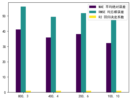
神经网络预测效果比较
比较上面的四个神经网络模型的预测精度和预测效果:
merged_indexs = pd.concat(
    [result_800_3, result_400_4, result_200_6, result_100_10],
    axis=1).transpose()
merged_indexs
| R2 回归决定系数 | MSE 均方误差 | RMSE 均方根误差 | MAE 平均绝对误差 | |
|---|---|---|---|---|
| 800, 3 | 0.947422 | 3133.644385 | 55.978964 | 41.062573 |
| 400, 4 | 0.959169 | 2433.517258 | 49.330693 | 35.835786 |
| 200, 6 | 0.955096 | 2676.282768 | 51.732802 | 38.050668 |
| 100, 10 | 0.962341 | 2244.489763 | 47.376046 | 32.094268 |
绘制柱状图进行多个模型的残差比较:
fig, ax = plt.subplots()
merged_indexs[[
    'MAE 平均绝对误差',
    'RMSE 均方根误差',
    'R2 回归决定系数'
    ]].plot.bar(ax=ax, cmap='viridis')
ax.set_xticklabels(ax.get_xticklabels(), rotation=0)
[Text(0, 0, '800, 3'),
 Text(1, 0, '400, 4'),
 Text(2, 0, '200, 6'),
 Text(3, 0, '100, 10')]
模型精度评价结果可视化。
在下图中,x 轴表示测试集数据的真实值,而 y 轴表示模型数据的预测值。当模型的预测效果绝对理想时,图中的所有数据点应当都处于 x = y 这条直线上;否则所有的点越接近直线 x = y 拟合效果越好。
fig, axes = plt.subplots(2, 2, figsize=(10, 10))

x = test_Y.flatten()

y = mlpr_800_3.predict(test_X)
axes[0][0].scatter(x, y, facecolors='none', edgecolors='C0')
z = np.polyfit(x, y, 1)
p = np.poly1d(z)
axes[0][0].plot(x, p(x), "r--")
axes[0][0].set_xlabel('ground truth')
axes[0][0].set_ylabel('prediction')
axes[0][0].text(400, 200, "y=%.2fx+%.2f"%(z[0], z[1]))
axes[0][0].set_title('800, 3')

y = mlpr_400_4.predict(test_X)
axes[0][1].scatter(x, y, facecolors='none', edgecolors='C0')
z = np.polyfit(x, y, 1)
p = np.poly1d(z)
axes[0][1].plot(x, p(x), "r--")
axes[0][1].set_xlabel('ground truth')
axes[0][1].set_ylabel('prediction')
axes[0][1].text(400, 200, "y=%.2fx+%.2f"%(z[0], z[1]))
axes[0][1].set_title('400, 4')

y = mlpr_200_6.predict(test_X)
axes[1][0].scatter(x, y, facecolors='none', edgecolors='C0')
z = np.polyfit(x, y, 1)
p = np.poly1d(z)
axes[1][0].plot(x, p(x), "r--")
axes[1][0].set_xlabel('ground truth')
axes[1][0].set_ylabel('prediction')
axes[1][0].text(400, 200, "y=%.2fx+%.2f"%(z[0], z[1]))
axes[1][0].set_title('200, 6')

y = mlpr_100_10.predict(test_X)
axes[1][1].scatter(x, y, facecolors='none', edgecolors='C0')
z = np.polyfit(x, y, 1)
p = np.poly1d(z)
axes[1][1].plot(x, p(x), "r--")
axes[1][1].set_xlabel('ground truth')
axes[1][1].set_ylabel('prediction')
axes[1][1].text(400, 200, "y=%.2fx+%.2f"%(z[0], z[1]))
axes[1][1].set_title('100, 10')
Text(0.5, 1.0, '100, 10')


 1962
1962

 被折叠的 条评论
为什么被折叠?
被折叠的 条评论
为什么被折叠?
 到【灌水乐园】发言


