


1、ListBox 介绍
ListBox 列表控件。
ListBox 是一个 ItemsControl,这意味着它可以包含任何类型的对象的集合 (,例如字符串、图像或面板) 。
一个 ListBox 中的多个项是可见的,与仅 ComboBox具有所选项可见的项不同,除非 IsDropDownOpen 属性为 true。 该 SelectionMode 属性确定一次是否可以选择多个项 ListBox 。
**************************************************************************************************************
2、常用属性介绍
FontFamily:字体系列; FontSize:字体大小; FontStretch:字体在屏幕上紧缩或加宽的程度;FontWeight:字体粗细;
Background:背景; BorderBrush:边框颜色; BorderThickness:边框宽度; Foreground:前景色;
Width/Height:宽度/高度; Name:元素标识名称; IsEnabled:使能,是否可用; Margin:外边距;
Opacity:透明度; Visibility:可见性; IsVisible:是否可见; FlowDirection:其子元素的流动方向;
LayoutTransform:在执行布局时应该应用于此元素的图形转换方式。 RenderTransform:元素的呈现位置的转换信息;
RenderTransformOrigin:由RenderTransform声明的任何可能呈现转换的中心点,相对于元素的边界。
HorizontalAlignment/VerticalAlignment:在父元素中组合此元素时所应用的水平对齐特征/垂直对齐特征。
HorizontalContentAlignment/VerticalContentAlignment:控件内容的水平对齐方式/垂直对齐方式。
Items:获取用于生成 ItemsControl 的内容的集合。
ItemsSource:获取或设置用于生成 ItemsControl 的内容的集合。
SelectedIndex:获取或设置当前选择中第一项的索引,如果选择为空,则返回负一(-1)。
SelectedItem:获取或设置当前选择中的第一项,或者,如果选择为空,则返回 null。
SelectedItems:获取当前选定的项。
SelectedValue:获取或设置通过使用 SelectedItem 而获取的 SelectedValuePath 的值。
SelectedValuePath:获取或设置用于从 SelectedValue 获取 SelectedItem 的路径。
SelectionMode:获取或设置 ListBox 的选择行为。
SnapsToDevicePixels:获取或设置一个值,该值确定在呈现过程中,此元素的呈现是否应使用特定于设备的像素设置。
**************************************************************************************************************
3、具体示例代码
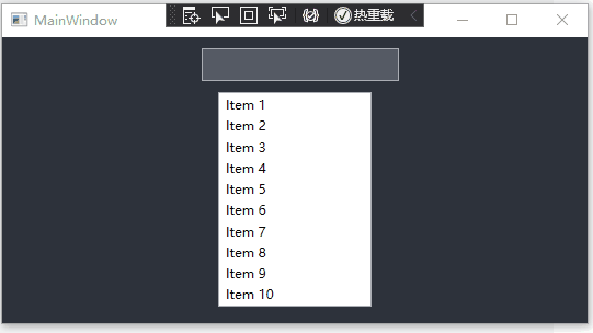
XAML代码
<StackPanel>
	<TextBox Name="tb" Width="180" Height="30"></TextBox>
	<ListBox Name="lb" Width="140" SelectionChanged="PrintText" SelectionMode="Single" Margin="10">
		<ListBoxItem>Item 1</ListBoxItem>
		<ListBoxItem>Item 2</ListBoxItem>
		<ListBoxItem>Item 3</ListBoxItem>
		<ListBoxItem>Item 4</ListBoxItem>
		<ListBoxItem>Item 5</ListBoxItem>
		<ListBoxItem>Item 6</ListBoxItem>
		<ListBoxItem>Item 7</ListBoxItem>
		<ListBoxItem>Item 8</ListBoxItem>
		<ListBoxItem>Item 9</ListBoxItem>
		<ListBoxItem>Item 10</ListBoxItem>
	</ListBox>
</StackPanel>
后端代码
private void PrintText(object sender, SelectionChangedEventArgs e)
{
	ListBoxItem lbi = ((sender as ListBox).SelectedItem as ListBoxItem);
	tb.Text = "   You selected " + lbi.Content.ToString() + ".";
}
**************************************************************************************************************
4、效果图
**************************************************************************************************************
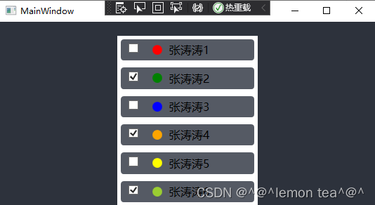
5、自定义样式
<Style x:Key="listBoxItemStyle" TargetType="{x:Type ListBoxItem}">
	<Setter Property="Template">
		<Setter.Value>
			<ControlTemplate TargetType="{x:Type ListBoxItem}">
				<Border  x:Name="IconBorder" Background="#555a64" CornerRadius="4" BorderThickness="0" Margin="5 5">
					<ContentPresenter />
				</Border>
				<ControlTemplate.Triggers>
					<Trigger Property="IsSelected" Value="true">
						<Setter TargetName="IconBorder" Property="BitmapEffect">
							<Setter.Value>
								<OuterGlowBitmapEffect GlowColor="Transparent" GlowSize="5" />
							</Setter.Value>
						</Setter>
					</Trigger>
				</ControlTemplate.Triggers>
			</ControlTemplate>
		</Setter.Value>
	</Setter>
</Style>
<ListBox x:Name="MyListBox" Background="#2d323c" Width="200" Margin="20"
ItemContainerStyle="{StaticResource listBoxItemStyle}" FocusVisualStyle="{x:Null}" ItemsSource="{Binding ListBoxDatas}">
<ListBox.Template>
<ControlTemplate>
<StackPanel Background="White" IsItemsHost="True"></StackPanel>
</ControlTemplate>
</ListBox.Template>
<ListBox.ItemTemplate>
<DataTemplate>
<StackPanel Orientation="Horizontal" HorizontalAlignment="Left">
<CheckBox IsChecked="{Binding IsChecked}" Height="20" Width="20" VerticalAlignment="Center" Margin="10,5"/>
<Ellipse Height="14" Width="14" Fill="{Binding Color}" VerticalAlignment="Center" Margin="5"/>
<TextBlock Text="{Binding NameText}" VerticalAlignment="Center" Margin="5" FontSize="16"/>
</StackPanel>
</DataTemplate>
</ListBox.ItemTemplate>
</ListBox>
public partial class MainWindow : Window, System.ComponentModel.INotifyPropertyChanged
{
	public MainWindow()
	{
		InitializeComponent();
		this.DataContext = this;

		ListBoxDatas.Add(new ListBoxData() { Color = Brushes.Red, IsChecked = false, NameText = "张涛涛1" });
		ListBoxDatas.Add(new ListBoxData() { Color = Brushes.Green, IsChecked = true, NameText = "张涛涛2" });
		ListBoxDatas.Add(new ListBoxData() { Color = Brushes.Blue, IsChecked = false, NameText = "张涛涛3" });
		ListBoxDatas.Add(new ListBoxData() { Color = Brushes.Orange, IsChecked = true, NameText = "张涛涛4" });
		ListBoxDatas.Add(new ListBoxData() { Color = Brushes.Yellow, IsChecked = false, NameText = "张涛涛5" });
		ListBoxDatas.Add(new ListBoxData() { Color = Brushes.YellowGreen, IsChecked = true, NameText = "张涛涛6" });
	}

	private List<ListBoxData>listBoxDatas = new List<ListBoxData>();
	public List<ListBoxData> ListBoxDatas
	{
		get { return listBoxDatas; }
		set { listBoxDatas = value; OnPropertyChanged("ListBoxDatas"); }
	}


	public event System.ComponentModel.PropertyChangedEventHandler PropertyChanged;
	protected void OnPropertyChanged(string propertyName)
	{
		if (PropertyChanged != null)
		{
			PropertyChanged(this, new System.ComponentModel.PropertyChangedEventArgs(propertyName));
		}
	}
}

public class ListBoxData
{
	public bool IsChecked { get; set; }
	public Brush Color { get; set; }
	public string NameText { get; set; }
}
**************************************************************************************************************
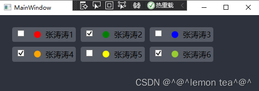
效果图
通过Template改变列表的布局,如使用WrapPanel进行布局;或者ItemsPanel也可
<ListBox.Template>
	<ControlTemplate>
		<WrapPanel  Background="#2d323c" IsItemsHost="True"/>
	</ControlTemplate>
</ListBox.Template>
效果图
**************************************************************************************************************
6、总结和扩展
IsItemsHost=true表示子元素将显示在此容器中。
第5点,演示了自定义的样式和Data绑定功能。
该 SelectionMode 属性确定用户可以一次选择的项数。 可以将属性设置为 Single (默认) , Multiple或 Extended。 下表描述了这些枚举值的行为。
Single:用户一次只能选择一项。
Multiple:用户可以选择多个项而无需按下修改键。
Extended:用户可以通过按住 Ctrl 键并单击项来选择多个连续项,同时按住 SHIFT 键或非连续项。
**************************************************************************************************************


 1746
1746


 被折叠的 条评论
为什么被折叠?
被折叠的 条评论
为什么被折叠?
 到【灌水乐园】发言


