


自定义控件
1. 度量单位
原来我们通常使用px(像素)来设定程度的长度和宽度,但是这种设定方式存在弊端,因为由于的使用设备的像素密度不同,导致相同的像素大小在不同的设备上展现出来的效果也会千差万别,因此,android提供了与设备分辨率无关的度量单位:
- dp:设备独立像素,与像素密度密切相关,常用的尺寸。
- sp:相当于dp,主要用来修饰文字。
- dip:=dp
2. LayoutInflater
是将实际的布局xml文件实例化为视图view,从它的源码可以看出,它不会被直接使用,而是通过以下三种方法获得实例:
LayoutInflater inflater = getLayoutInflater();LayoutInflater inflater = LayoutInflater.from(context);LayoutInflater inflater=(LayoutInflater)context.getSystemService(Context.LAYOUT_INFLATER_SERVICE);
大神们说其实这三种方法本质是相同的,本质是都是调用的context.getSystemService(),但是getlayoutInflater()方法我在源码中没有发现调用getSystemService()方法,但是在from(context)方法的确实如此:
/**
 * Obtains the LayoutInflater from the given context.
 */
public static LayoutInflater from(Context context) {
    LayoutInflater LayoutInflater =
            (LayoutInflater) context.getSystemService(Context.LAYOUT_INFLATER_SERVICE);
    if (LayoutInflater == null) {
        throw new AssertionError("LayoutInflater not found.");
    }
    return LayoutInflater;}
inflate方法:
将我们的和布局有关的资源文件转化为一个view对象,通过view对象可以实现相关的操作。
3. Theme和style
Theme:主要是针对窗口级别的,改变窗体样式;
style:是针对窗体元素级别的,改变指定控件或者Layout的样式;
Theme(主题):是一个包含一种或者多种格式化属性的集合,你可以将同一个主题用在所有的Activity当中或者应用中的某个Activity当中,主题通常在style元素里声明,而且主题可以指定自己的父元素,继承父元素的相关设定,而且还可以更改重写某些属性,感觉和Java中的类的继承和方法重写差不多。
theme的使用通常有两种方式:
- 在Android Manifest文件中设置,编辑<’application’>标签,更改android:theme的属性
- 在activity中设定,在Activity当中通过使用方法setTheme()来加载一个主题,但是应该初始化任何View之前设置主题,就是在调 用setContentView(View) 方法前。
4. View
view的工作流程:
- 构造器:进行初始化
- onMesure() 定大小
- onLayout() 定位置
- onDraw() 绘制
- invalidate() 刷新
view类的构造方法通常有三种主要形式:
- 继承已有的控件来实现自定义控件
- 通过继承一个布局文件实现自定义控件
- 通过继承view类来实现自定义控件
其实,以上都是继承view类来实现自定义控件,因为控件和已有的布局文件都是继承于view。
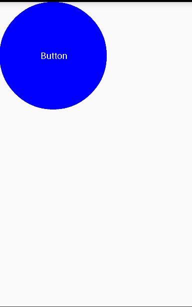
以自定义圆形红色按钮为例:
创建一个继承于view的自定义控件类:textbutton
public class TextButton extends View implements View.OnClickListener{ private Paint paint; private Rect rect; private String text="Button"; public TextButton(Context context) { this(context,null); } public TextButton(Context context, AttributeSet attrs) { this(context, attrs,0); } public TextButton(Context context, AttributeSet attrs, int defStyleAttr) { super(context, attrs, defStyleAttr); init(); } private void init(){ paint = new Paint(); rect = new Rect(); } @Override protected void onDraw(Canvas canvas) { super.onDraw(canvas); //设置圆形的颜色,画圆形 paint.setColor(Color.BLACK); canvas.drawCircle(getWidth()/2,getHeight()/2,getWidth()/2,paint);paint.getTextBounds(text,0,text.length(),rect); int text_width=rect.width(); int text_height=rect.height(); canvas.drawText(text,getWidth()/2-text_width/2,getHeight()/2+text_height/2,paint);//文字的坐标位置是以文字的左下角为基准的}
@Override
public void onClick(View v) {
//点击事件相关操作
}相关的xml布局文件:
< ?xml version=”1.0” encoding=”utf-8”?>

< LinearLayout xmlns:android=”http://schemas.android.com/apk/res/android”

xmlns:app=”http://schemas.android.com/apk/res-auto” //和自定义属性相对应

android:orientation=”vertical” android:layout_width=”match_parent”

android:layout_height=”match_parent” >

< com.example.lenovo_pc.class_three.TextButton

    android:background=”#3e1919”

    android:layout_width=”200dp”

    android:layout_height=”200dp”

    app:textSize=”50dp”//自定义属性

    />
自定义属性的声明:attrs.xml
< ?xml version=”1.0” encoding=”utf-8”?>

< resources>

< declare-styleable name=”TextRedButton”>

    < attr name=”backgroundColor” format=”color”/>

    < attr name=”textSize” format=”dimension”/>
创建新的activity:Circlebutton.java
public class CircleButton extends Activity{

@Override

protected void onCreate(Bundle savedInstanceState) {

    super.onCreate(savedInstanceState);

    setContentView(R.layout.text_button);

}

}
在自定义控件中,会经常使用到Paint和Canvas类,有一些资料:
Android Paint:
http://blog.sina.com.cn/s/blog_783ede0301012ilk.html
Android Canvas:
http://blog.sina.com.cn/s/blog_61ef49250100qw9x.html


 被折叠的 条评论
为什么被折叠?
被折叠的 条评论
为什么被折叠?
 到【灌水乐园】发言


