


前端的布局练习----骰子
这里写目录标题
效果图一:

html代码:
<div class="box">
     <span class="item"></span>
     <span class="item1"></span>
     <span class="item2"></span>
     <span class="item3"></span>
</div>
css代码:
body {
    font-family: 'Open Sans', sans-serif;
    background: linear-gradient(top, #222, #333);
  }

.box{
    margin: 16px;
    padding: 4px;
    background-color: #e7e7e7;
    width: 90px;
    height: 90px;
    display: flex;
    justify-content:space-between;
    align-content:space-between;
    flex-wrap: wrap;
    /*W3school上的flex-wrap属性:row-reverse*/
    flex-direction:row-reverse;
    /*菜鸟教程上的flex-direction属性:row-reverse*/
}

.item{
    width: 25px;
    height: 25px;
    background-color: black;
    border-radius: 50%;

}

.item1{
    width: 25px;
    height: 25px;
    background-color: brown;
    border-radius: 50%;
}
.item2{
    width: 25px;
    height: 25px;
    background-color:coral;
    border-radius: 50%;
}
.item3{
    width: 25px;
    height: 25px;
    background-color:blueviolet;
    border-radius: 50%;
    align-self:flex-end;
}
效果二:

html代码:
<!DOCTYPE html>
<html>
<head>
    <meta charset="UTF-8">
    <meta name="viewport" content="width=device-width,initial-scale=1.0">
    <link rel="stylesheet" type="text/css" href="E:\Web前端\Learning\Try_Third.css">
    <title>Document</title>
 </head>
 <body>
<div class="box">
    <div class="a">
     <span class="item"></span>
     <span class="item1"></span>
    </div>
    <div class="b">
     <span class="item2"></span>
     <span class="item3"></span>
    </div>
</div>
 </body>
</html>
css代码块:
body {
    font-family: 'Open Sans', sans-serif;
    background: linear-gradient(top, #222, #333);
  }

.box{
    margin: 16px;
    padding: 4px;
    background-color: #e7e7e7;
    width: 90px;
    height: 90px;
    display: flex;
    justify-content:space-between;
    flex-wrap: wrap;
    align-content: space-between;

}
.a{
    display: flex;
    flex-basis:100%;
    justify-content:space-between;
}
.item{
    width: 25px;
    height: 25px;
    background-color: black;
    border-radius: 50%;

}

.item1{
    width: 25px;
    height: 25px;
    background-color: brown;
    border-radius: 50%;
}
.b{
    display: flex;
    flex-basis:100%;
    justify-content:space-between;
}
.item2{
    width: 25px;
    height: 25px;
    background-color: black;
    border-radius: 50%;

}

.item3{
    width: 25px;
    height: 25px;
    background-color: brown;
    border-radius: 50%;
}
效果三

代码可参考效果二。
效果四:

html代码:
<!DOCTYPE html>
<html>
<head>
    <meta charset="UTF-8">
    <meta name="viewport" content="width=device-width,initial-scale=1.0">
    <link rel="stylesheet" type="text/css" href="E:\Web前端\Learning\Try_Third.css">
    <title>Document</title>
 </head>
 <body>
<div class="box">
    <div class="a">
     <span class="item"></span>
     <span class="item1"></span>
     <span class="item2"></span>
    </div>
    <div class="b">
     <span class="item3"></span>
     <span class="item4"></span>
     <span class="item5"></span>
    </div>
</div>
 </body>
</html>
css代码:
body {
    font-family: 'Open Sans', sans-serif;
    background: linear-gradient(top, #222, #333);
  }

.box{
    margin: 16px;
    padding: 4px;
    background-color: #e7e7e7;
    width: 90px;
    height: 90px;
    display: flex;
    flex-direction:column;
    flex-wrap: wrap;
    align-content: space-between;

}
.a{
    display: flex;
    flex-basis:100%;
    flex-direction:column;
    justify-content:space-between;
}
.item{
    width: 25px;
    height: 25px;
    background-color: black;
    border-radius: 50%;

}

.item1{
    width: 25px;
    height: 25px;
    background-color: brown;
    border-radius: 50%;
}
.item2{
    width: 25px;
    height: 25px;
    background-color: black;
    border-radius: 50%;

}
.b{
    display: flex;
    flex-basis:100%;
    flex-direction:column;
    justify-content:space-between;
}
.item3{
    width: 25px;
    height: 25px;
    background-color: black;
    border-radius: 50%;

}
.item4{
    width: 25px;
    height: 25px;
    background-color: brown;
    border-radius: 50%;
}
.item5{
    width: 25px;
    height: 25px;
    background-color:black;
    border-radius: 50%;
}
效果五: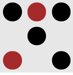
html代码:
<!DOCTYPE html>
<html>
<head>
    <meta charset="UTF-8">
    <meta name="viewport" content="width=device-width,initial-scale=1.0">
    <link rel="stylesheet" type="text/css" href="E:\Web前端\Learning\Try_Third.css">
    <title>Document</title>
 </head>
 <body>
<div class="box">
    <div class="a">
     <span class="item"></span>
     <span class="item1"></span>
     <span class="item2"></span>
    </div>
    <div class="b">
     <span class="item3"></span>
    </div>
    <div class="c">
     <span class="item4"></span>
     <span class="item5"></span>
    </div>
</div>
 </body>
</html>
css代码:
body {
    font-family: 'Open Sans', sans-serif;
    background: linear-gradient(top, #222, #333);
  }

.box{
    margin: 16px;
    padding: 4px;
    background-color: #e7e7e7;
    width: 90px;
    height: 90px;
    display: flex;
    flex-wrap: wrap;
    align-content: space-between;

}
.a{
    display: flex;
    flex-basis:100%;
    justify-content:space-between;
}
.item{
    width: 25px;
    height: 25px;
    background-color: black;
    border-radius: 50%;

}

.item1{
    width: 25px;
    height: 25px;
    background-color: brown;
    border-radius: 50%;
}
.item2{
    width: 25px;
    height: 25px;
    background-color: black;
    border-radius: 50%;

}
.b{
    display: flex;
    flex-basis:100%;
    justify-content:center;
}
.item3{
    width: 25px;
    height: 25px;
    background-color: black;
    border-radius: 50%;

}
.c{
    flex-basis:100%;
    display: flex;
    justify-content:space-between;
}
.item4{
    width: 25px;
    height: 25px;
    background-color: brown;
    border-radius: 50%;
    align-self: center;
}
.item5{
    width: 25px;
    height: 25px;
    background-color:black;
    border-radius: 50%;
}
效果六:
html代码:
<div class="box">
     <span class="item"></span>
     <span class="item"></span>
     <span class="item"></span>
     <span class="item"></span>
     <span class="item"></span>
     <span class="item"></span>
     <span class="item"></span>
     <span class="item"></span>
     <span class="item"></span>
</div>
css代码:
body {
font-family: ‘Open Sans’, sans-serif;
background: linear-gradient(top, #222, #333);
}
.box{
margin: 16px;
padding: 4px;
background-color: #e7e7e7;
width: 90px;
height: 90px;
display: flex;
flex-wrap: wrap;
justify-content: space-between;
align-items: space-between;
}
.item{
width: 25px;
height: 25px;
background-color: black;
border-radius: 50%;
}


 1942
1942


 被折叠的 条评论
为什么被折叠?
被折叠的 条评论
为什么被折叠?
 到【灌水乐园】发言


