


1 CSS排版
1.1 盒
- 标签、元素和盒的辨析
- 标签Tag:源代码层面,HTML代码中可以书写开始、结束和自封闭标签
- 元素Element:语义层面,一对起止标签表示一个元素,DOM中存储的是元素和其它类型(如文本)的节点,CSS选择器选中的是元素
- 盒box:表现层面,CSS选中的元素在排版时可能产生多个盒,排版和渲染的基本单位是盒
- 盒模型
- margin
- border-box
- border
- padding
- content-box
- content
box-sizing: border-box|content-box
- content

1.2 CSS正常流
- 几代排版技术
- 第一代:正常流
- 第二代:flex排版
- 第三代:grid排版
- 正常流的排版规则
与印刷排版和正常书写的规则类似
- 收集盒和文字进行
- 计算盒和文字在行中的位置
- 计算行的排布
- IFC和BFC
- IFC行内格式化上下文:从左到右排布的上下文
- BFC块级格式化上下文:从上到下排布的上下文
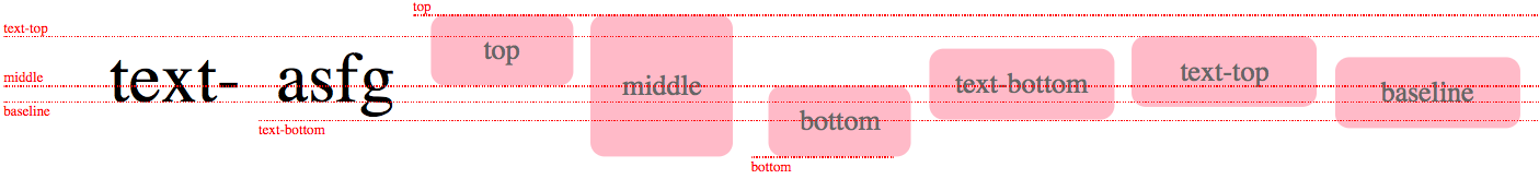
1.3 正常流的行级排布
会有几条参考线:
- base-line
- text-top
- text-bottom
- line-top
- line-bottom
1.4 正常流的块级排布
- 几种block:
- Block Container:里面有BFC的,能容纳正常流的里面就有BFC,如block,table-cell,table-caption,inline-block,flex-item等
- Block-level Box:外面有BFC的,如inline-block,inline-flex,inline-table,inline-grid等
- Block Box:里外都有BFC的,如block,flex,table,grid等
- 设立BFC的规则
- float
- absolutly positioned element
- 非block box的block containers
- overflow非visible的block box
总结:里面能放正常流+overflow非visible的block box(overflow为visible的block box会发生BFC合并)
1.5 BFC合并
BFC合并产生的影响:
- BFC与float
<html>
  <head></head>
  <body>
    <div style="float:right; width:100px; height:100px; background-color: blue; margin:20px"></div>
    <div style="overflow:visible; background-color: pink; margin:30px"><!--会发生BFC合并-->
      文字文字文字文字文字文字文字文字文字文字文字文字文字文字文字
      文字文字文字文字文字文字文字文字文字文字文字文字文字文字文字
      文字文字文字文字文字文字文字文字文字文字文字文字文字文字文字
      文字文字文字文字文字文字文字文字文字文字文字文字文字文字文字
      文字文字文字文字文字文字文字文字文字文字文字文字文字文字文字
      文字文字文字文字文字文字文字文字文字文字文字文字文字文字文字
    </div>
  </body>
</html>

<html>
  <head></head>
  <body>
    <div style="float:right; width:100px; height:100px; background-color: blue; margin:20px"></div>
    <div style="overflow:hidden; background-color: pink; margin:30px"><!--不会发生BFC合并-->
      文字文字文字文字文字文字文字文字文字文字文字文字文字文字文字
      文字文字文字文字文字文字文字文字文字文字文字文字文字文字文字
      文字文字文字文字文字文字文字文字文字文字文字文字文字文字文字
      文字文字文字文字文字文字文字文字文字文字文字文字文字文字文字
      文字文字文字文字文字文字文字文字文字文字文字文字文字文字文字
      文字文字文字文字文字文字文字文字文字文字文字文字文字文字文字
    </div>
  </body>
</html>

- BFC与边距折叠
<html>
  <head></head>
  <body>
    <div style=" width:100px; height:100px; background-color: blue; margin:20px"></div>
    <div style="overflow:hidden; background-color: pink; margin:30px"><!--与上面的会发生边距折叠(同在body的BFC下),与下面的不会(属于不同的BFC)-->
      <div style=" width:100px; height:100px; background-color: blue; margin:20px"></div>
    </div>
  </body>
</html>

<html>
  <head></head>
  <body>
    <div style=" width:100px; height:100px; background-color: blue; margin:20px"></div>
    <div style="overflow:visible; background-color: pink; margin:30px"><!--与上面的会发生边距折叠(同在body的BFC下),与下面的也会(产生BFC合并)-->
      <div style=" width:100px; height:100px; background-color: blue; margin:20px"></div>
    </div>
  </body>
</html>

1.6 Flex排版
- Flex排版规则
- 将元素排进行
- 根据主轴尺寸把元素分进行
- 如果设置了flex-wrap为no-wrap,则强行分配进第一行
- 计算盒在主轴方向的排布
- 找出所有flex元素
- 如果主轴空间有剩余,将剩余空间按比例分配给各flex元素
- 如果主轴剩余空间为负,将所有flex元素设为0,等比压缩剩余元素
- 计算盒在交叉轴方向的排布
- 根据每行中最大元素尺寸计算行高
- 依据行高和flex-content以及align-self,确定元素具体位置
2 动画与绘制
2.1 动画Animation
- @keyframe定义关键帧
@keyframe mykf{
  from {background: red;}
  50% {background: blue;}
  to {background: yellow;}
}

div {
  animation: mykf 5s infinite;
}
- animation的使用
- animation-name
- animation-duration
- animation-delay
- animation-timing-function:时间函数,ease, ease-in,ease-out等,基于具有强大拟合能力的三次贝塞尔曲线(cubic-bezier)实现
- animation-iteration-count
- animation-direction
ps:三次贝塞尔曲线的前端应用——生成抛物线
<html lang="en">
<head>
  <meta charset="UTF-8">
  <meta name="viewport" content="width=device-width, initial-scale=1.0">
  <title>Document</title>
  <style>
    .ball {
      width: 10px;
      height: 10px;
      background-color: black;
      border-radius: 5px;
      position: absolute;
      left: 0;
      top: 0;
      transform: translateY(180px);
    }
  </style>
</head>
<body>
  <p>t:</p><input type="text" id="t" value="5">
  <p>vx:</p><input type="text" id="vx" value="10">
  <p>vy:</p><input type="text" id="vy" value="-20">
  <p>g:</p><input type="text" id="g" value="10">
  <button id="btn">抛一个球</button>
  <script>
    function generateCubicBezier(v, g, t) {
      var a = v/g;
      var b = t + v/g;
      return [[(a/3 + (a+b)/3 - a)/(b-a), (a*a/3 + a*b*2/3 - a*a)/(b*b - a*a)],
              [(b/3 + (a+b)/3 - a)/(b-a), (b*b/3 + a*b*2/3 - a*a)/(b*b - a*a)]];
    }

    function createBall() {
      console.log("xxx");
      var ball = document.createElement("div");
      var t = Number(document.getElementById("t").value);
      var vx = Number(document.getElementById("vx").value);
      var vy = Number(document.getElementById("vy").value);
      var g = Number(document.getElementById("g").value);
      ball.className = "ball";
      document.body.appendChild(ball);
      ball.style.transition  = `left linear ${t}s, top cubic-bezier(${generateCubicBezier(vy, g, t)}) ${t}s`

      setTimeout(function (){
        ball.style.left = vx*t+"px";
        ball.style.top = (vy + g*(t**2)) +"px"
        console.log(ball.style.left, ball.style.top)
      }, 0)
    }

    document.getElementById("btn").addEventListener("click", createBall);
  </script>
</body>
</html>
2.2 过渡transition
比动画要简单,可以将动画看作由多个过渡组成,主要有4个属性:
- transition-property
- transition-timing-function
- transition-duration
- transition-delay
transition属性设置在过渡前的css规则中,例子
#delay {
  font-size: 14px;
  transition-property: font-size;
  transition-duration: 4s;
}

#delay:hover {
  font-size: 36px;
}
2.3 颜色
- RGB和CMYK
- RGB颜色体系符合人眼的生理结构,可以通过三种颜色分量的组合得到各种颜色
- CMYK(青、品红、黄、黑)是印刷行业的颜色体系,青、品红、黄是RGB的补色,即红绿等比混合为黄(黄色油墨反射红光和绿光),蓝绿等比混合为青,红蓝等比混合为品红,而还有一个黑色k是因为CMY三种彩色油墨成本高,而黑色油墨便宜,直接使用黑色油墨比用三种彩色油墨混合得到黑色成本低很多。
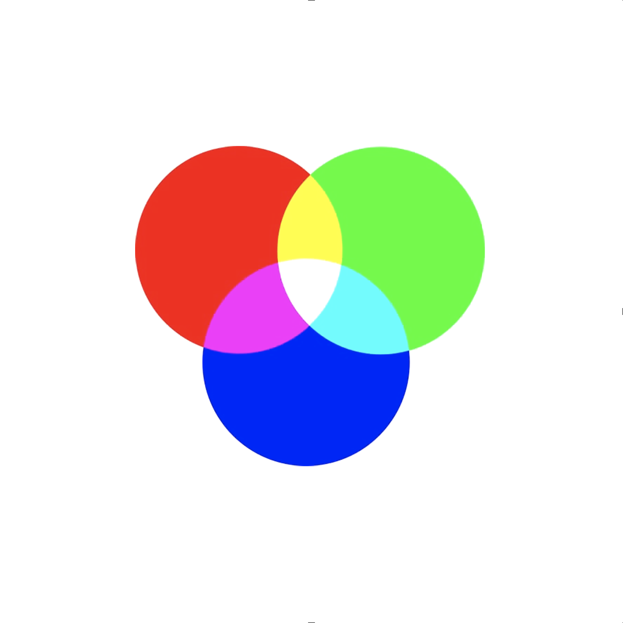
- HSL和HSV
这两种颜色体系更符合人的认知,是具有语义的颜色体系。H(Hue)代表色调,反映颜色的品相;S(Saturate)代表饱和度,反映颜色的鲜艳程度;HSL中的L(Lightness)代表亮度(0为黑,1为白),HSV中的V(Value)代表明度(0为黑,1为纯色)
二者的直观对比见下图

2.4 绘制
- 几何图形
- border
- border-radius
- box-shadow
- 文字
- font
- text-decoration
- 位图
- background-image
位图绘制小技巧:使用url(data:uri + svg)
data:image/svg+xml,<svg width="100%" height="100%" version="1.1" xmlns="http://www.w3.org/2000/svg"><ellipse cx="300" cy="150" rx="200" ry="80" style="fill:rgb(200,100,50); stroke:rgb(0, 0, 100); stroke-width:2"/></svg>


 631
631


 被折叠的 条评论
为什么被折叠?
被折叠的 条评论
为什么被折叠?
 到【灌水乐园】发言


