


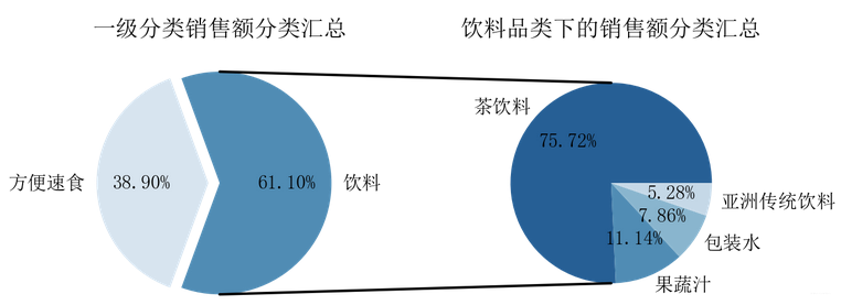
复合饼图
fig = plt.figure(figsize=(10,4))
ax1 = fig.add_subplot(121)
a = kcf.groupby('一级分类').总金额.sum().sort_values(ascending=False)
ax1.pie(a, labels=a.index, autopct='%.2f%%',startangle=-110, explode=[0,0.1],
        colors=['#508cb4','#d7e4ef'])
plt.title('一级分类销售额分类汇总')
ax2 = fig.add_subplot(122)
a = kcf[kcf.一级分类=='饮料'].groupby('二级分类').总金额.sum().sort_values(ascending=False)
ax2.pie(a, radius=0.9, labels=a.index, autopct='%.2f%%', colors=['#265f95', '#508cb4', '#89b5ce', '#c5d8e7', '#e7eff7'])
plt.title('饮料品类下的销售额分类汇总')

#使用ConnectionPatch画出两个饼图的间连线
#先得到饼图边缘的数据
theta1, theta2 = ax1.patches[0].theta1+20, ax1.patches[0].theta2-20
center, r = ax1.patches[0].center,ax1.patches[0].r
x = r*np.cos(np.pi/180*theta2)+center[0]
y = np.sin(np.pi/180*theta2)+center[1]
con = ConnectionPatch(xyA=(0, 0.9),xyB=(x,y),
                     coordsA='data', coordsB='data',axesA=ax2,axesB=ax1)
con.set_linewidth(2)
con.set_color=([0,0,0])
ax2.add_artist(con)

#画出下边缘的连线
x = r*np.cos(np.pi/180*theta1)+center[0]
y = np.sin(np.pi/180*theta1)+center[1]
con = ConnectionPatch(xyA=(0,-0.9),xyB=(x,y),
                     coordsA='data', coordsB='data',axesA=ax2,axesB=ax1)
con.set_linewidth(2)
con.set_color=([0,0,0])
ax2.add_artist(con)
 参考:python生成复合饼图
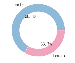
环形图
加入参数wedgeprops=dict(width=0.3, edgecolor='w')
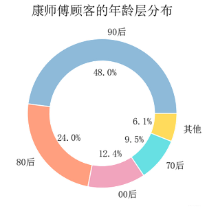
a = pe[pe.PID.isin(ksf.PID.drop_duplicates())].性别.value_counts()
plt.pie(a, labels=a.index, autopct='%.1f%%', colors=['#8ebad9','#f1a4bd'],
       wedgeprops=dict(width=0.3, edgecolor='w'))
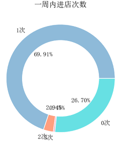
标签重叠、显示部分标签
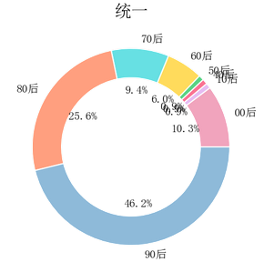
方法一:
- 参数
explode部分环块分开 - 参数
autopct只显示百分比大于1%的数据标签
def my_autopct(pct):
    return ('%.1f%%' % pct) if pct > 1 else ''
plt.pie(a, labels=a.index, explode=[0,0,0.1,0.2,0,0,0,0], colors=colorSeries[a.index], autopct=my_autopct, wedgeprops=dict(width=0.3, edgecolor='w'),pctdistance=0.58)
plt.title('统一', fontsize=15)
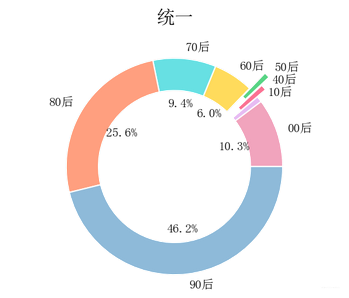
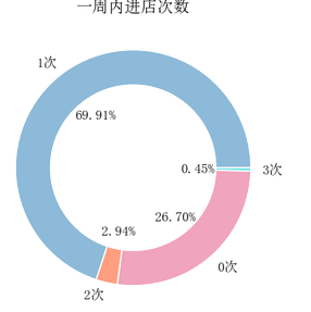
方法二:
调整饼图图表位置
参数 pctdistance 是数据标签离圆心的距离
ax2.pie(a, labels=a.index, autopct='%.1f%%',textprops=dict(fontsize=11),
       wedgeprops=dict(width=0.3, edgecolor='w'),pctdistance=0.55)
 #### 饼图图标重叠怎么办
更改位置
更改前:
更改后:


 2259
2259


 被折叠的 条评论
为什么被折叠?
被折叠的 条评论
为什么被折叠?
 到【灌水乐园】发言


