


是什么?
【圣杯布局是两边固定宽度,中间自适应的三栏布局】
圣杯布局是网页排版布局中的一种常见方式,通常用于具有两个侧边栏和一个中间内容区域的网页设计。
这种布局将整个页面区域分为三个部分:顶部导航栏、左侧边栏、右侧边栏以及中间的主要内容区域
特点:
圣杯布局的特点是左右两侧的栏目通常宽度相等,而中间的主要内容区域则相对较宽。
应用:
通常可用于博客、新闻网站等内容丰富,多栏目展示的网页设计
优势:
圣杯布局的优势在于提供了丰富的信息展示空间,可以让用户快速的找到自己需要的信息,但布局中各个元素大小的变化可能影响页面的响应性能,需要在设计时进行仔细考虑和优化。
应用1:
采用绝对定位方式实现圣杯布局,主要思路是左右两边的盒子采用绝对定位固定宽高,中间的盒子用margin-left和margin-right将盒子固定在中间
<!DOCTYPE html>
<html lang="en">
<head>
    <meta charset="UTF-8">
    <meta http-equiv="X-UA-Compatible" content="IE=edge">
    <meta name="viewport" content="width=device-width, initial-scale=1.0">
    <title>圣杯布局</title>
    <!-- 圣杯布局是两边固定宽度,中间自适应的三栏布局 -->
    <style>
        html,body{
            margin: 0;
            padding: 0;
        }
        .box {
            position: relative;
            width: 100vw;
            height: 200px;
            margin: 100px auto;
            background-color: pink;
        }

        .box .box-left {
            position: absolute;
            top: 0;
            left: 0;
            width: 200px;
            height: 100%;
            background-color: violet;
        }

        .box .box-right {
            position: absolute;
            top: 0;
            right: 0;
            width: 200px;
            height: 100%;
            background-color: violet;
        }

        .box .box-middle {
            margin: 0px 40px;
            height: 100%;
            background-color: orange;
        }
    </style>
</head>

<body>
    <div class="box">

        <div class="box-left"></div>

        <div class="box-middle"></div>

        <div class="box-right"></div>
    </div>
</body>

</html>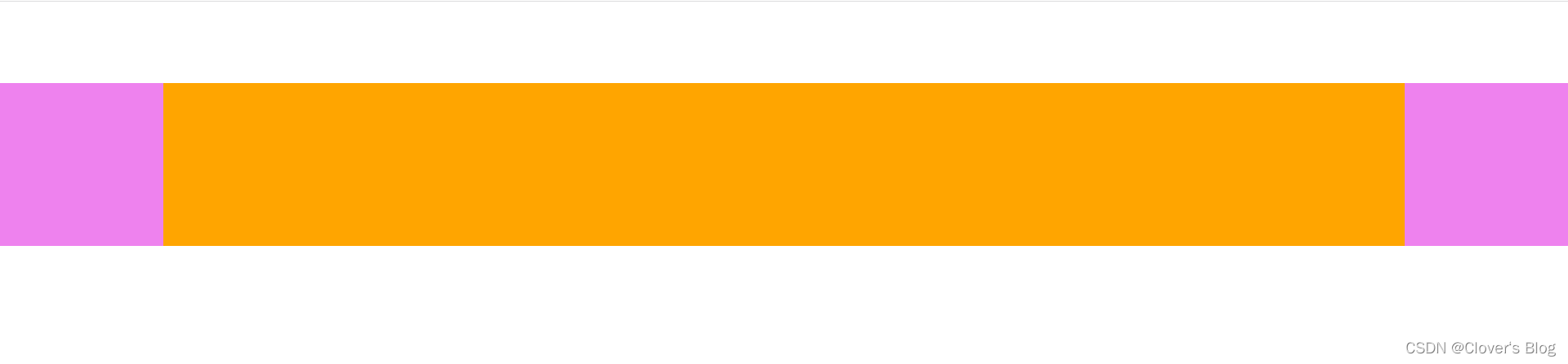
应用2:
采用flex布局实现圣杯布局,主要思路是左右两边的盒子固定高宽,中间的盒子采用flex:1占剩下的内容区域即可
<!DOCTYPE html>
<html lang="en">

<head>

    <meta charset="UTF-8">
    <meta http-equiv="X-UA-Compatible" content="IE=edge">
    <meta name="viewport" content="width=device-width, initial-scale=1.0">
    <title>圣杯布局2</title>

    <style>
        html,body{
            margin: 0;
            padding: 0;
        }
        .box {
            display: flex;
            width: 100vw;
            height: 100px;
            margin: 100px auto;
            background-color: pink;
        }

        .box .box-left {
            width: 40px;
            height: 100%;
            background-color: violet;
        }

        .box .box-right {
            width: 40px;
            height: 100%;
            background-color: violet;
        }

        .box .box-middle {
            flex: 1;
            background-color: orange;
        }
    </style>
</head>

<body>

    <div class="box">

        <div class="box-left"></div>

        <div class="box-middle"></div>

        <div class="box-right"></div>
    </div>
</body>

</html>
应用3:
grid实现圣杯布局相对简单,容易理解
grid-template-rows: 100px 300px 100px;
grid-template-rows:定义行数,并且设置每行的高度
grid-template-columns: 200px auto 150px;
grid-template-columns:定义列数,并且设置每列的宽度 auto:自适应
grid-row: 1;
grid-row:设置子元素在第一行
grid-column: 1/4;
设置子元素占几列。1/4表示,该子元素占1、2、3列;2/4表示占2、3列
<!DOCTYPE html>
<html lang="en">
<head>
    <meta charset="UTF-8">
    <meta http-equiv="X-UA-Compatible" content="IE=edge">
    <meta name="viewport" content="width=device-width, initial-scale=1.0">
    <title>Document</title>
    <style>
        *{
            margin: 0;
            padding: 0;
        }
        body{
            min-width: 700px;
            padding: 50px 50px;
        }
        .container{
            display: grid;
            grid-template-rows: 100px 300px 100px;
            grid-template-columns: 200px auto 150px;
        }
        .header{
            width: 100%;
            height: 100px;
            background-color: bisque;
            grid-row: 1;
            grid-column: 1/4;
        }
        .footer{
            width: 100%;
            height: 100px;
            background-color: #71c29d;
            grid-row: 3;
            grid-column: 1/4;
        }
        .column{
            height: 300px;
            line-height: 300px;
        }
        .left{
            /* width: 200px; */
            background-color: pink;
            grid-row: 2;
            grid-column: 1/2;
        }
        .center{
            background-color: skyblue;
            grid-row: 2;
            grid-column: 2/3;
        }
        .right{
            /* width: 150px; */
            background-color: greenyellow;
            grid-row: 2;
            grid-column: 3/4;
        }

    </style>
</head>
<body>
    <div class="container">
        <div class="header">header</div>
        <div class="left column">left</div>
        <div class="center column">center</div>
        <div class="right column">right</div>
        <div class="footer">footer</div>
    </div>

</body>
</html>


 扫一扫
扫一扫


 190
190

 被折叠的 条评论
为什么被折叠?
被折叠的 条评论
为什么被折叠?
 到【灌水乐园】发言


