


CSS、JavaScript实现进度条效果HTML
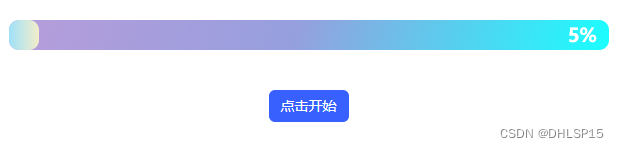
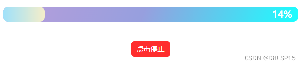
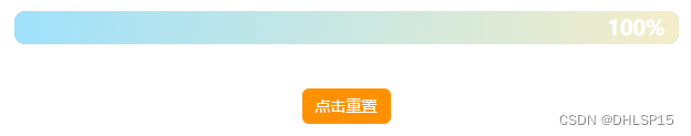
效果图
代码如下:
<!DOCTYPE html>
<html lang="en">

<head>
  <meta charset="UTF-8">
  <title>ProgressBar</title>
  <style>
    * {
      margin: 0;
      padding: 0;
    }

    body {
      position: relative;
    }

    .container {
      max-width: 600px;
      margin: 0 auto;
      text-align: center;
      margin-top: 50px;
    }

    #progress {
      position: relative;
      width: 100%;
      height: 30px;
      /* background: rgb(42, 138, 248); */
      background-image: linear-gradient(110.6deg, rgb(179, 157, 219) 7%, rgb(150, 159, 222) 47.7%, rgb(24, 255, 255) 100.6%);
      /* background: linear-gradient(111.4deg, rgb(238, 113, 113) 1%, rgb(246, 215, 148) 58%); */
      border-radius: 10px;
    }

    #bar {
      width: 0%;
      height: 30px;
      /* margin-top: 1px; */
      /* background: purple; */
      /* background-image: linear-gradient(to right, #e66465, #9198e5); */
      background: linear-gradient(to right, #9fe1fa, #f4edc9);
      border-radius: 10px;
    }

    #text-progress {
      position: absolute;
      right: 2%;
      top: 0;
      color: #FFFFFF;
      height: 30px;
      line-height: 30px;
    }

    .btn {
      background: #3860FF;
      border: none;
      line-height: 32px;
      height: 32px;
      width: 80px;
      text-align: center;
      color: #FFFFFF;
      font-size: 14px;
      border-radius: 6px;

      position: absolute;
      left: calc(50% - 40px);
      margin-top: 40px;
      cursor: pointer;
    }

    .btn:hover {
      opacity: 0.6;
      transition: all 0.6s;
    }

    .reset {
      background: #ff9100;
    }

    .stop {
      background: #ff2d2d;
    }
  </style>

</head>

<body>
  <div class="container">
    <div id="progress">
      <div id="bar"></div>
      <h3 id="text-progress">0%</h3>
    </div>
  </div>
  <input class="btn" type="button" id="btn" value="点击开始" onclick="action()">
</body>
<script>
  var obj = 0;
  var iSpeed = 0;
  var btnVal = document.getElementById('btn');

  function action() {
    if (obj == 0 && iSpeed < 100) {
      obj = setInterval(function () {
        iSpeed += 1;
        if (iSpeed >= 100) {    // 设置达到多少进度后停止
          clearInterval(obj);
          btnVal.value = '点击重置';
          btnVal.setAttribute('class', 'btn reset');
        }
        bar.style.width = iSpeed + '%';
        document.getElementById('text-progress').innerHTML = iSpeed + '%';
      }, 100);    // 1s后函数执行一次

      btnVal.value = '点击停止';
      btnVal.setAttribute('class', 'btn stop');
    } else if (iSpeed >= 100) {
      clearInterval(obj);
      obj = 0;
      iSpeed = 0;
      obj = setInterval(function () {
        iSpeed += 1;
        if (iSpeed >= 100) {    // 设置达到多少进度后停止
          clearInterval(obj);
        }
        bar.style.width = iSpeed + '%';
        document.getElementById('text-progress').innerHTML = iSpeed + '%';
      }, 100);

      btnVal.value = '点击停止';
      btnVal.setAttribute('class', 'btn stop');
    } else {
      clearInterval(obj);
      obj = 0;
      btnVal.value = '点击开始';
      btnVal.setAttribute('class', 'btn');
    }
  }
</script>

</html>


 195
195


 被折叠的 条评论
为什么被折叠?
被折叠的 条评论
为什么被折叠?
 到【灌水乐园】发言


