


本文使用echarts版本:v5.3.3 项目相关依赖版本信息
参考文档:Documentation - Apache ECharts
自定义传入初始化数据treeData
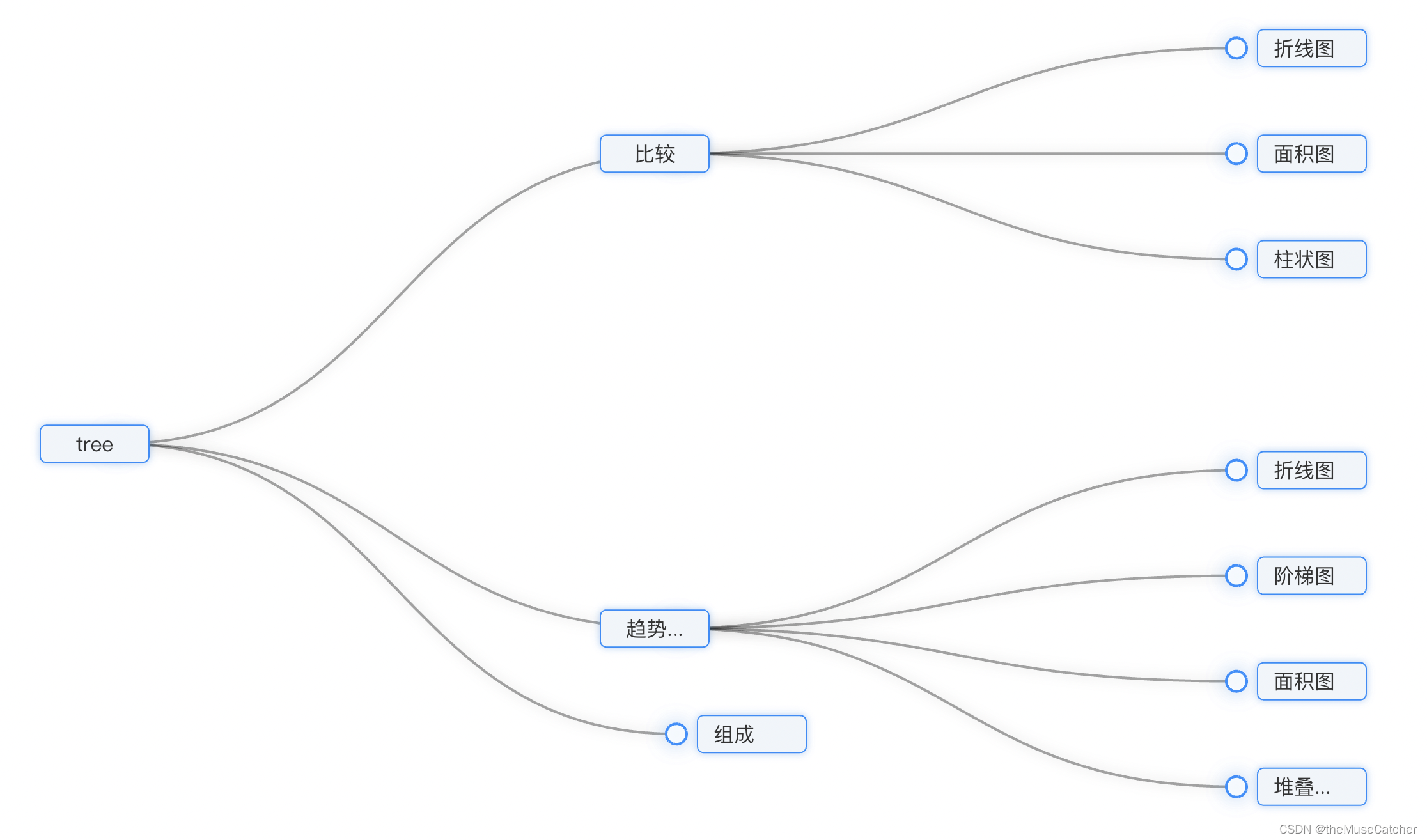
效果如下图:
①安装echarts:yarn add echarts
②创建树图组件TreeChart.vue:
<template>
<div class="echarts-container"></div>
</template>
<script>
import * as echarts from 'echarts/core'
import { TooltipComponent } from 'echarts/components'
import { TreeChart } from 'echarts/charts'
import { CanvasRenderer } from 'echarts/renderers'
echarts.use([TooltipComponent, TreeChart, CanvasRenderer])
var myChart
var option
export default {
name: 'TreeChart',
props: {
treeData: { // 树图数据
type: Object,
default: () => {
return {}
}
}
},
mounted () {
this.init()
// 监听树图节点的点击事件
myChart.on('click', (e) => {
console.log('e:', e)
this.$emit('clickNode', e.data)
})
},
methods: {
init () {
// console.log('$el:', this.$el)
myChart = echarts.init(this.$el)
option = {
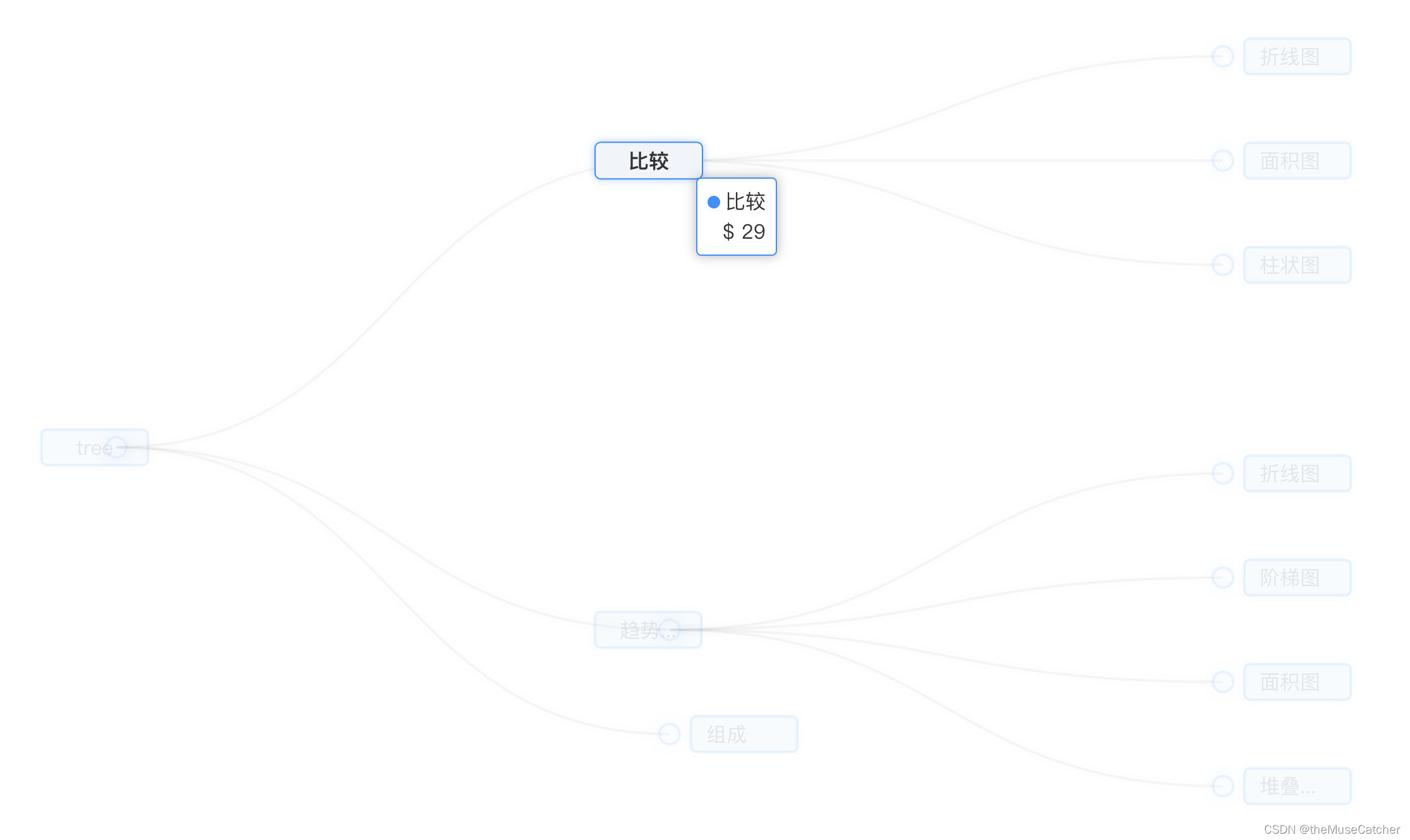
tooltip: { // 提示框浮层设置
trigger: 'item',
triggerOn: 'mousemove', // 提示框触发条件
enterable: true, // 鼠标是否可进入提示框浮层中,默认false
confine: true, // 是否将tooltip框限制在图表的区域内
formatter: function (params) { // 提示框浮层内容格式器,支持字符串模板和回调函数两种形式
// console.log('params:', params)
return params.marker + params.name + '<br/>' + '$ ' + (params.value || '--')
},
// valueFormatter: function (value) { // tooltip 中数值显示部分的格式化回调函数
// return '$' + value.toFixed(2)
// },
backgroundColor: '#FFF', // 提示框浮层的背景颜色
borderColor: '#1890FF', // 提示框浮层的边框颜色
borderWidth: 1, // 提示框浮层的边框宽
borderRadius: 8, // 提示框浮层圆角
padding: [6, 8], // 提示框浮层的内边距
textStyle: { // 提示框浮层的文本样式
color: '#333', // 文字颜色
fontWeight: 400, // 字体粗细
fontSize: 16, // 字体大小
lineHeight: 20, // 行高
width: 60, // 文本显示宽度
// 文字超出宽度是否截断或者换行;只有配置width时有效
overflow: 'breakAll', // truncate截断,并在末尾显示ellipsis配置的文本,默认为...;break换行;breakAll换行,并强制单词内换行
ellipsis: '...'
},
extraCssText: 'box-shadow: 0 0 9px rgba(0, 0, 0, 0.3);text-align: right;' // 额外添加到浮层的css样式
},
series: [
{
type: 'tree',
data: [this.treeData],
name: '树图',
top: '1%', // 组件离容器上侧的距离,像素值20,或相对容器的百分比20%
left: '7%', // 组件离容器左侧的距离
bottom: '1%', // 组件离容器下侧的距离
right: '20%', // 组件离容器右侧的距离
layout: 'orthogonal', // 树图的布局,正交orthogonal和径向radial两种
orient: 'LR', // 树图中正交布局的方向,'LR','RL','TB','BT',只有布局是正交时才生效
edgeShape: 'curve', // 树图边的形状,有曲线curve和折线polyline两种,只有正交布局下生效
roam: false, // 是否开启鼠标缩放或平移,默认false
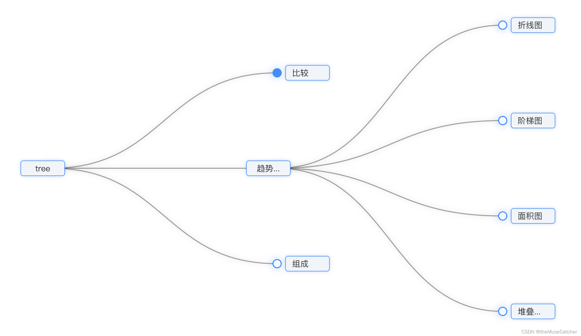
initialTreeDepth: 2, // 树图初始的展开层级(深度),根节点是0,不设置时全部展开
// symbol: 'arrow', // 标记的图形,默认是emptyCircle;circle,rect,roundRect,triangle,diamond,pin,arrow,none
// symbolRotate: 270, // 配合arrow图形使用效果较好
symbolSize: 16, // 大于0时是圆圈,等于0时不展示,标记的大小
itemStyle: { // 树图中每个节点的样式
color: '#1890FF', // 节点未展开时的填充色
borderColor: 'rgba(255, 144, 0, 1)', // 图形的描边颜色
borderWidth: 1, // 描边线宽,为0时无描边
borderType: 'dotted', // 描边类型
borderCap: 'square', // 指定线段末端的绘制方式butt方形结束,round圆形结束,square
shadowColor: 'rgba(0,121,221,0.3)', // 阴影颜色
shadowBlur: 16, // 图形阴影的模糊大小
opacity: 1 // 图形透明度
},
label: { // 每个节点对应的文本标签样式
show: true, // 是否显示标签
distance: 8, // 文本距离图形元素的距离
position: 'left', // 标签位置
verticalAlign: 'middle', // 文字垂直对齐方式,默认自动,top,middle,bottom
align: 'center', // 文字水平对齐方式,默认自动,left,right,center
fontSize: 16, // 字体大小
color: '#333', // 字体颜色
backgroundColor: '#F0F5FA', // 文字块的背景颜色
borderColor: '#1890FF', // 文字块边框颜色
borderWidth: 1, // 文字块边框宽度
borderType: 'solid', // 文字块边框描边类型 solid dashed dotted
borderRadius: 4, // 文字块的圆角
padding: [6, 12], // 文字块内边距
shadowColor: 'rgba(0,121,221,0.3)', // 文字块的背景阴影颜色
shadowBlur: 6, // 文字块的背景阴影长度
width: 60,
// 文字超出宽度是否截断或者换行;只有配置width时有效
overflow: 'truncate', // truncate截断,并在末尾显示ellipsis配置的文本,默认为...;break换行;breakAll换行,并强制单词内换行
ellipsis: '...'
},
lineStyle: { // 树图边的样式
color: 'rgba(0,0,0,.35)', // 树图边的颜色
width: 2, // 树图边的宽度
curveness: 0.5, // 树图边的曲度
shadowColor: 'rgba(0, 0, 0, 0.5)', // 阴影颜色
shadowBlur: 10 // 图形阴影的模糊大小
},
emphasis: { // 树图中图形和标签高亮的样式
disabled: false, // 是否关闭高亮状态,默认false
// 在高亮图形时,是否淡出其它数据的图形已达到聚焦的效果
focus: 'self', // none不淡出其他图形(默认);self只聚焦当前高亮的数据图形;series聚焦当前高亮的数据所在系列的所有图形;ancestor聚焦所有祖先节点;descendant聚焦所有子孙节点;relative聚焦所有子孙和祖先节点
blurScope: 'coordinateSystem', // 开启focus时,配置淡出的范围,coordinateSystem淡出范围为坐标系(默认);series淡出范围为系列;global淡出范围为全局
itemStyle: { // 该节点的样式
color: '#1890FF', // 图形的颜色
// borderColor: 'rgba(255, 144, 0, 1)', // 图形的描边颜色
borderWidth: 1, // 描边线宽,为0时无描边
borderType: 'solid', // 描边类型 solid dashed dotted
borderCap: 'square', // 指定线段末端的绘制方式butt方形结束,round圆形结束,square
shadowColor: 'rgba(0,121,221,0.3)', // 阴影颜色
shadowBlur: 12, // 图形阴影的模糊大小
opacity: 1 // 图形透明度
},
lineStyle: { // 树图边的样式
color: 'rgba(0,0,0,.45)', // 树图边的颜色
width: 2, // 树图边的宽度
curveness: 0.5, // 树图边的曲度
shadowColor: 'rgba(0, 0, 0, 0.5)', // 阴影颜色
shadowBlur: 6 // 图形阴影的模糊大小
},
label: { // 高亮标签的文本样式
color: '#333',
fontWeight: 600
}
},
blur: { // 淡出状态的相关配置,开启emphasis.focus后有效
itemStyle: {}, // 节点的样式
lineStyle: {}, // 树图边的样式
label: {} // 淡出标签的文本样式
},
leaves: { // 叶子节点的特殊配置
label: { // 叶子节点的文本标签样式
distance: 8,
// color: '#1890FF',
position: 'right',
verticalAlign: 'middle',
align: 'left'
},
itemStyle: {}, // 叶子节点的样式
emphasis: {}, // 叶子节点高亮状态的配置
blur: {}, // 叶子节点淡出状态的配置
select: {} // 叶子节点选中状态的配置
},
animation: true, // 是否开启动画
expandAndCollapse: true, // 子树折叠和展开的交互,默认打开
animationDuration: 550, // 初始动画的时长
animationEasing: 'linear', // 初始动画的缓动效果
animationDelay: 0, // 初始动画的延迟
animationDurationUpdate: 750, // 数据更新动画的时长
animationEasingUpdate: 'cubicInOut', // 数据更新动画的缓动效果
animationDelayUpdate: 0 // 数据更新动画的延迟
}
]
}
myChart.setOption(option)
}
}
}
</script>
<style lang="less" scoped>
.echarts-container {
width: 100%;
height: 100%;
}
</style>
③在要使用的页面引入:
<TreeChart :treeData="treeData" @clickNode="getNodeData" />
import TreeChart from '@/components/TreeChart'
components: {
    TreeChart
},
treeData: {
    name: 'tree',
    children: [
    {
        name: '比较',
        value: 29,
        children: [
        {
            name: '折线图',
            value: 1
        },
        {
            name: '面积图',
            value: 2
        },
        {
            name: '柱状图',
            value: 3
        }
        ]
    },
    {
        name: '趋势趋势趋势趋势趋势趋势趋势趋势趋势趋势',
        value: 9,
        children: [
        {
            name: '折线图',
            value: 1
        },
        {
            name: '阶梯图',
            value: 2
        },
        {
            name: '面积图',
            value: 3
        },
        {
            name: '堆叠面积图',
            value: 4
        }
        ]
    },
    {
        name: '组成'
    }
    ]
},
getNodeData (data) {
    console.log('data:', data)
}


 1万+
1万+


 被折叠的 条评论
为什么被折叠?
被折叠的 条评论
为什么被折叠?
 到【灌水乐园】发言


