


 文章介绍了如何在Vue2中创建一个Steps步骤条组件,包括自定义设置如步骤数组、当前选中步骤、宽度和描述文本最大宽度等属性。组件支持点击切换,提供了计算属性来处理当前选中步骤和总步骤数。在实际应用中,组件可通过v-model与父组件交互,动态改变当前选中的步骤。
可自定义设置以下属性:
-
步骤数组(items),类型:Item[],默认 []
-
步骤条总宽度(width),类型:number | string,单位 px,默认 'auto'
-
步骤条大小(size),类型:'default' | 'small',默认 'default'
-
是否使用垂直步骤条(vertical),当 vertical: true 时,labelPlacement 自动设为 right,类型:boolean,默认 false
-
标签放置位置(labelPlacement),默认放图标右侧,可选 bottom 放图标下方,类型:'right' | 'bottom',默认 'right'
-
是否使用点状步骤条(dotted),当 dotted: true 且 vertical: false 时,labelPlacement 将自动设为 bottom,类型:boolean,默认 false
-
当前选中的步骤,设置 v-model 后,Steps 变为可点击状态(v-model:current),类型:number,默认 1,从 1 开始计数
效果如下图:
在线预览
①创建步骤条组件Steps.vue:
其中引入使用了以下工具函数:
<script setup lang="ts">
import { computed } from 'vue'
import { useInject } from 'components/utils'
export interface Item {
  title?: string // 标题
  description?: string // 描述
}
export interface Props {
  items?: Item[] // 步骤数组
  width?: number | string // 步骤条总宽度,单位 px
  size?: 'default' | 'small' // 步骤条大小
  vertical?: boolean // 是否使用垂直步骤条,当 vertical: true 时,labelPlacement 自动设为 right
  labelPlacement?: 'right' | 'bottom' // 标签放置位置,默认放图标右侧,可选 bottom 放图标下方
  dotted?: boolean // 是否使用点状步骤条,当 dotted: true 且 vertical: false 时,labelPlacement 将自动设为 bottom
  current?: number // (v-model) 当前选中的步骤,设置 v-model 后,Steps 变为可点击状态。从 1 开始计数
}
const props = withDefaults(defineProps<Props>(), {
  items: () => [],
  width: 'auto',
  size: 'default',
  vertical: false,
  labelPlacement: 'right',
  dotted: false,
  current: 1
})
const { colorPalettes } = useInject('Steps') // 主题色注入
const emits = defineEmits(['update:current', 'change'])
const totalWidth = computed(() => {
  if (typeof props.width === 'number') {
    return `${props.width}px`
  } else {
    return props.width
  }
})
// 步骤总数
const totalSteps = computed(() => {
  return props.items.length
})
const currentStep = computed(() => {
  if (props.current < 1) {
    return 1
  } else if (props.current > totalSteps.value + 1) {
    return totalSteps.value + 1
  } else {
    return props.current
  }
})
// 点击切换选择步骤
function onChange(index: number): void {
  if (currentStep.value !== index) {
    emits('update:current', index)
    emits('change', index)
  }
}
</script>
<template>
  <div
    class="m-steps"
    :class="{
      'steps-small': size === 'small',
      'steps-vertical': vertical,
      'steps-label-bottom': !vertical && (labelPlacement === 'bottom' || dotted),
      'steps-dotted': dotted
    }"
    :style="`
      --steps-width: ${totalWidth};
      --steps-primary-color: ${colorPalettes[5]};
      --steps-primary-color-hover: ${colorPalettes[5]};
      --steps-icon-color: ${colorPalettes[0]};
      --steps-icon-color-hover: ${colorPalettes[5]};
    `"
  >
    <div
      class="steps-item"
      :class="{
        'steps-finish': currentStep > index + 1,
        'steps-process': currentStep === index + 1,
        'steps-wait': currentStep < index + 1
      }"
      v-for="(item, index) in items"
      :key="index"
    >
      <div tabindex="0" class="steps-info-wrap" @click="onChange(index + 1)">
        <div class="steps-tail"></div>
        <div class="steps-icon">
          <template v-if="!dotted">
            <span v-if="currentStep <= index + 1" class="steps-num">{{ index + 1 }}</span>
            <svg
              v-else
              class="icon-svg"
              focusable="false"
              data-icon="check"
              width="1em"
              height="1em"
              fill="currentColor"
              aria-hidden="true"
              viewBox="64 64 896 896"
            >
              <path
                d="M912 190h-69.9c-9.8 0-19.1 4.5-25.1 12.2L404.7 724.5 207 474a32 32 0 00-25.1-12.2H112c-6.7 0-10.4 7.7-6.3 12.9l273.9 347c12.8 16.2 37.4 16.2 50.3 0l488.4-618.9c4.1-5.1.4-12.8-6.3-12.8z"
              ></path>
            </svg>
          </template>
          <template v-else>
            <span class="steps-dot"></span>
          </template>
        </div>
        <div class="steps-content">
          <div class="steps-title">{{ item.title }}</div>
          <div v-if="item.description" class="steps-description">{{ item.description }}</div>
        </div>
      </div>
    </div>
  </div>
</template>
<style lang="less" scoped>
.m-steps {
  display: flex;
  gap: 16px;
  width: var(--steps-width);
  transition: all 0.3s;
  &:not(.steps-label-bottom) {
    .steps-item .steps-info-wrap {
      .steps-tail {
        display: none;
      }
    }
  }
  .steps-item {
    position: relative;
    overflow: hidden;
    flex: 1; // 弹性盒模型对象的子元素都有相同的长度,且忽略它们内部的内容
    vertical-align: top;
    &:last-child {
      flex: none;
      .steps-info-wrap {
        .steps-content .steps-title {
          padding-right: 0;
          &::after {
            display: none;
          }
        }
        .steps-tail {
          display: none;
        }
      }
    }
    .steps-info-wrap {
      display: inline-block;
      vertical-align: top;
      outline: none;
      .steps-tail {
        height: 9px;
        position: absolute;
        top: 12px;
        left: 0;
        width: 100%;
        transition: all 0.3s;
        &::after {
          display: inline-block;
          vertical-align: top;
          width: 100%;
          height: 1px;
          background-color: rgba(5, 5, 5, 0.06);
          border-radius: 1px;
          transition: background-color 0.3s;
          content: '';
        }
      }
      .steps-icon {
        display: inline-flex;
        align-items: center;
        justify-content: center;
        margin-right: 8px;
        width: 32px;
        height: 32px;
        border-radius: 50%;
        text-align: center;
        background-color: rgba(0, 0, 0, 0.06);
        border: 1px solid transparent;
        transition: all 0.3s;
        .steps-num {
          display: inline-block;
          font-size: 16px;
          line-height: 1;
          color: rgba(0, 0, 0, 0.65);
          transition: all 0.3s;
        }
        .icon-svg {
          display: inline-block;
          font-size: 16px;
          color: var(--steps-primary-color);
          fill: currentColor;
          transition: all 0.3s;
        }
        .steps-dot {
          width: 100%;
          height: 100%;
          border-radius: 50%;
          transition: all 0.3s;
        }
      }
      .steps-content {
        display: inline-block;
        vertical-align: top;
        transition: all 0.3s;
        .steps-title {
          position: relative;
          display: inline-block;
          color: rgba(0, 0, 0, 0.45);
          font-size: 16px;
          line-height: 32px;
          transition: all 0.3s;
          padding-right: 16px;
          &::after {
            background: #e8e8e8;
            position: absolute;
            top: 16px;
            left: 100%;
            display: block;
            width: 3000px;
            height: 1px;
            content: '';
            cursor: auto;
            transition: all 0.3s;
          }
        }
        .steps-description {
          max-width: 140px;
          font-size: 14px;
          color: rgba(0, 0, 0, 0.45);
          line-height: 22px;
          word-break: break-all;
          transition: all 0.3s;
        }
      }
    }
  }
  .steps-finish {
    .steps-info-wrap {
      cursor: pointer;
      .steps-tail {
        &::after {
          background-color: var(--steps-primary-color);
        }
      }
      .steps-icon {
        background-color: var(--steps-icon-color);
        border-color: var(--steps-icon-color);
        .steps-dot {
          background: var(--steps-primary-color);
        }
      }
      .steps-content {
        .steps-title {
          color: rgba(0, 0, 0, 0.88);
          &::after {
            background-color: var(--steps-primary-color);
          }
        }
        .steps-description {
          color: rgba(0, 0, 0, 0.45);
        }
      }
      &:hover {
        .steps-icon {
          border-color: var(--steps-icon-color-hover);
        }
        .steps-content {
          .steps-title,
          .steps-description {
            color: var(--steps-primary-color-hover);
          }
        }
      }
    }
  }
  .steps-process {
    .steps-info-wrap {
      .steps-icon {
        background-color: var(--steps-primary-color);
        border: 1px solid rgba(0, 0, 0, 0.25);
        border-color: var(--steps-primary-color);
        .steps-num {
          color: #fff;
        }
        .steps-dot {
          background: var(--steps-primary-color);
        }
      }
      .steps-content {
        .steps-title,
        .steps-description {
          color: rgba(0, 0, 0, 0.88);
        }
      }
    }
  }
  .steps-wait {
    .steps-info-wrap {
      cursor: pointer;
      &:hover {
        .steps-icon {
          border-color: var(--steps-icon-color-hover);
          .steps-num {
            color: var(--steps-primary-color-hover);
          }
        }
        .steps-content {
          .steps-title,
          .steps-description {
            color: var(--steps-primary-color-hover);
          }
        }
      }
      .steps-icon {
        .steps-dot {
          background: rgba(0, 0, 0, 0.25);
        }
      }
    }
  }
}
.steps-small {
  gap: 12px;
  .steps-item {
    .steps-info-wrap {
      .steps-icon {
        width: 24px;
        height: 24px;
        .steps-num,
        .icon-svg {
          font-size: 12px;
        }
      }
      .steps-content {
        .steps-title {
          font-size: 14px;
          line-height: 24px;
          padding-right: 12px;
          &::after {
            top: 12px;
          }
        }
      }
    }
  }
}
.steps-label-bottom {
  gap: 0;
  .steps-item {
    overflow: visible;
    .steps-info-wrap {
      .steps-tail {
        margin-left: 56px;
        padding: 4px 24px;
      }
      .steps-icon {
        margin-left: 40px;
      }
      .steps-content {
        display: block;
        width: 112px;
        margin-top: 12px;
        text-align: center;
        .steps-title {
          padding-right: 0;
          &::after {
            display: none;
          }
        }
      }
    }
  }
}
.steps-dotted {
  .steps-item {
    overflow: visible;
    .steps-info-wrap {
      .steps-tail {
        height: 3px;
        top: 2.5px;
        width: 100%;
        margin-top: 0;
        margin-bottom: 0;
        margin-inline: 70px 0;
        padding: 0;
        &::after {
          width: calc(100% - 24px);
          height: 3px;
          margin-left: 12px;
        }
      }
      .steps-icon {
        position: absolute;
        width: 8px;
        height: 8px;
        margin-left: 66px;
        padding-right: 0;
        line-height: 8px;
        background: transparent;
        border: 0;
        vertical-align: top;
      }
      .steps-content {
        width: 140px;
        margin-top: 20px;
        .steps-title {
          line-height: 1.5714285714285714;
        }
      }
    }
  }
  .steps-process {
    .steps-info-wrap .steps-icon {
      transform: scale(1.25);
    }
  }
}
.steps-vertical {
  display: inline-flex;
  flex-direction: column;
  gap: 0;
  .steps-item {
    flex: 1 0 auto;
    overflow: visible;
    &:last-child {
      flex: 1 0 auto;
    }
    &:not(:last-child) {
      .steps-info-wrap {
        .steps-tail {
          display: block;
        }
        .steps-content {
          .steps-title {
            &::after {
              display: none;
            }
          }
        }
      }
    }
    .steps-info-wrap {
      .steps-tail {
        top: 0;
        left: 15px;
        width: 1px;
        height: 100%;
        padding: 38px 0 6px;
        &::after {
          width: 1px;
          height: 100%;
        }
      }
      .steps-icon {
        float: left;
        margin-right: 16px;
      }
      .steps-content {
        display: block;
        min-height: 48px;
        overflow: hidden;
        .steps-title {
          line-height: 32px;
        }
        .steps-description {
          padding-bottom: 12px;
        }
      }
    }
  }
}
.steps-small.steps-vertical {
  .steps-item {
    .steps-info-wrap {
      .steps-tail {
        left: 11px;
        padding: 30px 0 6px;
      }
      .steps-content {
        .steps-title {
          line-height: 24px;
        }
      }
    }
  }
}
.steps-vertical.steps-dotted {
  .steps-item {
    .steps-info-wrap {
      .steps-tail {
        top: 12px;
        left: 0;
        margin: 0;
        padding: 16px 0 8px;
        &::after {
          margin-left: 3.5px;
        }
      }
      .steps-icon {
        position: static;
        margin-top: 12px;
        margin-left: 0;
        background: none;
      }
      .steps-content {
        width: inherit;
        margin: 0;
      }
    }
  }
  .steps-process {
    .steps-info-wrap {
      .steps-icon {
        position: relative;
        margin-top: 11px;
        top: 0;
        left: -1px;
      }
    }
  }
}
.steps-small.steps-vertical.steps-dotted {
  .steps-item {
    .steps-info-wrap {
      .steps-tail {
        top: 8px;
      }
      .steps-icon {
        margin-top: 8px;
      }
    }
  }
  .steps-process {
    .steps-info-wrap {
      .steps-icon {
        margin-top: 7px;
      }
    }
  }
}
</style>
其中引入使用了以下组件:
②在要使用的页面引入:
<script setup lang="ts">
import Steps from './Steps.vue'
import { ref, watchEffect, reactive } from 'vue'
import type { StepsProps, StepsItem } from 'vue-amazing-ui'
const stepsItems = ref<StepsItem[]>([
{
title: 'Step 1',
description: 'description 1'
},
{
title: 'Step 2',
description: 'description 2'
},
{
title: 'Step 3',
description: 'description 3'
},
{
title: 'Step 4',
description: 'description 4'
},
{
title: 'Step 5',
description: 'description 5'
}
])
const minStepsItems = ref<StepsItem[]>([
{
title: 'Step 1'
},
{
title: 'Step 2'
},
{
title: 'Step 3'
},
{
title: 'Step 4'
},
{
title: 'Step 5'
}
])
const current = ref(3)
watchEffect(() => {
console.log('current', current.value)
})
const sizeOptions = [
{
label: 'default',
value: 'default'
},
{
label: 'small',
value: 'small'
}
]
const size = ref('small')
const placeOptions = [
{
label: 'right',
value: 'right'
},
{
label: 'bottom',
value: 'bottom'
}
]
const place = ref('bottom')
function onChange(index: number) {
// 父组件获取切换后的选中步骤
console.log('change', index)
}
function onPrev() {
if (current.value > 1) {
current.value--
}
}
function onNext() {
if (stepsItems.value.length >= current.value) {
current.value++
}
}
const state = reactive<StepsProps>({
size: 'default',
vertical: false,
labelPlacement: 'right',
dotted: false,
current: 3
})
</script>
<template>
<div>
<h1>{{ $route.name }} {{ $route.meta.title }}</h1>
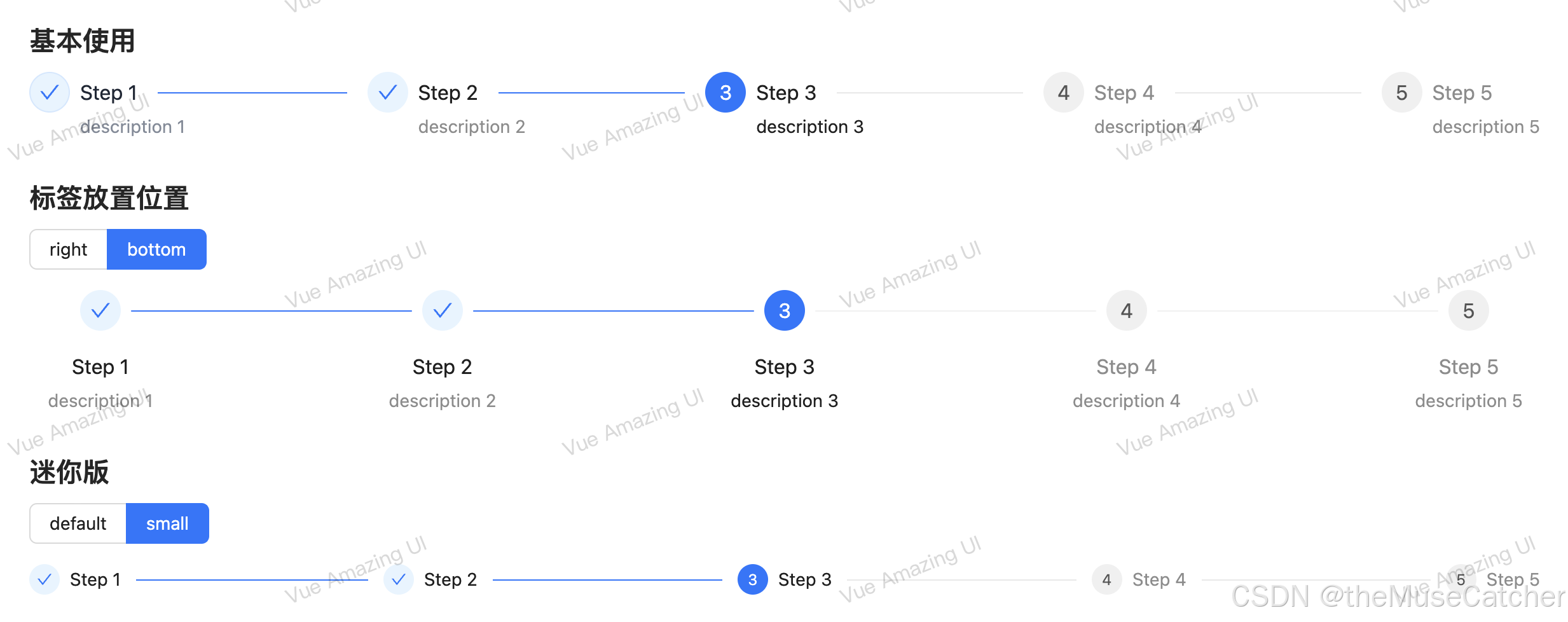
<h2 class="mt30 mb10">基本使用</h2>
<Steps :items="stepsItems" :current="current" @change="onChange" />
<h2 class="mt30 mb10">标签放置位置</h2>
<Flex vertical>
<Radio :options="placeOptions" v-model:value="place" button button-style="solid" />
<Steps :items="stepsItems" :label-placement="place" :current="current" />
</Flex>
<h2 class="mt30 mb10">迷你版</h2>
<Flex vertical>
<Radio :options="sizeOptions" v-model:value="size" button button-style="solid" />
<Steps :items="minStepsItems" :size="size" :current="current" />
</Flex>
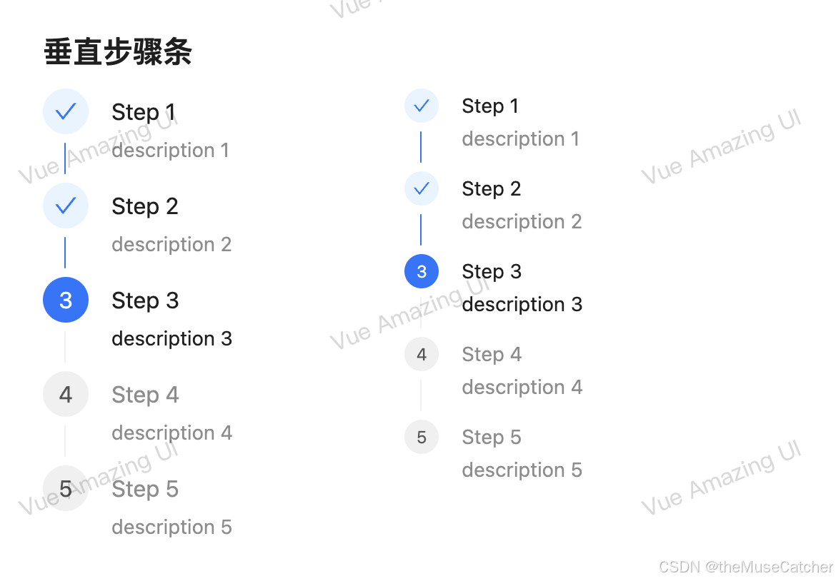
<h2 class="mt30 mb10">垂直步骤条</h2>
<Space :gap="120">
<Steps :items="stepsItems" vertical :current="current" />
<Steps :items="stepsItems" vertical size="small" :current="current" />
</Space>
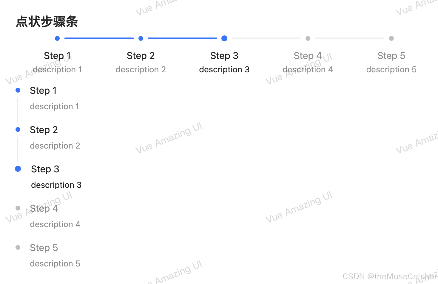
<h2 class="mt30 mb10">点状步骤条</h2>
<Space vertical>
<Steps :items="stepsItems" dotted v-model:current="current" />
<Steps :items="stepsItems" vertical dotted v-model:current="current" />
</Space>
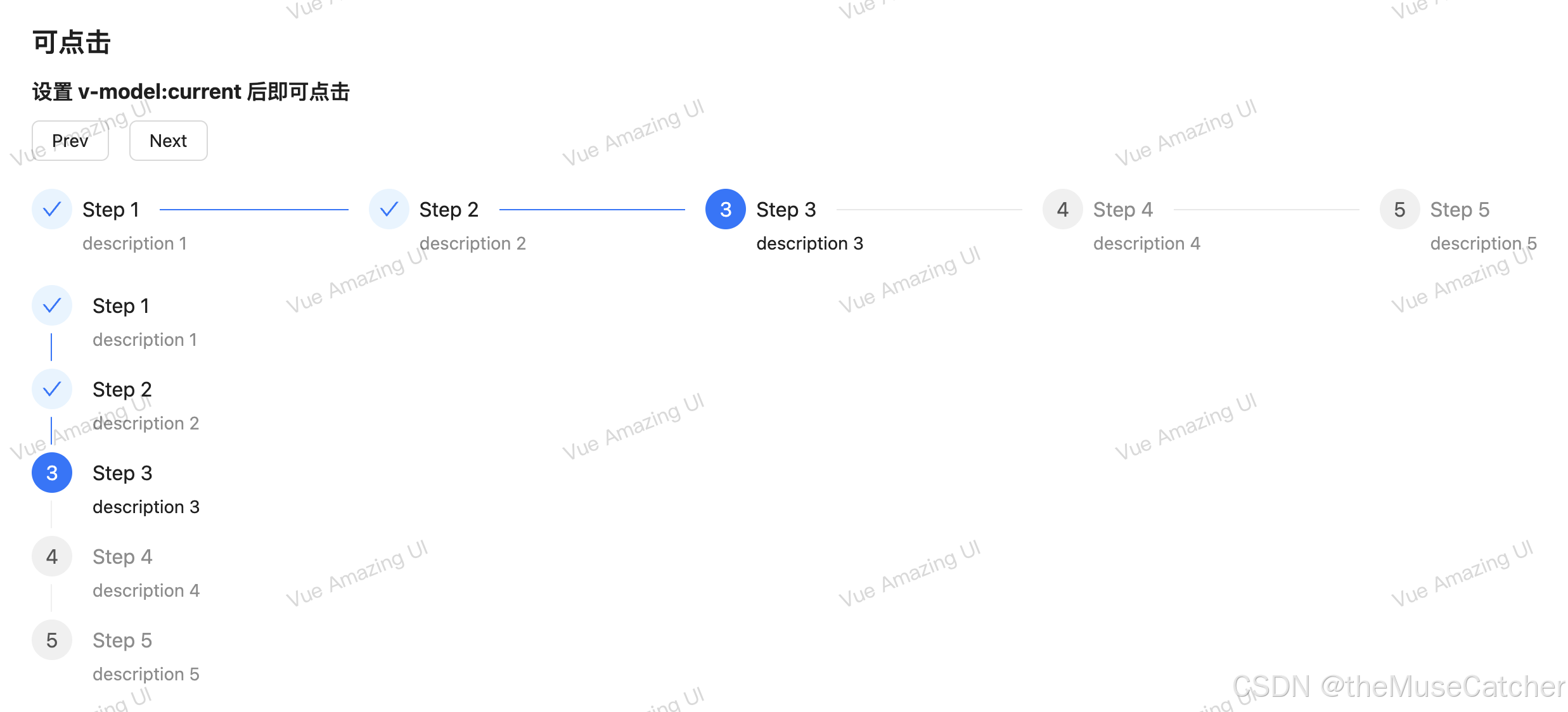
<h2 class="mt30 mb10">可点击</h2>
<h3 class="mb10">设置 v-model:current 后即可点击</h3>
<Flex vertical>
<Space>
<Button @click="onPrev">Prev</Button>
<Button @click="onNext">Next</Button>
</Space>
<Steps :items="stepsItems" v-model:current="current" />
<Steps :items="stepsItems" vertical v-model:current="current" />
</Flex>
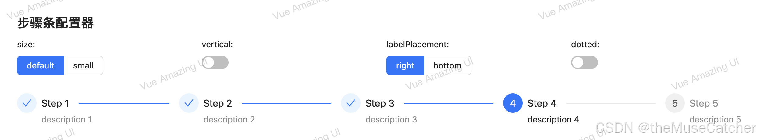
<h2 class="mt30 mb10">步骤条配置器</h2>
<Row :gutter="24">
<Col :span="6">
<Space gap="small" vertical>
size:
<Radio :options="sizeOptions" v-model:value="state.size" button button-style="solid" />
</Space>
</Col>
<Col :span="6">
<Space gap="small" vertical>
vertical:
<Switch v-model="state.vertical" />
</Space>
</Col>
<Col :span="6">
<Space gap="small" vertical>
labelPlacement:
<Radio :options="placeOptions" v-model:value="state.labelPlacement" button button-style="solid" />
</Space>
</Col>
<Col :span="6">
<Space gap="small" vertical>
dotted:
<Switch v-model="state.dotted" />
</Space>
</Col>
</Row>
<Steps
class="mt30"
:items="stepsItems"
:size="state.size"
:vertical="state.vertical"
:label-placement="state.labelPlacement"
:dotted="state.dotted"
v-model:current="current"
/>
</div>
</template>


 扫一扫
扫一扫


 1047
1047

 被折叠的 条评论
为什么被折叠?
被折叠的 条评论
为什么被折叠?
 到【灌水乐园】发言


