


文章目录
HTML 表格完全指南
表格元素 (table, tr, td, th, thead, tbody, tfoot, caption)
表格元素用于创建数据表格:
<table> 是表格的容器元素。
<tr> 定义表格行。
<td> 定义普通的数据单元格。
<th> 定义表头单元格,通常会加粗显示。
<thead> 组织表格的头部区域。
<tbody> 组织表格的主体内容。
<tfoot> 组织表格的底部区域。
<caption> 表格标题
表格基础
HTML 表格是展示结构化数据的强大工具,通过 <table> 元素及其相关标签创建。
<!-- 基本表格结构 -->
<table border="1">
  <tr> <!-- 表格行 -->
    <th>姓名</th> <!-- 表头单元格 -->
    <th>年龄</th>
  </tr>
  <tr>
    <td>张三</td> <!-- 数据单元格 -->
    <td>25</td>
  </tr>
</table>
| 姓名 | 年龄 |
|---|---|
| 张三 | 25 |
表格组成部分
基本元素
<table>- 定义整个表格<tr>- 表格行(Table Row)<td>- 表格数据单元格(Table Data)<th>- 表格表头单元格(Table Header)
结构元素
<thead>- 表格头部区域<tbody>- 表格主体区域<tfoot>- 表格底部区域<caption>- 表格标题
<!-- 使用结构元素的表格 -->
<table border="1">
  <caption>员工信息表</caption> <!-- 表格标题 -->
  <thead>
    <tr>
      <th>工号</th>
      <th>姓名</th>
      <th>部门</th>
    </tr>
  </thead>
  <tbody>
    <tr>
      <td>001</td>
      <td>李华</td>
      <td>技术部</td>
    </tr>
    <tr>
      <td>002</td>
      <td>王明</td>
      <td>市场部</td>
    </tr>
  </tbody>
  <tfoot>
    <tr>
      <td colspan="3">共2名员工</td> <!-- 跨列单元格 -->
    </tr>
  </tfoot>
</table>
| 工号 | 姓名 | 部门 |
|---|---|---|
| 001 | 李华 | 技术部 |
| 002 | 王明 | 市场部 |
| 共2名员工 | ||
单元格合并
跨行合并(rowspan)
使用 rowspan 属性让单元格跨越多行。
<!-- 行合并示例 -->
<table border="1">
  <tr>
    <th>姓名</th>
    <th>科目</th>
    <th>成绩</th>
  </tr>
  <tr>
    <td rowspan="2">张三</td> <!-- 该单元格跨越两行 -->
    <td>数学</td>
    <td>90</td>
  </tr>
  <tr>
    <!-- 这里不需要再写张三 -->
    <td>语文</td>
    <td>85</td>
  </tr>
</table>
| 姓名 | 科目 | 成绩 |
|---|---|---|
| 张三 | 数学 | 90 |
| 语文 | 85 |
跨列合并(colspan)
使用 colspan 属性让单元格跨越多列。
<!-- 列合并示例 -->
<table border="1">
  <tr>
    <th colspan="3">学生成绩表</th> <!-- 该单元格跨越三列 -->
  </tr>
  <tr>
    <th>姓名</th>
    <th>数学</th>
    <th>语文</th>
  </tr>
  <tr>
    <td>李四</td>
    <td>88</td>
    <td>92</td>
  </tr>
</table>
| 学生成绩表 | ||
|---|---|---|
| 姓名 | 数学 | 语文 |
| 李四 | 88 | 92 |
同时使用行列合并
可以同时使用 rowspan 和 colspan 创建复杂表格结构。
<!-- 复杂合并示例 -->
<table border="1">
  <tr>
    <th rowspan="2">部门</th>
    <th colspan="2">销售情况</th> <!-- 跨两列 -->
  </tr>
  <tr>
    <!-- 不需要重复部门 -->
    <th>上半年</th>
    <th>下半年</th>
  </tr>
  <tr>
    <td>技术部</td>
    <td>120万</td>
    <td>150万</td>
  </tr>
  <tr>
    <td>市场部</td>
    <td>85万</td>
    <td>90万</td>
  </tr>
</table>
| 部门 | 销售情况 | |
|---|---|---|
| 上半年 | 下半年 | |
| 技术部 | 120万 | 150万 |
| 市场部 | 85万 | 90万 |
表格样式与属性
基础属性
border- 设置表格边框宽度cellpadding- 单元格内边距cellspacing- 单元格间距width/height- 表格宽度/高度
CSS样式增强
使用CSS美化表格更为灵活且符合现代标准。
<!-- 使用CSS样式的表格 -->
<style>
table {
border-collapse: collapse; /* 合并边框 */
width: 100%;
font-family: Arial, sans-serif;
}
th, td {
border: 1px solid #dddddd;
text-align: left;
padding: 8px;
}
th {
background-color: #f2f2f2; /* 表头背景色 */
font-weight: bold;
}
tr:nth-child(even) {
background-color: #f9f9f9; /* 奇偶行不同背景色 */
}
tr:hover {
background-color: #e6f7ff; /* 鼠标悬停效果 */
}
</style>
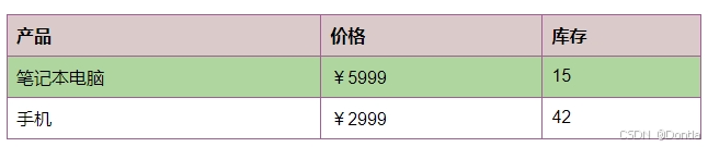
<table>
<tr>
<th>产品</th>
<th>价格</th>
<th>库存</th>
</tr>
<tr>
<td>笔记本电脑</td>
<td>¥5999</td>
<td>15</td>
</tr>
<tr>
<td>手机</td>
<td>¥2999</td>
<td>42</td>
</tr>
</table>
| 产品 | 价格 | 库存 |
|---|---|---|
| 笔记本电脑 | ¥5999 | 15 |
| 手机 | ¥2999 | 42 |
csdn上嵌入样式显示不出来,在html上可以:
表格的语义化与可访问性(colgroup、scope、headers)
语义化增强
<col>和<colgroup>- 定义列组scope属性 - 指定表头关联的数据范围headers属性 - 关联数据单元格与表头
<!-- 语义化表格示例 -->
<table border="1">
  <colgroup>
    <col style="background-color: #f0f0f0;"> <!-- 第一列背景色 -->
    <col span="2" style="background-color: #e0e0e0;"> <!-- 第二、三列背景色 -->
  </colgroup>
  <tr>
    <th scope="col">项目</th> <!-- 列表头 -->
    <th scope="col">一季度</th>
    <th scope="col">二季度</th>
  </tr>
  <tr>
    <th scope="row">收入</th> <!-- 行表头 -->
    <td>10万</td>
    <td>15万</td>
  </tr>
</table>
| 项目 | 一季度 | 二季度 |
|---|---|---|
| 收入 | 10万 | 15万 |
复杂表格示例
结合所有技术创建一个功能完备的表格。
<!-- 综合应用示例 -->
<style>
  .report-table {
    border-collapse: collapse;
    width: 100%;
    margin: 20px 0;
    font-size: 14px;
  }
  .report-table th, .report-table td {
    border: 1px solid #ccc;
    padding: 10px;
    text-align: center;
  }
  .report-table thead th {
    background: #4a7db3;
    color: white;
  }
  .report-table tbody th {
    background: #e9f0f8;
    font-weight: normal;
  }
  .report-table tfoot {
    background: #f1f1f1;
    font-weight: bold;
  }
  .highlight {
    background-color: #fffde7;
  }
</style>

<table class="report-table">
  <caption>2023年季度销售报表</caption>
  <colgroup>
    <col style="width: 20%"> <!-- 第一列宽度 -->
    <col span="4" style="width: 20%"> <!-- 其他列宽度 -->
  </colgroup>
  <thead>
    <tr>
      <th rowspan="2">产品类别</th> <!-- 表头行合并 -->
      <th colspan="4">季度销售额(万元)</th> <!-- 表头列合并 -->
    </tr>
    <tr>
      <!-- 产品类别已合并 -->
      <th>第一季度</th>
      <th>第二季度</th>
      <th>第三季度</th>
      <th>第四季度</th>
    </tr>
  </thead>
  <tbody>
    <tr>
      <th scope="row">电子产品</th>
      <td>120</td>
      <td>145</td>
      <td class="highlight">180</td> <!-- 高亮显示特殊数据 -->
      <td>210</td>
    </tr>
    <tr>
      <th scope="row">家居用品</th>
      <td>85</td>
      <td>95</td>
      <td>100</td>
      <td>115</td>
    </tr>
    <tr>
      <th scope="row" rowspan="2">服装</th> <!-- 行合并 -->
      <td>75</td>
      <td>82</td>
      <td>90</td>
      <td rowspan="2">195</td> <!-- 行合并 -->
    </tr>
    <tr>
      <!-- 服装已合并 -->
      <td>60</td>
      <td>65</td>
      <td>70</td>
      <!-- 第四季度已合并 -->
    </tr>
  </tbody>
  <tfoot>
    <tr>
      <th scope="row">总计</th>
      <td>340</td>
      <td>387</td>
      <td>440</td>
      <td>520</td>
    </tr>
  </tfoot>
</table>
| 产品类别 | 季度销售额(万元) | |||
|---|---|---|---|---|
| 第一季度 | 第二季度 | 第三季度 | 第四季度 | |
| 电子产品 | 120 | 145 | 180 | 210 |
| 家居用品 | 85 | 95 | 100 | 115 |
| 服装 | 75 | 82 | 90 | 195 |
| 60 | 65 | 70 | ||
| 总计 | 340 | 387 | 440 | 520 |
响应式表格
在移动设备上,标准表格可能会溢出屏幕。以下技术可解决这个问题:
<!-- 响应式表格 -->
<style>
  .responsive-table {
    width: 100%;
    border-collapse: collapse;
    margin: 25px 0;
  }

  .responsive-table th, .responsive-table td {
    padding: 12px 15px;
    border: 1px solid #ddd;
    text-align: left;
  }

  /* 移动设备适配 */
  @media (max-width: 600px) {
    .responsive-table {
      display: block;
      width: 100%;
    }

    .responsive-table thead {
      display: none; /* 在小屏幕隐藏表头 */
    }

    .responsive-table tbody, .responsive-table tr, .responsive-table td {
      display: block;
      width: 100%;
    }

    .responsive-table tr {
      margin-bottom: 15px;
    }

    .responsive-table td {
      text-align: right;
      padding-left: 50%;
      position: relative;
    }

    /* 在每个单元格前显示标签 */
    .responsive-table td:before {
      content: attr(data-label);
      position: absolute;
      left: 15px;
      font-weight: bold;
    }
  }
</style>

<table class="responsive-table">
  <thead>
    <tr>
      <th>产品</th>
      <th>单价</th>
      <th>数量</th>
      <th>金额</th>
    </tr>
  </thead>
  <tbody>
    <tr>
      <td data-label="产品">智能手表</td>
      <td data-label="单价">¥1299</td>
      <td data-label="数量">3</td>
      <td data-label="金额">¥3897</td>
    </tr>
    <tr>
      <td data-label="产品">蓝牙耳机</td>
      <td data-label="单价">¥699</td>
      <td data-label="数量">5</td>
      <td data-label="金额">¥3495</td>
    </tr>
  </tbody>
</table>
| 产品 | 单价 | 数量 | 金额 |
|---|---|---|---|
| 智能手表 | ¥1299 | 3 | ¥3897 |
| 蓝牙耳机 | ¥699 | 5 | ¥3495 |
表格生成技术
除了手动编写表格代码,还可以使用以下方式生成表格:
1. JavaScript动态生成表格
// 动态创建表格
function createTable(data) {
  // 创建表格元素
  const table = document.createElement('table');
  table.border = '1';

  // 创建表头
  const thead = document.createElement('thead');
  const headerRow = document.createElement('tr');

  // 添加表头单元格
  Object.keys(data[0]).forEach(key => {
    const th = document.createElement('th');
    th.textContent = key;
    headerRow.appendChild(th);
  });

  thead.appendChild(headerRow);
  table.appendChild(thead);

  // 创建表格主体
  const tbody = document.createElement('tbody');

  // 遍历数据添加行
  data.forEach(item => {
    const row = document.createElement('tr');

    // 为每个数据项创建单元格
    Object.values(item).forEach(value => {
      const td = document.createElement('td');
      td.textContent = value;
      row.appendChild(td);
    });

    tbody.appendChild(row);
  });

  table.appendChild(tbody);
  return table;
}

// 示例数据
const employees = [
  {姓名: '张伟', 部门: '研发', 工龄: 5, 级别: '高级'},
  {姓名: '李娜', 部门: '市场', 工龄: 3, 级别: '中级'},
  {姓名: '王刚', 部门: '销售', 工龄: 7, 级别: '资深'}
];

// 生成表格并添加到文档
document.body.appendChild(createTable(employees));
2. 使用框架(如React)生成表格
// React表格组件示例
function DataTable({ data }) {
  // 如果没有数据,显示提示信息
  if (!data || data.length === 0) {
    return <p>暂无数据</p>;
  }

  // 获取表头(从第一个数据项中提取)
  const headers = Object.keys(data[0]);

  return (
    <table className="data-table">
      <thead>
        <tr>
          {headers.map(header => (
            <th key={header}>{header}</th>
          ))}
        </tr>
      </thead>
      <tbody>
        {data.map((row, rowIndex) => (
          <tr key={rowIndex}>
            {headers.map(header => (
              <td key={`${rowIndex}-${header}`}>{row[header]}</td>
            ))}
          </tr>
        ))}
      </tbody>
    </table>
  );
}

// 使用组件
// <DataTable data={employees} />
表格最佳实践
1. 使用语义化标签:<thead>, <tbody>, <tfoot>清晰划分表格结构
2. 合理使用合并:避免过度使用rowspan和colspan导致表格难以理解
3. 提供表格标题:使用<caption>说明表格用途
4. 保持一致性:单元格内容格式应保持一致
5. CSS样式分离:避免内联样式,使用外部CSS提高可维护性
6. 考虑响应式设计:确保在各种屏幕尺寸上都能良好显示
7. 避免嵌套表格:嵌套会增加复杂性,影响性能
HTML表格不仅是展示数据的有效方式,掌握其合并单元格、结构布局和样式技巧,能构建出既美观又功能强大的数据展示界面。


 扫一扫
扫一扫


 被折叠的 条评论
为什么被折叠?
被折叠的 条评论
为什么被折叠?
 到【灌水乐园】发言


