


1.什么是matplotlsb
Matplotlib 是一个 Python 的 2D绘图库,它以各种硬拷贝格式和跨平台的交互式环境生成出版质量级别的图形 。
通过 Matplotlib,开发者可以仅需要几行代码,便可以生成绘图,直方图,功率谱,条形图,错误图,散点图等。
绘制折线图
import  random
from matplotlib  import  pyplot as plt


#
x = range(2,26,2)
y = [random.randint(10,30) for i in range(12)]

#设置图片的大小,dpi: 设置图片的清晰度
plt.figure(figsize=(20,8), dpi= 100)
#传递 x, y 值
plt.plot(x,y)

#x轴和y轴显示的范围
plt.xticks(x[:])
plt.yticks(range(min(y),max(y) +1))
# plt.show()
plt.savefig("./hello.png" , dpi = 100)
运行结果为:

设置坐标轴的含义
import random
from matplotlib import pyplot as plt, font_manager
import matplotlib

#  fc-list  :lang=zh  =====> 列出电脑上所有的中文字体库
myfont = font_manager.FontProperties(fname="/usr/share/fonts/wqy-microhei/wqy-microhei.ttc", size=12)
titlefont = font_manager.FontProperties(fname="/usr/share/fonts/wqy-microhei/wqy-microhei.ttc", size=32, weight=True)

y = [random.randint(20, 35) for i in range(120)]
x = range(0, 120)
plt.figure(figsize=(10, 5), dpi=100)
plt.plot(x, y)


plt.xlabel("时间", fontproperties=myfont)
plt.ylabel("温度(摄氏度)", fontproperties=myfont)
plt.title("10点到12点每分钟时间的时间变化情况", fontproperties=titlefont)
plt.show()
plt.savefig('./hello.png')
运行结果为:

绘制线性函数
import  numpy as np
from matplotlib import  pyplot as plt

x = np.arange(1,11)
y1 = x+5
y2 = x**2 +5
y3 = x**3  +5

# 设置标题,x轴,y轴的含义
plt.title('Matplotlib')
plt.xlabel('x')
plt.ylabel('y')

# “o” 代表圆点,“b” 代表蓝色
plt.plot(x,y1 , 'ob')
plt.plot(x,y2)
plt.plot(x,y3)
plt.show()
运行结果为:

绘制正弦函数
import  numpy as np
from matplotlib import pyplot as plt

# np.arange([start, ]stop, [step, ]dtype=None): arange函数用于创建等差数组
"""
start:可忽略不写,默认从0开始;起始值
stop:结束值;生成的元素不包括结束值
step:可忽略不写,默认步长为1;步长
dtype:默认为None,设置显示元素的数据类型
"""
x = np.arange(0,3*np.pi,0.01)
y = np.sin(x)

plt.title("sin(x)")
plt.xlabel('x')
plt.ylabel('y')


plt.plot(x,y)
plt.show()
运行结果为:

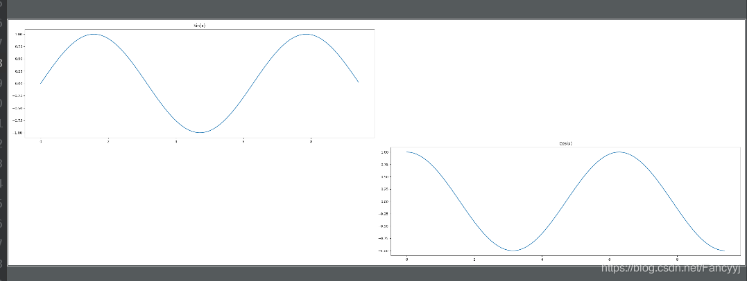
绘制竖向子图
import numpy as np
import matplotlib.pyplot as plt

# 计算正弦和余弦曲线上的点的 x 和 y 坐标
x = np.arange(0,  3  * np.pi,  0.1)
y_sin = np.sin(x)
y_cos = np.cos(x)

# 建立 subplot 网格,高为 2,宽为 1
# 激活第一个 subplot, 位于第一行
plt.subplot(2,  1,  1)
# 绘制第一个图像
plt.plot(x, y_sin)
plt.title('Sin(x)')
# 将第二个 subplot 激活,并绘制第二个图像, 位于第2行;
plt.subplot(2,  1,  2)
plt.plot(x, y_cos)

plt.title('Cos(x)')
# 展示图像
plt.show()
运行结果为:

绘制横向子图
import numpy as np
import matplotlib.pyplot as plt
# 计算正弦和余弦曲线上的点的 x 和 y 坐标
x = np.arange(0, 3 * np.pi, 0.1)
y_sin = np.sin(x)
y_cos = np.cos(x)
plt.figure(figsize=(30, 10), dpi=100)
# 建立 subplot 网格,高为 2,宽为 1
# 激活第一个 subplot, 位于第一行
plt.subplot(2, 2, 1)
# 绘制第一个图像
plt.plot(x, y_sin)
plt.title('Sin(x)')
# 将第二个 subplot 激活,并绘制第二个图像, 位于第2行;
plt.subplot(2, 2, 4)
plt.plot(x, y_cos)
plt.title('Cos(x)')
# 展示图像
plt.show()
运行结果为:
添加网格和图例
import numpy as np
import matplotlib.pyplot as plt
# 设置x和y
x = np.arange(1, 11) # [1, 2, 3,.....10]
y1 = x + 5
y2 = x ** 2 + 5
y3 = x ** 3 + 5
# 设置标题, x周和y轴含义
plt.title("Matplotlib demo")
plt.xlabel("x")
plt.ylabel("y")
# label是一个子图多条图像时,设置的图例名称;
plt.plot(x, y1, 'ob', label='y=x+5') # 'o'代表圆点, ‘b’颜色, 蓝色blue
plt.plot(x, y2, "*y", label='y=x**2+5')
plt.plot(x, y3, label='y=x**3+5')
# 设置图例位置
plt.legend(loc="upper left")
# # 添加网格
plt.grid(alpha=0.1)
plt.show()
运行结果为:

绘制散点图
import random
from matplotlib import pyplot as plt
from matplotlib.font_manager import FontProperties
"""
绘制10月和三月温度变化的散点图
"""

# 字体设置
myfont = FontProperties(fname="/usr/share/fonts/wqy-microhei/wqy-microhei.ttc", size=14)
titlefont = FontProperties(fname="/usr/share/fonts/wqy-microhei/wqy-microhei.ttc", size=25)

# x轴和Y轴数据
march_y = [random.randint(10, 20) for i in range(31)]
october_y = [random.randint(20, 30) for j in range(31)]
x = range(1, 32) # 1, 2, 3, ...31


# 设置图形大小
plt.figure(figsize=(10, 5), dpi=100)

# 绘制散点图
plt.subplot(2,  1,  1)
plt.scatter(x, march_y, )
# 调整刻度
_x3_labels = ["3月{}日".format(_) for _ in x]
# rotation: 旋转
plt.xticks(x[::3], labels=_x3_labels[::3], fontproperties=myfont, rotation=45)
# x, y和标题的说明
plt.xlabel("月份", fontproperties=myfont)
plt.ylabel("温度(摄氏度)", fontproperties=myfont)
plt.title("3月温度变化散点图", fontproperties=titlefont)

plt.subplot(2,  1,  2)
plt.scatter(x, october_y)
_x10_labels = ["10月{}日".format(_) for _ in x]
plt.xticks(x[::3], labels=_x10_labels[::3], fontproperties=myfont, rotation=45)
# x, y和标题的说明
plt.xlabel("月份", fontproperties=myfont)
plt.ylabel("温度(摄氏度)", fontproperties=myfont)
plt.title("10月温度变化散点图", fontproperties=titlefont)

# 添加网格
plt.grid(alpha=0.5)

# 显示图像
plt.show()调整刻度
_x3_labels = ["3月{}日".format(_) for _ in x]
# rotation: 旋转
plt.xticks(x[::3], labels=_x3_labels[::3], fontproperties=myfont, rotation=45)
# x, y和标题的说明
plt.xlabel("月份", fontproperties=myfont)
plt.ylabel("温度(摄氏度)", fontproperties=myfont)
plt.title("3月温度变化散点图", fontproperties=titlefont)

plt.subplot(2,  1,  2)
plt.scatter(x, october_y)
_x10_labels = ["10月{}日".format(_) for _ in x]
plt.xticks(x[::3], labels=_x10_labels[::3], fontproperties=myfont, rotation=45)
# x, y和标题的说明
plt.xlabel("月份", fontproperties=myfont)
plt.ylabel("温度(摄氏度)", fontproperties=myfont)
plt.title("10月温度变化散点图", fontproperties=titlefont)

# 添加网格
plt.grid(alpha=0.5)

# 显示图像
plt.show()
运行结果为:

绘制条形图
"""
bar(): pyplot 子模块提供 bar() 函数来生成条形图。
"""

from matplotlib import pyplot as plt

x = [5, 8, 10]
y = [12, 16, 6]
x2 = [6, 9, 11]
y2 = [6, 15, 7]
plt.bar(x, y, align='center')
plt.bar(x2, y2, color='g', align='center')

plt.title('Bar graph')
plt.ylabel('Y axis')
plt.xlabel('X axis')
plt.show()
运行结果为:

绘制直方图
import random
import matplotlib.pyplot as plt

names = ['电影%s' % (i) for i in range(100)]
times = [random.randint(40, 140) for i in range(100)]

# 如何实现数据的分组?   组数 = 极差 / 组距; 极差= max - min
#  数据为100个以内, 一般分为5~12组;

bin_width = 3  # 设置组距为3;
num_bins = (max(times) - min(times)) // bin_width  # 合理确定组数
print(num_bins)
# hist代表直方图, times为需要统计的数据, 20为统计的组数.
# plt.hist(times, num_bins)
# plt.hist(times, [min(times) + i * bin_width for i in range(num_bins)])
# normed: bool, 是否绘制频率分布直方图, 默认为频数直方图.
plt.hist(times, [min(times) + i * bin_width for i in range(num_bins)], normed=1)

# x轴的设置
plt.xticks(list(range(min(times), max(times)))[::bin_width], rotation=45)

# 设置网格
plt.grid(True, linestyle='-.', alpha=0.5)
plt.show()
运行结果为:


 1万+
1万+

 被折叠的 条评论
为什么被折叠?
被折叠的 条评论
为什么被折叠?
 到【灌水乐园】发言


