


概述:
要实现这个组合, 先要了解结构层次. 合理的组合应该是Drawer封装ToolBar, 然后ToolBar再封装Tab.
Drawer:
首先是Drawer, Drawer的层次结构比较简单, 可以在layout中直接实现.
为Drawer创建一个layout:
Layout的结构是
<android.support.v4.widget.DrawerLayout …>
<!--Your contents ToolBar-->
<android.support.design.widget.NavigationView …/>
</android.support.v4.widget.DrawerLayout>
其中NavigationView是Material Design中推荐的用法, 它可以在Drawer中显示一个这样的页面:
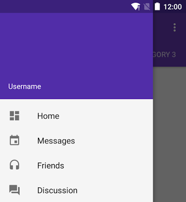
其中蓝色的头部区域是可选的, 下面的菜单区域是必选的. 它的完整用法是这样:
<android.support.design.widget.NavigationView
android:layout_width="wrap_content"
android:layout_height="match_parent"
android:layout_gravity="start"
app:headerLayout="@layout/drawer_header"
app:menu="@menu/drawer"/>
其中, 有两个属性, 一个是app:headerLayout, 它是可选的, 指定了一个header. App:menu则指定了一个菜单资源, 代表header下面的菜单(可以在运行时更新). 最简单的drawer菜单是一些checkable菜单项:
<group android:checkableBehavior="single">
<item
android:id="@+id/navigation_item_1"
android:checked="true"
android:icon="@drawable/ic_android"
android:title="@string/navigation_item_1"/>
<item
android:id="@+id/navigation_item_2"
android:icon="@drawable/ic_android"
android:title="@string/navigation_item_2"/>
</group>
选中的菜单项将会在drawer中高亮显示, 以确保让用户知道当前选中的是哪个. 还可以在菜单中使用subheader来指定一个独立组的item:
<item
android:id="@+id/navigation_subheader"
android:title="@string/navigation_subheader">
<menu>
<item
android:id="@+id/navigation_sub_item_1"
android:icon="@drawable/ic_android"
android:title="@string/navigation_sub_item_1"/>
<item
android:id="@+id/navigation_sub_item_2"
android:icon="@drawable/ic_android"
android:title="@string/navigation_sub_item_2"/>
</menu>
</item>
现在假设我们已经拥有了一个这样的Drawer的layout, 它来自Android的Sample:
<?xml version="1.0" encoding="utf-8"?>
<android.support.v4.widget.DrawerLayout xmlns:android="http://schemas.android.com/apk/res/android"
    xmlns:app="http://schemas.android.com/apk/res-auto"
    android:id="@+id/my_drawer_layout"
    android:layout_width="match_parent"
    android:layout_height="match_parent">

    <FrameLayout
        android:layout_width="match_parent"
        android:layout_height="match_parent">
    </FrameLayout>

    <android.support.design.widget.NavigationView android:id="@+id/nav_view"
        android:layout_width="wrap_content" android:layout_height="match_parent"
        android:layout_gravity="start" android:fitsSystemWindows="true"
        app:headerLayout="@layout/nav_header_main" app:menu="@menu/activity_main_drawer" />

</android.support.v4.widget.DrawerLayout>
这里的NavigationVIew也可以使用一个LIstView来代替, 以显示一个简单的菜单, 它的headerLayout和menu的实现稍后再研究, 我们先拿它作为一个整体来看待. 在主layout中有了这些之后我们就拥有了一个Drawer的基本框架, 它在隐藏和显示的时候分别长这样:


而在MainActivity中不需要添加额外的代码, 设置Activity的Content即可.
ToolBar:
现在要为APP添加layout, 只需要修改Drawer layout中的主界面内容为一个appbar就可以了.
为ToolBar添加Layout:
添加一个新建的layout, 很简单, 一个Toolbar + 主界面内容:
<?xml version="1.0" encoding="utf-8"?>
<LinearLayout xmlns:android="http://schemas.android.com/apk/res/android"
    android:layout_width="match_parent"
    android:layout_height="match_parent"
    android:orientation="vertical">

    <android.support.v7.widget.Toolbar
        android:id="@+id/my_own_toolbar"
        android:layout_width="match_parent"
        android:layout_height="?attr/actionBarSize"
        android:background="?attr/colorPrimary"
        android:elevation="4dp"
        android:theme="@style/ThemeOverlay.AppCompat.ActionBar" />

    <include layout="@layout/content_main" />
</LinearLayout>
并将Drawer中的FrameLayout改为引入Toolbar的代码:
<?xml version="1.0" encoding="utf-8"?>
<android.support.v4.widget.DrawerLayout …>

    <include layout="@layout/app_bar_my_own" android:layout_height="match_parent"
        android:layout_width="match_parent"/>
    …
</android.support.v4.widget.DrawerLayout>
这时候就可以看到已经拥有一个ToolBar了, 但是上面是空的, 什么也没有:


关联ToolBar与Drawer:
现在我们需要在Activity中添加一些代码:
@Override
protected void onCreate(Bundle savedInstanceState) {
    super.onCreate(savedInstanceState);
    setContentView(R.layout.activity_my_own);
//设置Toolbar
    Toolbar myToolbar = (Toolbar) findViewById(R.id.my_own_toolbar);
    setSupportActionBar(myToolbar);
    //关联Drawer
    DrawerLayout drawer = (DrawerLayout) findViewById(R.id.my_drawer_layout);
    ActionBarDrawerToggle toggle = new ActionBarDrawerToggle(
            this, drawer, myToolbar, R.string.navigation_drawer_open, R.string.navigation_drawer_close);
    drawer.setDrawerListener(toggle);
    toggle.syncState();
}
上面的代码包括两部分, 一个是设置Toolbar, 还有就是关联Drawer与Toolbar. setSupportActionBar()之后, Activity的名字就会出现在ToolBar上面. 下面关联Drawer这段可以参考Android 原生导航 III-Drawer导航. 它添加了对Drawer显示/隐藏事件的监听. syncState()则是用来在ToolBar上为Drawer添加一个指示器. 这个指示器可以通过drawerArrowStyle属性修改. 完成这些代码之后, 主界面变成了这样, 并且图标会因为Drawer显示而发生变化:

Tab:
Tab的实现比较复杂, 基础逻辑是TabLayout+ ViewPager.
实现Tab的Layout:
因为Tab是AppBar的子view, 所以要修改AppBar的layout文件, 添加TabLayout和ViewPager元素, 修改之后的AppBar的layout文件如下:
<?xml version="1.0"encoding="utf-8"?>
<LinearLayout xmlns:android="http://schemas.android.com/apk/res/android"
android:layout_width="match_parent"
android:layout_height="match_parent"
android:orientation="vertical">
<android.support.v7.widget.Toolbar
android:id="@+id/my_own_toolbar"
android:layout_width="match_parent"
android:layout_height="?attr/actionBarSize"
android:background="?attr/colorPrimary"
android:elevation="4dp"
android:theme="@style/ThemeOverlay.AppCompat.ActionBar"/>
<android.support.design.widget.TabLayout
android:id="@+id/tab_layout"
android:layout_width="match_parent"
android:layout_height="wrap_content">
</android.support.design.widget.TabLayout>
<android.support.v4.view.ViewPager
android:id="@+id/pager"
android:layout_width="match_parent"
android:layout_height="match_parent">
</android.support.v4.view.ViewPager>
</LinearLayout>
这时界面没有变化, 因为想让它们起作用还得设置一下.
关联TabLayout和VIewPager:
首先是TabLayout, 它比较简单, 添加如下代码到onCreate()中即可:
TabLayout tabLayout= (TabLayout)findViewById(R.id.tab_layout);
tabLayout.addTab(tabLayout.newTab().setText("Tab 1"));
tabLayout.addTab(tabLayout.newTab().setText("Tab 2"));
tabLayout.addTab(tabLayout.newTab().setText("Tab 3"));
这时候就可以看到Tab了.

然后添加ViewPager, ViewPager需要用到FragmentPagerAdapter或者FragmentStatePagerAdapter. 这里使用FragmentPagerAdapter:
public class SectionsPagerAdapter extends FragmentPagerAdapter {
    public SectionsPagerAdapter(FragmentManager fm) {
        super(fm);
    }

    @Override
    public Fragment getItem(int position) {
        Fragment fragment = new DummySectionFragment();
        Bundle args = new Bundle();
        args.putInt(DummySectionFragment.ARG_SECTION_NUMBER, position + 1);
        fragment.setArguments(args);
        return fragment;
    }

    @Override
    public int getCount() {
        return 3;
    }
}

public static class DummySectionFragment extends Fragment {
    public static final String ARG_SECTION_NUMBER = "section_number";
    @Override
    public View onCreateView(LayoutInflater inflater, ViewGroup container,
                             Bundle savedInstanceState) {
        View rootView = inflater.inflate(R.layout.content_main, container, false);
        TextView dummyTextView = (TextView) rootView.findViewById(R.id.section_label);
        dummyTextView.setText(Integer.toString(getArguments().getInt(ARG_SECTION_NUMBER)));
        return rootView;
    }
}
这里添加一个Fragment作为页面内容, 显示Tab的号码. 有了FragmentPagerAdapter就可以将它设置给ViewPager了, 在onCreate()中添加如下代码:
mSectionsPagerAdapter = new SectionsPagerAdapter(getSupportFragmentManager());
mViewPager = (ViewPager) findViewById(R.id.pager);
mViewPager.setAdapter(mSectionsPagerAdapter);
mViewPager.addOnPageChangeListener(new TabLayout.TabLayoutOnPageChangeListener(tabLayout));

tabLayout.setOnTabSelectedListener(this);
现在完整的onCreate()代码是这样的:
SectionsPagerAdapter mSectionsPagerAdapter;
ViewPager mViewPager;

@Override
protected void onCreate(Bundle savedInstanceState) {
    super.onCreate(savedInstanceState);
    setContentView(R.layout.activity_my_own);
    Toolbar myToolbar = (Toolbar) findViewById(R.id.my_own_toolbar);
    setSupportActionBar(myToolbar);

    DrawerLayout drawer = (DrawerLayout) findViewById(R.id.my_drawer_layout);
    ActionBarDrawerToggle toggle = new ActionBarDrawerToggle(
            this, drawer, myToolbar, R.string.navigation_drawer_open, R.string.navigation_drawer_close);
    drawer.setDrawerListener(toggle);
    toggle.syncState();

    TabLayout tabLayout = (TabLayout)findViewById(R.id.tab_layout);
    tabLayout.addTab(tabLayout.newTab().setText("Tab 1"));
    tabLayout.addTab(tabLayout.newTab().setText("Tab 2"));
    tabLayout.addTab(tabLayout.newTab().setText("Tab 3"));

    mSectionsPagerAdapter = new SectionsPagerAdapter(getSupportFragmentManager());
    mViewPager = (ViewPager) findViewById(R.id.pager);
    mViewPager.setAdapter(mSectionsPagerAdapter);
    mViewPager.addOnPageChangeListener(new TabLayout.TabLayoutOnPageChangeListener(tabLayout));

    tabLayout.setOnTabSelectedListener(this);
}
由于要监听Tab的点击事件, 还要添加implements TabLayout.OnTabSelectedListener到Activity. 并且实现它的回调方法:
@Override
public void onTabSelected(TabLayout.Tab tab) {
    mViewPager.setCurrentItem(tab.getPosition());
}

@Override
public void onTabUnselected(TabLayout.Tab tab) {

}

@Override
public void onTabReselected(TabLayout.Tab tab) {

}
至此这个Android最常用的导航的基本样子就已经有了, 它是这样的, 并且可以响应点击和滑动改变Tab的事件:


在栗子中, NavigationView和TabLayout这两种很重要的类都来自于android.support.design, 它提供了Material Design的支持, 很好用.
参考: https://github.com/googlesamples/android-HorizontalPaging/
https://github.com/googlesamples/android-NavigationDrawer/
http://stackoverflow.com/questions/26540078/use-tab-with-new-toolbar-appcompat-v7-21


 扫一扫
扫一扫
 1188
1188

 被折叠的 条评论
为什么被折叠?
被折叠的 条评论
为什么被折叠?
 到【灌水乐园】发言


