


通过echarts来实现柱状图的效果,echarts是针对数据报表等展现的一个产品,具体了解看官方网站:Echarts官网,在这个官网中有详细教程以及API,很容易入手Echarts,从个人刚学习Echarts图表来看,它的难度在于它有自己的一套属性,这和我们平时用的css是不同的,因而我们需要什么效果就得去遵守它的属性,去识别图表的各个部分的专业名称,才能从它API中获取相应属性去实现你想要效果!
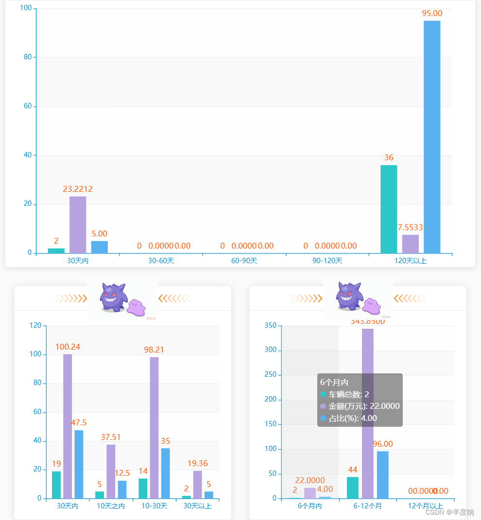
实现效果
业务代码:
<!-- 主页面(单个柱状图,想在一个主页面显示多个柱状图直接引用即可) -->
<div class="chart-wrapper">
    <!-- :chart-data="" 为柱状图传的数据 -->
    <!-- style样式需跟柱状图大小一致 -->
	<bar-chart1 style="width:360px;height:317px" :chart-data="newCarTotal" />
</div>

import BarChart1 from "./dashboard/BarChart1";

components: {
	  BarChart1,
},
<!-- 柱状图(页面名为BarChart1) -->
<template>
<div :class="className" :style="{ height: height, width: width }" />
</template>
<script>
import echarts from "echarts";
require("echarts/theme/macarons"); // echarts theme
import resize from "./mixins/resize";
const animationDuration = 6000;
export default {
mixins: [resize],
props: {
className: {
type: String,
default: "chart",
},
width: {
type: String,
default: "360px",
},
height: {
type: String,
default: "317px",
},
option: { type: Object },
chartData: {
type: Object,
// default: [],
},
},
watch: {
chartData: {
deep: true,
handler(val) {
this.initChart(val);
},
},
},
data() {
return {
chart: null,
poption: this.option,
};
},
beforeDestroy() {
if (!this.chart) {
return;
}
this.chart.dispose();
this.chart = null;
},
methods: {
initChart() {
// console.log("chartData2",this.chartData)
this.chart = echarts.init(this.$el, "macarons");
this.chart.setOption({
backgroundColor: 'rgba(255, 255, 255, 1)',
tooltip: {
trigger: "axis",//鼠标悬浮提示数据
axisPointer: {
// Use axis to trigger tooltip
type: "shadow", // 'shadow' as default; can also be 'line' or 'shadow'
},
// formatter: function(data) {
// console.log("data",data);
// return data.newcarNames +"<br/>"+ "车辆总数 : " + data.newcarMount + "<br/>" + "金额(万元): " + data.newcarAmount +
// "<br/>" + "占比 :" + data.newcarRatio + "%";
// },
},
legend: {
data: this.chartData,
},
grid: {//柱状图在窗口的位置设置
left: "3%",
right: "4%",
top: "4%",
bottom: "1%",
containLabel: true,
},
yAxis: {
type: "value",
minInterval: 1,
},
xAxis: {
type: "category",
data: this.chartData.数据, //X轴数据
axisLabel:{
interval:0,
rotate:0 //值>0向右倾斜,值<0则向左倾斜
}
},
series: [{
name: '车辆总数',
type: 'bar',
barWidth: '20%',
data: this.chartData.字段名, //Y轴数据(this.chartData是主页面传来的数据,直接写字段名就可以了)
itemStyle: {
normal: {
label: {
show: true, //开启显示数字
position: 'top', //在上方显示
textStyle: { //数值样式
color: '#ff5500',
fontSize: 14
}
},
}
},
},{
name: '金额(万元)',
type: 'bar',
barWidth: '20%',
data: this.chartData.字段名, //Y轴数据(this.chartData是主页面传来的数据,直接写字段名就可以了)
itemStyle: {
normal: {
label: {
show: true, //开启显示数字
position: 'top', //在上方显示
textStyle: { //数值样式
color: '#ff5500',
fontSize: 14
}
},
}
},
},{
name: '占比(%)',
type: 'bar',
barWidth: '20%',
data: this.chartData.字段名, //Y轴数据(this.chartData是主页面传来的数据,直接写字段名就可以了)
itemStyle: {
normal: {
label: {
show: true, //开启显示数字
position: 'top', //在上方显示
textStyle: { //数值样式
color: '#ff5500',
fontSize: 14
}
},
}
},
},
],
});
},
},
};
</script>


 6359
6359


 被折叠的 条评论
为什么被折叠?
被折叠的 条评论
为什么被折叠?
 到【灌水乐园】发言


