


colors,legends,and lines
虽然这些参数我都知道,但是当要画某些特定的图形时,大脑会空白,所以需要加深。
1.data simulation
# simulate some data
set.seed(111)
dat <- data.frame(X = runif(100,-2,2),
                  T1 = gl(n = 4,k = 25,labels = c("Small","Medium","Large","Big")),
                  Site = rep(c("site1","site2"),times=50))

mm <- model.matrix(~ Site+X*T1,dat)
betas <- runif(9,-2,2)
dat$Y<- rnorm(100,mm%*%betas,1)
summary(dat)
      X                T1        Site          Y
 Min.   :-1.9751   Small :25   site1:50   Min.   :-7.348
 1st Qu.:-0.6380   Medium:25   site2:50   1st Qu.:-4.149
 Median : 0.3572   Large :25              Median :-2.654
 Mean   : 0.1718   Big   :25              Mean   :-2.844
 3rd Qu.: 1.0866                          3rd Qu.:-1.542
 Max.   : 1.9922                          Max.   : 0.499
model.matrix(object,…) 构造设计矩阵
object:类似回归模型,指定公式和数据
2.adding colors
pass a vector of colors to the col argument
# select the colors that will be used
library(RColorBrewer)
display.brewer.all()
# selsect the first 4 colors in the Set1 palette
cols <- brewer.pal(n = 4,name = "Set1")
cols_t1 <- cols[dat$T1]
#plot
plot(Y~X,dat,col=cols_t1,pch=16)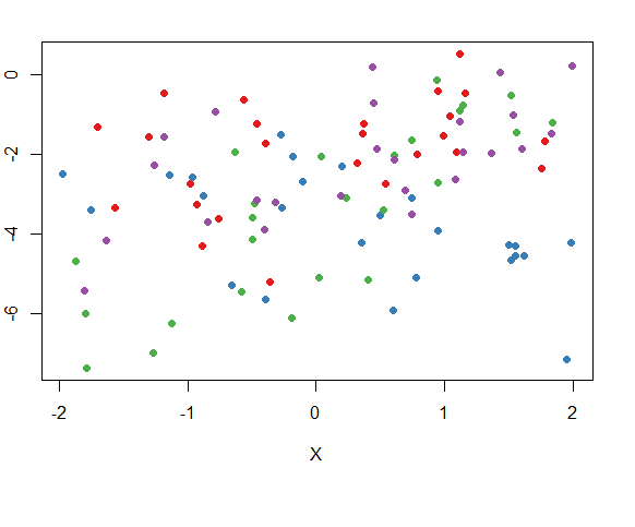
RColorBrewer 包提供了三类调色板
display.brewer.all 展示三类调色板”div”, “qual”, “seq”
cols_t1 <- cols[dat$T1] 生成对应因子型的颜色向量
补充:每个因子水平在后台都对应着一个整数值
3.change plotting symbols
pch_site <- c(16,18)[factor(dat$Site)] # 再次使用向量下标是因子的类型
plot(Y~X,dat,col = cols_t1,pch = pch_site)
4.add a legend to the graph
plot(Y~X,dat,col = cols_t1,pch = pch_site)
legend("topright",legend = paste(rep(c("Small","Medium","Large","Big"),times = 2),
      rep(c("Site 1","Site 2"),each = 4),
      sep = ","),
      col = rep(cols,times = 2),
      pch = rep(c(16,18),each = 4),
      bty = "n",ncol = 2,cex = 0.7,pt.cex = 0.7,xpd=TRUE
       )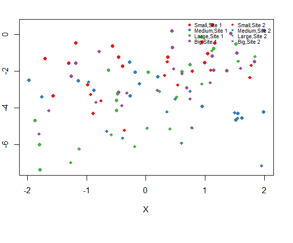
add a legend outside of the graph by setting xpd=TRUE
and by specifying the x and y coordinates of the legend.
在图形外部增加图例
plot(Y~X,dat,col=cols_t1,pch=pch_site)
legend(x=-1,y=10,legend=paste(rep(c("Small","Medium","Large","Big"),times=2),
                             rep(c("Site 1","Site 2"),each=4),sep=", "),
       col=rep(cols,times=2),pch=rep(c(16,18),each=4),
       bty="n",ncol=2,cex=0.7,pt.cex=0.7,xpd=TRUE)
bty 设定图例框的样式
cex 设定字符串文本的扩张倍数
pt.cex 设定对应因子点的伸展倍数
xpd :TRUE 表示将图例放在绘图区域外,同时要指定图例的x,y坐标
5.Add regression lines
# generate a new data frame as a predicted dataset
new_x <- expand.grid(X = seq(-2,2,length = 10),
                     T1 = c("Small","Medium","Large","Big"),
                     Site = c("site1","site2"))
m <- lm(Y~Site+X*T1,dat)
pre <- predict(m,new_x)
xs <- seq(-2,2,length = 10)
plot(Y ~ X,dat,col = cols_t1,pch = pch_site)
lines(xs,pre[1:10],col = cols[1],lty = 1,lwd = 3)
lines(xs,pre[11:20],col = cols[2],lty = 1,lwd = 3)
lines(xs,pre[21:30],col = cols[3],lty = 1,lwd = 3)
lines(xs,pre[31:40],col = cols[4],lty = 1,lwd = 3)
lines(xs,pre[41:50],col=cols[1],lty=2,lwd=3)
lines(xs,pre[51:60],col=cols[2],lty=2,lwd=3)
lines(xs,pre[61:70],col=cols[3],lty=2,lwd=3)
lines(xs,pre[71:80],col=cols[4],lty=2,lwd=3)
legend(x=-1,y=10,
       legend=paste(rep(c("Small","Medium","Large","Big"),times=2),
                    rep(c("Site 1","Site 2"),each=4),sep=", "),
       col=rep(cols,times=2),
       pch=rep(c(16,18),each=4),
       lwd=1,lty=rep(c(1,2),each=4),
       bty="n",ncol=2,cex=0.7,pt.cex=0.7,xpd=TRUE)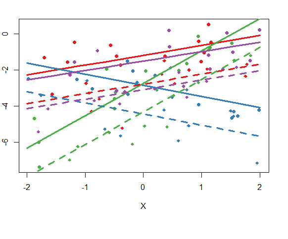


 1403
1403


 被折叠的 条评论
为什么被折叠?
被折叠的 条评论
为什么被折叠?
 到【灌水乐园】发言


