


原始网址:http://www.w3schools.com/css/css_positioning.asp
翻译:
CSS Layout - The position Property
position 属性用以对元素指定定位方法的类型(static、relative、fixed 或 absolute)。
The position Property
position 属性用以对元素指定定位方法的类型。
position 值有以下 4 种:
- static
- relative
- fixed
- absolute
接着,再结合 top、bottom、left 以及 right 属性定位元素。切记,只有在 position 属性被设置之后,它们才会起作用。根据 position 值的不同,它们的作用效果会不同。
position: static;
HTML 元素默认由 static 值来定位。
由 static 值定位的元素不受 top、bottom、left 以及 right 属性的影响。
以 position: static; 修饰的元素不以特殊方式定位,它总是根据页面的正常流进行定位:

<!DOCTYPE html>
<html>
<head>
<style>
div.static {
    position: static;
    border: 3px solid #73AD21;
}
</style>
</head>
<body>
<div class="static">This <div> element has position: static;</div>
</body>
</html>CSS 修饰如下所示:
div.static {
position: static;
border: 3px solid #73AD21;
}position: relative;
以 position: relative; 修饰的元素是相对于自身的常规位置来定位的。
设置相对定位的元素的 top、bottom、left 以及 right 属性将调整自身与常规位置的距离。其它内容将不会适应元素的余留间隔。

<!DOCTYPE html>
<html>
    <head>
        <style>
            div.relative {
                position: relative;
                left: 30px;
                border: 3px solid #73AD21;
            }
        </style>
    </head>
    <body>
        <div class="relative">This div element has position: relative;</div>
    </body>
</html>
CSS 修饰如下所示:
div.relative {
    position: relative;
    left: 30px;
    border: 3px solid #73AD21;
}
position: fixed;
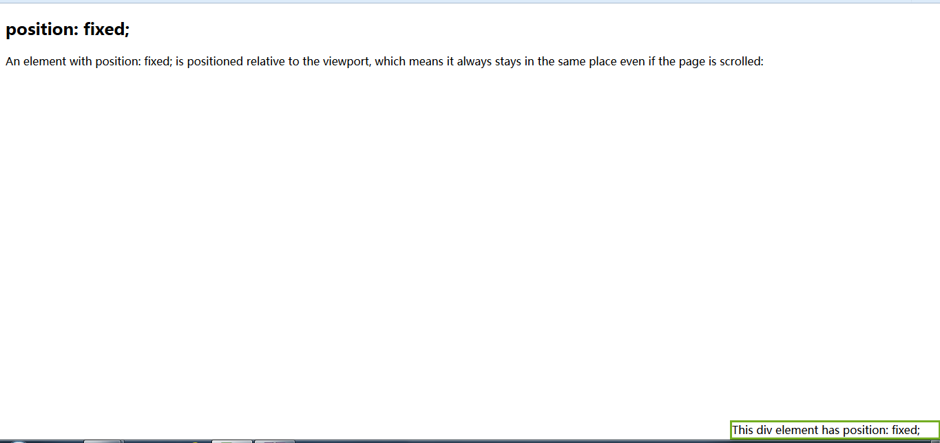
以 position: fixed; 修饰的元素是相对于 viewport 来定位的。这意味着,即使页面处于滚动状态,元素总是停在相同的位置。top、bottom、left 以及 right 属性用以定位元素。
以 fixed 修饰的元素不会在其原本处于页面的常规位置的地方预留间隔。
注意在页面的右下角以 fixed 修饰的元素。CSS 修饰如下所示:
div.fixed {
    position: fixed;
    bottom: 0;
    right: 0;
    width: 300px;
    border: 3px solid #73AD21;
}
<!DOCTYPE html>
<html>
    <head>
        <style>
            div.fixed {
                position: fixed;
                bottom: 0;
                right: 0;
                width: 300px;
                border: 3px solid #73AD21;
            }
        </style>
    </head>
    <body>
        <h2>position: fixed;</h2>
        <p>An element with position: fixed; is positioned relative to the
            viewport, which means it always stays in the same place even if the
            page is scrolled:</p>
        <div class="fixed">This div element has position: fixed;</div>
    </body>
</html>
position: absolute;
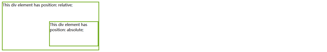
以 position: absolute; 修饰的元素是相对于已定位的父级元素来定位的(而不是相对于 viewport)。然而,如果以 absolute 修饰的元素没有已定位的父级元素,它会以文档体(document body)为基准,并且会随着页面的滚动而移动。
注意:“已定位”的元素是除了以 static 修饰的元素。
以下是一个简单的示例:
<!DOCTYPE html>
<html>
    <head>
        <style>
            div.relative {
                position: relative;
                width: 400px;
                height: 200px;
                border: 3px solid #73AD21;
            }

            div.absolute {
                position: absolute;
                top: 80px;
                right: 0;
                width: 200px;
                height: 100px;
                border: 3px solid #73AD21;
            }
        </style>
    </head>
    <body>
        <div class="relative">
            This div element has position: relative;
            <div class="absolute">This div element has position: absolute;</div>
        </div>
    </body>
</html>
CSS 修饰如下所示:
div.relative {
    position: relative;
    width: 400px;
    height: 200px;
    border: 3px solid #73AD21;
}

div.absolute {
    position: absolute;
    top: 80px;
    right: 0;
    width: 200px;
    height: 100px;
    border: 3px solid #73AD21;
}
Overlapping Elements
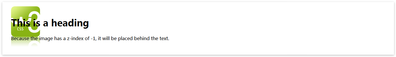
在定位元素的时候,元素之间可能会重叠。
z-index 属性用以指定元素的栈指令(栈指令:用以确定元素之间的重叠次序)。
元素可以有正、负栈指令:
<!DOCTYPE html>
<html>
    <head>
        <style>
            div {
                position: relative;
                padding: 30px;
                box-shadow: 0 2px 4px 0 rgba(0, 0, 0, 0.16), 0 2px 10px 0 rgba(0, 0, 0, 0.12) !important;
            }

            img {
                position: absolute;
                left: 30px;
                top: 15px;
                z-index: -1;
            }
        </style>
    </head>
    <body>
        <div>
            <h1>This is a heading</h1>
            <img src="w3css.gif" width="100" height="140">
            <p>Because the image has a z-index of -1, it will be placed behind the text.</p>
        </div>
    </body>
</html>
栈指令大的元素总是重叠于栈指令低的元素之上。
| 注意:如果没有以 z-index 修饰且已定位的两个元素重叠,那么,在 HTML 代码中,后编辑的元素将被显示在上面。 |
Positioning Text In an Image
如何在图片之上定位文本:
<!DOCTYPE html>
<html lang="en-US">
    <head>
        <meta charset="utf-8">
        <style>
            .w3-example {
                box-shadow: 0 2px 4px 0 rgba(0, 0, 0, 0.16), 0 2px 10px 0 rgba(0, 0, 0, 0.12) !important;
                margin: 20px 0;
                padding: 0.01em 16px;
                background-color: #f1f1f1;
            }
        </style>
    </head>
    <body>
        <div class="w3-example">
            <h3>Example</h3>
            <div class="notranslate">
                <div style="position: relative; text-align: center;">
                    <img src="http://www.w3schools.com/css/trolltunga.jpg" alt="Norway" style="width: 100%; height: auto; opacity: 0.3">
                    <div style="position: absolute; bottom: 8px; left: 16px; font-size: 18px">Bottom Left</div>
                    <div style="position: absolute; top: 8px; left: 16px; font-size: 18px">Top Left</div>
                    <div style="position: absolute; top: 8px; right: 16px; font-size: 18px">Top Right</div>
                    <div style="position: absolute; bottom: 8px; right: 16px; font-size: 18px">Bottom Right</div>
                    <div style="position: absolute; top: 50%; left: 50%; transform: translate(-50%, -50%); font-size: 18px">Centered</div>
                </div>
            </div>
        </div>
    </body>
</html>


 扫一扫
扫一扫
 3405
3405

 被折叠的 条评论
为什么被折叠?
被折叠的 条评论
为什么被折叠?
 到【灌水乐园】发言


