


原始网址:http://www.w3schools.com/css/css_navbar.asp
翻译:
CSS 导航栏
演示:导航栏
<!DOCTYPE html>
<html lang="en-US"><head><meta http-equiv="Content-Type" content="text/html; charset=UTF-8">
<title>CSS Navigation Bar</title>
<meta name="viewport" content="width=device-width, initial-scale=1">
<style>
.w3-col {
float: left;
width: 100%;
}
@media only screen and (min-width:601px){
.w3-col.m1 {width: 8.33333%}
.w3-col.m2 {width:16.66666%}
.w3-col.m3 {width:24.99999%}
.w3-col.m4 {width:33.33333%}
.w3-col.m5 {width:41.66666%}
.w3-col.m6 {width:49.99999%}
.w3-col.m7 {width:58.33333%}
.w3-col.m8 {width:66.66666%}
.w3-col.m9 {width:74.99999%}
.w3-col.m10{width:83.33333%}
.w3-col.m11{width:91.66666%}
.w3-col.m12{width:99.99999%}
}
ul.horizontal {
list-style-type: none;
margin: 0;
padding: 0;
overflow: hidden;
background-color: #333;
}
ul.horizontal li {
float: left;
}
ul.horizontal li a {
display: inline-block;
color: white;
text-align: center;
padding: 14px 16px;
text-decoration: none;
}
ul.horizontal li a:hover:not(.active) {
background-color: #000;
}
ul.horizontal li a.active {
background-color:#4CAF50;
}
ul.vertical {
list-style-type: none;
margin: 0;
padding: 0;
width: 200px;
background-color: #f1f1f1;
}
ul.vertical li a {
display: block;
color: #000;
padding: 8px 0 8px 16px;
text-decoration: none;
}
ul.vertical li a:hover:not(.active) {
background-color: #555;
color:white;
}
ul.vertical a.active {
background-color: #4CAF50;
color:white;
}
ul.gray {
border: 1px solid #e7e7e7;
background-color: #f3f3f3;
}
ul.gray li a {
display: block;
color: #666;
text-align: center;
padding: 14px 16px;
text-decoration: none;
}
ul.gray li a:hover:not(.active) {
background-color: #ddd;
}
ul.gray li a.active {
color: white;
background-color: #008CBA;
}
.rightli {
float:right;
}
@media screen and (max-width: 408px) {
.rightli {
display:none;
}
}
ul.ex {
width:90%;
}
@media screen and (max-width: 600px) {
ul.ex {
width:100%;
}
}
</style>
<body>
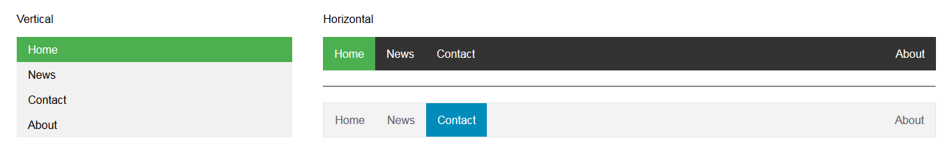
<div style="padding: 16px;">
<div class="w3-row">
<div class="w3-col m4">
<p>Vertical</p>
<ul class="vertical ex">
<li><a class="active" href="javascript:void(0)">Home</a></li>
<li><a href="javascript:void(0)">News</a></li>
<li><a href="javascript:void(0)">Contact</a></li>
<li><a href="javascript:void(0)">About</a></li>
</ul>
</div>
<div class="w3-col m8">
<p>Horizontal</p>
<ul class="horizontal">
<li><a class="active" href="javascript:void(0)">Home</a></li>
<li><a href="javascript:void(0)">News</a></li>
<li><a href="javascript:void(0)">Contact</a></li>
<li class="rightli" style="float: right"><a href="javascript:void(0)">About</a></li>
</ul>
<hr style="margin: 22px 0;">
<ul class="horizontal gray">
<li><a href="javascript:void(0)">Home</a></li>
<li><a href="javascript:void(0)">News</a></li>
<li><a class="active" href="javascript:void(0)">Contact</a></li>
<li class="rightli" style="float: right"><a href="javascript:void(0)">About</a></li>
</ul>
</div>
</div>
</div>
</body>
</html>导航栏
对任何 web 站点而言,拥有易用的导航是至关重要的。
使用 CSS,你可以把难看的 HTML 菜单转变为赏心悦目的导航栏。
Navigation Bar = List of Links
导航栏以 HTML 标准为基础。
在示例中,我们以 HTML 标准列表构建导航栏。
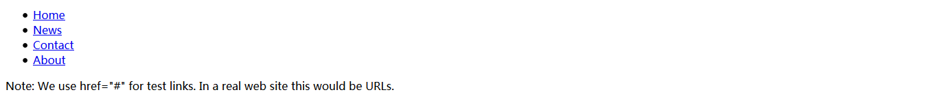
导航栏为基本的链接列表,因此,使用 <ul>、<li> 元素使其更加完美:
<!DOCTYPE html>
<html>
<body>
    <ul>
      <li><a href="#home">Home</a></li>
      <li><a href="#news">News</a></li>
      <li><a href="#contact">Contact</a></li>
      <li><a href="#about">About</a></li>
    </ul>
    <p>Note: We use href="#" for test links. In a real web site this would be URLs.</p>
</body>
</html>
现在,让我们去掉列表的着重号、内外边距:
ul {
    list-style-type: none;
    margin: 0;
    padding: 0;
}示例解释:
- list-style-type: none; - 去掉着重号。导航栏不需要列表标记。
- 设置 margin: 0; 和 padding: 0; 以去掉浏览器默认设置。
以上示例中的代码为应用于垂直、水平导航栏的标准代码。
垂直导航栏
要构建垂直导航栏,除了以上代码,我们还可以对列表内的 <a> 元素式样化:
li a {
    display: block;
    width: 60px;
}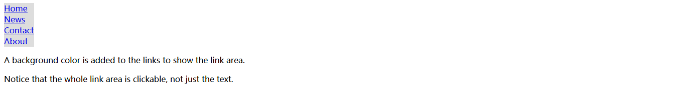
<!DOCTYPE html>
<html>
<head>
<style>
ul {
    list-style-type: none;
    margin: 0;
    padding: 0;
}

li a {
    display: block;
    width: 60px;
    background-color: #dddddd;
}
</style>
</head>
<body>
    <ul>
      <li><a href="#home">Home</a></li>
      <li><a href="#news">News</a></li>
      <li><a href="#contact">Contact</a></li>
      <li><a href="#about">About</a></li>
    </ul>
    <p>A background color is added to the links to show the link area.</p>
    <p>Notice that the whole link area is clickable, not just the text.</p>
</body>
</html>
示例解释:
- display: block; - 将链接以块级元素显示使得链接的整个区域可点击(不局限于文本),这样,我们还可以对
<a>元素指定宽度(内、外边距,高度等等,随你使唤) - width: 60px; - 块级元素在默认情况下占据整个宽度,我们指定其宽度为 60 像素
我们也可以设置 <ul> 的宽度,去掉 <a> 的宽度设置,作为块级元素(<a>),它们将以占据着 <ul> 整个宽度的形式呈现。这种做法的结果将和我们之前的示例是一样的:
ul {
    list-style-type: none;
    margin: 0;
    padding: 0;
    width: 60px;
}

li a {
    display: block;
}
<!DOCTYPE html>
<html>
<head>
<style>
ul {
    list-style-type: none;
    margin: 0;
    padding: 0;
    width: 60px;
}

li a {
    display: block;
    background-color: #dddddd;
}
</style>
</head>
<body>
    <ul>
        <li><a href="#home">Home</a></li>
        <li><a href="#news">News</a></li>
        <li><a href="#contact">Contact</a></li>
        <li><a href="#about">About</a></li>
    </ul>
    <p>A background color is added to the links to show the link area.</p>
    <p>Notice that the whole link area is clickable, not just the text.</p>
</body>
</html>
垂直导航栏示例
我们将创建一个基本的导航栏,背景色置灰,当用户移动鼠标悬停其上的时候,链接的背景色随之变更:
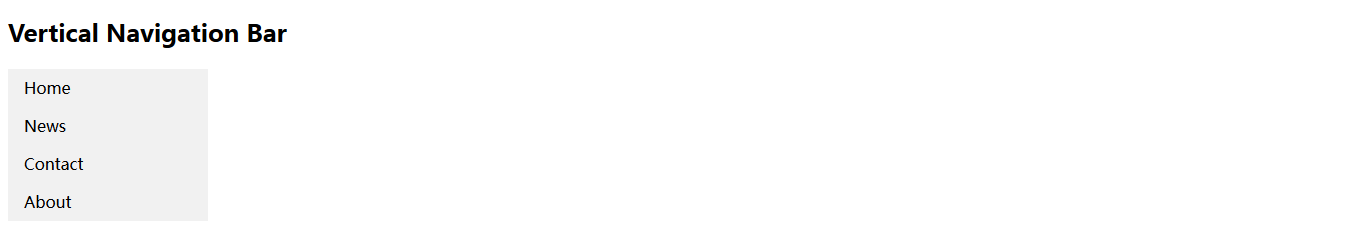
<!DOCTYPE html>
<html>
<head>
<style>
ul {
    list-style-type: none;
    margin: 0;
    padding: 0;
    width: 200px;
    background-color: #f1f1f1;
}

li a {
    display: block;
    color: #000;
    padding: 8px 16px;
    text-decoration: none;
}

/* Change the link color on hover */
li a:hover {
    background-color: #555;
    color: white;
}
</style>
</head>
<body>
    <h2>Vertical Navigation Bar</h2>
    <ul>
        <li><a href="#home">Home</a></li>
        <li><a href="#news">News</a></li>
        <li><a href="#contact">Contact</a></li>
        <li><a href="#about">About</a></li>
    </ul>
</body>
</html>
激活/当前导航链接(Active/Current Navigation Link)
给当前链接增加一个 "active" 类,让用户知道自己目前处在哪个页面:
<!DOCTYPE html>
<html>
<head>
<style>
ul {
list-style-type: none;
margin: 0;
padding: 0;
width: 200px;
background-color: #f1f1f1;
}
li a {
display: block;
color: #000;
padding: 8px 16px;
text-decoration: none;
}
li a.active {
background-color: #4CAF50;
color: white;
}
li a:hover:not(.active) {
background-color: #555;
color: white;
}
</style>
</head>
<body>
<h2>Vertical Navigation Bar</h2>
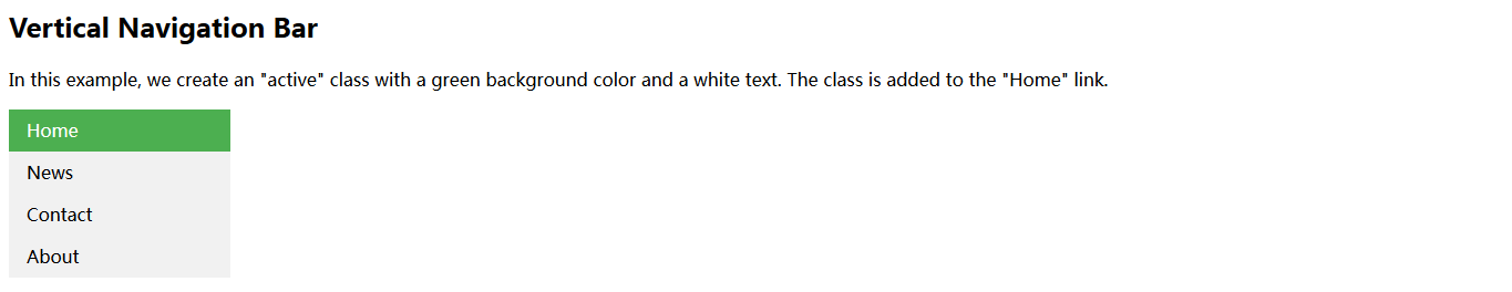
<p>In this example, we create an "active" class with a green
background color and a white text. The class is added to the "Home"
link.</p>
<ul>
<li><a class="active" href="#home">Home</a></li>
<li><a href="#news">News</a></li>
<li><a href="#contact">Contact</a></li>
<li><a href="#about">About</a></li>
</ul>
</body>
</html>居中链接、添加边框(Center Links & Add Borders)
对 <li> 或 <a> 设置 text-align: center 以达到链接居中的效果。
对 <ul> 设置 border 属性即对导航栏添加边框的效果。根据需求,我们还可以对 <li> 元素(除了最后一个)设置 border-bottom 以增加导航栏内的边框:
<!DOCTYPE html>
<html>
<head>
<style>
ul {
list-style-type: none;
margin: 0;
padding: 0;
width: 200px;
background-color: #f1f1f1;
border: 1px solid #555;
}
li a {
display: block;
color: #000;
padding: 8px 16px;
text-decoration: none;
}
li {
text-align: center;
border-bottom: 1px solid #555;
}
li:last-child {
border-bottom: none;
}
li a.active {
background-color: #4CAF50;
color: white;
}
li a:hover:not(.active) {
background-color: #555;
color: white;
}
</style>
</head>
<body>
<h2>Vertical Navigation Bar</h2>
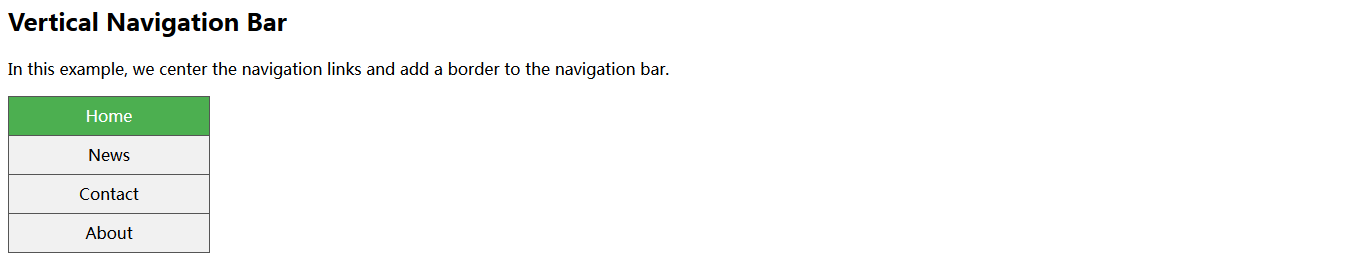
<p>In this example, we center the navigation links and add a border
to the navigation bar.</p>
<ul>
<li><a class="active" href="#home">Home</a></li>
<li><a href="#news">News</a></li>
<li><a href="#contact">Contact</a></li>
<li><a href="#about">About</a></li>
</ul>
</body>
</html>全高固定垂直导航栏(Full-height Fixed Vertical Navbar)
创建一个全高、sticky 侧边导航:
<!DOCTYPE html>
<html>
<head>
<style>
body {
margin: 0;
}
ul {
list-style-type: none;
margin: 0;
padding: 0;
width: 25%;
background-color: #f1f1f1;
position: fixed;
height: 100%;
overflow: auto;
}
li a {
display: block;
color: #000;
padding: 8px 16px;
text-decoration: none;
}
li a.active {
background-color: #4CAF50;
color: white;
}
li a:hover:not(.active) {
background-color: #555;
color: white;
}
</style>
</head>
<body>
<ul>
<li><a class="active" href="#home">Home</a></li>
<li><a href="#news">News</a></li>
<li><a href="#contact">Contact</a></li>
<li><a href="#about">About</a></li>
</ul>
<div style="margin-left: 25%; padding: 1px 16px; height: 100%;">
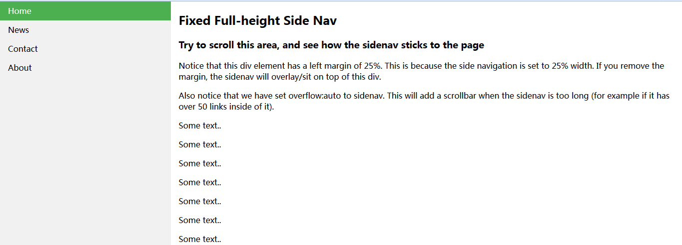
<h2>Fixed Full-height Side Nav</h2>
<h3>Try to scroll this area, and see how the sidenav sticks to the page</h3>
<p>Notice that this div element has a left margin of 25%. This is
because the side navigation is set to 25% width. If you remove the
margin, the sidenav will overlay/sit on top of this div.
</p>
<p>Also notice that we have set overflow:auto to sidenav. This
will add a scrollbar when the sidenav is too long (for example if it
has over 50 links inside of it).
</p>
<p>Some text..</p>
<p>Some text..</p>
<p>Some text..</p>
<p>Some text..</p>
<p>Some text..</p>
<p>Some text..</p>
<p>Some text..</p>
</div>
</body>
</html>注意:本示例在移动设备上的运行效果可能不佳。
水平导航栏
创建水平导航栏的方式有两种:使用 inline 或 floating 列表项。
行内列表项(Inline List Items)
除了上述”标准“代码外,构建水平导航栏的方式之一是指定 <li> 为行内元素:
li {
    display: inline;
}
<!DOCTYPE html>
<html>
<head>
<style>
ul {
    list-style-type: none;
    margin: 0;
    padding: 0;
}

li {
    display: inline;
}
</style>
</head>
<body>
    <ul>
        <li><a href="#home">Home</a></li>
        <li><a href="#news">News</a></li>
        <li><a href="#contact">Contact</a></li>
        <li><a href="#about">About</a></li>
    </ul>
</body>
</html>
示例解释:
- display: inline; - 默认情况下,
<li>元素为块级元素。在此,我们去掉了每一个列表项的前后分行符以达到单行显示的目的。
浮动列表项(Floating List Items)
创建水平导航栏的另一种方式是将 <li> 变为浮动元素,并且指定导航链接的布局:
li {
    float: left;
}

a {
    display: block;
    padding: 8px;
    background-color: #dddddd;
}
<!DOCTYPE html>
<html>
<head>
<style>
ul {
list-style-type: none;
margin: 0;
padding: 0;
overflow: hidden;
}
li {
float: left;
}
li a {
display: block;
padding: 8px;
background-color: #dddddd;
}
</style>
</head>
<body>
<ul>
<li><a href="#home">Home</a></li>
<li><a href="#news">News</a></li>
<li><a href="#contact">Contact</a></li>
<li><a href="#about">About</a></li>
</ul>
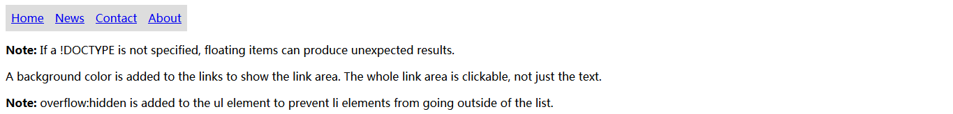
<p><b>Note:</b> If a !DOCTYPE is not specified, floating items can produce unexpected results.</p>
<p>A background color is added to the links to show the link area. The whole link area is clickable, not just the text.</p>
<p><b>Note:</b> overflow:hidden is added to the ul element to prevent li elements from going outside of the list.</p>
</body>
</html>示例解释:
- float: left; - 使用
float以致块级元素之间互为接近。 - display: block; - 将链接作为块级元素显示使得整个链接区域可点击(不局限于文本),我们还可根据意愿对其指定内外边距、宽、高等等。
- padding: 8px; - 由于块级元素占据整行宽度,它们不能以浮动的方式互为接近。因此,指定适当大小的内边距可使它们看起来更加美观。
background-color: #dddddd; - 给每个元素的背景色置灰。
提示:如果你想让整个宽度显示为一个背景色,对
<ul>添加背景色以替代对每个<a>元素设置背景色:
ul {
    background-color: #dddddd;
}
<!DOCTYPE html>
<html>
<head>
<style>
ul {
    list-style-type: none;
    margin: 0;
    padding: 0;
    overflow: hidden;
    background-color: #dddddd;
}

li {
    float: left;
}

li a {
    display: block;
    padding: 8px;
}
</style>
</head>
<body>
    <ul>
        <li><a href="#home">Home</a></li>
        <li><a href="#news">News</a></li>
        <li><a href="#contact">Contact</a></li>
        <li><a href="#about">About</a></li>
    </ul>
    <p>A background color is added to the list instead of each link to create a full-width background color.</p>
    <p><b>Note:</b> overflow:hidden is added to the ul element to prevent li elements from going outside of the list.</p>
</body>
</html>
水平导航栏示例
创建一个基本的水平导航栏,背景色置黑,当用户移动鼠标悬停其上的时候,变更链接的背景色:
ul {
    list-style-type: none;
    margin: 0;
    padding: 0;
    overflow: hidden;
    background-color: #333;
}

li {
    float: left;
}

li a {
    display: block;
    color: white;
    text-align: center;
    padding: 14px 16px;
    text-decoration: none;
}

/* Change the link color to #111 (black) on hover */
li a:hover {
    background-color: #111;
}
<!DOCTYPE html>
<html>
<head>
<style>
ul {
    list-style-type: none;
    margin: 0;
    padding: 0;
    overflow: hidden;
    background-color: #333;
}

li {
    float: left;
}

li a {
    display: block;
    color: white;
    text-align: center;
    padding: 14px 16px;
    text-decoration: none;
}

li a:hover {
    background-color: #111;
}
</style>
</head>
<body>
    <ul>
        <li><a class="active" href="#home">Home</a></li>
        <li><a href="#news">News</a></li>
        <li><a href="#contact">Contact</a></li>
        <li><a href="#about">About</a></li>
    </ul>
</body>
</html>
激活/当前导航链接(Active/Current Navigation Link)
对当前链接添加 "active" 类,让用户知道自己目前处在哪个页面:
.active {
    background-color: #4CAF50;
}
<!DOCTYPE html>
<html>
<head>
<style>
ul {
    list-style-type: none;
    margin: 0;
    padding: 0;
    overflow: hidden;
    background-color: #333;
}

li {
    float: left;
}

li a {
    display: block;
    color: white;
    text-align: center;
    padding: 14px 16px;
    text-decoration: none;
}

li a:hover:not (.active ) {
    background-color: #111;
}

.active {
    background-color: #4CAF50;
}
</style>
</head>
<body>
    <ul>
        <li><a class="active" href="#home">Home</a></li>
        <li><a href="#news">News</a></li>
        <li><a href="#contact">Contact</a></li>
        <li><a href="#about">About</a></li>
    </ul>
</body>
</html>
链接右排列(Right-Align Links)
通过让列表项向右浮动使链接右排列(float:right;):
 <ul>
  <li><a href="#home">Home</a></li>
  <li><a href="#news">News</a></li>
  <li><a href="#contact">Contact</a></li>
  <li style="float:right"><a class="active" href="#about">About</a></li>
</ul>
<!DOCTYPE html>
<html>
<head>
<style>
ul {
    list-style-type: none;
    margin: 0;
    padding: 0;
    overflow: hidden;
    background-color: #333;
}

li {
    float: left;
}

li a {
    display: block;
    color: white;
    text-align: center;
    padding: 14px 16px;
    text-decoration: none;
}

li a:hover:not (.active ) {
    background-color: #111;
}

.active {
    background-color: #4CAF50;
}
</style>
</head>
<body>
    <ul>
        <li><a href="#home">Home</a></li>
        <li><a href="#news">News</a></li>
        <li><a href="#contact">Contact</a></li>
        <li style="float: right"><a class="active" href="#about">About</a></li>
    </ul>
</body>
</html>
Border Dividers
对 <li> 添加 border-right 属性以创建链接分割效果:
 /* Add a gray right border to all list items, except the last item (last-child) */
li {
    border-right: 1px solid #bbb;
}

li:last-child {
    border-right: none;
}
<!DOCTYPE html>
<html>
<head>
<style>
ul {
    list-style-type: none;
    margin: 0;
    padding: 0;
    overflow: hidden;
    background-color: #333;
}

li {
    float: left;
    border-right:1px solid #bbb;
}

li:last-child {
    border-right: none;
}

li a {
    display: block;
    color: white;
    text-align: center;
    padding: 14px 16px;
    text-decoration: none;
}

li a:hover:not(.active) {
    background-color: #111;
}

.active {
    background-color: #4CAF50;
}
</style>
</head>
<body>
    <ul>
        <li><a class="active" href="#home">Home</a></li>
        <li><a href="#news">News</a></li>
        <li><a href="#contact">Contact</a></li>
        <li style="float: right"><a href="#about">About</a></li>
    </ul>
</body>
</html>
固定导航栏(Fixed Navigation Bar)
让导航栏停留在页面的顶部或底部,即使在用户滚动页面的时候:
| Fixed Top | Fixed Bottom |
|---|---|
ul {position: fixed; top: 0; width: 100%;} | ul {position: fixed; bottom: 0; width: 100%;} |
<!DOCTYPE html>
<html>
    <head>
        <style>
            div {
                padding: 20px;
                border: 1px solid blue;
            }
        </style>
    </head>
    <body>
        <div>
            <iframe src="iframe_a.html" width="49.5%" height="400px;"></iframe>
            <iframe src="iframe_b.html" width="49.5%" height="400px;"></iframe>
        </div>
    </body>
</html>
<!-- iframe_a.html -->
<!DOCTYPE html>
<html>
<head>
<style>
body {margin:0;}
ul {
list-style-type: none;
margin: 0;
padding: 0;
overflow: hidden;
background-color: #333;
position: fixed;
top: 0;
width: 100%;
}
li {
float: left;
}
li a {
display: block;
color: white;
text-align: center;
padding: 14px 16px;
text-decoration: none;
}
li a:hover:not(.active) {
background-color: #111;
}
.active {
background-color: #4CAF50;
}
</style>
</head>
<body>
<ul>
<li><a class="active" href="#home">Home</a></li>
<li><a href="#news">News</a></li>
<li><a href="#contact">Contact</a></li>
<li><a href="#about">About</a></li>
</ul>
<div
style="padding: 20px; margin-top: 30px; background-color: #1abc9c; height: 1500px;">
<h1>Fixed Top Navigation Bar</h1>
<h2>Scroll this page to see the effect</h2>
<h2>The navigation bar will stay at the top of the page while
scrolling</h2>
<p>Some text some text some text some text..</p>
<p>Some text some text some text some text..</p>
<p>Some text some text some text some text..</p>
<p>Some text some text some text some text..</p>
<p>Some text some text some text some text..</p>
<p>Some text some text some text some text..</p>
<p>Some text some text some text some text..</p>
<p>Some text some text some text some text..</p>
<p>Some text some text some text some text..</p>
<p>Some text some text some text some text..</p>
<p>Some text some text some text some text..</p>
<p>Some text some text some text some text..</p>
<p>Some text some text some text some text..</p>
<p>Some text some text some text some text..</p>
<p>Some text some text some text some text..</p>
<p>Some text some text some text some text..</p>
<p>Some text some text some text some text..</p>
<p>Some text some text some text some text..</p>
<p>Some text some text some text some text..</p>
<p>Some text some text some text some text..</p>
</div>
</body>
</html><!-- iframe_b.html -->
<!DOCTYPE html>
<html>
<head>
<style>
body {margin:0;}
ul {
list-style-type: none;
margin: 0;
padding: 0;
overflow: hidden;
background-color: #333;
position: fixed;
bottom: 0;
width: 100%;
}
li {
float: left;
}
li a {
display: block;
color: white;
text-align: center;
padding: 14px 16px;
text-decoration: none;
}
li a:hover:not(.active) {
background-color: #111;
}
.active {
background-color: #4CAF50;
}
</style>
</head>
<body>
<ul>
<li><a class="active" href="#home">Home</a></li>
<li><a href="#news">News</a></li>
<li><a href="#contact">Contact</a></li>
<li><a href="#about">About</a></li>
</ul>
<div style="padding: 20px; background-color: #1abc9c; height: 1500px;">
<h1>Fixed Bottom Navigation Bar</h1>
<h2>Scroll this page to see the effect</h2>
<h2>The navigation bar will stay at the bottom of the page while
scrolling</h2>
<p>Some text some text some text some text..</p>
<p>Some text some text some text some text..</p>
<p>Some text some text some text some text..</p>
<p>Some text some text some text some text..</p>
<p>Some text some text some text some text..</p>
<p>Some text some text some text some text..</p>
<p>Some text some text some text some text..</p>
<p>Some text some text some text some text..</p>
<p>Some text some text some text some text..</p>
<p>Some text some text some text some text..</p>
<p>Some text some text some text some text..</p>
<p>Some text some text some text some text..</p>
<p>Some text some text some text some text..</p>
<p>Some text some text some text some text..</p>
<p>Some text some text some text some text..</p>
<p>Some text some text some text some text..</p>
<p>Some text some text some text some text..</p>
<p>Some text some text some text some text..</p>
<p>Some text some text some text some text..</p>
<p>Some text some text some text some text..</p>
</div>
</body>
</html>注意:这些示例在移动设备里的运行效果可能不佳。
灰色水平导航栏
带有浅灰色边框的灰色水平导航栏示例:
ul {
    border: 1px solid #e7e7e7;
    background-color: #f3f3f3;
}

li a {
    color: #666;
}
<!DOCTYPE html>
<html>
<head>
<style>
ul {
    list-style-type: none;
    margin: 0;
    padding: 0;
    overflow: hidden;
    border: 1px solid #e7e7e7;
    background-color: #f3f3f3;
}

li {
    float: left;
}

li a {
    display: block;
    color: #666;
    text-align: center;
    padding: 14px 16px;
    text-decoration: none;
}

li a:hover:not(.active) {
    background-color: #ddd;
}

li a.active {
    color: white;
    background-color: #4CAF50;
}
</style>
</head>
<body>
    <ul>
        <li><a class="active" href="#home">Home</a></li>
        <li><a href="#news">News</a></li>
        <li><a href="#contact">Contact</a></li>
        <li><a href="#about">About</a></li>
    </ul>
</body>
</html>
更多示例
响应式顶部导航

如何使用 CSS3 的媒体查询(media queries)创建响应式顶部导航。

<!DOCTYPE html>
<html>
<head>
<meta name="viewport" content="width=device-width, initial-scale=1.0">
<style>
body {margin: 0;}

ul.topnav {
    list-style-type: none;
    margin: 0;
    padding: 0;
    overflow: hidden;
    background-color: #333;
}

ul.topnav li {float: left;}

ul.topnav li a {
    display: block;
    color: white;
    text-align: center;
    padding: 14px 16px;
    text-decoration: none;
}

ul.topnav li a:hover:not(.active) {background-color: #111;}

ul.topnav li a.active {background-color: #4CAF50;}

ul.topnav li.right {float: right;}

@media screen and (max-width: 600px){
    ul.topnav li.right,
    ul.topnav li {float: none;}
}
</style>
</head>
<body>
    <ul class="topnav">
        <li><a class="active" href="#home">Home</a></li>
        <li><a href="#news">News</a></li>
        <li><a href="#contact">Contact</a></li>
        <li class="right"><a href="#about">About</a></li>
    </ul>
    <div style="padding: 0 16px;">
        <h2>Responsive Topnav Example</h2>
        <p>This example use media queries to stack the topnav vertically when the screen size is 600px or less.</p>
        <p>You will learn more about media queries and responsive web design later in our CSS Tutorial.</p>
        <h4>Resize the browser window to see the effect.</h4>
    </div>
</body>
</html>
响应式侧边导航
如何使用 CSS3 的媒体查询(media queries)创建响应式侧边导航。
<!DOCTYPE html>
<html>
<head>
<meta name="viewport" content="width=device-width, initial-scale=1.0">
<style>
body {margin: 0;}
ul.sidenav {
list-style-type: none;
margin: 0;
padding: 0;
width: 25%;
background-color: #f1f1f1;
position: fixed;
height: 100%;
overflow: auto;
}
ul.sidenav li a {
display: block;
color: #000;
padding: 8px 16px;
text-decoration: none;
}
ul.sidenav li a.active {
background-color: #4CAF50;
color: white;
}
ul.sidenav li a:hover:not(.active) {
background-color: #555;
color: white;
}
div.content {
margin-left: 25%;
padding: 1px 16px;
height: 1000px;
}
@media screen and (max-width: 1050px){
ul.sidenav {
width:100%;
height:auto;
position:relative;
}
ul.sidenav li a {
float: left;
padding: 15px;
}
div.content {margin-left:0;}
}
@media screen and (max-width: 400px){
ul.sidenav li a {
text-align: center;
float: none;
}
}
</style>
</head>
<body>
<ul class="sidenav">
<li><a class="active" href="#home">Home</a></li>
<li><a href="#news">News</a></li>
<li><a href="#contact">Contact</a></li>
<li><a href="#about">About</a></li>
</ul>
<div class="content">
<h2>Responsive Sidenav Example</h2>
<p>This example use media queries to transform the sidenav to a top navigation bar when the screen size is 600px or less.</p>
<p>We have also added a media query for screens that are 400px or less, which will vertically stack and center the navigation links.</p>
<p>You will learn more about media queries and responsive web design later in our CSS Tutorial.</p>
<h4>Resize the browser window to see the effect.</h4>
</div>
</body>
</html>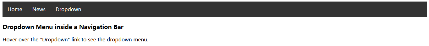
下拉式导航栏

如何在导航栏内添加下拉式菜单。

<!DOCTYPE html>
<html>
<head>
<style>
ul {
    list-style-type: none;
    margin: 0;
    padding: 0;
    overflow: hidden;
    background-color: #333;
}

li {
    float: left;
}

li a, .dropbtn {
    display: inline-block;
    color: white;
    text-align: center;
    padding: 14px 16px;
    text-decoration: none;
}

li a:hover, .dropdown:hover .dropbtn {
    background-color: red;
}

li.dropdown {
    display: inline-block;
}

.dropdown-content {
    display: none;
    position: absolute;
    background-color: #f9f9f9;
    min-width: 160px;
    box-shadow: 0px 8px 16px 0px rgba(0,0,0,0.2);
}

.dropdown-content a {
    color: black;
    padding: 12px 16px;
    text-decoration: none;
    display: block;
    text-align: left;
}

.dropdown-content a:hover {background-color: #f1f1f1}

.dropdown:hover .dropdown-content {
    display: block;
}
</style>
</head>
<body>
    <ul>
        <li><a class="active" href="#home">Home</a></li>
        <li><a href="#news">News</a></li>
        <li class="dropdown"><a href="#" class="dropbtn">Dropdown</a>
            <div class="dropdown-content"><a href="#">Link 1</a> <a href="#">Link 2</a> <a href="#">Link 3</a></div>
        </li>
    </ul>
    <h3>Dropdown Menu inside a Navigation Bar</h3>
    <p>Hover over the "Dropdown" link to see the dropdown menu.</p>
</body>
</html>


 531
531


 被折叠的 条评论
为什么被折叠?
被折叠的 条评论
为什么被折叠?
 到【灌水乐园】发言


