


原始地址:http://www.w3schools.com/css/css_dropdowns.asp
翻译:
CSS 下拉式菜单(CSS Dropdowns)
使用 CSS 创建可悬停、下拉式菜单。
演示:下拉式菜单示例
移动鼠标至以下示例:

<!DOCTYPE html>
<html lang="en-US"><head><meta http-equiv="Content-Type" content="text/html; charset=UTF-8">
<title>CSS Dropdowns</title>
<meta name="viewport" content="width=device-width, initial-scale=1">
<style>
@media screen and (max-width:992px){.w3-main{margin-left:0!important;margin-right:0!important}}

.w3-third{float:left;width:100%}

@media only screen and (min-width:601px){
    .w3-col.m1{width:8.33333%}
    .w3-col.m2{width:16.66666%}
    .w3-col.m3,.w3-quarter{width:24.99999%}
    .w3-col.m4,.w3-third{width:33.33333%}
    .w3-col.m5{width:41.66666%}
    .w3-col.m6,.w3-half{width:49.99999%}
    .w3-col.m7{width:58.33333%}
    .w3-col.m8,.w3-twothird{width:66.66666%}
    .w3-col.m9,.w3-threequarter{width:74.99999%}
    .w3-col.m10{width:83.33333%}
    .w3-col.m11{width:91.66666%}
    .w3-col.m12{width:99.99999%}
}

@media only screen and (min-width:993px){
    .w3-col.l1{width:8.33333%}
    .w3-col.l2{width:16.66666%}
    .w3-col.l3,.w3-quarter{width:24.99999%}
    .w3-col.l4,.w3-third{width:33.33333%}
    .w3-col.l5{width:41.66666%}
    .w3-col.l6,.w3-half{width:49.99999%}
    .w3-col.l7{width:58.33333%}
    .w3-col.l8,.w3-twothird{width:66.66666%}
    .w3-col.l9,.w3-threequarter{width:74.99999%}
    .w3-col.l10{width:83.33333%}
    .w3-col.l11{width:91.66666%}
    .w3-col.l12{width:99.99999%}
}
</style>
<style>
.dropbtn {
    background-color: #4CAF50;
    color: white;
    padding: 16px;
    font-size: 16px;
    border: none;
    cursor: pointer;
}

.dropdown {
    position: relative;
    display: inline-block;
}

.dropdown:hover .dropbtn {
    background-color: #3e8e41;
}

.dropdown-content {
    display: none;
    position: absolute;
    background-color: #f9f9f9;
    min-width: 100%;
    overflow: auto;
    box-shadow: 0px 8px 16px 0px rgba(0,0,0,0.2);
    z-index: 1;
}

.dropdown-content a {
    color: black;
    padding: 12px 16px;
    text-decoration: none;
    display: block;
}

.dropdown-content a:hover {background-color: #f1f1f1;}

.dropdown2:hover .dropdown-content {
    display: block;
}

.right {
    right: 0;
}

@media only screen and (max-width: 600px) {
    .dropdown {
        display: inline;
    }

    .dropbtn {
        width: 100%;
        margin-top: 55px;
    }

    .dropspan {
        width: 100%;
        margin-top: 5px;
    }

    .dropimg {
        margin-top: 55px;
    }

    .right {
        left: 0;
        min-width: 300px;
    }
}
</style>
<body>
    <div class="w3-main" style="margin-left: 220px; padding-top: 0px;">
        <div class="w3-col l10 m12" id="main">
            <div class="w3-row" style="margin-top: 35px; margin-bottom: 35px;">
                <div class="w3-third">
                    <div class="dropdown dropdown2" style="position: relative; top: 15px;">
                        <span class="dropspan">Dropdown Text</span>
                        <div class="dropdown-content" style="padding: 8px 16px; min-width: 150px; text-align: center">
                            <p>Hello World!</p>
                        </div>
                    </div>
                </div>
                <div class="w3-third">
                    <div class="dropdown dropdown2">
                        <button class="dropbtn">Dropdown Menu</button>
                        <div class="dropdown-content">
                            <a href="javascript:void(0)">Link 1</a>
                            <a href="javascript:void(0)">Link 2</a>
                            <a href="javascript:void(0)">Link 3</a>
                        </div>
                    </div>
                </div>
                <div class="w3-third">
                    <div class="dropdown dropdown2">
                        <span style="position: relative; bottom: 15px;">Other: </span>
                        <img class="dropimg" src="http://www.w3schools.com/css/img_fjords.jpg" alt="Trolltunga Norway" width="100" height="50">
                        <div class="dropdown-content right">
                            <div class="img">
                                <img src="http://www.w3schools.com/css/img_fjords.jpg" alt="Trolltunga Norway" width="300" height="200">
                                <div style="padding: 15px; text-align: center;">Beautiful Trolltunga, Norway</div>
                            </div>
                        </div>
                    </div>
                </div>
            </div>
        </div>
    </div>
</body>
</html>
基本下拉式(Basic Dropdown)
创建一个下拉框,当用户移动鼠标至元素之上的时候,它才显现:
<!DOCTYPE html>
<html>
<head>
<style>
.dropdown {
    position: relative;
    display: inline-block;
}

.dropdown-content {
    display: none;
    position: absolute;
    background-color: #f9f9f9;
    min-width: 160px;
    box-shadow: 0px 8px 16px 0px rgba(0, 0, 0, 0.2);
    padding: 12px 16px;
}

.dropdown:hover .dropdown-content {
    display: block;
}
</style>
</head>
<body>
    <h2>Hoverable Dropdown</h2>
    <p>Move the mouse over the text below to open the dropdown content.</p>
    <div class="dropdown">
        <span>Mouse over me</span>
        <div class="dropdown-content">
            <p>Hello World!</p>
        </div>
    </div>
</body>
</html>
示例解释:
HTML) 使用任何元素以开启下拉式内容,例如,<span>、<button> 元素等。使用容器元素(如 <div>)创建下拉式内容,在里面添加任何你想要的东西。在容器元素之外包裹一个 <div> 以使 CSS 正确定位下拉式内容。
CSS) .dropdown 类使用 position:relative,我们想让下拉式内容放置在下拉式按钮(使用 position:absolute)的右下方。.dropdown-content 类维持着实际的下拉式内容。在默认情况下,它是隐藏的,基于悬停(hover)才显现。注意,min-width 设置了 160px 。这个值可随意修改(feel free to change)。提示:如果你想要让下拉式内容的宽度与下拉式按钮的宽度保持一致,请将 width 设置为 100%(增加 overflow:auto 以使在小屏设备上出现滚动条)。
我们使用了 CSS3 的 box-shadow 属性取代边框,让下拉式菜单看起来像是“卡片(card)”。
:hover 选择器用以显示下拉式菜单,当用户移动鼠标至下拉式按钮的时候即可显示。
下拉式菜单(Dropdown Menu)
创建下拉式菜单以使用户可以对列表进行选择:
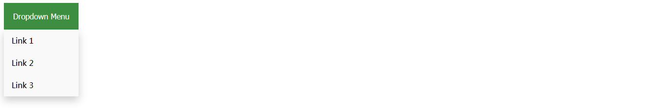
这个示例与前一个示例是相似的,我们只是在下拉框内增加了链接并且对它们进行了样式化,以适应下拉按钮:
<!DOCTYPE html>
<html>
<head>
<style>
.dropbtn {
    background-color: #4CAF50;
    color: white;
    padding: 16px;
    font-size: 16px;
    border: none;
    cursor: pointer;
}

.dropdown {
    position: relative;
    display: inline-block;
}

.dropdown-content {
    display: none;
    position: absolute;
    background-color: #f9f9f9;
    min-width: 100%; /* min-width: 160px; */
    box-shadow: 0px 8px 16px 0px rgba(0, 0, 0, 0.2);
}

.dropdown-content a {
    color: black;
    padding: 12px 16px;
    text-decoration: none;
    display: block;
}

.dropdown-content a:hover {
    background-color: #f1f1f1
}

.dropdown:hover .dropdown-content {
    display: block;
}

.dropdown:hover .dropbtn {
    background-color: #3e8e41;
}
</style>
</head>
<body>
    <h2>Dropdown Menu</h2>
    <p>Move the mouse over the button to open the dropdown menu.</p>
    <div class="dropdown">
        <button class="dropbtn">Dropdown Menu</button>
        <div class="dropdown-content">
            <a href="#">Link 1</a> <a href="#">Link 2</a> <a href="#">Link 3</a>
        </div>
    </div>
    <p><strong>Note:</strong> We use href="#" for test links. In a real web site this would be URLs.</p>
</body>
</html>
右排列下拉式内容(Right-aligned Dropdown Content)

<!DOCTYPE html>
<html>
<head>
<style>
.dropbtn {
    background-color: #4CAF50;
    color: white;
    padding: 16px;
    font-size: 16px;
    border: none;
    cursor: pointer;
}

.dropdown {
    position: relative;
    display: inline-block;
}

.dropdown-content {
    display: none;
    position: absolute;
    right: 0;
    background-color: #f9f9f9;
    min-width: 160px;
    box-shadow: 0px 8px 16px 0px rgba(0, 0, 0, 0.2);
}

.dropdown-content a {
    color: black;
    padding: 12px 16px;
    text-decoration: none;
    display: block;
}

.dropdown-content a:hover {
    background-color: #f1f1f1
}

.dropdown:hover .dropdown-content {
    display: block;
}

.dropdown:hover .dropbtn {
    background-color: #3e8e41;
}
</style>
</head>
<body>
    <h2>Aligned Dropdown Content</h2>
    <p>Determine whether the dropdown content should go from left to right or right to left with the left and right properties.</p>
    <div class="dropdown" style="float: left;">
        <button class="dropbtn">Left</button>
        <div class="dropdown-content" style="left: 0;">
            <a href="#">Link 1</a> <a href="#">Link 2</a> <a href="#">Link 3</a>
        </div>
    </div>
    <div class="dropdown" style="float: right;">
        <button class="dropbtn">Right</button>
        <div class="dropdown-content">
            <a href="#">Link 1</a> <a href="#">Link 2</a> <a href="#">Link 3</a>
        </div>
    </div>
</body>
</html>
如果你想让下拉式菜单从右到左而不是从左到右,添加 right: 0; 。
.dropdown-content {
    right: 0;
}
更多示例
下拉式图片

如何在下拉框内添加图片和其它内容。

<!DOCTYPE html>
<html>
<head>
<style>
.dropdown {
    position: relative;
    display: inline-block;
}

.dropdown-content {
    display: none;
    position: absolute;
    background-color: #f9f9f9;
    min-width: 160px;
    box-shadow: 0px 8px 16px 0px rgba(0, 0, 0, 0.2);
}

.dropdown:hover .dropdown-content {
    display: block;
}

.desc {
    padding: 15px;
    text-align: center;
}
</style>
</head>
<body>
    <h2>Dropdown Image</h2>
    <p>Move the mouse over the image below to open the dropdown content.</p>
    <div class="dropdown">
        <img src="http://www.w3schools.com/css/img_fjords.jpg" alt="Trolltunga Norway" width="100" height="50">
        <div class="dropdown-content">
            <img src="http://www.w3schools.com/css/img_fjords.jpg" alt="Trolltunga Norway" width="300" height="200">
            <div class="desc">Beautiful Trolltunga, Norway</div>
        </div>
    </div>
</body>
</html>
下拉式导航栏
如何在导航栏内添加下拉菜单。
<!DOCTYPE html>
<html>
<head>
<style>
ul {
list-style-type: none;
margin: 0;
padding: 0;
overflow: hidden;
background-color: #333;
}
li {
float: left;
}
li a, .dropbtn {
display: inline-block;
color: white;
text-align: center;
padding: 14px 16px;
text-decoration: none;
}
li a:hover, .dropdown:hover .dropbtn {
background-color: red;
}
li.dropdown {
display: inline-block;
}
.dropdown-content {
display: none;
position: absolute;
background-color: #f9f9f9;
min-width: 160px;
box-shadow: 0px 8px 16px 0px rgba(0, 0, 0, 0.2);
}
.dropdown-content a {
color: black;
padding: 12px 16px;
text-decoration: none;
display: block;
text-align: left;
}
.dropdown-content a:hover {
background-color: #f1f1f1
}
.dropdown:hover .dropdown-content {
display: block;
}
</style>
</head>
<body>
<ul>
<li><a class="active" href="#home">Home</a></li>
<li><a href="#news">News</a></li>
<li class="dropdown">
<a href="#" class="dropbtn">Dropdown</a>
<div class="dropdown-content">
<a href="#">Link 1</a>
<a href="#">Link 2</a>
<a href="#">Link 3</a>
</div>
</li>
</ul>
<h3>Dropdown Menu inside a Navigation Bar</h3>
<p>Hover over the "Dropdown" link to see the dropdown menu.</p>
</body>
</html>


 4049
4049

 被折叠的 条评论
为什么被折叠?
被折叠的 条评论
为什么被折叠?
 到【灌水乐园】发言


