


原始网址:http://www.w3schools.com/css/css_form.asp
翻译:
CSS 表单
使用 CSS 能够对 HTML 表单的外观进行极大地改善:
<!DOCTYPE html>
<html lang="en-US">
<head>
<meta http-equiv="Content-Type" content="text/html; charset=UTF-8">
<title>CSS Forms</title>
<meta name="viewport" content="width=device-width, initial-scale=1">
<style>
html {
font-family: Verdana, sans-serif;
font-size: 15px;
line-height: 1.5;
box-sizing: border-box;
}
*, *:before, *:after {
box-sizing: inherit
}
@media only screen and (min-width:601px) {
.w3-col.m1{width:8.33333%}
.w3-col.m2{width:16.66666%}
.w3-col.m3,.w3-quarter{width:24.99999%}
.w3-col.m4,.w3-third{width:33.33333%}
.w3-col.m5{width:41.66666%}
.w3-col.m6,.w3-half{width:49.99999%}
.w3-col.m7{width:58.33333%}
.w3-col.m8,.w3-twothird{width:66.66666%}
.w3-col.m9,.w3-threequarter{width:74.99999%}
.w3-col.m10{width:83.33333%}
.w3-col.m11{width:91.66666%}
.w3-col.m12{width:99.99999%}
}
@media only screen and (min-width:993px) {
.w3-col.l1{width:8.33333%}
.w3-col.l2{width:16.66666%}
.w3-col.l3,.w3-quarter{width:24.99999%}
.w3-col.l4,.w3-third{width:33.33333%}
.w3-col.l5{width:41.66666%}
.w3-col.l6,.w3-half{width:49.99999%}
.w3-col.l7{width:58.33333%}
.w3-col.l8,.w3-twothird{width:66.66666%}
.w3-col.l9,.w3-threequarter{width:74.99999%}
.w3-col.l10{width:83.33333%}
.w3-col.l11{width:91.66666%}
.w3-col.l12{width:99.99999%}
}
@media screen and (max-width:992px){.w3-main{margin-left:0!important;margin-right:0!important}}
</style>
<style>
.test input[type=text], .test select {
width: 100%;
margin: 8px 0;
display: inline-block;
border: 1px solid #ccc;
box-shadow: inset 0 1px 3px #ddd;
border-radius: 4px;
-webkit-box-sizing: border-box;
-moz-box-sizing: border-box;
box-sizing: border-box;
padding-left: 20px;
padding-right: 20px;
padding-top: 12px;
padding-bottom: 12px;
}
.test input[type=button], .test .button {
width: 100%;
text-align: center;
background-color: #4CAF50;
color: white;
padding: 12px 20px;
margin: 14px 0 8px 0;
display: inline-block;
border: none;
border-radius: 4px;
box-shadow: inset 0 1px 3px #ddd;
}
.test input[type=button]:hover, .test .button:hover {
background-color: #45a049;
}
.test input[type=text]:focus, .test select:focus {
box-shadow: inset 0 1px 1px rgba(0, 0, 0, .075), 0 0 8px
rgba(102, 175, 233, .6);
}
.label {
color: green;
display: inline-block;
width: 130px;
text-align: right;
padding-right: 15px;
}
.button {
background-color: #4CAF50;
border: none;
color: white;
padding: 15px 32px;
text-decoration: none;
margin: 4px 2px;
}
</style>
</head>
<body>
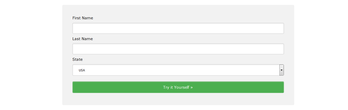
<div class="w3-main w3-light-grey" style="margin-left: 220px; padding-top: 0px;">
<div class="w3-row w3-white">
<div class="w3-col l10 m12" style="padding: 16px;">
<div style="border-radius: 5px; background-color: #f2f2f2; padding: 40px;">
<form action="http://www.w3schools.com/css/action_page.php" class="test">
<label for="fname">First Name</label>
<input type="text" id="fname" name="firstname">
<label for="lname">Last Name</label>
<input type="text" id="lname" name="lastname">
<label for="country">State</label>
<select id="country" name="country">
<option value="usa">Australia</option>
<option value="usa">Canada</option>
<option value="usa">USA</option>
</select>
<a target="_blank" href="http://www.w3schools.com/css/tryit.asp?filename=trycss_forms" class="button">Try it Yourself »</a>
</form>
</div>
</div>
</div>
</div>
</body>
</html>样式化输入栏(Styling Input Fields)
使用 width 属性确定输入栏的宽度:
input {
    width: 100%;
}
<!DOCTYPE html>
<html>
<head>
<style>
input {
width: 100%;
}
</style>
</head>
<body>
<p>A full-width input field:</p>
<form>
<label for="fname">First Name</label> <input type="text" id="fname" name="fname">
</form>
</body>
</html>以上示例作用于所有的 <input> 元素。如果你只想对特定的 input 类型进行式样化,请使用属性选择器:
- input[type=text] - 只选择
text栏。 - input[type=password] - 只选择
password栏。 - input[type=number] - 只选择
number栏。 - 等等……
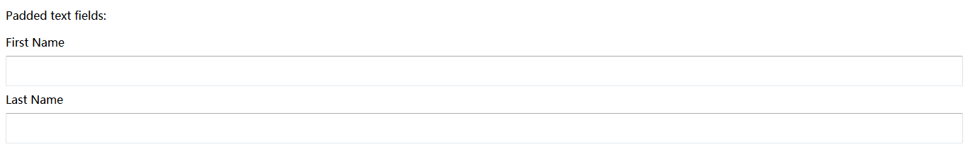
Padded Inputs
使用 padding 属性在 text 栏内添加空间。
提示:当有很多输入栏前后排列的时候,我们可以使用 margin 属性以增加输入栏外围空间:
input[type=text] {
    width: 100%;
    padding: 12px 20px;
    margin: 8px 0;
    box-sizing: border-box;
}
<!DOCTYPE html>
<html>
<head>
<style>
input[type=text] {
    width: 100%;
    padding: 12px 20px;
    margin: 8px 0;
    box-sizing: border-box;
}
</style>
</head>
<body>
    <p>Padded text fields:</p>
    <form>
        <label for="fname">First Name</label>
        <input type="text" id="fname" name="fname">
        <label for="lname">Last Name</label>
        <input type="text" id="lname" name="lname">
    </form>
</body>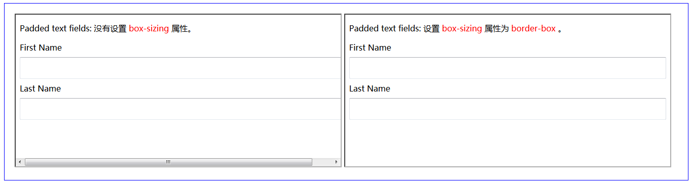
</html>注意:我们将 box-sizing 属性设置为 border-box 。这将确保内边距和边框最终位于元素的总宽高之内。在 CSS3 Box Sizing 章节可以查看到更多有关 box-sizing 属性的内容。
补充内容:
<!DOCTYPE html>
<html>
    <head>
        <meta charset="utf-8" />
        <style>
            div {
                padding: 20px;
                border: 1px solid blue;
            }
        </style>
    </head>
    <body>
        <div>
            <iframe src="iframe_a.html" width="49.5%" height="300px;"></iframe>
            <iframe src="iframe_b.html" width="49.5%" height="300px;"></iframe>
        </div>
    </body>
</html>

<!-- iframe_a.html -->
<!DOCTYPE html>
<html>
<head>
<style>
input[type=text] {
    width: 100%;
    padding: 12px 20px;
    margin: 8px 0;
    /* box-sizing: border-box; */
}
</style>
</head>
<body>
    <p>Padded text fields: 没有设置 <font color="red">box-sizing</font> 属性。</p>
    <form>
        <label for="fname">First Name</label>
        <input type="text" id="fname" name="fname">
        <label for="lname">Last Name</label>
        <input type="text" id="lname" name="lname">
    </form>
</body>
</html>

<!-- iframe_b.html -->
<!DOCTYPE html>
<html>
<head>
<style>
input[type=text] {
    width: 100%;
    padding: 12px 20px;
    margin: 8px 0;
    box-sizing: border-box;
}
</style>
</head>
<body>
    <p>Padded text fields: 设置 <font color="red">box-sizing</font> 属性为 <font color="red">border-box</font> 。</p>
    <form>
        <label for="fname">First Name</label>
        <input type="text" id="fname" name="fname">
        <label for="lname">Last Name</label>
        <input type="text" id="lname" name="lname">
    </form>
</body>
</html>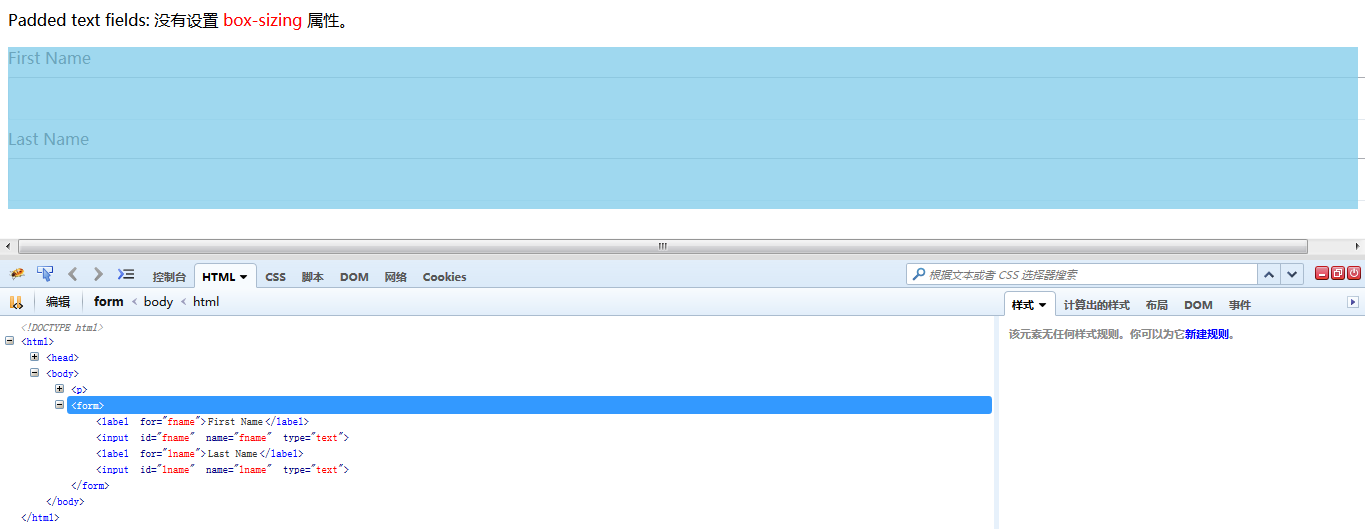
Bordered Inputs
使用 border 属性变更边框的大小和颜色,使用 border-radius 属性以增加弧度:
input[type=text] {
    border: 2px solid red;
    border-radius: 4px;
}
<!DOCTYPE html>
<html>
<head>
<style>
input[type=text] {
width: 100%;
padding: 12px 20px;
margin: 8px 0;
box-sizing: border-box;
border: 2px solid red;
border-radius: 4px;
}
</style>
</head>
<body>
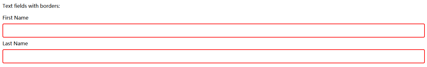
<p>Text fields with borders:</p>
<form>
<label for="fname">First Name</label>
<input type="text" id="fname" name="fname">
<label for="lname">Last Name</label>
<input type="text" id="lname" name="lname">
</form>
</body>
</html>如果你只想要个底部边框,请使用 border-bottom 属性:
input[type=text] {
    border: none;
    border-bottom: 2px solid red;
}
<!DOCTYPE html>
<html>
<head>
<style>
input[type=text] {
width: 100%;
padding: 12px 20px;
margin: 8px 0;
box-sizing: border-box;
border: none;
border-bottom: 2px solid red;
}
</style>
</head>
<body>
<p>Text fields with only a bottom border:</p>
<form>
<label for="fname">First Name</label>
<input type="text" id="fname" name="fname">
<label for="lname">Last Name</label>
<input type="text" id="lname" name="lname">
</form>
</body>
</html>Colored Inputs
使用 background-color 属性对 input 添加背景色,使用 color 属性变更文本颜色:
input[type=text] {
    background-color: #3CBC8D;
    color: white;
}
<!DOCTYPE html>
<html>
<head>
<style>
input[type=text] {
width: 100%;
padding: 12px 20px;
margin: 8px 0;
box-sizing: border-box;
border: none;
background-color: #3CBC8D;
color: white;
}
</style>
</head>
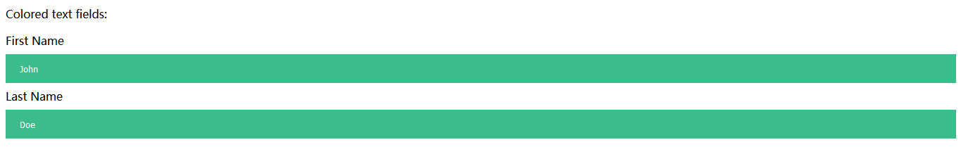
<body>
<p>Colored text fields:</p>
<form>
<label for="fname">First Name</label>
<input type="text" id="fname" name="fname" value="John">
<label for="lname">Last Name</label>
<input type="text" id="lname" name="lname" value="Doe">
</form>
</body>
</html>Focused Inputs
默认情况下,某些浏览器会在 input 栏获得焦点的时候增加 input 栏的外围蓝色轮廓。你可以通过对 input 添加 outline: none; 来去掉这个默认行为。
在 input 栏获得焦点的时候,使用 :focus 选择器对它做出某些改变:
/* 背景蓝 */
input[type=text]:focus {
    background-color: lightblue;
}
/* 边框黑 */
input[type=text]:focus {
border: 3px solid #555;
}
<!DOCTYPE html>
<html>
<head>
<meta charset="utf-8" />
<style>
div {
padding: 20px;
border: 1px solid blue;
}
</style>
</head>
<body>
<div>
<iframe src="iframe_a.html" width="49.5%" height="300px;"></iframe>
<iframe src="iframe_b.html" width="49.5%" height="300px;"></iframe>
</div>
</body>
</html>
<!-- iframe_a.html -->
<!DOCTYPE html>
<html>
<head>
<style>
input[type=text] {
width: 100%;
padding: 12px 20px;
margin: 8px 0;
box-sizing: border-box;
border: 1px solid #555;
outline: none;
}
input[type=text]:focus {
background-color: lightblue;
}
</style>
</head>
<body>
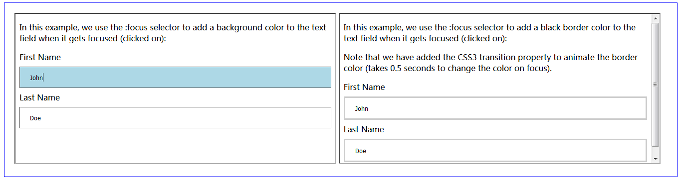
<p>
In this example, we use the :focus selector to add a background
color to the text field when it gets focused (clicked on):
</p>
<form>
<label for="fname">First Name</label>
<input type="text" id="fname" name="fname" value="John">
<label for="lname">Last Name</label>
<input type="text" id="lname" name="lname" value="Doe">
</form>
</body>
</html>
<!-- iframe_b.html -->
<!DOCTYPE html>
<html>
<head>
<style>
input[type=text] {
width: 100%;
padding: 12px 20px;
margin: 8px 0;
box-sizing: border-box;
border: 3px solid #ccc;
-webkit-transition: 0.5s;
transition: 0.5s;
outline: none;
}
input[type=text]:focus {
border: 3px solid #555;
}
</style>
</head>
<body>
<p>
In this example, we use the :focus selector to add a black
border color to the text field when it gets focused (clicked on):
</p>
<p>
Note that we have added the CSS3 transition property to animate
the border color (takes 0.5 seconds to change the color on focus).
</p>
<form>
<label for="fname">First Name</label>
<input type="text" id="fname" name="fname" value="John">
<label for="lname">Last Name</label>
<input type="text" id="lname" name="lname" value="Doe">
</form>
</body>
</html>Input with icon/image
如果你想让 input 内有图标,请使用 background-image 属性,并且使用 background-position 对它进行定位。需要注意的是,为了给图标预留空间,我们增大了左侧内边距:
input[type=text] {
    background-color: white;
    background-image: url('searchicon.png');
    background-position: 10px 10px;
    background-repeat: no-repeat;
    padding-left: 40px;
}
<!DOCTYPE html>
<html>
<head>
<style>
input[type=text] {
    width: 100%;
    box-sizing: border-box;
    border: 2px solid #ccc;
    border-radius: 4px;
    font-size: 16px;
    background-color: white;
    background-image: url('http://www.w3schools.com/css/searchicon.png');
    background-position: 10px 10px;
    background-repeat: no-repeat;
    padding: 12px 20px 12px 40px;
}
</style>
</head>
<body>
    <p>Input with icon:</p>
    <form>
        <input type="text" name="search" placeholder="Search..">
    </form>
</body>
</html>
Animated Search Input
在本例中,当搜索输入栏(search input)获得焦点的时候,我们用 CSS3 的 transition 属性使它的宽动态改变。你将在 CSS3 Transitions 章节学习到更多有关 transition 属性的内容。
input[type=text] {
    -webkit-transition: width 0.4s ease-in-out;
    transition: width 0.4s ease-in-out;
}

input[type=text]:focus {
    width: 100%;
}
<!DOCTYPE html>
<html>
<head>
<style>
input[type=text] {
    width: 130px;
    box-sizing: border-box;
    border: 2px solid #ccc;
    border-radius: 4px;
    font-size: 16px;
    background-color: white;
    background-image: url('http://www.w3schools.com/css/searchicon.png');
    background-position: 10px 10px;
    background-repeat: no-repeat;
    padding: 12px 20px 12px 40px;
    -webkit-transition: width 0.4s ease-in-out;
    transition: width 0.4s ease-in-out;
}

input[type=text]:focus {
    width: 100%;
}
</style>
</head>
<body>
    <p>Animated search input:</p>
    <form>
        <input type="text" name="search" placeholder="Search..">
    </form>
</body>
</html>
Styling Textareas
提示:使用 resize 属性以阻止 textareas 调整大小(使处于右下角的 "grabber" 失效):
textarea {
    width: 100%;
    height: 150px;
    padding: 12px 20px;
    box-sizing: border-box;
    border: 2px solid #ccc;
    border-radius: 4px;
    background-color: #f8f8f8;
    resize: none;
}
<!DOCTYPE html>
<html>
<head>
<meta charset="utf-8" />
<style>
div {
padding: 20px;
border: 1px solid blue;
}
</style>
</head>
<body>
<div>
<iframe src="iframe_a.html" width="49.5%" height="300px;"></iframe>
<iframe src="iframe_b.html" width="49.5%" height="300px;"></iframe>
</div>
</body>
</html>
<!-- iframe_a.html -->
<!DOCTYPE html>
<html>
<head>
<style>
textarea {
width: 100%;
height: 150px;
padding: 12px 20px;
box-sizing: border-box;
border: 2px solid #ccc;
border-radius: 4px;
background-color: #f8f8f8;
font-size: 16px;
/* resize: none; */
}
</style>
</head>
<body>
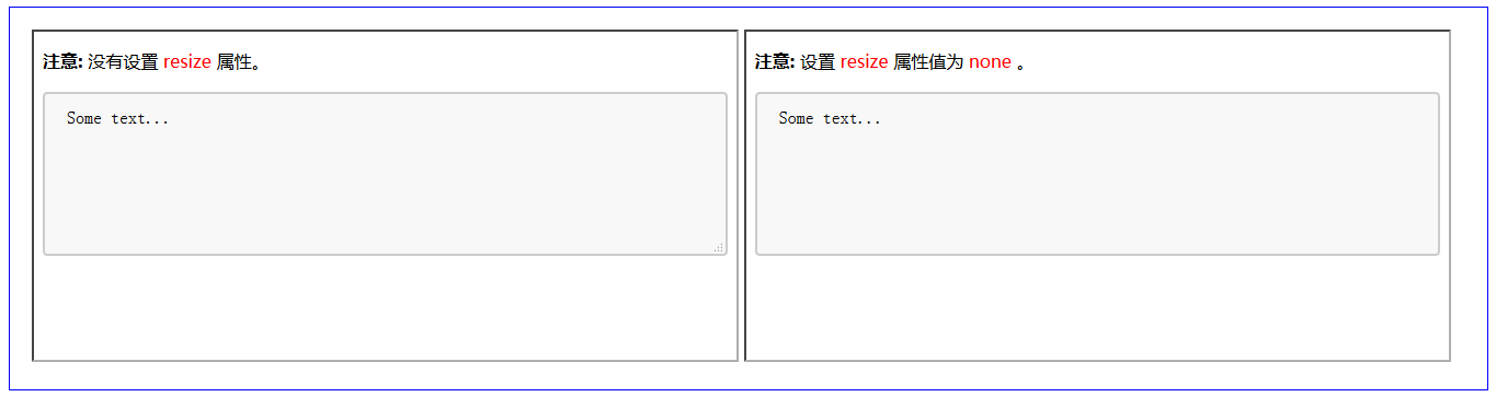
<p>
<strong>注意:
</strong> 没有设置 <font color="red">resize</font> 属性。
</p>
<form>
<textarea>Some text...</textarea>
</form>
</body>
</html>
<!-- iframe_b.html -->
<!DOCTYPE html>
<html>
<head>
<style>
textarea {
width: 100%;
height: 150px;
padding: 12px 20px;
box-sizing: border-box;
border: 2px solid #ccc;
border-radius: 4px;
background-color: #f8f8f8;
font-size: 16px;
resize: none;
}
</style>
</head>
<body>
<p>
<strong>注意:
</strong> 设置 <font color="red">resize</font> 属性值为 <font color="red">none</font> 。
</p>
<form>
<textarea>Some text...</textarea>
</form>
</body>
</html>Styling Select Menus
select {
    width: 100%;
    padding: 16px 20px;
    border: none;
    border-radius: 4px;
    background-color: #f1f1f1;
}
<!DOCTYPE html>
<html>
<head>
<style>
select {
    width: 100%;
    padding: 16px 20px;
    border: none;
    border-radius: 4px;
    background-color: #f1f1f1;
}
</style>
</head>
<body>
    <p>A styled select menu.</p>
    <form>
        <select id="country" name="country">
            <option value="au">Australia</option>
            <option value="ca">Canada</option>
            <option value="usa">USA</option>
        </select>
    </form>
</body>
</html>
Styling Input Buttons
input[type=button], input[type=submit], input[type=reset] {
    background-color: #4CAF50;
    border: none;
    color: white;
    padding: 16px 32px;
    text-decoration: none;
    margin: 4px 2px;
    cursor: pointer;
}

/* Tip: use width: 100% for full-width buttons */
<!DOCTYPE html>
<html>
<head>
<style>
input[type=button], input[type=submit], input[type=reset] {
    background-color: #4CAF50;
    border: none;
    color: white;
    padding: 16px 32px;
    text-decoration: none;
    margin: 4px 2px;
    cursor: pointer;
}
</style>
</head>
<body>
    <p>Styled input buttons.</p>
    <input type="button" value="Button">
    <input type="reset" value="Reset">
    <input type="submit" value="Submit">
</body>
</html>
关于更多如何使用 CSS 样式化按钮的内容,请查看 CSS3 Buttons Tutorial 章节。


 扫一扫
扫一扫
 1114
1114

 被折叠的 条评论
为什么被折叠?
被折叠的 条评论
为什么被折叠?
 到【灌水乐园】发言


