


原始网址:http://www.w3schools.com/css/css3_borders.asp
翻译:
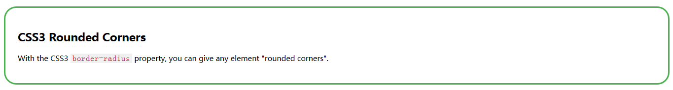
CSS3 圆角(CSS3 Rounded Corners)
<!DOCTYPE html>
<html>
<head>
<style>
.w3-theme-border {
    border-color: #4caf50 !important;
}

.w3-codespan {
    background-color: #f1f1f1;
    color: crimson;
    font-size: 110%;
    padding-left: 4px;
    padding-right: 4px;
}
</style>
</head>
<body>
    <div class="w3-theme-border" style="border-width: 3px; border-style: solid; margin-top: 20px; font-size: 15px; padding: 25px; border-radius: 25px;">
        <h2>CSS3 Rounded Corners</h2>
        <p>With the CSS3 <code class="w3-codespan">border-radius</code> property, you can give any element "rounded corners".</p>
    </div>
</body>
</html>
Browser Support
表格里的数字代表对 CSS3 属性全面支持的各浏览器的第一个版本号。
数字之后跟从 -webkit- 或 -moz- 指定带前缀工作的第一个版本号。
| 属性(Property) |  |  |  |  |  |
|---|---|---|---|---|---|
| border-radius | 5.0 4.0 -webkit- | 9.0 | 4.0 3.0 -moz- | 5.0 3.1 -webkit- | 10.5 |
CSS3 border-radius 属性(CSS3 border-radius Property)
通过使用 CSS3 的 border-radius 属性,你可以给任何元素添加“圆角”。
以下为 3 个示例:
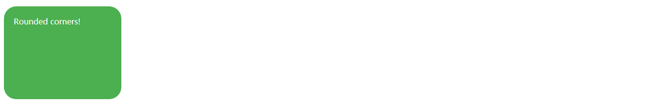
给带特定背景色的元素添加圆角效果:
<!DOCTYPE html>
<html>
<head>
<style>

#rcorners1 {

    border-radius: 25px;
    height: 150px;
    padding: 20px;
    width: 200px;
}

.w3-theme {
    background-color: #4caf50 !important;
    color: #fff !important;
}
</style>
</head>
<body>
    <p id="rcorners1" class="w3-theme">Rounded corners!</p>
</body>
</html>
给带边框的元素添加圆角效果:
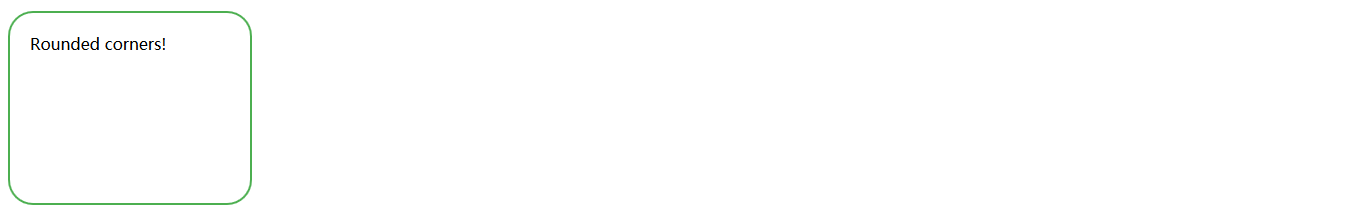
<!DOCTYPE html>
<html>
<head>
<style>

#rcorners2 {

    border-radius: 25px;
    border-style: solid;
    border-width: 2px;
    height: 150px;
    padding: 20px;
    width: 200px;
}

.w3-theme-border {
    border-color: #4caf50 !important;
}
</style>
</head>
<body>
    <p id="rcorners2" class="w3-theme-border">Rounded corners!</p>
</body>
</html>
给带背景图的元素添加圆角效果:
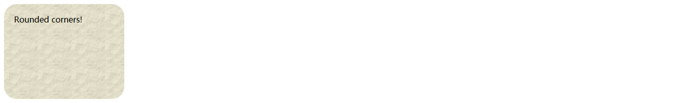
<!DOCTYPE html>
<html>
<head>
<style>

#rcorners3 {

    background: rgba(0, 0, 0, 0) url("http://www.w3schools.com/css/paper.gif") repeat scroll left top;
    border-radius: 25px;
    height: 150px;
    padding: 20px;
    width: 200px;
}
</style>
</head>
<body>
    <p id="rcorners3">Rounded corners!</p>
</body>
</html>
以下为综合代码:
<!DOCTYPE html>
<html>
<head>
<style>
#rcorners1 {
border-radius: 25px;
background: #73AD21;
padding: 20px;
width: 200px;
height: 150px;
}
#rcorners2 {
border-radius: 25px;
border: 2px solid #73AD21;
padding: 20px;
width: 200px;
height: 150px;
}
#rcorners3 {
border-radius: 25px;
background: url("http://www.w3schools.com/css/paper.gif");
background-position: left top;
background-repeat: repeat;
padding: 20px;
width: 200px;
height: 150px;
}
</style>
</head>
<body>
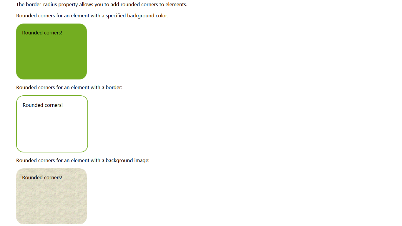
<p>The border-radius property allows you to add rounded corners to elements.</p>
<p>Rounded corners for an element with a specified background color:</p>
<p id="rcorners1">Rounded corners!</p>
<p>Rounded corners for an element with a border:</p>
<p id="rcorners2">Rounded corners!</p>
<p>Rounded corners for an element with a background image:</p>
<p id="rcorners3">Rounded corners!</p>
</body>
</html>| 提示:border-radius 属性实际上是 border-top-left-radius、border-top-right-radius、border-bottom-right-radius 和 border-bottom-left-radius 的简写属性。 |
CSS3 border-radius - Specify Each Corner
如果你只对 border-radius 属性指定单个值,此半径(radius)会应用于所有 4 个角。
然而,如果你喜欢,你可以单独指定每个角。规则如下:
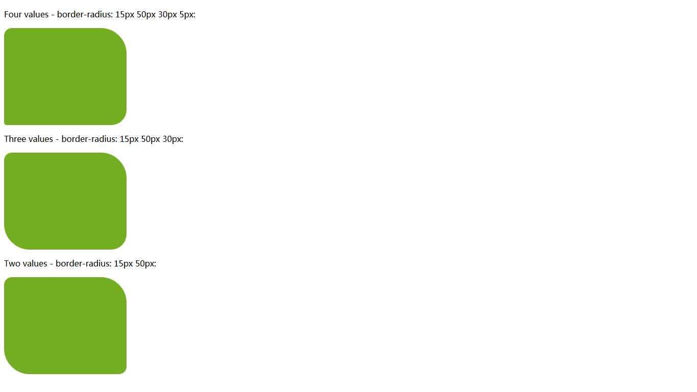
- Four values: 第 1 个值作用于左上角,第 2 个值作用于右上角,第 3 个值作用于右下角,第 4 个值作用于左下角。
- Three values: 第 1 个值作用于左上角,第 2 个值作用于右上角,第 3 个值作用于右下角。
- Two values: 第 1 个值作用于左上角和右下角,第 2 个值作用于右上角和左下角。
- One value: 4 角产生均等圆弧。
以下为 3 个示例:
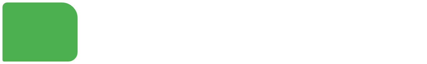
Four values - border-radius: 15px 50px 30px 5px:
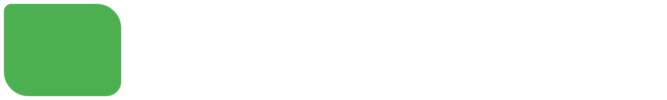
<!DOCTYPE html>
<html>
<head>
<style>

#rcorners4 {

    border-radius: 15px 50px 30px 5px;
    height: 150px;
    padding: 20px;
    width: 200px;
}

.w3-theme {
    background-color: #4caf50 !important;
    color: #fff !important;
}
</style>
</head>
<body>
    <p id="rcorners4" class="w3-theme"></p>
</body>
</html>
Three values - border-radius: 15px 50px 30px:
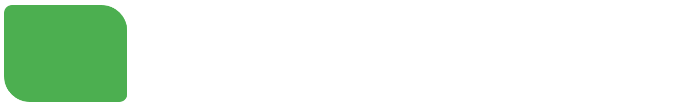
<!DOCTYPE html>
<html>
<head>
<style>

#rcorners5 {

    border-radius: 15px 50px 30px;
    height: 150px;
    padding: 20px;
    width: 200px;
}

.w3-theme {
    background-color: #4caf50 !important;
    color: #fff !important;
}
</style>
</head>
<body>
    <p id="rcorners5" class="w3-theme"></p>
</body>
</html>
Two values - border-radius: 15px 50px:
<!DOCTYPE html>
<html>
<head>
<style>

#rcorners6 {

    border-radius: 15px 50px;
    height: 150px;
    padding: 20px;
    width: 200px;
}

.w3-theme {
    background-color: #4caf50 !important;
    color: #fff !important;
}
</style>
</head>
<body>
    <p id="rcorners6" class="w3-theme"></p>
</body>
</html>
以下为综合代码:
<!DOCTYPE html>
<html>
<head>
<style>
#rcorners4 {
border-radius: 15px 50px 30px 5px;
background: #73AD21;
padding: 20px;
width: 200px;
height: 150px;
}
#rcorners5 {
border-radius: 15px 50px 30px;
background: #73AD21;
padding: 20px;
width: 200px;
height: 150px;
}
#rcorners6 {
border-radius: 15px 50px;
background: #73AD21;
padding: 20px;
width: 200px;
height: 150px;
}
</style>
</head>
<body>
<p>Four values - border-radius: 15px 50px 30px 5px:</p>
<p id="rcorners4"></p>
<p>Three values - border-radius: 15px 50px 30px:</p>
<p id="rcorners5"></p>
<p>Two values - border-radius: 15px 50px:</p>
<p id="rcorners6"></p>
</body>
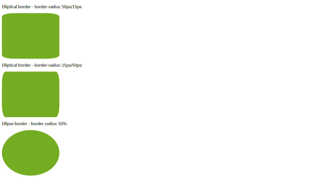
</html>你也可以创建椭圆角:
#rcorners7 {
    border-radius: 50px/15px;
    background: #73AD21;
    padding: 20px;
    width: 200px;
    height: 150px;
}

#rcorners8 {
    border-radius: 15px/50px;
    background: #73AD21;
    padding: 20px;
    width: 200px;
    height: 150px;
}

#rcorners9 {
    border-radius: 50%;
    background: #73AD21;
    padding: 20px;
    width: 200px;
    height: 150px;
}
<!DOCTYPE html>
<html>
<head>
<style>
#rcorners7 {
    border-radius: 50px/15px;
    background: #73AD21;
    padding: 20px;
    width: 200px;
    height: 150px;
}

#rcorners8 {
    border-radius: 15px/50px;
    background: #73AD21;
    padding: 20px;
    width: 200px;
    height: 150px;
}

#rcorners9 {
    border-radius: 50%;
    background: #73AD21;
    padding: 20px;
    width: 200px;
    height: 150px;
}
</style>
</head>
<body>
    <p>Elliptical border - border-radius: 50px/15px:</p>
    <p id="rcorners7"></p>
    <p>Elliptical border - border-radius: 15px/50px:</p>
    <p id="rcorners8"></p>
    <p>Ellipse border - border-radius: 50%:</p>
    <p id="rcorners9"></p>
</body>
</html>


 405
405


 被折叠的 条评论
为什么被折叠?
被折叠的 条评论
为什么被折叠?
 到【灌水乐园】发言


