


原始网址:http://www.w3schools.com/css/css3_text_effects.asp
翻译:
CSS3 文本
CSS3 文本
CSS3 包含几个新的文本特征。
在本章,你将学习到以下文本属性:
- text-overflow
- word-wrap
- word-break
Browser Support
表格里的数字代表对 CSS3 属性全面支持的各浏览器的第一个版本号。
数字之后跟从 -o- 指定带前缀工作的第一个版本号。
| 属性(Property) |  |  |  |  |  |
|---|---|---|---|---|---|
| text-overflow | 4.0 | 6.0 | 7.0 | 3.1 | 11.0 9.0 -o- |
| word-wrap | 23.0 | 5.5 | 3.5 | 6.1 | 12.1 |
| word-break | 4.0 | 5.5 | 15.0 | 3.1 | 15.0 |
CSS3 文本溢出
CSS3 text-overflow 属性指定如何溢出对用户不显示却应该有所示意的内容。
它可以被剪切:

<!DOCTYPE html>
<html>
<head>
<style>
#overflow1 {
    border: 1px solid #000000;
    overflow: hidden;
    text-overflow: clip;
    white-space: nowrap;
    width: 200px;
}
</style>
</head>
<body>
    <p id="overflow1">This is some long text that will not fit in the box</p>
</body>
</html>
或它可以被渲染为省略(…):

<!DOCTYPE html>
<html>
<head>
<style>
#overflow2 {
    border: 1px solid #000000;
    overflow: hidden;
    text-overflow: ellipsis;
    white-space: nowrap;
    width: 200px;
}
</style>
</head>
<body>
    <p id="overflow2">This is some long text that will not fit in the box</p>
</body>
</html>
CSS 代码如下:
p.test1 {
    white-space: nowrap;
    width: 200px;
    border: 1px solid #000000;
    overflow: hidden;
    text-overflow: clip;
}

p.test2 {
    white-space: nowrap;
    width: 200px;
    border: 1px solid #000000;
    overflow: hidden;
    text-overflow: ellipsis;
}
下列示例展示,当鼠标指针悬停元素之上的时候,你如何显示溢出的内容:
div.test:hover {
    text-overflow: inherit;
    overflow: visible;
}
<!DOCTYPE html>
<html>
<head>
<style>
div.test {
    white-space: nowrap;
    width: 200px;
    overflow: hidden;
    border: 1px solid #000000;
}

div.test:hover {
    text-overflow: inherit;
    overflow: visible;
}
</style>
</head>
<body>
    <p>Hover over the two divs below, to see the entire text.</p>
    <div class="test" style="text-overflow: ellipsis;">This is some long text that will not fit in the box</div>
    <br>
    <div class="test" style="text-overflow: clip;">This is some long text that will not fit in the box</div>
</body>
</html>
CSS3 自动换行(CSS Word Wrapping)
CSS3 属性允许过长的单词组(long words)可自动换行。
如果单个单词过长而无法填充到区域内,它将扩张至区域外:
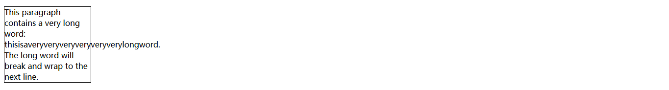
<!DOCTYPE html>
<html>
<head>
<style>
#normal {
    border: 1px solid #000000;
    overflow-wrap: normal;
    width: 11em;
}
</style>
</head>
<body>
    <p id="normal">
        This paragraph contains a very long word: thisisaveryveryveryveryveryverylongword. The long word will break and wrap to the next line.
    </p>
</body>
</html>
word-wrap 属性允许你可对文本强制折行 - 即使这意味着单词会被分割:
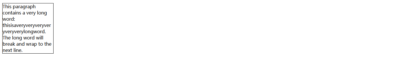
<!DOCTYPE html>
<html>
<head>
<style>
#wordwrap {
    border: 1px solid #000000;
    overflow-wrap: break-word;
    width: 11em;
}
</style>
</head>
<body>
    <p id="wordwrap">
        This paragraph contains a very long word: thisisaveryveryveryveryveryverylongword. The long word will break and wrap to the next line.
    </p>
</body>
</html>
CSS 代码如下:
/* 允许过长单词组(long words)自动换行 */
p {
    word-wrap: break-word;
}
CSS3 断字(CSS3 Word Breaking)
CSS3 word-break 属性指定断行规则:

<!DOCTYPE html>
<html>
<head>
<style>
p.test1 {
    border: 1px solid #000000;
    width: 140px;
    word-break: keep-all;
}
</style>
</head>
<body>
    <p class="test1">This paragraph contains some text. This line will-break-at-hyphens.</p>
</body>
</html>
<!DOCTYPE html>
<html>
<head>
<style>
p.test2 {
    border: 1px solid #000000;
    width: 140px;
    word-break: break-all;
}
</style>
</head>
<body>
    <p class="test2">This paragraph contains some text. The lines will break at any character.</p>
</body>
</html>
CSS 代码如下:
p.test1 {
    word-break: keep-all;
}

p.test2 {
    word-break: break-all;
}


 3808
3808


 被折叠的 条评论
为什么被折叠?
被折叠的 条评论
为什么被折叠?
 到【灌水乐园】发言


