


HTML5+CSS3 做一个鼠标悬停按钮发光效果,代码简单,没什么难点。
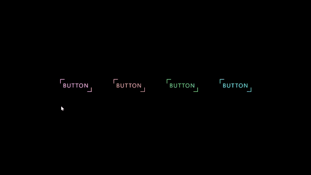
效果:
源码:
<!DOCTYPE html>
<html lang="en">

<head>
    <meta charset="UTF-8">
    <meta http-equiv="X-UA-Compatible" content="IE=edge">
    <meta name="viewport" content="width=device-width, initial-scale=1.0">
    <title>鼠标悬停按钮发光</title>
    <link rel="stylesheet" href="./1.css">
</head>

<body>
    <span>button</span>
    <span>button</span>
    <span>button</span>
    <span>button</span>
</body>

</html>
css:
* {
    margin: 0;
    padding: 0;
    box-sizing: border-box;
}
html,body {
    display: flex;
    justify-content: center;
    align-items: center;
    min-height: 100%;
    background: #000;
}
span {
    position: relative;
    margin: 40px;
    padding: 10px;
    color: #21ebff;
    /* 标准文本 */
    text-decoration: none;
    /* 文本单词大写 */
    text-transform: uppercase;
    letter-spacing: 2px;
    font-size: 20px;
    transition: .5s;
    overflow: hidden;
}

span::before {
    content: '';
    position: absolute;
    top: 0;
    left: 0;
    width: 14px;
    height: 14px;
    border-left: 2px solid #21ebff;
    border-top: 2px solid #21ebff;
    transition: .5s;
}
span::after {
    content: '';
    position: absolute;
    bottom: 0;
    right: 0;
    width: 14px;
    height: 14px;
    border-bottom: 2px solid #21ebff;
    border-right: 2px solid #21ebff;
    transition: .5s;
}
span:hover::after {
    width: 100%;
    height: 100%;
}
span:hover::before {
    width: 100%;
    height: 100%;
}
span:hover {
    background: #21ebff;
    color: #fff;
    box-shadow: 0 0 40px #21ebff;
    transition-delay: .3s;
    -webkit-box-reflect: below 0 linear-gradient(transparent,rgba(0 0 0 .4));
}
span:nth-child(1) {
    filter: hue-rotate(100deg);
}
span:nth-child(2) {
    filter: hue-rotate(180deg);
}
span:nth-child(3) {
    filter: hue-rotate(300deg);
}


 734
734


 被折叠的 条评论
为什么被折叠?
被折叠的 条评论
为什么被折叠?
 到【灌水乐园】发言


