


@[TOC](文章目录)
#任务目标
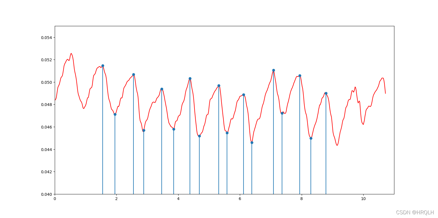
以折线图的形式表现信号,以茎图的形式表现波峰波谷数值,检验给出的波峰波谷数值是否与原信号相符
一、Material
数据:GitHub - SHUTCM-tcme/AMAData: Data of AMA
数据组成:1.源数据文件 2.result文件(已经检验过的波峰波谷位置及数据)
二、使用步骤
1.引入库
代码如下:
import numpy as np
from matplotlib import pyplot as plt
import xlrd
2.导入数据
代码如下:
book = xlrd.open_workbook(r'G:\SRTP\test_data.xlsx') #打开excel文件
table = book.sheets()[0]                             #打开文件中第一个表格
3.读取数据(原信号数据)
x1 = table.col_values(0, 4)     #x1=第一列从第四行以后的数据
y1 = table.col_values(14, 4)
4.读取数据(波峰波谷数据)
def get_crests(x2, y2):
    a = [108, 173, 230, 297, 363, 427, 494, 559, 626, 159, 218, 283, 349, 414, 478, 542, 610]   #波峰波谷行位置
    a.sort()
#读取波峰波谷数据
    for name in a:
       time = table.cell_value(name+1, 0)  #读取单元格
       data = table.cell_value(name+1, 14)
       x2.append(time)                     #将数据添加进数组
       y2.append(data)
5.画图
def draw(x1, y1, x2, y2):
    fig, ax = plt.subplots()      #创建画布
    ax.set_xlim(0, 12)            #设置x轴范围 set_xlim(start, end)
    ax.set_ylim(0.105, 0.124)
    ax.plot(x1, y1, color='red')  #创建信号点 plot(x轴数据,y轴数据, 颜色)
    ax.stem(x2, y2)               #创建茎图点 stem(x轴数据,y轴数据)
    plt.show()                    #绘图
6.main()
x2 = []
y2 = []
get_crests(x2, y2)
draw(x1, y1, x2, y2)
三、结果显示
四、如何将两张子图合并到一张图上(同X同Y轴)
1. 创建一张画布
fig, ax = plt.subplots()
2.完成画布设置
ax.set_xlim(0, 12) #设置x轴范围 set_xlim(start, end)
ax.set_ylim(0.105,
 最低0.47元/天 解锁文章


 2640
2640

 被折叠的 条评论
为什么被折叠?
被折叠的 条评论
为什么被折叠?
 到【灌水乐园】发言


