


变形transform:平移、旋转、缩放
变形通过css改变元素的形状或者位置
但不该页面布局
1. 平移
属性
translateX()沿着x轴方向平移translateY()沿着y轴方向平移translateZ()沿着z轴方向平移元素
z轴就是人眼与屏幕的方向
如果用百分比去平移,那百分比是相对于自身计算的
垂直水平居中的方式举例
- 使用绝对定位
/* 这种居中方式,只适用于元素的大小确定 */ position: absolute; top: 0; left: 0; bottom: 0; right: 0; margin: auto; - 使用
table-cell/* table-cell的方式具有一定局限性 */ display: table-cell; vertical-align: middle; text-align: center; - 使用平移
/* transform变形平移的方式 */
position: absolute;
left: 50%;
top: 50%;
transform: translateX(-50%) translateY(-50%);
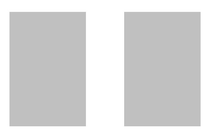
示例:浮出效果
div {
    float: left;
    width: 200px;
    height: 300px;
    background-color: silver;
    margin: 100px 50px auto 50px;
    transition: all .3s;
}

div:hover {
    box-shadow: 0 0 10px rgba(0, 0, 0, .2);
    transform: translateY(-5px);
}
z轴平移
z轴就是、调整我们人眼与元素之间的距离
立体效果,近大远小
注意:默认情况网页是不支持透视的,使用z轴平移,必须设置网页的视距
视距在html里面设置,参数是拟定人眼与页面的距离
html {
    background-color: rgb(71, 44, 32);
    perspective: 800px;
}
示例
html {
    background-color: rgb(71, 44, 32);
    perspective: 800px;
}

.box {
    width: 200px;
    height: 300px;
    background-color: silver;
    margin: 100px auto;
    transition: all .3s;
}

.box:hover {
    box-shadow: 0 0 10px rgba(0, 0, 0, .2);
    transform: translateZ(200px);
}

2. 旋转
属性
rotateX()沿x轴旋转rotateY()沿着y轴旋转rotateZ()z轴旋转
z 轴要开视距
/* transform: rotateY(0.5turn); */
transform: rotateY(180deg);

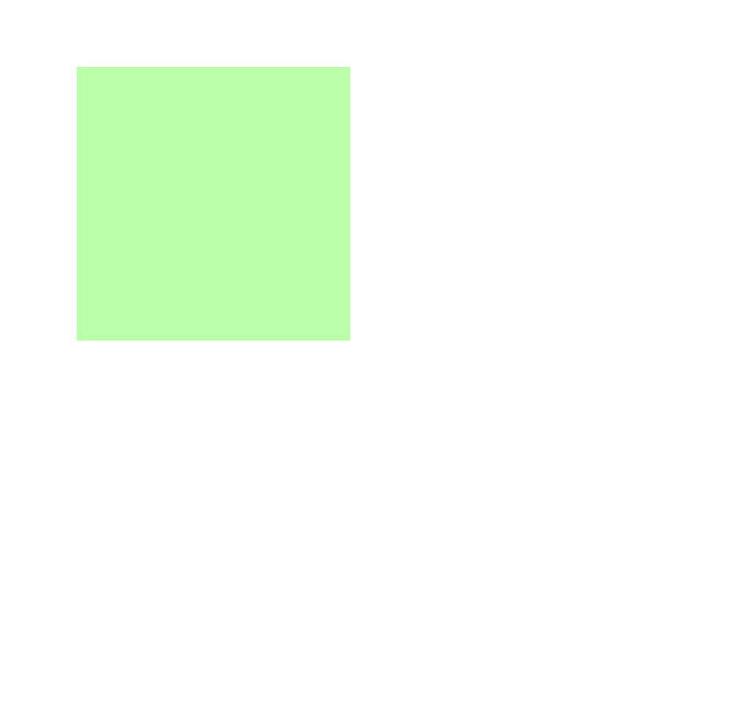
3. 缩放
对元素进行缩放
scalex()水平方向缩放scaley()垂直方向缩放scale水平垂直双方向缩放transform-origin变形原点设置
.box {
    height: 200px;
    width: 200px;
    background-color: #bfa;
    margin: 200px auto;
    transition: 2s;
}

.box:hover {
    /* transform: scaleX(2); */
    /* transform: scaleY(2); */
    transform: scale(2);
    /* 变形的原点 */
    transform-origin: 0 0;
}


 1万+
1万+


 被折叠的 条评论
为什么被折叠?
被折叠的 条评论
为什么被折叠?
 到【灌水乐园】发言


