


一、【HarmonyOS4.0】第四篇-ArkUI样式绑定和事件
ArkUI框架提供的基础组件直接或者间接的继承自 CommonMethod , CommonMethod 中定义的属性样式属于公共样式。下面就来学习这些样式
1.1.尺寸设置
●宽高设置
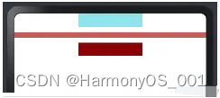
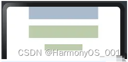
设置组件的宽高,缺省时使用组件自身内容的宽高,比如充满父布局可以使用 string 值:“100%”,当组件同时设置 size 和 width / height 时,以最后设置的值为准。
@Entry
@Component
struct TextExample {
  build() {
    Column({space:10}){
      Text()
        .size({width:220, height:25}) //设置宽高
        .width(120)                   //设置宽度,会覆盖上面的宽度
        .height(25)                   //设置高度,会覆盖上面的高度
        .backgroundColor("#8EE5EE")   //设置背景色

      Text()
        .width("100%")                //设置宽度
        .height(10)                   //设置高度
        .backgroundColor("#CD5555")   //设置背景色

      Text()
        .width(200)                   //设置宽度
        .height(200)                  //设置宽度
        .size({width:120, height:25}) //设置宽高、覆盖前边的值
        .backgroundColor("#8B0000")   //设置背景
    }
    .size({width:"100%", height:"100%"})

  }
}
预览效果如下:
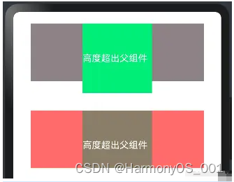
如果子组件的宽高大于父组件的宽高,默认情况下子组件会绘制出父组件的可视范围,此时可以设置 clip(true) 方法限制子组件超出父组件的范围,样例如下所示:
@Entry
@Component
struct TextExample02 {
  build() {
    Column({space:50}){
      Column(){
        Text("高度超出父组件")
          .width(120)
          .height(120) //高度超出父组件
          .fontColor(Color.White)
          .backgroundColor("#00EE76")
      }
      .width(300)
      .height(100)
      .backgroundColor("#8B8386")


      Column(){
        Text("高度超出父组件")
          .width(120)
          .height(120)
          .fontColor(Color.White)
          .backgroundColor("#8B7E66")
      }
      .width(300)
      .height(100)
      .backgroundColor("#FF6A6A")
      .clip(true) // 设置父组件对于超出范围的子组件做剪切处理

    }
    .width("100%")
    .height("100%")
    .padding(20)
  }
}
预览效果如下:
●宽高比设置
设置组件的宽高比:aspectRatio = width / height,在设备适配上比较实用。
@Entry
@Component
struct AspectRationExample {
  build() {
    Column({space:10}){
      Row({space:10}){
        //1:1
        Text().width(50).height(50).backgroundColor("#FF4040")

        //1:1
        Text().width(50).backgroundColor("#FF4040").aspectRatio(1) //设置宽高比

        //1.5:1
        Text().width(50).backgroundColor("#FF4040").aspectRatio(1.5) //设置宽高比

        // 0.5:1 = 50: 100
        Text().width(50).backgroundColor("#FF4040").aspectRatio(0.5) //设置宽高比
        //和上面的效果一样
        //Text().width(50).height(100).backgroundColor("#FF4040")

        // 宽和高的比例,50:100, 宽是高的0.5倍
        Text().height(100).backgroundColor("#FF4040").aspectRatio(0.5)

      }
      .padding(10).size({width:"100%", height:120})
    }
    .padding(10)
    .size({width:"100%", height:"100%"})
  }
}
预览效果如下:
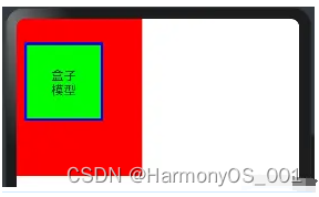
●边距设置
盒模型作为前端布局中最简单,也最重要的一项布局方式,CSS盒模型本质上是一个盒子,封装周围的HTML元素,它包括:外边距(margin)、边框(border)、内边距(padding)、实际内容(content)四个属性。CSS盒模型:标准模型 + IE模型
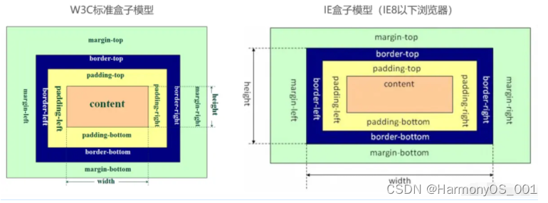
盒模型包括:
●内容(content):元素中显示的文本,图片等实际内容。
●内边距(padding):内容和边框之间的空白区域。
●边框(border):围绕内容和内边距的线条或图案。
●外边距(margin):边框和其他元素之间的空白区域。
标准模型和IE模型的区别计算宽度和高度的不同:
●标准盒模型:盒子总宽度/高度 = width/height + padding + border + margin。( 即 width/height 只是内容高度,不包含 padding 和 border 值 )
●IE盒子模型:盒子总宽度/高度 = width/height + margin = (内容区宽度/高度 + padding + border) + margin。( 即 width/height 包含了 padding 和 border 值 )
在HarmonyOS4.0中,盒模型也是类似的,代码如下
@Entry
@Component
struct BoxExample {
  build() {
    Row(){  // 创建一个水平布局的Row组件

      Text("盒子模型")  // 显示文本内容为“盒子模型”
        .height("100vp")  // 设置高度为视口宽度的百分之百
        .width("100vp")  // 设置宽度为视口宽度的百分之百
        .margin({left:"10vp", top:"30vp", right:"50vp", bottom:"70pv"})  // 设置外边距
        .border({width:"10px", style: BorderStyle.Solid, color: "#0000ff"})  // 设置边框样式
        .padding(30)  // 设置内边距
        .backgroundColor("#00ff00")  // 设置背景颜色为绿色
        .textAlign(TextAlign.Center)  // 设置文本水平居中对齐
    }.backgroundColor("#ff0000")  // 设置Row组件的背景颜色为红色
  }
}
预览效果如下:
在双向预览中查看盒模型构成,如下:
设置组件的内边距/外边距,当只设置一个值时表示对四个方向的边距同时生效;参数类型为 Padding / Margin 时,可单独设置边距,若设置为百分比时,上下左右内外距均以父容器的 width 作为基础值。案例代码如下:
@Entry
@Component
struct BoxExample02 {
  build() {
    Row(){
      Column(){
        Row(){
          Text()
            .width("100%")               //设置宽度充满父组件
            .height("100%")              //设置高度充满父组件
            .backgroundColor("#EE799F")  //设置背景色
        }
        .padding(20)                    //设置四个边距
        .backgroundColor("#FFF0F5")     //设置背景色
        .size({width:80, height:80})    //设置宽和高尺寸

        Row(){
          Text()
            .width("100%")                              //设置宽度充满父组件
            .height("100%")                             //设置高度充满父组件
            .backgroundColor("#EE799F")                 //设置背景色
        }
        .padding({left:5, top: 20, right:5,bottom:20})  //设置四个边距
        .backgroundColor("#FFF0F5")                     //设置背景色
        .size({width:80, height:80})                    //设置宽和高尺寸
        .margin(30)                                     //设置外边距,否则两个Row容器会挤在一起

      }
      .size({width:"100%",height:"100%"})
      .backgroundColor("#54FF9F")
    }
  }
}
预览效果如下:
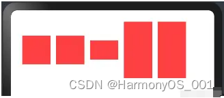
●权重设置
设置组件的布局权重,该属性仅在 Row、Column、Flex 布局中生效,表示在父容器主轴方向上的尺寸按照权重比进行分配,默认值为 0。
@Entry
@Component
struct WeightSettings {
build() {
Column({space:20}){
Row(){ //下面两个Text子组件全都设置了权重,则子组件的宽度按照权重比例分配
Text()
.height(30)
.backgroundColor("#F4A460")
.layoutWeight(1)
Text()
.height(30)
.backgroundColor("#5F9EA0")
.layoutWeight(1)
}
Row(){ //子组件全都设置了权重,则子组件的宽度按照权重比例分配,子组件设置的宽度无效
Text()
.width(80)
.height(30)
.backgroundColor("#F4A460")
.layoutWeight(1)
Text()
.width(150)
.height(30)
.backgroundColor("#5F9EA0")
.layoutWeight(1)
}
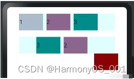
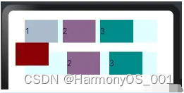
Row(){ // 除去无权重子组件的宽度,剩余子组件的宽度按照权重比例分配
Text()
.width(150)
.height(30)
.backgroundColor("#228B22")
Text()
.width(150)
.height(30)
.backgroundColor("#F4A460")
.layoutWeight(1)
Text()
.width(120)
.height(30)
.backgroundColor("#5F9EA0")
.layoutWeight(2)
}
}
.size({width:"100%", height:"100%"})
.padding({top:20, bottom:20})
}
}
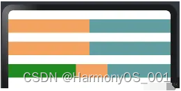
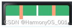
本样例中, Row 的每个子组件都设置了权重为 1 ,表示均分父组件的宽度,此时子组件设置的 width 是不起作用的,样例运行结果如下图所示:预览效果如下:
●尺寸约束
设置组件的约束尺寸从而在组件布局时对其尺寸进行限制,constraintSize() 的优先级高于 width() 和 height(),若设置的 minWidth 大于 maxWidth,则 minWidth 生效,minHeight 与 maxHeight 同理。
@Entry
@Component
struct SizeConstraints {
  build() {
    Column({space:20}){

      Text() // 目标参照组件
        .width(220)
        .height(40)
        .backgroundColor("#aabbcc")

      Text() // 设置约束尺寸
        .width(220)
        .height(40)
        .constraintSize({
          minWidth: 120,
          minHeight: 20
        })
        .backgroundColor("#bbccaa")

      Text() // 设置过最大约束尺寸,实际宽和高超过了,则按照约束显示
        .width(220)
        .height(40)
        .constraintSize({
          maxWidth: 120,
          maxHeight: 20
        })
        .backgroundColor("#bbccaa")

    }
    .size({width:"100%",height:"100%"})
  }
}
预览效果如下:
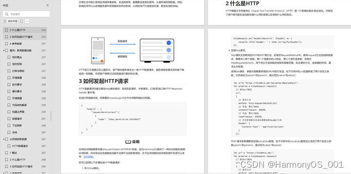
1.2.位置设置
●对齐方式
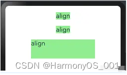
设置元素内容的对齐方式,当设置的 width 和 height 大小超过元素本身内容大小时生效。
@Entry
@Component
struct PositionSetting {
  build() {
    Column({space:20}){
      Text("align")  //默认样式
        .fontSize(20)
        .backgroundColor("#90EE90")

      Text("align")  //组件尺寸默认等于内容尺寸
        .fontSize(20)
        .backgroundColor("#90EE90")
        .align(Alignment.TopStart) //组件尺寸默认等于内容尺寸,不符合要求

      Text("align")
        .fontSize(20)
        .backgroundColor("#90EE90")
        .align(Alignment.TopStart)        //设置内容对齐方式
        .size({width: 200, height: 60})   //组件尺寸大于内容尺寸,符合条件

    }
    .size({width:"100%", height:"100%"})
    .padding(20)
  }
}
预览效果如下:
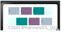
●布局方向
设置子组件在水平方向上的布局方式,Direction 定义了一下 3 种布局方式:
●Ltr:元素从左到右布局。
●Rtl:元素从右到左布局。
●Auto(默认值):使用系统默认布局方向。
案例代码如下:
@Entry
@Component
struct DirectionExample {
  build() {
    Column({space:20}){
      Row({space:10}){ //不设置子组件的对齐方式时采用默认值
        Text("1").height(50).width("25%").fontSize(18).backgroundColor("#AABBCC")

        Text("2").height(50).width("25%").fontSize(18).backgroundColor("#8B658B")

        Text("3").height(50).width("25%").fontSize(18).backgroundColor("#008B8B")
      }
      .width("90%")
      .backgroundColor("#E0FFFF")
      .direction(Direction.Rtl)

    }
    .width('100%')
    .height("100%")
    .padding(20)
  }
预览效果如下:
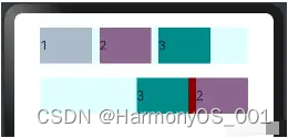
●绝对定位
设置当前组件在父组件中的位置,参照点为父容器顶点位置。在布局容器中,设置该属性不影响父容器布局,仅在绘制时进行位置调整。
@Entry
@Component
struct DirectionExample {
  build() {
    Column({space:20}){
      Row({space:10}){ //不设置子组件的对齐方式时采用默认值
        Text("1").height(50).width("25%").fontSize(18).backgroundColor("#AABBCC")

        Text("2").height(50).width("25%").fontSize(18).backgroundColor("#8B658B")

        Text("3").height(50).width("25%").fontSize(18).backgroundColor("#008B8B")
      }
      .width("90%")
      .backgroundColor("#E0FFFF")

      Row({space:10}){ //不设置子组件的对齐方式时采用默认值
        Text("1")
          .height(50)
          .width("25%")
          .fontSize(18)
          .backgroundColor("#8B0000")
          .position({x:200,y:0}) //使用绝对定位,设置组件位置

        Text("2").height(50).width("25%").fontSize(18).backgroundColor("#8B658B")

        Text("3").height(50).width("25%").fontSize(18).backgroundColor("#008B8B")
      }
      .width("90%")
      .backgroundColor("#E0FFFF")
      .direction(Direction.Rtl)

    }
    .width('100%')
    .height("100%")
    .padding(20)
  }
}
postion 属性会更改子组件的布局结构,预览效果如下,第二行的第一个text组件设置了位置,:
●相对定位
设置当前组件在父组件中的位置,参照点为自身顶点位置。设置该属性,不影响父容器布局,仅在绘制时进行位置调整。
@Entry
@Component
struct DirectionExample {
  build() {
    Column({space:20}){
      Row({space:10}){ //不设置子组件的对齐方式时采用默认值
        Text("1").height(50).width("25%").fontSize(18).backgroundColor("#AABBCC")

        Text("2").height(50).width("25%").fontSize(18).backgroundColor("#8B658B")

        Text("3").height(50).width("25%").fontSize(18).backgroundColor("#008B8B")
      }
      .width("90%")
      .backgroundColor("#E0FFFF")

      Row({space:10}){
        Text("1")
          .height(50)
          .width("25%")
          .fontSize(18)
          .backgroundColor("#8B0000")
          .offset({x:10,y:50}) //使用相对定位(相对之前的位置,参照点为自身顶点位置),设置组件位置

        Text("2").height(50).width("25%").fontSize(18).backgroundColor("#8B658B")

        Text("3").height(50).width("25%").fontSize(18).backgroundColor("#008B8B")
      }
      .width("90%")
      .backgroundColor("#E0FFFF")
      .direction(Direction.Rtl)

    }
    .width('100%')
    .height("100%")
    .padding(20)
  }
}
offset 属性只更改组件自身的布局结构。下面的text组件1,设置了相对定位,预览效果如下:
●锚点设置
设置元素在位置定位时的锚点,以自身顶点位置作为基准点进行偏移。设置该属性,不影响父容器布局,仅在绘制时进行位置调整。
@Entry
@Component
struct DirectionExample {
  build() {
    Column({space:20}){
      Row({space:10}){ //不设置子组件的对齐方式时采用默认值
        Text("1").height(50).width("25%").fontSize(18).backgroundColor("#AABBCC")

        Text("2").height(50).width("25%").fontSize(18).backgroundColor("#8B658B")

        Text("3").height(50).width("25%").fontSize(18).backgroundColor("#008B8B")
      }
      .width("90%")
      .backgroundColor("#E0FFFF")

      Row({space:20}){
        Text("1")
          .height(50)
          .width("25%")
          .fontSize(18)
          .backgroundColor("#8B0000")
          .markAnchor({x:20,y:20}) //以自身顶点位置作为基准点进行偏移

        Text("2").height(50).width("25%").fontSize(18).backgroundColor("#8B658B")

        Text("3").height(50).width("25%").fontSize(18).backgroundColor("#008B8B")
      }
      .width("90%")
      .backgroundColor("#E0FFFF")

    }
    .width('100%')
    .height("100%")
    .padding(20)
  }
}
markAnchor 属性只更改组件自身的布局结构,预览效果如下:
●约束条件(可以参考,相对定位容器里面的内容)
设置子组件在父组件 RelativeContainer 中的对齐方式,分为水平对齐规则和竖直对齐规则,分别说明如下:
●水平对齐规则
○left: 设置左对齐参数。
○middle: 设置中间对齐的参数。
○right: 设置右对齐参数。
●竖直对齐规则
○top: 设置顶部对齐的参数。
○bottom: 设置底部对齐的参数。
○center: 设置中心对齐的参数。
参考相对容器布局里面的内容。
1.3.背景设置
●背景色设置
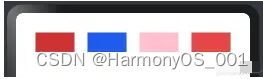
设置组件的背景颜色, ResourceColor 类型支持 Color | number | string | Resource 四种:
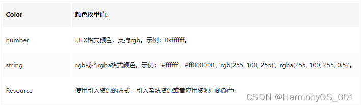
案例代码如下:
@Entry
@Component
struct ColorExample {
  build() {
    Row({space:20}) {
      Text()
        .height(30)
        //string
          //
          // rgb或者rgba格式颜色。
          // 示例:'#ffffff', '#ff000000', 'rgb(255, 100, 255)', 'rgba(255, 100, 255, 0.5)'。
        .backgroundColor("#CD3333")
        .layoutWeight(1)

      Text()
        .height(30)
        //number HEX格式颜色,支持rgb
        .backgroundColor(2055151)
        .layoutWeight(1)

      Text()
        .height(30)
        //颜色枚举值
        .backgroundColor(Color.Pink)
        .layoutWeight(1)

      Text()
        .height(30)
        .layoutWeight(1)
        //Resource 使用引入资源的方式,引入系统资源或者应用资源中的颜色
        .backgroundColor($r("sys.color.ohos_id_color_warning_dark"))

    }
    .width("100%")
    .padding(30)
  }
}
预览效果如下:
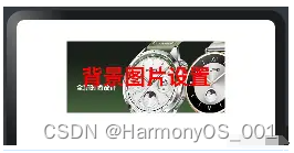
●背景图设置
设置组件的背景图片,repeat 参数可以设置图片的填充模式,例如代码下所示:
@Entry
@Component
struct ColorExample02 {
  build() {
    Column(){

      Text("背景图片设置")
        .fontSize(30)                                //字体大小
        .fontColor(Color.Red)                        //字体颜色
        .size({width:220, height:100})               //设置宽和高
        .backgroundImage($r('app.media.WATCHGT4'))   //设置组件的背景图片
        .textAlign(TextAlign.Center)
        .fontWeight(FontWeight.Bold)
    }
    .width("100%")
    .padding(30)
  }
}
预览效果如下:
1.4.边框设置
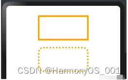
●边框样式
设置组件的边框样式,支持设置边框颜色、边框粗细、边框圆角以及边框的展示样式。同时设置 border 和 borderXXX ,以最后设置的值为准。
@Entry
@Component
struct BorderExample {
  build() {
    // 创建一个Column组件,设置间距为20
    Column({space:20}){
      // 创建一个Text组件,设置高度为80,宽度为160
      Text()
        .height(80)
        .width(160)
        // 通过参数设置边框样式
        .border({
          color:Color.Orange,        // 边框颜色为橙色
          width:5,                   // 边框宽度为5
          radius: 0,                 // 边框圆角半径为0,即直角
          style: BorderStyle.Solid   // 边框样式为实线
        })

      // 创建另一个Text组件,设置高度为80,宽度为160
      Text()
        .height(80)
        .width(160)
        // 通过属性设置边框样式
        .borderWidth(5)                  // 边框宽度为5
        .borderColor(Color.Orange)       // 边框颜色为橙色
        .borderRadius(15)                // 边框圆角半径为15
        .borderStyle(BorderStyle.Dotted) // 边框样式为点状线
    }
    // 设置Column组件的宽度为100%,内边距为30
    .width("100%")
    .padding(30)
  }
}
预览代码如下:
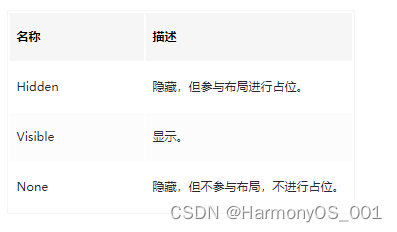
1.5:显隐设置
●显示和隐藏设置
设置组件的显示和隐藏, Visibility 类型说明如下:
●Visible(默认值):组件显示在页面上。
●Hidden:组件在屏幕上占位但是不显示。
●None:组件在屏幕上不显示也不占用位置。
简单样例如下图所示:
@Entry
@Component
struct VisibilityExample {
  build() {
    Column({space:20}){
      Row(){
        Text()
          .height(30)
          .width(120)
          .backgroundColor("#AABBCC")
          .layoutWeight(1)

        Text()
          .height(30)
          .width(120)
          .backgroundColor("#2E8B57")
          .visibility(Visibility.Visible) //设置为Hidden,虽然不在界面显示,但是还占着位置
          .layoutWeight(1)

        Text()
          .height(30)
          .backgroundColor("#CD8C95")
          .layoutWeight(1)
      }

      Row(){
        Text()
          .height(30)
          .width(120)
          .backgroundColor("#AABBCC")
          .layoutWeight(1)

        Text()
          .height(30)
          .width(120)
          .backgroundColor("#2E8B57")
          .visibility(Visibility.Hidden) //设置默认值Visible
          .layoutWeight(1)

        Text()
          .height(30)
          .backgroundColor("#CD8C95")
          .layoutWeight(1)
      }

      Row(){
        Text()
          .height(30)
          .width(120)
          .backgroundColor("#AABBCC")
          .layoutWeight(1)

        Text()
          .height(30)
          .width(120)
          .backgroundColor("#2E8B57")
          .visibility(Visibility.None) //设置为None就不会在界面上显示
          .layoutWeight(1)

        Text()
          .height(30)
          .backgroundColor("#CD8C95")
          .layoutWeight(1)
      }


    }
    .width("100%")
    .padding(30)
  }
}
预览效果如下:
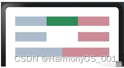
●显示优先级设置
设置当前组件在布局容器中显示的优先级,当父容器空间不足时,低优先级的组件会被隐藏,该属性仅在Row 、Column、和 Flex(单行) 容器组件中生效。
class ChildInfo {
  text: string = '';
  priority: number = 0;
}

class ContainerInfo {
  label: string = '';
  size: string = '';
}


@Entry
@Component
struct DisplayPriorityExample {
  @State currentIdx: number = 0

  private children: ChildInfo[] = [
    { text: '1\n(优先项:2)', priority: 2 },
    { text: '2\n(优先项:1)', priority: 1 },
    { text: '3\n(优先项:3)', priority: 3 },
    { text: '4\n(优先项:5)', priority: 5 },
    { text: '5\n(优先项:4)', priority: 4 }
  ]

  // 显示容器大小
  private container: ContainerInfo[] = [
    { label: 'Big container', size: '100%' },
    { label: 'Middle container', size: '50%' },
    { label: 'Small container', size: '25%' }
  ]

  build() {
    Column({space:20}){
      Flex({justifyContent: FlexAlign.SpaceBetween}){
        ForEach(this.children,(item:ChildInfo)=>{
          Text(item.text)
            .width(60)
            .height(160)
            .fontSize(20)
            .fontColor(Color.White)
            .textAlign(TextAlign.Center)
            .backgroundColor("#CD8C95")
            .displayPriority(item.priority)//使用displayPriority给子组件绑定显示优先级,数字越大优先级越高
        })
      }
      .width(this.container[this.currentIdx].size) //通过变量设置Flex父容器宽度
      .backgroundColor("#778899")

      Button(this.container[this.currentIdx].label) //切换父容器大小
        .backgroundColor("#66CDAA")
        .onClick(()=>{
          //点击后修改currentIdx的值为     (currentIdx+1)/3 取余数   1
          this.currentIdx = (this.currentIdx + 1) % this.container.length
        })
    }
    .width("100%")
    .padding(20)
  }
}
当父容器空间不足的时候。只会展示优先级高的子组件,优先级底的子组件会自动隐藏,如下:
1.6.多态样式
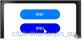
●多种状态样式设置
设置组件在不同状态下的显示样式,目前只支持通用属性, StateStyle 有以下几种状态:
●normal:设置组件默认情况下的显示样式。
●pressed:设置组件按下时的显示样式。
●disabled:设置组件不可用时的显示样式。
●focused:设置组件获取焦点时的显示样式。
●clicked:设置组件点击时的显示样式。
案例代码如下:
@Entry
@Component
struct StateStylesExample {
  build() {
    Column({space:20}){
      Button("按钮1")
        .width(200)
        .height(50)

      Button("按钮2")
        .width(200)
        .height(50)
        .stateStyles({
          normal:{
            .backgroundColor(Color.Blue) //设置默认情况下的显示样式
          },
          pressed:{
            .backgroundColor(Color.Red) //设置手指按下的显示样式
          }
        })

    }
    .width("100%")
    .padding({top:30,bottom:30})
  }
}
会发现上面的代码,给按钮2设置,点击的时候会变成红色,预览效果如下:
●@Styles样式设置
@Styles 作用是提取组件的公共样式,方便其他组件复用样式,它可以定义在组件内部或者组件外部,当定义在组件外部时需要添加 funcition 关键字,简单样例如下所示:
@Styles function buttonGlobalNormalStyles(){ //组件外定义按钮默认的样式
  .backgroundColor("#43CD80")
  .width(200)
  .height(50)
}

@Styles function buttonGlobalPressedStyles(){ //组件外定义按钮摁下的样式
  .backgroundColor("#FF7F50")
  .width(200)
  .height(50)
}


@Entry
@Component
struct StylesExample {
    @Styles buttonNormalStyles(){ //组件内定义按钮默认的样式
      .backgroundColor("#8B8682")
      .width(200)
      .height(50)
    }

    @Styles buttonPressedStyles(){ //组件内定义按钮摁下的样式
      .backgroundColor("#FF6347")
      .width(200)
      .height(50)
    }

  build() {
    Column({space:20}){
      Button("默认样式")
        .width(200)
        .height(50)

      Button("组件外样式")
        .stateStyles({
          normal:buttonGlobalNormalStyles, //使用组件外定义的按钮默认的样式
          pressed:buttonGlobalPressedStyles //使用组件外定义的按钮摁下的样式
        })

      Button("组件内样式")
        .stateStyles({
          normal:this.buttonNormalStyles, //使用组件内定义的按钮默认的样式
          pressed:this.buttonPressedStyles //使用组件内定义的按钮摁下的样式
        })

    }
    .width("100%")
    .padding({top:30,bottom:30})
  }
}
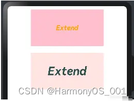
@Extend样式设置
在 UI 构建中,如果组件设置的属性都是相同的,比如 Text 组件的 fontColor、fontSize 等设置都一致,那么可以使用 @Extend 对 Text 组件进行扩展,提取相同的属性部分,这样可以有效降低代码量。简单样例如下所示:
@Extend(Text) // 使用@Extend装饰器扩展Text组件的样式
function textStyle(size:number=20, color:ResourceColor=Color.Orange,bgColor:ResourceColor=Color.Pink){
  .fontSize(size) // 设置字体大小为参数指定的大小
  .fontColor(color) // 设置字体颜色为参数指定的颜色
  .backgroundColor(bgColor) // 设置背景颜色为参数指定的颜色
  .fontStyle(FontStyle.Italic) // 设置字体样式为斜体
  .fontWeight(FontWeight.Bold) // 设置字体粗细为粗体
  .width(220) // 设置宽度为220
  .height(110) // 设置高度为110
  .textAlign(TextAlign.Center) // 设置文本对齐方式为居中
}

@Entry // 使用@Entry装饰器标识为入口文件
@Component // 使用@Component装饰器标识为组件
struct ExtendExample { // 定义名为ExtendExample的结构体
  build() { // 定义build方法
    Column({space:20}){ // 使用Column组件,设置间距为20
      Text("Extend").textStyle() // 使用Text组件并应用textStyle函数定义的样式
      Text("Extend").textStyle(35, "#2F4F4F", "#FFE4E1") // 使用Text组件并应用textStyle函数定义的样式,传入自定义的参数
    }
    .width('100%') // 设置宽度为100%
    .height("100%") // 设置高度为100%
    .padding(10) // 设置内边距为10
  }
}
@Extend 装饰器不能定义在 struct 内部,暂时无法在其它页面引入 Extend 样式。预览效果如下:
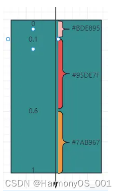
1.7.渐变颜色
设置组件的渐变样式,参数如下:
●angle:设置渐变的角度。
●direction:设置渐变方向,是angle的抽象
●colors:渐变颜色数组
●repeating:是否重复渲染。
示例代码如下:
.linearGradient({
  angle: 180, // 设置渐变角度
  colors: [['#BDE895', 0.1], ["#95DE7F", 0.6],  ["#7AB967", 1]] // 设置渐变颜色
})
组件渐变色方向旋转 180° ,在 [0 ~ 0.1] 区间渐变色为 #BDE895,在 [0.1, 0.6] 区间渐变色由 #BDE895 线性渐变成 #95DE7F ,在 [0.6, 1.0] 区间渐变色由 #95DE7F 线性渐变成 #7AB967 。如下图:
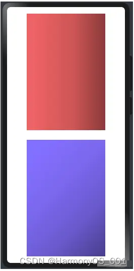
案例代码如下:
@Entry
@Component
struct LinearGradientExample {
  build() {
    // 创建一个Column组件,设置间距为30
    Column({space:30}){
      // 创建一个Text组件,设置宽度为240,高度为50,布局权重为1
      Text()
        .size({width:240, height: 50})
        .layoutWeight(1)
        // 设置线性渐变样式
        .linearGradient({
          angle:90, // 渐变角度为90度
          colors: [["#EE6363",0.1],["#CD5555",0.6],["#8B3A3A",1]] // 渐变颜色和位置
        })

      // 创建另一个Text组件,设置宽度为240,高度为50,布局权重为1
      Text()
        .size({width:240, height: 50})
        .layoutWeight(1)
        // 设置线性渐变样式
        .linearGradient({
          angle:135, // 渐变角度为135度
          colors: [["#8470FF",0.1],["#7B68EE",0.4],["#6A5ACD",0.7],["#483D8B",1]] // 渐变颜色和位置
        })

    }
    // 设置Column组件的宽度为100%,高度为100%,内边距为20
    .width("100%")
    .height("100%")
    .padding(20)
  }
}
预览效果如下:
二、公共事件类属性
2.1.点击事件
组件被点击时触发的事件。
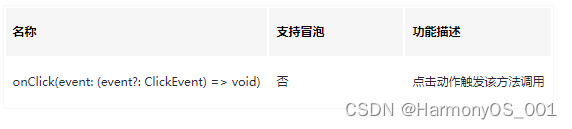
ClickEvent对象说明
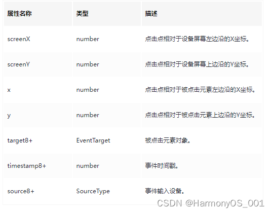
onClick:给组件添加点击事件的回调,设置回调后,当点击组件时会触发回调。回调参数 event 包含了点击信息,比如点击坐标等。
@Entry
@Component
struct OnclickExample {
  build() {
    Column(){
      Text("click text")
        .width(120)
        .height(40)
        .backgroundColor("#00868B")  //设置背景颜色
        .fontColor(Color.White)      //设置字体颜色
        .onClick(()=>{               //设置点击事件回调
          console.log("click text...........") //输出日志
        })
        .textAlign(TextAlign.Center)
    }
    .width("100%")
    .height("100%")
    .padding(30)
  }
}
点击 Text 组件,控制台会打印 click text… 的日志。
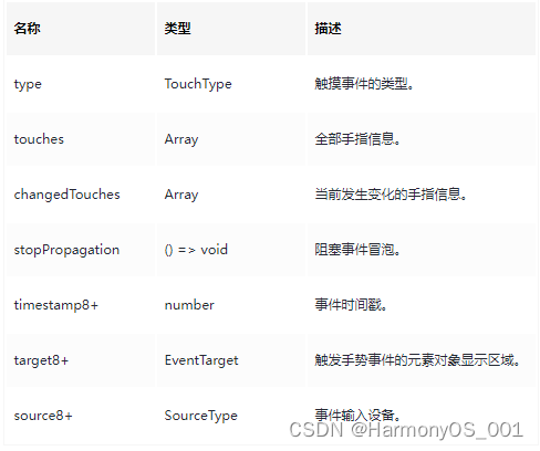
2.2.触摸事件
onTouch:给组件设置触摸事件的回调,设置回调后,当手指在组件上按下、滑动、抬起时触发组件时会触发该回调。回调参数 event 包含了事件类型、点击坐标等信息。事件如下:
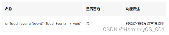
参数类型TouchEvent对象说明:
预览效果如下:
@Entry
@Component
struct OntouchExample {
  build() {
    Column(){
      Text("click text")
        .width(120)
        .height(40)
        .textAlign(TextAlign.Center)
        .backgroundColor("#00868B")  //设置背景颜色
        .fontColor(Color.White)      //设置字体颜色
        .onTouch((event)=>{ //设置触摸事件回调
          if(event.type == TouchType.Down){ //手指按下的事件回调
            console.log("touch down");
          }else if(event.type == TouchType.Move){//手指移动的事件回调
            console.log("touch move");
          }else if(event.type == TouchType.Cancel){ //触摸事件取消时的事件回调
            console.log("touch cancel");
          }else if(event.type == TouchType.Up){ //手指抬起的事件回调
            console.log("touch up");
          }
        })
    }
    .width("100%")
    .height("100%")
    .padding(30)
  }
}
触摸该Text 组件,控制台输出如下:
12-25 10:16:30.427 I A0c0d0/JSApp: app Log: touch down
12-25 10:16:30.533 I A0c0d0/JSApp: app Log: touch up
12-25 10:16:32.270 I A0c0d0/JSApp: app Log: touch down
12-25 10:16:32.868 I A0c0d0/JSApp: app Log: touch move
使用触摸事件实现的通用下拉刷新和上拉加载更多的 RefreshLayout 组件,如下所示:
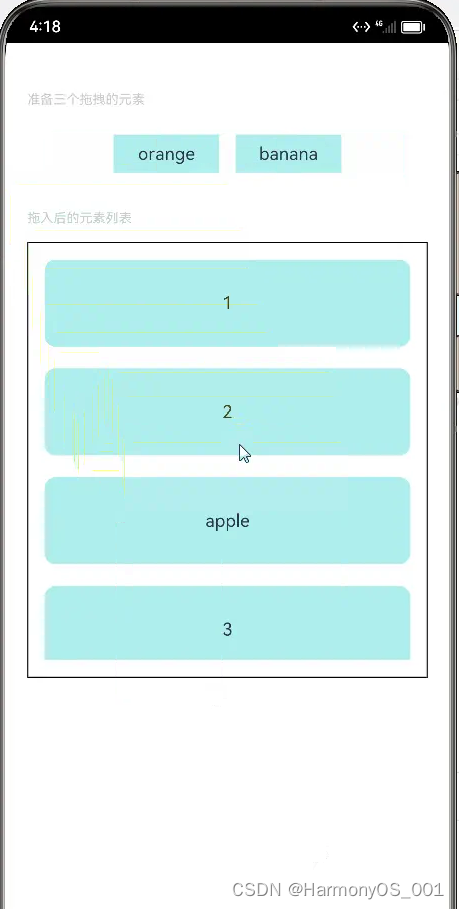
2.3.拖拽事件
拖拽事件指组件被长按后拖拽时触发的事件。给组件设置拖拽事件的回调,设置回调后,拖拽组件动作发生时会触发相应的拖拽回调,各拖拽方法说明如下:
●onDragStart:第一次拖拽此事件绑定的组件时,触发回调。参数 event 包含了拖拽坐标等信息,extraParams 拖拽事件的额外信息。拖拽事件注意事项:
长按150毫秒(ms)可触发拖拽事件。
优先级:长按手势配置时间小于等于150毫秒时,长按手势优先触发,否则拖拽事件优先触发。
●onDragEnter:拖拽进入组件范围内时,触发回调。参数 event 包含了拖拽坐标等信息,extraParams 拖拽事件的额外信息。拖拽事件注意事项:
当监听了 onDrop 事件时,此事件才有效。
onDragMove:拖拽在组件范围内移动时,触发回调。参数 event 包含了拖拽坐标等信息,extraParams 拖拽事件的额外信息。拖拽事件注意事项:
当监听了 onDrop 事件时,此事件才有效。
●onDragLeave:拖拽离开组件范围内时,触发回调。参数 event 包含了拖拽坐标等信息,extraParams 拖拽事件的额外信息。拖拽事件注意事项:
当监听了 onDrop 事件时,此事件才有效。
●onDrop:绑定此事件的组件可作为拖拽释放目标,当在本组件范围内停止拖拽行为时,触发回调。参数 event 包含了拖拽坐标等信息,extraParams 拖拽事件的额外信息。
注意上面会用到枚举:Visibility
案例代码如下:
// xxx.ets
// 定义文本样式函数
@Extend(Text) function textStyle() {
  .width('25%')  // 设置宽度为25%
  .height(35)  // 设置高度为35
  .fontSize(16)  // 设置字体大小为16
  .textAlign(TextAlign.Center)  // 设置文本居中对齐
  .backgroundColor(0xAFEEEE)  // 设置背景颜色为浅蓝色
}

// 定义组件
@Entry
@Component
struct Index {
  // 定义状态变量
  @State numbers: string[] = ['1', '2', '3', '4', '5', '6']  // 定义字符串数组变量
  @State text: string = ''  // 定义字符串变量
  @State bool: boolean = true  // 定义布尔变量
  @State eventType: string = ''  // 定义字符串变量
  /**
   * Visibility.Visible 隐藏,但参与布局进行占位。
   * 隐藏,但不参与布局,不进行占位。
   */
  @State fruitVisible: Visibility[] = [Visibility.Visible, Visibility.Visible, Visibility.Visible]  // 定义可见性枚举数组变量
  @State idx: number = 0  // 定义数字变量

  // 自定义拖拽过程中显示的内容
  @Builder pixelMapBuilder() {
    Column() {
      Text(this.text)
        .width('50%')  // 设置宽度为50%
        .height(60)  // 设置高度为60
        .fontSize(16)  // 设置字体大小为16
        .borderRadius(10)  // 设置边框圆角半径为10
        .textAlign(TextAlign.Center)  // 设置文本居中对齐
        .backgroundColor(Color.Yellow)  // 设置背景颜色为黄色
    }
  }

  //自定义拖拽的文本框
  @Builder dragText(textContent:string, index:number){
    Text(textContent)  // 在文本框中显示传入的文本内容
      .textStyle() // 使用自定义的文本样式
      .visibility(this.fruitVisible[index]) // 设置文本框的可见性为预先定义的数组中对应索引的值
      .onDragStart(() => {  // 当开始拖拽时触发以下操作
        this.bool = true  // 将布尔变量设置为true
        this.text = textContent  // 将文本内容赋值给this.text
        this.fruitVisible[index] = Visibility.None  // 将预先定义的数组中对应索引的值设置为不可见
        return this.pixelMapBuilder // 返回自定义拖拽过程中显示的内容
      })
      .onTouch((event: TouchEvent) => {  // 当触摸事件发生时触发以下操作
        if (event.type === TouchType.Down) {  // 如果触摸类型为按下
          this.eventType = 'Down'  // 将事件类型设置为“Down”
          this.idx = index  // 将当前索引赋值给this.idx
        }
        if (event.type === TouchType.Up) {  // 如果触摸类型为抬起
          this.eventType = 'Up'  // 将事件类型设置为“Up”
          if (this.bool) {  // 如果布尔变量为true
            this.fruitVisible[index] = Visibility.Visible  // 将预先定义的数组中对应索引的值设置为可见
          }
        }
      })
  }

  // 构建组件
  build() {
    Column() {
      // 显示说明文本
      Text('准备三个拖拽的元素')
        .fontSize(12)  // 设置字体大小为12
        .fontColor(0xCCCCCC)  // 设置字体颜色为灰色
        .width('90%')  // 设置宽度为90%
        .textAlign(TextAlign.Start)  // 设置文本左对齐
        .margin(5)  // 设置外边距为5
      // 显示水果文本元素
      Row({ space: 15 }) {
        //调用组件产生文本框, 数组是上面元素是否可见的索引列表
        this.dragText("apple", 0)
        this.dragText("orange", 1)
        this.dragText("banana", 2)

      }.padding({ top: 10, bottom: 10 }).margin(10)

      // 显示列表元素
      Text('拖入后的元素列表')
        .fontSize(12)  // 设置字体大小为12
        .fontColor(0xCCCCCC)  // 设置字体颜色为灰色
        .width('90%')  // 设置宽度为90%
        .textAlign(TextAlign.Start)  // 设置文本左对齐
        .margin(15)  // 设置外边距为15
      List({ space: 20 }) {
        ForEach(this.numbers, (item) => {
          ListItem() {
            Text(item)
              .width('100%')  // 设置宽度为100%
              .height(80)  // 设置高度为80
              .fontSize(16)  // 设置字体大小为16
              .borderRadius(10)  // 设置边框圆角半径为10
              .textAlign(TextAlign.Center)  // 设置文本居中对齐
              .backgroundColor(0xAFEEEE)  // 设置背景颜色为浅蓝色
          }
        }, item => item)
      }
      .editMode(true)  // 设置编辑模式为true
      .height('50%')  // 设置高度为50%
      .width('90%')  // 设置宽度为90%
      .border({ width: 1 })  // 设置边框宽度为1
      .padding(15)  // 设置内边距为15
      .divider({ strokeWidth: 2, color: 0xFFFFFF, startMargin: 20, endMargin: 20 })  // 设置分隔线样式
      // 注册拖拽进入事件处理函数
      .onDragEnter((event: DragEvent, extraParams: string) => {
        console.log('List onDragEnter, ' + extraParams + 'X:' + event.getX() + 'Y:' + event.getY())
      })
      // 注册拖拽移动事件处理函数
      .onDragMove((event: DragEvent, extraParams: string) => {
        console.log('List onDragMove, ' + extraParams + 'X:' + event.getX() + 'Y:' + event.getY())
      })
      // 注册拖拽离开事件处理函数
      .onDragLeave((event: DragEvent, extraParams: string) => {
        console.log('List onDragLeave, ' + extraParams + 'X:' + event.getX() + 'Y:' + event.getY())
      })
      // 注册放置事件处理函数
      .onDrop((event: DragEvent, extraParams: string) => {  // 当拖拽结束时触发以下操作,接受拖拽事件和额外参数
        let jsonString = JSON.parse(extraParams);  // 将额外参数解析为JSON格式并赋值给jsonString
        if (this.bool) {  // 如果布尔变量为true
          // 通过splice方法插入元素
          this.numbers.splice(jsonString.insertIndex, 0, this.text)  // 在numbers数组中的指定位置插入this.text
          this.bool = false  // 将布尔变量设置为false
        }
        this.fruitVisible[this.idx] = Visibility.None  // 将预先定义的数组中对应索引的值设置为不可见
      })
    }.width('100%').height('100%').padding({ top: 20 }).margin({ top: 20 })
  }
}
预览效果如下:
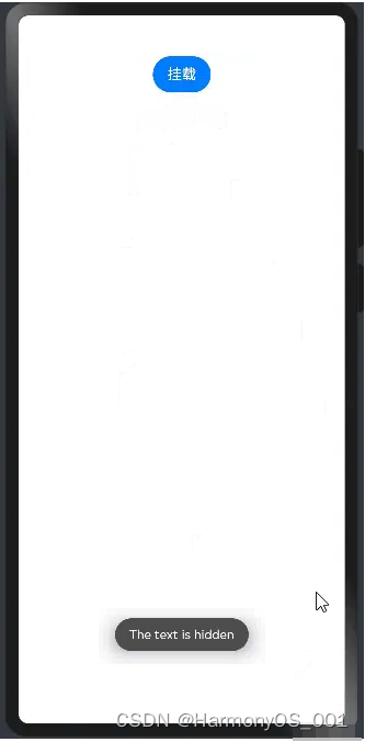
2.4.挂载卸载事件
挂载卸载事件指组件从组件树上挂载、卸载时触发的事件。各 API 方法说明如下:
●onAppear:组件从组件树上挂载时的回调。
●onDisAppear:组件从组件树上卸载时的回到。
案例代码如下:
import promptAction from '@ohos.promptAction'  // 导入名为promptAction的模块

@Entry  // 声明为入口组件
@Component  // 声明为组件
struct AppearExample {  // 定义名为AppearExample的结构体
  @State isShow: boolean = false  // 声明一个名为isShow的状态变量,初始值为false

  build() {  // 定义一个名为build的方法
    Column() {  // 创建一个Column组件

      Button(this.isShow?"卸载":"挂载")  // 创建一个Button组件,并根据isShow的值显示不同的文本内容
        .onClick(() => {  // 绑定点击事件处理函数
          this.isShow = !this.isShow  // 切换isShow的值
        }).margin(15)  // 设置按钮的外边距为15

      Column(){  // 创建一个嵌套的Column组件
        if(this.isShow){  // 如果isShow为true
          Text("挂载/卸载")  // 创建一个Text组件,显示文本'挂载/卸载'
            .fontSize(22)  // 设置字体大小为22
            .onAppear(()=>{  // 绑定onAppear事件处理函数
              console.log("------------------实现了挂载------------------")  // 在控制台输出信息
              promptAction.showToast({  // 调用promptAction模块的showToast方法
                message: 'The text is shown',  // 设置提示消息为'The text is shown'
                duration: 2000  // 设置提示持续时间为2000毫秒
              })
            })
            .onDisAppear(()=>{  // 绑定onDisAppear事件处理函数
              console.log("------------------实现了卸载------------------")  // 在控制台输出信息
              promptAction.showToast({  // 调用promptAction模块的showToast方法
                message: 'The text is hidden',  // 设置提示消息为'The text is hidden'
                duration: 2000  // 设置提示持续时间为2000毫秒
              })
            })
        }
      }
    }.padding(30).width('100%')  // 设置Column组件的内边距为30,宽度为100%
  }
}
预览效果如下:
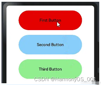
2.5.焦点事件
焦点事件指页面焦点在可获焦组件间移动时触发的事件,组件可使用焦点事件来处理相关逻辑。说明:
●目前仅支持通过外接键盘的tab键、方向键触发。
●存在默认交互逻辑的组件例如Button、TextInput等,默认即为可获焦,Text、Image等组件则默认状态为不可获焦,不可获焦状态下,无法触发焦点事件,需要设置focusable属性为true才可触发。
组件获取到焦点或者失去焦点时的事件回调,组件可使用焦点事件来更改内容。说明如下:
●onFocus:组件获取到焦点时的事件回调。
●onBlur:组件失去焦点时的事件回调。
案例代码如下:
@Entry
@Component
struct FocusEventExample {
  @State oneButtonColor: string = '#FFC0CB'
  @State twoButtonColor: string = '#87CEFA'
  @State threeButtonColor: string = '#90EE90'

  build() {
    Column({ space: 20 }) {
      // 通过外接键盘的上下键可以让焦点在三个按钮间移动,按钮获焦时颜色变化,失焦时变回原背景色

      Button("First Button")
        .backgroundColor(this.oneButtonColor)
        .width(260)
        .height(80)
        .fontColor(Color.Black)
        .focusable(true)// 设置可获取焦点
        //当前组件获取焦点时触发的回调
        .onFocus(()=>{
          this.oneButtonColor = "#FF0000"
        })
        //当前组件失去焦点时触发的回调。
        .onBlur(()=>{
          this.oneButtonColor = "#FFC0CB"
        })

      Button("Second Button")
        .backgroundColor(this.twoButtonColor)
        .width(260)
        .height(80)
        .fontColor(Color.Black)
        .focusable(true)// 设置可获取焦点
          //当前组件获取焦点时触发的回调
        .onFocus(()=>{
          this.twoButtonColor = "#00688B"
        })
          //当前组件失去焦点时触发的回调。
        .onBlur(()=>{
          this.twoButtonColor = "#90EE90"
        })

      Button("Third Button")
        .backgroundColor(this.threeButtonColor)
        .width(260)
        .height(80)
        .fontColor(Color.Black)
        .focusable(true)// 设置可获取焦点
          //当前组件获取焦点时触发的回调
        .onFocus(()=>{
          this.threeButtonColor = "#9B30FF"
        })
          //当前组件失去焦点时触发的回调。
        .onBlur(()=>{
          this.threeButtonColor = "#AEEEEE"
        })

    }.width('100%').margin({ top: 20 })
  }
}
点击后,用外接键盘上下键移动,模拟获取和失去焦点后改变不同的背景颜色,预览效果如下:
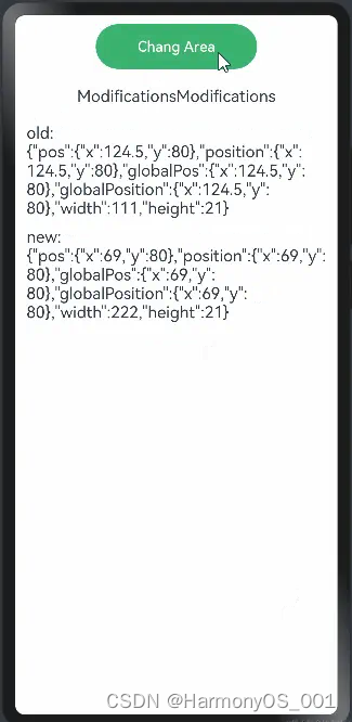
2.6.区域变化事件
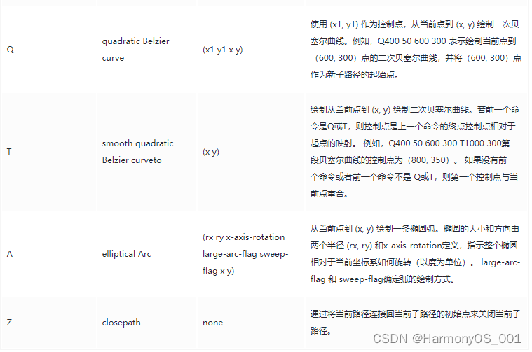
事件定义如下:
declare class CommonMethod<T> {
  // 区域变化的事件回调
  onAreaChange(event: (oldArea: Area, newArea: Area) => void): T;
}
//Area返回的数据类型说明
declare interface Area {
  width: Length;            // 组件的宽度,单位为vp。
  height: Length;           // 组件的高度,单位为vp。
  position: Position;       // 组件左上角相对父组件左上角的位置。
  globalPosition: Position; // 组件左上角相对页面左上角的位置。
}
组件区域发生变化会触发该回调,比如组件尺寸或者在屏幕上的位置发生改变都会触发该回调。
●oldArea:组件变化前区域信息。
●newArea:组件变化后区域信息。
预览代码如下:
//定义一个全局样式
@Styles function btnGlobalPressedStyle(){  // 定义名为btnGlobalPressedStyle的全局样式函数
  .backgroundColor("#3CB371")  // 设置背景颜色为"#3CB371"
  .width(180)  // 设置宽度为180
  .height(50)  // 设置高度为50
}
//定义一个全局样式
@Styles function btnGlobalNormalStyle(){  // 定义名为btnGlobalNormalStyle的全局样式函数
  .backgroundColor("#CD5555")  // 设置背景颜色为"#CD5555"
  .width(180)  // 设置宽度为180
  .height(50)  // 设置高度为50
}

@Entry  // 声明为入口组件
@Component  // 声明为组件
struct AreaExample  {  // 定义名为AreaExample的结构体
  @State text: string = "";  // 声明一个名为text的状态变量,初始值为空字符串
  @State area: string = "";  // 声明一个名为area的状态变量,初始值为空字符串

  build() {  // 定义一个名为build的方法
    Column({space:20}){  // 创建一个Column组件,设置间距为20
      Button("Chang Area")  // 创建一个Button组件,显示文本"Chang Area"
        .stateStyles({  // 设置状态样式
          normal:btnGlobalPressedStyle,  // 普通状态使用btnGlobalPressedStyle样式
          pressed:btnGlobalNormalStyle  // 按下状态使用btnGlobalNormalStyle样式
        })
        .onClick((event: ClickEvent) => {  // 绑定点击事件处理函数
          this.text += "Modifications";  // 在text变量后追加字符串"Modifications"
        })

      Text(this.text)  // 创建一个Text组件,显示text变量的值
        .fontSize(18)  // 设置字体大小为18
          //当该组件的大小或位置改变完成时,会触发该回调。
          //返回目标元素的宽高以及目标元素相对父元素和页面左上角的坐标位置。
        .onAreaChange((oldArea, newArea)=>{  // 绑定onAreaChange事件处理函数
          this.area = "old:\n" + JSON.stringify(oldArea) + "\n\n\nnew:\n" + JSON.stringify(newArea);  // 设置area变量的值为旧区域和新区域的JSON字符串
        })

      Text(this.area).fontSize(18)  // 创建一个Text组件,显示area变量的值,设置字体大小为18

    }.width("100%").height("100%").padding(10)  // 设置Column组件的宽度、高度和内边距
  }
}
上面的代码点击一次,就会给拼接一段文本,这有文本元素大小就会改变,这时候就会触发onAreaChange的执行,预览效果如下:
三、公共剪切类属性
ArkUI框架提供的组件继承自 CommonMethod ,因此在 CommonMethod 中的定义的属性是组件的公共属性,用于对组件进行裁剪、遮罩处理。属性
3.1.遮罩设置
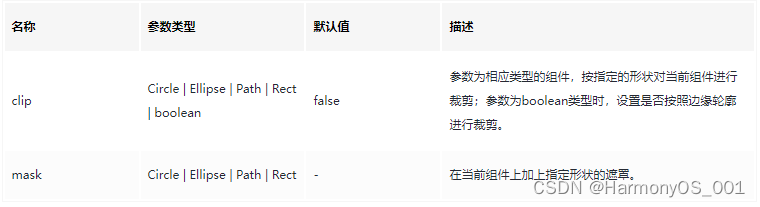
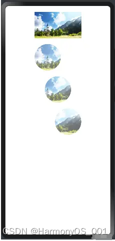
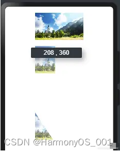
mask:给当前组件添加指定形状的遮罩,遮罩的参考系为当前组件的左上角坐标,为了使遮罩显示还必须调用 fill() 方法添加遮罩颜色。参数说明如下:
●Circle:添加圆形遮罩,案例如下:
@Entry
@Component
struct CirleExample {
  build() {
    Column({space:20}){
      Image($r("app.media.Snip")) //默认加载图片
        .width(160)
        .height(90)

      Image($r("app.media.Snip")) //居左剪切出来一个圆形
        .width(160)
        .height(90)
          //Circle用于绘制圆形的组件:以90为直径, fill设置填充区域颜色。
        .mask(new Circle({width:90, height:90}).fill(Color.Pink))

      Image($r("app.media.Snip")) //居中裁剪出图片
        .width(160)
        .height(90)
        //Circle用于绘制圆形的组件,如果宽和高不一致,则按照较小值为:直径
        .mask(new Circle({width:160, height:90}).fill(Color.Pink))

      Image($r("app.media.Snip")) //居右裁剪出图片
        .width(160)
        .height(90)
        //以90为直径
        .mask(new Circle({width:230, height:90}).fill(Color.Pink))

    }
    .width("100%").height("100%").padding({top:20, bottom:20})
  }
}
预览效果如下:
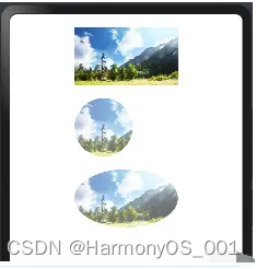
●Ellipse:添加椭圆形遮罩,样例如下:
@Entry
@Component
struct EllipseExample {
  build() {
    Column({space:20}){
      Image($r("app.media.Snip")) //默认加载图片
        .width(160)
        .height(90)

      Image($r("app.media.Snip")) //居左剪切出来一个圆形
        .width(160)
        .height(90)
          //Ellipse用于绘制椭圆的组件:如果宽和高一致,则为圆形, fill设置填充区域颜色。
        .mask(new Ellipse({width:90, height:90}).fill(Color.Pink))

      Image($r("app.media.Snip")) //居中裁剪出图片
        .width(160)
        .height(90)
        //Ellipse用于绘制椭圆的组件,
        .mask(new Ellipse({width:160, height:90}).fill(Color.Pink))

    }
    .width("100%").height("100%").padding({top:20, bottom:20})
  }
}
预览效果如下:
●Path:在指定路径上添加遮罩, Path 使用 commands 才生效果,
路径绘制的命令字符串,单位为px。commands支持的绘制命令如下:
commands支持的绘制命令如下:
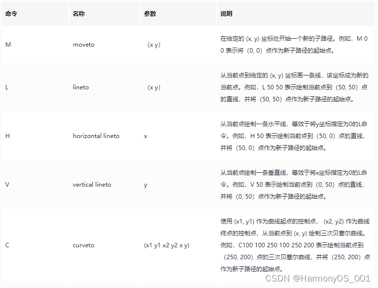
例如: commands(‘M0 20 L50 50 L50 100 Z’)定义了一个三角形,起始于位置(0,20),接着绘制点(0,20)到点(50,50)的直线,再绘制点(50,50)到点(50,100)的直线,最后绘制点(50,100)到(0,20)的直线关闭路径,形成封闭三角形。
@Entry
@Component
struct PathExample {
  build() {
    Column({space:20}){
      Image($r("app.media.Snip")) //默认加载图片
        .width(160)
        .height(90)

      Image($r("app.media.Snip")) //裁剪出一个矩形
        .width(160)
        .height(90)
          //commands路径绘制的命令字符串,单位为px, fill设置填充区域颜色。
        .mask(new Path({commands:"M0 0 L200 0 L200 300 L0 300 Z"}).fill(Color.Pink))

      Image($r("app.media.Snip"))
        .width(160)
        .height(90)
        //不使用commands不起作用,
        .mask(new Path({width:160, height:90}).fill(Color.Pink))

      Image($r("app.media.Snip")) //裁剪出一个三角形
        .width(160)
        .height(90)
          //commands路径绘制的命令字符串,单位为px, fill设置填充区域颜色。
        .mask(new Path({commands:"M0 0 L200 300 L0 300 Z"}).fill(Color.Pink))
    }
    .width("100%").height("100%").padding({top:20, bottom:20})
  }
}
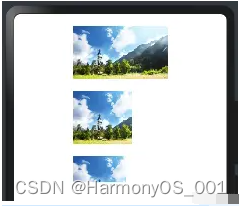
预览效果如下:
Rect:添加矩形遮罩,样例如下:
@Entry
@Component
struct RectExample {
  build() {
    Column({space:20}){
      Image($r("app.media.Snip")) //默认加载图片
        .width(160)
        .height(90)

      Image($r("app.media.Snip")) //全部遮罩
        .width(160)
        .height(90)
        //Rect绘制矩形, fill设置填充区域颜色。
        .mask(new Rect({width:160,height:90}).fill(Color.Pink))

      Image($r("app.media.Snip"))
        .width(160)
        .height(90)
        //部分遮罩
        .mask(new Rect({width:90, height:90}).fill(Color.Pink))

    }
    .width("100%").height("100%").padding({top:20, bottom:20})
  }
}
预览效果如下:
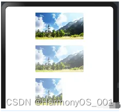
3.2.剪切设置
●clip是按照指定形状对当前组件进行剪切,剪切的参考系为当前组件的左上角坐标,参数如下:
boolean:表示是否按照边缘轮廓进行裁剪,案例如下:
@Entry
@Component
struct ClipExample01 {
  build() {
    Column({space:20}){
      Image($r("app.media.Snip"))
        .width(160)
        .height(90)
        .borderRadius(10) //设置圆角

      Column(){
        Image($r("app.media.Snip"))
          .width(160)
          .height(90)
      }.borderRadius(10) //设置圆角。对子组件无效

      Column(){
      }
      .width(160)
      .height(90)
      .backgroundColor("#3CB371")
      .borderRadius(10) //设置圆角。对子组件无效

      Column(){
        Image($r("app.media.Snip"))
          .width(160)
          .height(90)
      }
      .clip(true) //设置允许剪切,对所有子组件起作用
      .backgroundColor("#3CB371")
      .borderRadius(10) //设置圆角。对子组件无效

    }
    .width("100%")
    .height("100%")
    .padding(20)
  }
}
预览效果如下:
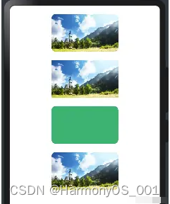
ArkUI允许子组件超出父组件的绘制范围,如果不希望超出可以使用该属性做下限制,样例如下所示:
@Entry
@Component
struct ClipExample02 {
  build() {
    Row({space:10}){
      //没有设置clip属性,默认允许子组件超出父组件的绘制范围
      Column(){
        Text().size({width:20, height:80}).backgroundColor("#FFA07A")
      }.height("100%").layoutWeight(1).backgroundColor("#3CB371")


      Column(){
        Text().size({width:20, height:80}).backgroundColor("#FFA07A")
      }
      .height("100%")
      .layoutWeight(1)
      .backgroundColor("#3CB371")
      .clip(true)//添加clip属性为 true,表示子组件的绘制范围不能超出父组件

    }.width("100%").height(60)
  }
}
第 1 个 Column 没有添加 clip 属性,则子组件的绘制区域可以超出父组件,第 2 个 Column 添加了 clip 并且属性值设置为true,则子组件超出父组件区域时被剪切到了。预览效果如下:
Circle:把组件剪切成圆形,如下所示:
@Entry
@Component
struct ClipExample03 {
  build() {
    Column({space:20}){
      Image($r("app.media.Snip"))  // 默认图片
        .width(160)
        .height(90)

      Image($r("app.media.Snip"))  // 居左裁剪出一个圆
        .width(160)
        .height(90)
        //宽高一致,则按照90为直径
        .clip(new Circle({width:90, height:90}).fill("#66CDAA"))

      Image($r("app.media.Snip"))  // 居中裁剪出一个圆
        .width(160)
        .height(90)
        //宽高不一致,则按照小的值为直径
        .clip(new Circle({width:160, height:90}).fill("#66CDAA"))

      Image($r("app.media.Snip"))  // 居右裁剪出一个圆
        .width(160)
        .height(90)
        .clip(new Circle({width:230, height:90}).fill("#66CDAA"))

    }.width("100%").height("100%").padding({top:20, bottom:20})
  }
}
预览效果如下:
●Ellipse:把组件剪切成椭圆形,如下:
@Entry
@Component
struct ClipExample04 {
  build() {
    Column({space:20}){
      Image($r("app.media.Snip"))  // 默认图片
        .width(160)
        .height(90)

      Image($r("app.media.Snip"))  // 裁剪出一个椭圆
        .width(160)
        .height(90)
        .clip(new Ellipse({width:160, height:90}).fill("#66CDAA"))

      Image($r("app.media.Snip"))  // 裁剪出一个椭圆
        .width(160)
        .height(90)
        //Ellipse裁剪出椭圆
        .clip(new Ellipse({width:130, height:90}).fill("#66CDAA"))

    }.width("100%").height("100%").padding({top:20, bottom:20})
  }
}
预览效果如下:
●Path:把组件按照Path剪切出对应形状,Path使用commands才生效果,如下:
@Entry
@Component
struct ClipExample05 {
  build() {
    Column({space:20}){
      Image($r("app.media.Snip"))  // 默认图片
        .width(160)
        .height(90)

      Image($r("app.media.Snip"))  // 使用commands参数起作用,绘制出图形
        .width(160)
        .height(90)
        .clip(new Path({commands:"M0 0 L150 0 L300 150 L0 300 Z"}).fill("#66CDAA"))

      Image($r("app.media.Snip"))  //直接设置宽和高不起作用
        .width(160)
        .height(90)
        .clip(new Path({width:130, height:90}).fill("#66CDAA"))

      Image($r("app.media.Snip"))  //使用commands参数起作用,绘制出图形
        .width(160)
        .height(90)
        //vp2px(80)将vp(屏幕密度)单位的数值转换为以px(屏幕物理像素单位。)为单位的数值。
        .clip(new Path({width:130, height:90, commands:"M0 0 L" + vp2px(80) + " 0 L" + vp2px(80) + " " + vp2px(45) + " L0 " + vp2px(45) + " Z"}).fill("#66CDAA"))

    }.width("100%").height("100%").padding({top:20, bottom:20})
  }
}
预览效果如下:
●Rect:把组件按照指定区域剪切出对应形状,如下:
@Entry
@Component
struct ClipExample06 {
  build() {
    Column({space:20}){
      Image($r("app.media.Snip"))  // 默认图片
        .width(160)
        .height(90)

      Image($r("app.media.Snip"))
        .width(160)
        .height(90)
        .clip(new Rect({width:100, height:100}).fill("#66CDAA"))

      Image($r("app.media.Snip"))
        .width(160)
        .height(90)
        .clip(new Rect({width:90, height:45}).fill("#66CDAA"))

    }.width("100%").height("100%").padding({top:20, bottom:20})
  }
}
预览效果如下:
四、公共提示类属性
为组件绑定弹出式菜单,弹出式菜单以垂直列表形式显示菜单项,可通过长按、点击或鼠标右键触发。
说明
●CustomBuilder里不支持再使用bindMenu、bindContextMenu弹出菜单。多级菜单可使用Menu组件。
●弹出菜单的文本内容不支持长按选中。
属性
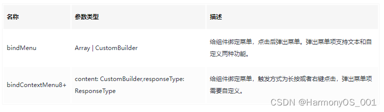
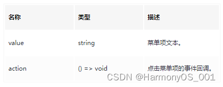
MenuItem
4.1:bindMenu
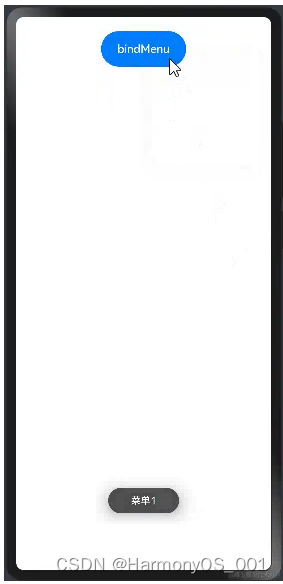
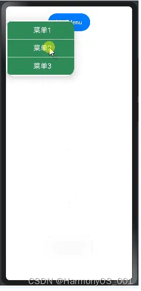
bindMenu 表示给当前组件绑定一个菜单项,用户点击组件后弹出菜单, bindMenu 如下:
单项文本实现:当 content 类型为 { value: string; action: () => void } 时, value 表示要显示的菜单文本, action 表示点击该文本的事件回调,如下所示:
import prompt from '@system.prompt';
@Entry
@Component
struct BindMenuExample01 {
build() {
Column({space:20}){
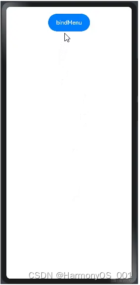
Button("bindMenu")
.width(120)
.height(50)
.onClick(()=>{
prompt.showToast({message:"bindMenu"})
})
.bindMenu([
{value:"菜单1",action:()=>{
//显示文本提示框
prompt.showToast({message:"菜单1"})
}},
{value:"菜单2",action:()=>{
//显示文本提示框
prompt.showToast({message:"菜单2"})
}},
{value:"菜单3",action:()=>{
//显示文本提示框
prompt.showToast({message:"菜单3"})
}}
])
}.width("100%").height("100%").padding(20)
}
}
预览效果如下:
上面使用单项文本实现一个菜单,文字太小并且样式和布局均无法修改,这种方式UI局限性太大,为了满足多样式场景需求,ArkUI框架提供了 CustomBuilder 方式允许开发者自定义 UI 描述。
●CustomBuilder方式实现:CustomBuilder 在 common.d.ts 文件中定义,源码定义如下:
CustomBuilder 可代表一个空类型也可以表示一个返回任意类型的函数,自定义 UI 描述使用 @Builder 装饰器装饰一个方法,该方法功能和语法规范和 build 函数相同,返回一个 UI 布局,语法格式如下:
@Builder function_name() { // @Builder修饰一个方法
  // UI布局
  Column() {
  }
}
用户自定义 UI 实现,就是使用 @Builder 修饰一个方法,该方法返回一个 UI 布局即可,案例如下:
import prompt from '@system.prompt'
@Entry
@Component
struct CustomBuilderExample {
  //自定义菜单组件
  @Builder ButtonMenuBuilder(){
    Column(){
      Text("菜单1")
        .width("100%")
        .height(50)
        .fontSize(20)
        .fontColor(Color.White)
        .textAlign(TextAlign.Center)
        .onClick(()=>{
          prompt.showToast({message:"菜单1"})
        })

      //提供分隔器组件,分隔不同内容块/内容元素。
      Divider()
        .width("100%").height(1).backgroundColor(Color.White)

      Text("菜单2")
        .width("100%")
        .height(50)
        .fontSize(20)
        .fontColor(Color.White)
        .textAlign(TextAlign.Center)
        .onClick(()=>{
          prompt.showToast({message:"菜单2"})
        })

      //提供分隔器组件,分隔不同内容块/内容元素。
      Divider()
        .width("100%").height(1).backgroundColor(Color.White)

      Text("菜单3")
        .width("100%")
        .height(50)
        .fontSize(20)
        .fontColor(Color.White)
        .textAlign(TextAlign.Center)
        .onClick(()=>{
          prompt.showToast({message:"菜单3"})
        })
    }
    .width(200)
    .backgroundColor("#2E8B57")
  }

  build() {
    Column({space:10}){
      Button("bindMenu")
        .width(120)
        .height(50)
        .onClick(() => {//同时设置onClick
          prompt.showToast({message:"hi Augus"})
      })
        //调用自定义的菜单组件
        .bindMenu(this.ButtonMenuBuilder)//绑定自定义菜单
    }
    .width("100%")
    .height("100%")
    .padding(20)
  }
}
预览效果如下:
4.2.bindContextMenu
bindContextMenu 在长按或者右键点击组件是才会触发显示菜单项,bindContextMenu 定义如下:
declare class CommonMethod<T> {
  bindContextMenu(content: CustomBuilder, responseType: ResponseType): T;
}
参数说明:
●content:参数只支持使用 CustomBuilder 自定义 UI 一种方式,
●responseType:触发弹窗的响应类型,
ResponseType
定义了一下两种类型:
○LongPress:通过长按触发菜单弹出。
○RightClick:通过鼠标右键触发菜单弹出。(为了PC端 准备)
代码如下:
import prompt from '@system.prompt'
@Entry
@Component
struct CustomBuilderExample {
  //自定义菜单组件
  @Builder ButtonMenuBuilder(){
    Column(){
      Text("菜单1")
        .width("100%")
        .height(50)
        .fontSize(20)
        .fontColor(Color.White)
        .textAlign(TextAlign.Center)
        .onClick(()=>{
          prompt.showToast({message:"菜单1"})
        })

      //提供分隔器组件,分隔不同内容块/内容元素。
      Divider()
        .width("100%").height(1).backgroundColor(Color.White)

      Text("菜单2")
        .width("100%")
        .height(50)
        .fontSize(20)
        .fontColor(Color.White)
        .textAlign(TextAlign.Center)
        .onClick(()=>{
          prompt.showToast({message:"菜单2"})
        })

      //提供分隔器组件,分隔不同内容块/内容元素。
      Divider()
        .width("100%").height(1).backgroundColor(Color.White)

      Text("菜单3")
        .width("100%")
        .height(50)
        .fontSize(20)
        .fontColor(Color.White)
        .textAlign(TextAlign.Center)
        .onClick(()=>{
          prompt.showToast({message:"菜单3"})
        })
    }
    .width(200)
    .backgroundColor("#2E8B57")
  }

  build() {
    Column({space:10}){
      Button("bindMenu")
        .width(120)
        .height(50)
        .onClick(() => {//同时设置onClick和bindMenu,onClick不生效
          prompt.showToast({message:"hi Augus"})
      })
        //调用自定义的菜单组件
        .bindContextMenu(this.ButtonMenuBuilder, ResponseType.LongPress)//长按绑定菜单
    }
    .width("100%")
    .height("100%")
    .padding(20)
  }
}
预览效果如下:
4.3.bindPopup
bindPopup 和 bindMenu 类似,都是弹出一个可选项提示框, bindPopup 接口如下:
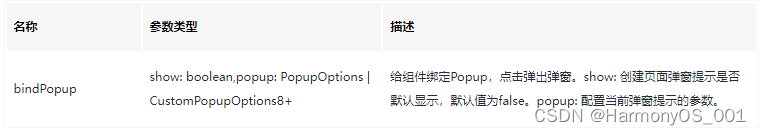
参数说明如下:
●show:创建 Popup 弹窗时是否默认显示,默认值为 false 。
●popup:Popup 的显示配置,参数支持 PopupOptions 和 CustomPopupOptions 两种类型,他们分别如下所示:
1)PopupOptions配置如下:
declare interface PopupOptions {
  message: string;                                         // 显示的信息提示
  placementOnTop?: boolean;                                // 是否显示在组件上方,默认值为 false
  primaryButton?: {                                        // 第一个按钮的配置
    value: string;                                         // 按钮的文字
    action: () => void;                                    // 按钮的点击回调
  };
  secondaryButton?: {                                      // 第二个按钮的配置
    value: string;                                         // 按钮的文字
    action: () => void;                                    // 按钮的事件回调
  };
  onStateChange?: (event: { isVisible: boolean }) => void; // Popup可见性变化的回调
}
说明:
●message: Popup 显示的提示文字。
●placementOnTop: Popup 是否显示在组件上方。
●primaryButton: Popup 显示按钮配置。
●secondaryButton: Popup 显示按钮配置。
●onStateChange: Popup 弹窗状态(是否可见性)变化事件回调
案例代码如下:
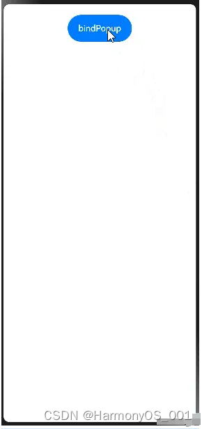
import prompt from '@system.prompt'
@Entry
@Component
struct BindPopupExample {
  //默认状态值
  @State isPopup:boolean = false

  build() {
    Column({space:20}){
      Button("bindPopup")
        .width(120)
        .height(50)
        //this.isPopup为true的时候,才会显示
        .bindPopup(this.isPopup, {
          message: "获取摄像头权限",//显示的内容
          placementOnTop: true,//显示在组件上方
          onStateChange: ((state)=>{ // Popup可以见到菜单变化的回调
            prompt.showToast({message: `弹出是否可见:${state.isVisible}`})
          }),
          primaryButton:{
            value:"同意",
            action:()=>{
              prompt.showToast({message: "允许获取权限"})
              //修改状态
              this.isPopup = !this.isPopup
            }
          },
          secondaryButton:{
            value:"不同意",
            action:()=>{
              prompt.showToast({message: "不允许获取权限"})
              //修改状态
              this.isPopup = !this.isPopup
            }
          }
        })
        .onClick(()=>{
          prompt.showToast({message:"bindPopup按钮测试"})
          //修改状态
          this.isPopup = !this.isPopup
        })
    }
    .width("100%")
    .height("100%")
    .padding(20)
  }
}
预览效果如下:

2)CustomPopupOptions配置如下:
declare interface CustomPopupOptions {
  builder: CustomBuilder;
  placement?: Placement;
  maskColor?: Color | string | Resource | number;
  popupColor?: Color | string | Resource | number;
  enableArrow?: boolean;
  autoCancel?: boolean;
  onStateChange?: (event: { isVisible: boolean }) => void;
}
参数如下:
●builder:自定义 Popup 。
●placement: Popup 的相对位置。
●maskColor: Popup 蒙层颜色。
●popupColor: Popup 背景颜色。
●enableArrow: Popup 是否显示箭头。
●autoCancel: Popup 是否自动隐藏。
●onStateChange: Popup 弹出状态(窗口可见性)变化的回调。
案例代码如下:
import prompt from '@system.prompt'
@Entry
@Component
struct BindPopupExample02 {
  //默认状态值
  @State isPopup:boolean = false

  //自定义UI组件
  @Builder PopupButton(){
    Row(){
      Text("分享").width(80).height("100%").fontSize(20).fontColor(Color.White).textAlign(TextAlign.Center).backgroundColor("#3CB371").onClick(()=>{
        prompt.showToast({message:"分享"})
      })
      Divider().width(3).height("100%").backgroundColor(Color.White)

      Text("转发").width(80).height("100%").fontSize(20).fontColor(Color.White).textAlign(TextAlign.Center).backgroundColor("#3CB371").onClick(()=>{
        prompt.showToast({message:"转发"})
      })

      Divider().width(3).height("100%").backgroundColor(Color.White)

      Text("点赞").width(80).height("100%").fontSize(20).fontColor(Color.White).textAlign(TextAlign.Center).backgroundColor("#3CB371").onClick(()=>{
        prompt.showToast({message:"点赞"})
      })

    }.height(50)
  }

  build() {
    Column({space:20}){
      Button("bindPopup")
        .width(120)
        .height(50)
        //this.isPopup为true的时候,才会显示
        .bindPopup(this.isPopup, {
          builder: this.PopupButton, //使用自定义UI
          placement:Placement.Bottom, //显示到下方按钮
          maskColor: Color.Pink,      //蒙层颜色
          popupColor: Color.Orange,    //背景颜色
          enableArrow: true,         //显示箭头
          autoCancel:true,           //设置自动隐藏
          onStateChange:((state)=>{
            prompt.showToast({message:`弹窗是否可见:${state.isVisible}`})
          })
        })
        .onClick(()=>{
          prompt.showToast({message:"bindPopup按钮测试"})
          //修改状态
          this.isPopup = !this.isPopup
        })
    }
    .width("100%")
    .height("100%")
    .padding(20)
  }
}
预览效果如下:
写在最后
有很多小伙伴不知道学习哪些鸿蒙开发技术?不知道需要重点掌握哪些鸿蒙应用开发知识点?而且学习时频繁踩坑,最终浪费大量时间。所以有一份实用的鸿蒙(HarmonyOS NEXT)资料用来跟着学习是非常有必要的。
这份鸿蒙(HarmonyOS NEXT)资料包含了鸿蒙开发必掌握的核心知识要点,内容包含了(ArkTS、ArkUI开发组件、Stage模型、多端部署、分布式应用开发、音频、视频、WebGL、OpenHarmony多媒体技术、Napi组件、OpenHarmony内核、Harmony南向开发、鸿蒙项目实战等等)鸿蒙(HarmonyOS NEXT)技术知识点。
希望这一份鸿蒙学习资料能够给大家带来帮助,有需要的小伙伴自行领取,限时开源,先到先得~无套路领取!!
获取这份完整版高清学习路线,请点击→纯血版全套鸿蒙HarmonyOS学习资料
鸿蒙(HarmonyOS NEXT)最新学习路线
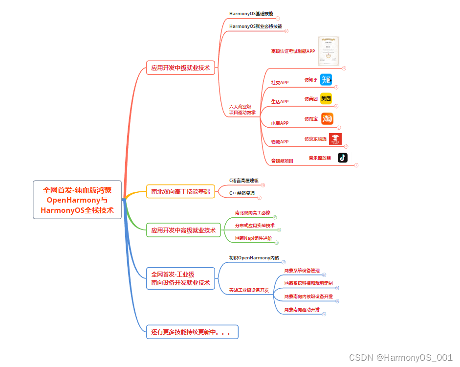
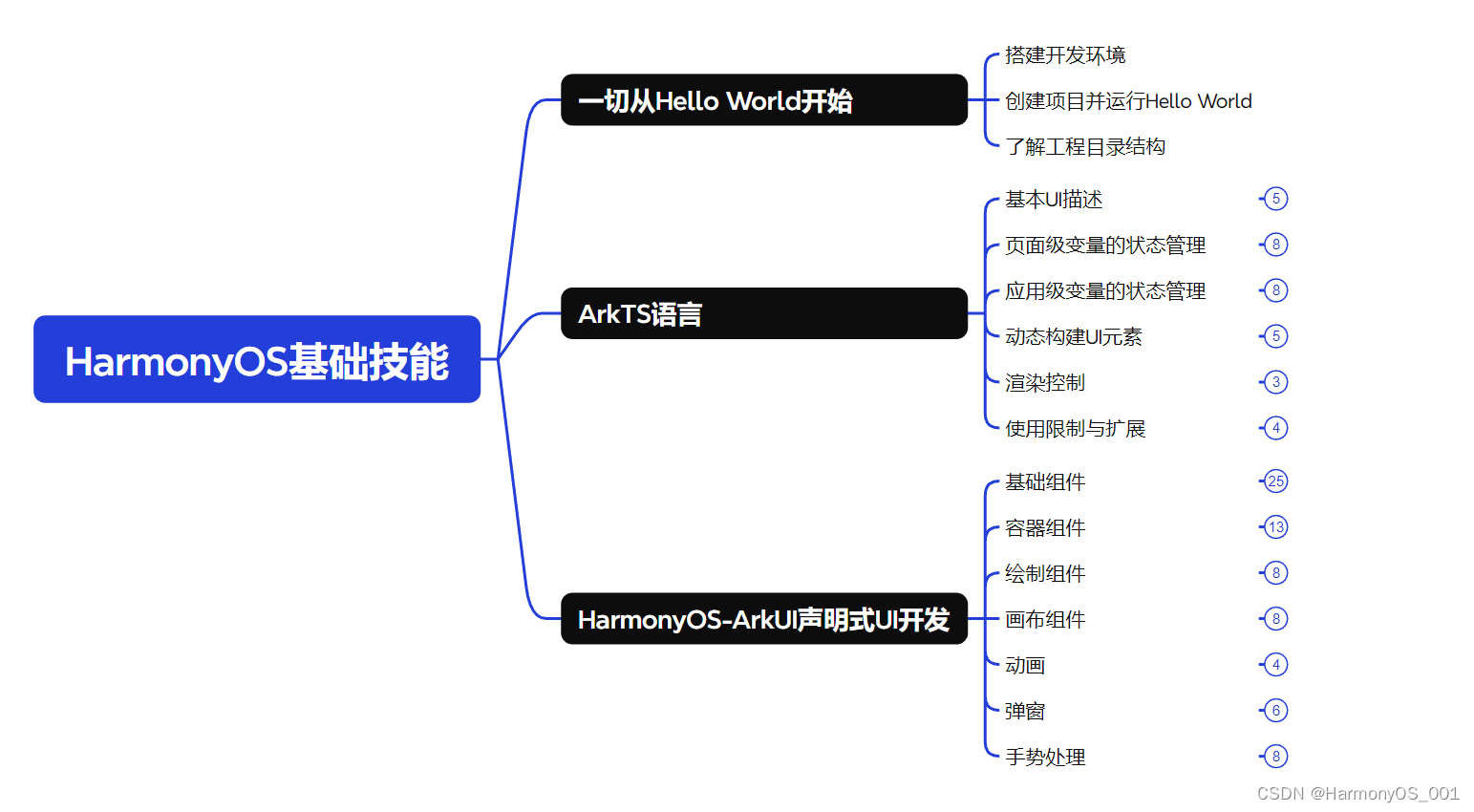
HarmonOS基础技能
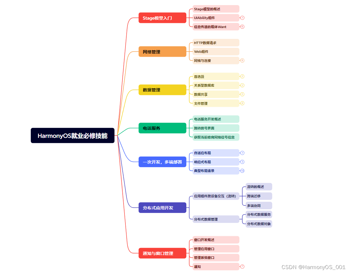
HarmonOS就业必备技能
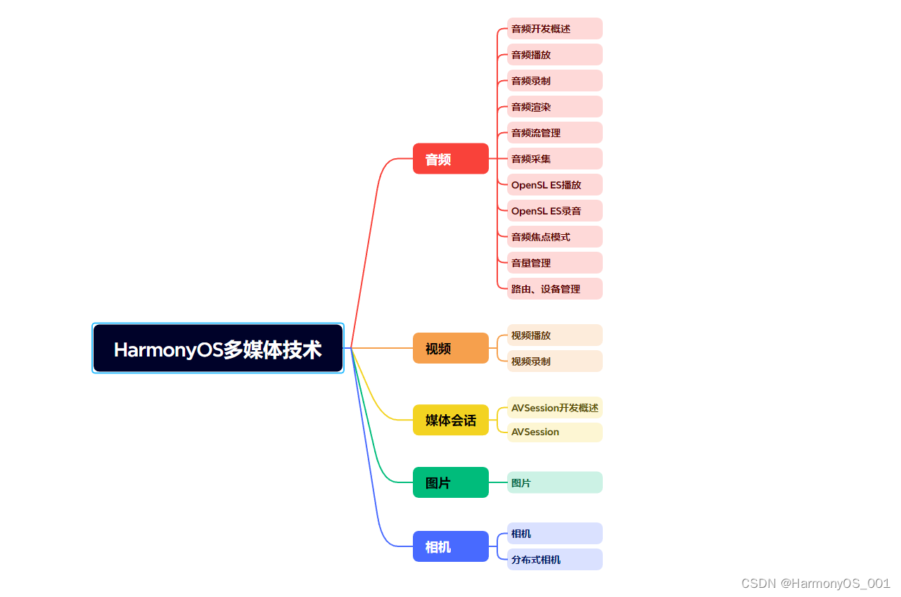
HarmonOS多媒体技术
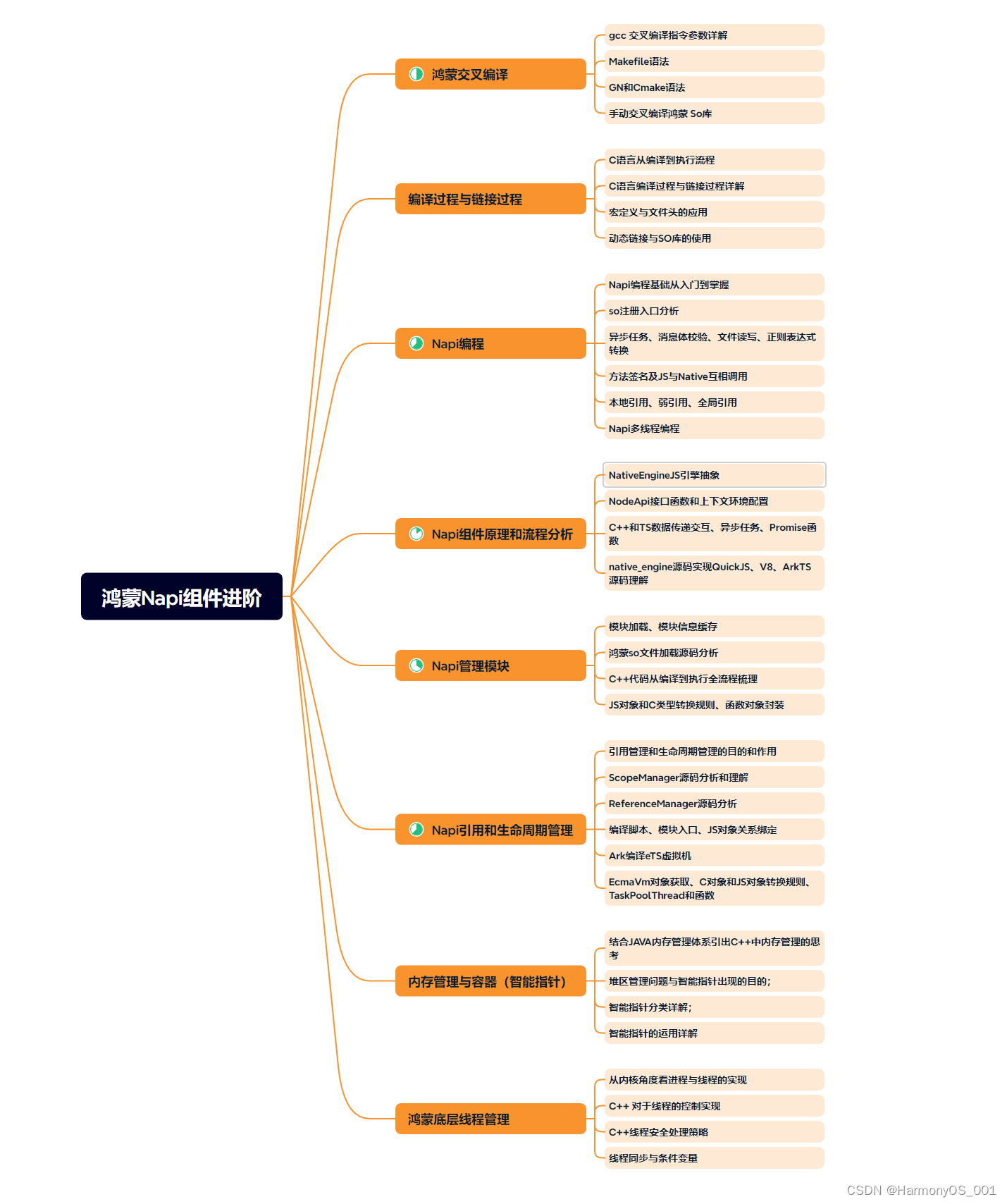
鸿蒙NaPi组件进阶
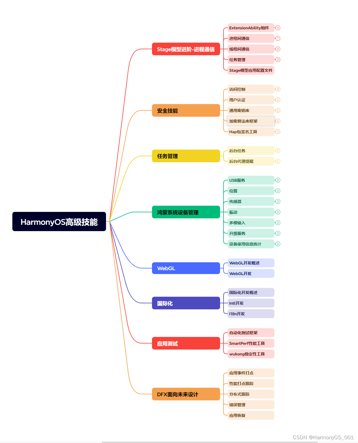
HarmonOS高级技能
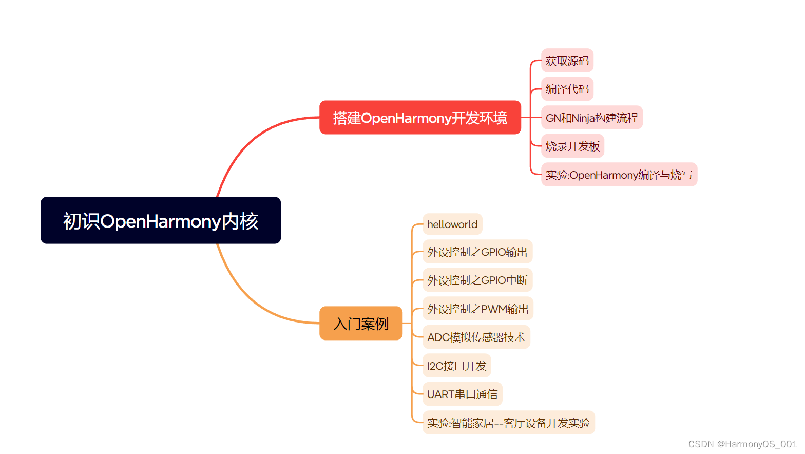
初识HarmonOS内核
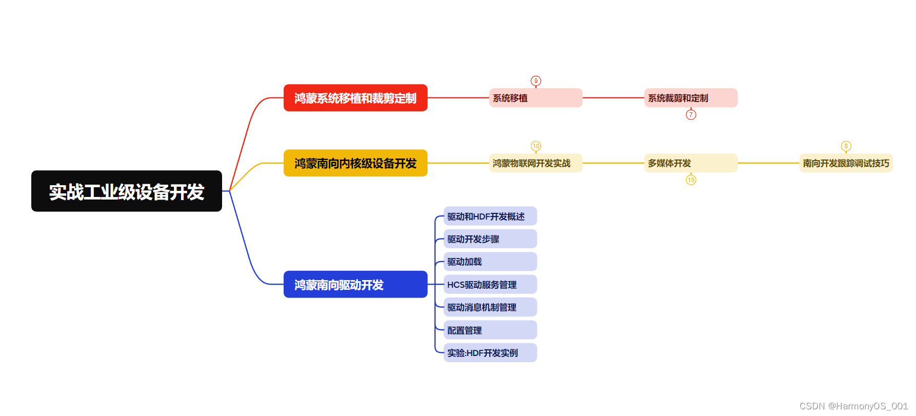
实战就业级设备开发
有了路线图,怎么能没有学习资料呢,小编也准备了一份联合鸿蒙官方发布笔记整理收纳的一套系统性的鸿蒙(OpenHarmony )学习手册(共计1236页)与鸿蒙(OpenHarmony )开发入门教学视频,内容包含:ArkTS、ArkUI、Web开发、应用模型、资源分类…等知识点。
获取以上完整版高清学习路线,请点击→纯血版全套鸿蒙HarmonyOS学习资料
《鸿蒙 (OpenHarmony)开发入门教学视频》
《鸿蒙生态应用开发V2.0白皮书》
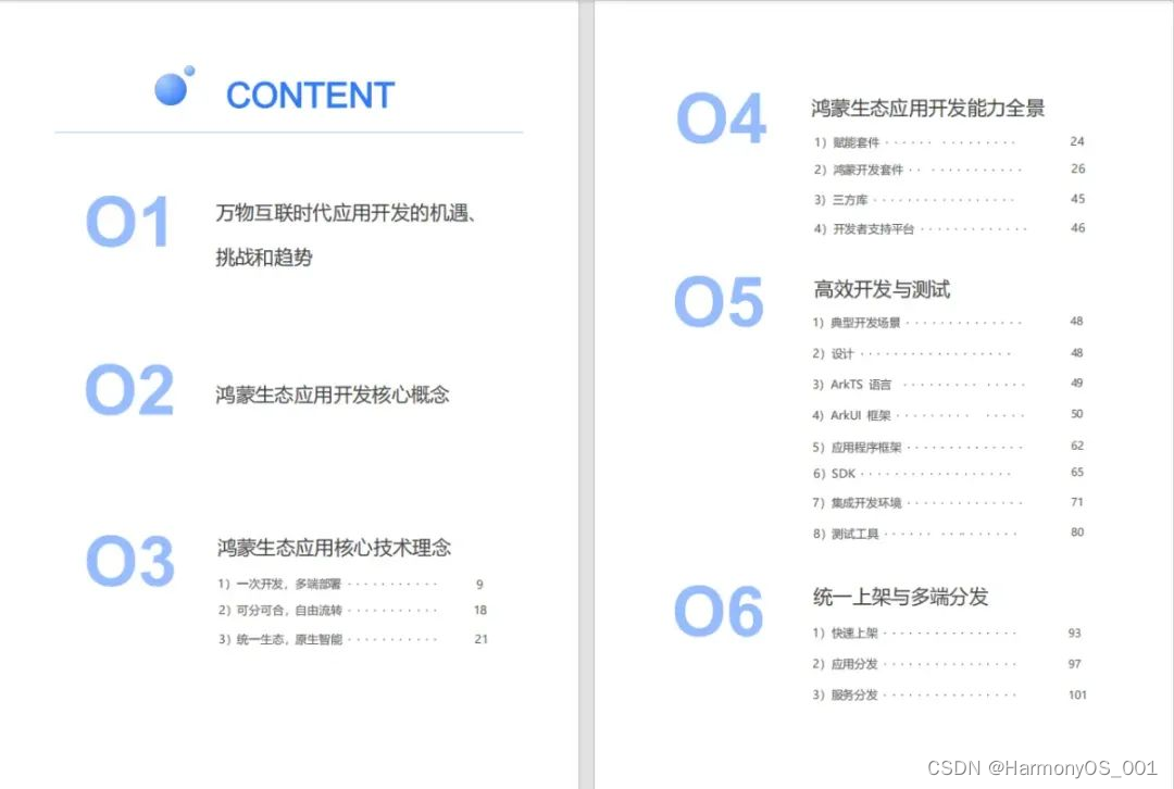
《鸿蒙 (OpenHarmony)开发基础到实战手册》
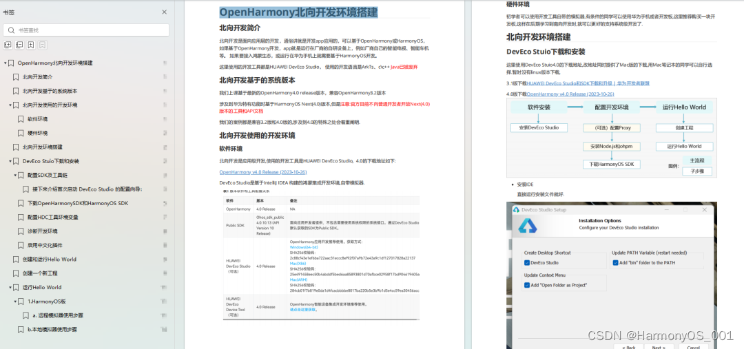
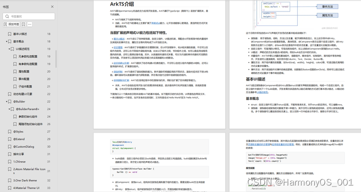
OpenHarmony北向、南向开发环境搭建
《鸿蒙开发基础》
●ArkTS语言
●安装DevEco Studio
●运用你的第一个ArkTS应用
●ArkUI声明式UI开发
.……
《鸿蒙开发进阶》
●Stage模型入门
●网络管理
●数据管理
●电话服务
●分布式应用开发
●通知与窗口管理
●多媒体技术
●安全技能
●任务管理
●WebGL
●国际化开发
●应用测试
●DFX面向未来设计
●鸿蒙系统移植和裁剪定制
……
《鸿蒙进阶实战》
●ArkTS实践
●UIAbility应用
●网络案例
……


 736
736


 被折叠的 条评论
为什么被折叠?
被折叠的 条评论
为什么被折叠?
 到【灌水乐园】发言


