


实验环境
python 3.6
matplotlib 2.2.3
折线图的绘制
matplotlib.pyplot.plot(x,y,linestyle,linewidth,color,marker,markersize,markeredgecolor,markerfactcolor,label,alpha)
-
x:指定折线图的x轴数据;
-
y:指定折线图的y轴数据;
-
linestyle:指定折线的类型,可以是实线、虚线、点虚线、点点线等,默认文实线;
-
linewidth:指定折线的宽度
-
marker:可以为折线图添加点,该参数是设置点的形状;
-
markersize:设置点的大小;
-
markeredgecolor:设置点的边框色;
-
markerfactcolor:设置点的填充色;
-
label:为折线图添加标签,类似于图例的作用;
import pandas as pd
import numpy as np
import matplotlib.pyplot as plot
生成数据
article_reading = pd.DataFrame()
date = pd.date_range("2019-1-1",periods=270,freq = "D")
date = pd.Series(date)
article_reading["date"]= date
article_reading_cnts = pd.Series(np.random.randint(16,1025,270))
article_reading["article_reading_cnts"]= article_reading_cnts
article_reading_times = pd.Series(np.random.randint(61, 1933,270))
article_reading["article_reading_times"]= article_reading_times
collect_times = pd.Series(np.random.randint(0, 71,270))
article_reading["collect_times"]= collect_times
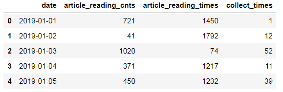
article_reading.head()
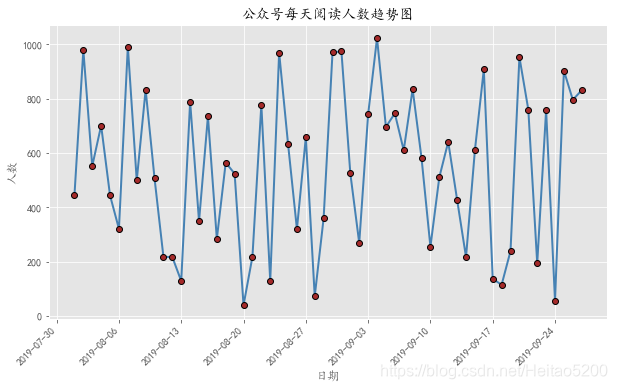
一元折线图的绘制
某公众号文章的阅读人数
# 导入模块
import pandas as pd
import matplotlib.pyplot as plt
# 设置绘图风格
plt. style.use("ggplot")
# 设置中文编码和符号的正常显示
plt.rcParams["font.sans-serif"] = "KaiTi"
plt.rcParams["axes.unicode_minus"] = False
# 取出8月份至9月28日的数据
sub_data = article_reading.loc[article_reading.date >= '2019-08-01' ,:]
# 设置图框的大小
fig = plt.figure(figsize = (10,6))
# 绘图
plt.plot(sub_data.date, # x轴数据
         sub_data.article_reading_cnts, # y轴数据
         linestyle = '-', # 折线类型
         linewidth = 2, # 折线宽度
         color = 'steelblue', # 折线颜色
         marker = 'o', # 点的形状
         markersize = 6, # 点的大小
         markeredgecolor='black', # 点的边框色
         markerfacecolor='brown') # 点的填充色
# 添加标题和坐标轴标签
plt.title('公众号每天阅读人数趋势图')
plt.xlabel('日期')
plt.ylabel('人数')

# 剔除图框上边界和右边界的刻度
plt.tick_params(top = 'off', right = 'off')

# 为了避免x轴日期刻度标签的重叠,设置x轴刻度自动展现,并且45度倾斜
fig.autofmt_xdate(rotation = 45)

# 显示图形
plt.show()
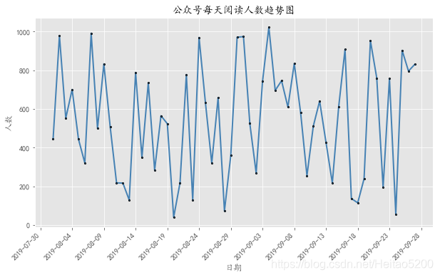
一元折线图的绘制—图形优化
# 导入模块
import matplotlib as mpl

# 设置图框的大小
fig = plt.figure(figsize=(10,6))
# 绘图
plt.plot(sub_data.date, # x轴数据
         sub_data.article_reading_cnts, # y轴数据
         linestyle = '-', # 折线类型
         linewidth = 2, # 折线宽度
         color = 'steelblue', # 折线颜色
         marker = 'o', # 点的形状
         markersize = 2, # 点的大小
         markeredgecolor='black', # 点的边框色
         markerfacecolor='steelblue') # 点的填充色

# 添加标题和坐标轴标签
plt.title('公众号每天阅读人数趋势图')
plt.xlabel('日期')
plt.ylabel('人数')

# 剔除图框上边界和右边界的刻度
plt.tick_params(top = 'off', right = 'off')

# 获取图的坐标信息
ax = plt.gca()
# 设置日期的显示格式
date_format = mpl.dates.DateFormatter("%Y-%m-%d")
ax.xaxis.set_major_formatter(date_format)

# 设置x轴显示多少个日期刻度
#xlocator = mpl.ticker.LinearLocator(10)
# 设置x轴每个刻度的间隔天数
xlocator = mpl.ticker.MultipleLocator(5)
ax.xaxis.set_major_locator(xlocator)

# 为了避免x轴日期刻度标签的重叠,设置x轴刻度自动展现,并且45度倾斜
fig.autofmt_xdate(rotation = 45)

# 显示图形
plt.show()
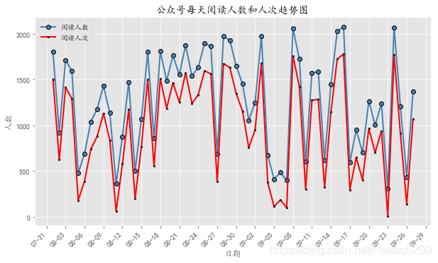
多元折线图的绘制
如果你需要在一张图形中画上两条折线图,也很简单,只需要在代码中写入两次plot函数即可,其他都不需要改动了。具体可以参考下面的代码逻辑:
# 设置图框的大小
fig = plt.figure(figsize=(10,6))

# 绘图--阅读人数趋势
plt.plot(sub_data.date, # x轴数据
         sub_data.article_reading_times+200, # y轴数据
         linestyle = '-', # 折线类型
         linewidth = 2, # 折线宽度
         color = 'steelblue', # 折线颜色
         marker = 'o', # 点的形状
         markersize = 6, # 点的大小
         markeredgecolor='black', # 点的边框色
         markerfacecolor='steelblue', # 点的填充色
         label = '阅读人数') # 添加标签

# 绘图--阅读人次趋势
plt.plot(sub_data.date, # x轴数据
         sub_data.article_reading_times-100, # y轴数据
         linestyle = '-', # 折线类型
         linewidth = 2, # 折线宽度
         color = 'r', # 折线颜色
         marker = 'o', # 点的形状
         markersize = 2, # 点的大小
         markeredgecolor='black', # 点的边框色
         markerfacecolor='#ff9999', # 点的填充色
         label = '阅读人次') # 添加标签

# 添加标题和坐标轴标签
plt.title('公众号每天阅读人数和人次趋势图')
plt.xlabel('日期')
plt.ylabel('人数')

# 剔除图框上边界和右边界的刻度
plt.tick_params(top = 'off', right = 'off')

# 获取图的坐标信息
ax = plt.gca()
# 设置日期的显示格式
date_format = mpl.dates.DateFormatter('%m-%d')
ax.xaxis.set_major_formatter(date_format)

# 设置x轴显示多少个日期刻度
#xlocator = mpl.ticker.LinearLocator(10)
# 设置x轴每个刻度的间隔天数
xlocator = mpl.ticker.MultipleLocator(3)
ax.xaxis.set_major_locator(xlocator)

# 为了避免x轴日期刻度标签的重叠,设置x轴刻度自动展现,并且45度倾斜
fig.autofmt_xdate(rotation = 45)

# 显示图例
plt.legend()
# 显示图形
plt.show()


 2200
2200

 被折叠的 条评论
为什么被折叠?
被折叠的 条评论
为什么被折叠?
 到【灌水乐园】发言


