


官网地址:Apache ECharts

girde 网格
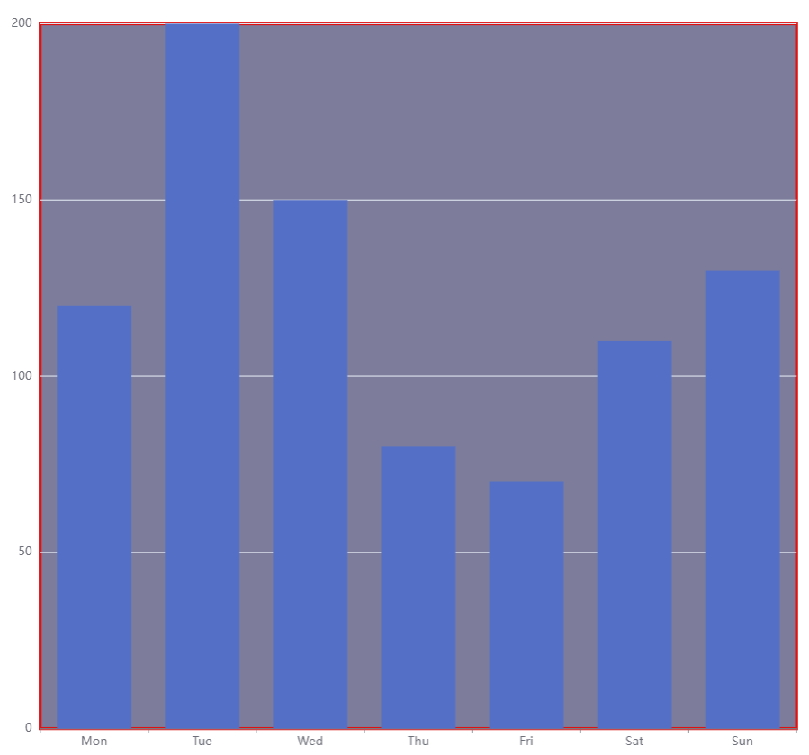
 grid: {
    show:true,
    left: "5%",  //距离容器左侧的距离
    top: "5%",  // 距离容器上侧的距离
    right: "5%", // 距离容器右侧的距离
    bottom: "5%", // 距离容器下侧的距离
    backgroundColor: "rgba(125, 125, 155, 1)", // 网格背景颜色
    borderColor: "rgba(224, 17, 17, 1)",  // 网格的边框颜色
    borderWidth:3, //网格的边框线宽
    containLabel: false, // 区域是否包含坐标轴的刻度标签 为true时『防止标签溢出』
  },
title标题
title:{
    text: "单位 : %",
    subtext: 'Fake Data',  // 二级标题
    textStyle: {   // 字体设置
      color: "rgba(0, 0, 0, 1)",
      fontWeight: 400,
      fontSize: 16,
      fontFamily: "PingFang SC",
    },
    x:"center",  // 水平安放位置,默认为左对齐,可选为:'center' ¦ 'left' ¦ 'right'¦ {number}(x坐标,单位px)
    y:15,        // 垂直安放位置,默认为全图顶端,可选为:'center' ¦ 'left' ¦ 'right'¦ {number}(x坐标,单位px)
    //textAlign: null, // 水平对齐方式,默认根据x设置自动调整
    backgroundColor: 'rgba(125,125,125,0.3)', // 背景颜色
    borderColor: '#ccc',       // 标题边框颜色
    borderWidth: 0,            // 标题边框线宽,单位px,默认为0(无边框)
    padding: 5,                // 标题内边距,单位px,默认各方向内边距为5,接受数组分别设定上右下左边距,同css
    itemGap: 10,               // 主副标题纵向间隔,单位px,默认为10
    subtextStyle: {
      color: '#aaa'           // 副标题文字颜色
    }
}
自定义title
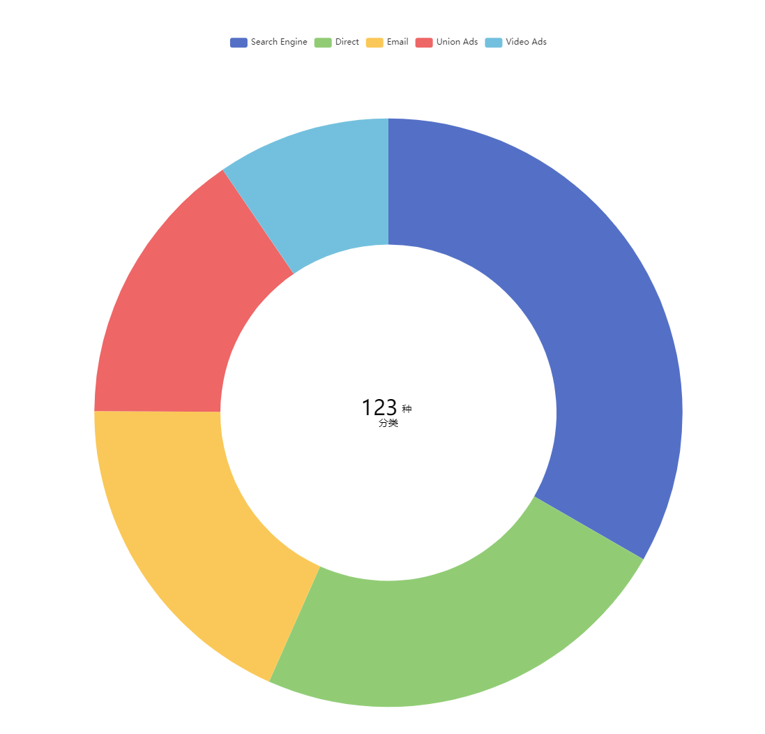
title: [
  {
    text: "{name|123}{u|种}\n{c|分类}",
    top: 580,
    left: "center",
    textStyle: {
      rich: {
        name: {
          fontSize: 30,
          lineHeight: 20,
          fontWeight: 500,
          color: "#000",
        },
        u: {
          fontSize: 14,
          fontWeight: 400,
          color: "#000",
          padding: 6,
        },
        c: {
          fontSize: 14,
          lineHeight: 14,
          fontWeight: 400,
          color: "#000",
        },
      },
    },
  },
],
legend 图例
legend: {
    icon:"rect", // 图标样式 'circle', 'rect', 'roundRect', 'triangle', 'diamond', 'pin', 'arrow', 'none'
    orient: 'horizontal',  //布局方式,默认为水平布局,可选'horizontal' ¦ 'vertical'(垂直)
    left: 0, // 水平安放位置,默认为全图居中
    y:"top", //垂直安放位置,默认为全图顶端
    itemHeight: 16,  // 图例图形的高
    itemWidth: 16,   // 图例图形的宽
    data: ["Direct", "Mail Ad","Affiliate Ad"],  // 数据
    textStyle: {
      color: "#000",   // 文字颜色
      fontSize: 14,   //  文字大小
    },
    backgroundColor: 'rgba(125,25,25,0.1)', // 背景颜色
    borderColor: '#ccc',       // 图例边框颜色
    borderWidth: 0,            // 图例边框线宽,单位px,默认为0(无边框)
    padding: 5,                // 图例内边距,单位px,默认各方向内边距为5,
    itemGap: 15,               // 各个item之间的间隔,单位px,默认为10,
  },
tooltip 提示框
tooltip: {
    trigger: 'axis',  // 触发类型 可选“item/axis”
    axisPointer: {
      type: 'shadow', // 'shadow' as default; can also be 'line' or 'shadow'
      lineStyle : {          // 直线指示器样式设置
         color: '#48b',
         width: 2,
         type: 'solid'
      },
      shadowStyle : {                    // 阴影指示器样式设置
        width: 'auto',                  // 阴影大小
        color: 'rgba(150,150,150,0.3)'  // 阴影颜色
      }
    },
    hideDelay: 100,            // 隐藏延迟,单位ms
    transitionDuration : 0.4,  // 动画变换时间,单位s
    borderColor: "rgba(125, 254, 254, 1)",
    borderRadius: 0,
    borderWidth: 1, // 提示框浮层的边框宽。
    padding: 15, // 提示框浮层内边距,
    textStyle: {
      fontSize: 15,
      align: "left",
    },
    // 添加单位
    valueFormatter: function (value) {
      return value + "  m";
    },
},
xAxis x轴
xAxis: {
    type: 'category',
    name:"week", // x轴坐标单位
    nameTextStyle: {   // 设置单位样式
      color: "rgba(255, 255, 255, 1)",
      fontSize: 15,
    },
    data: ['Mon', 'Tue', 'Wed', 'Thu', 'Fri', 'Sat', 'Sun'],  // x轴数据
    axisLabel:{   // x轴的文字样式
        fontSize: 15,
        fontWeight: 400,
        fontFamily: "PingFang SC",
        rotate: 40, // 文本旋转角度
        color: "rgba(0,0,0,.6)",
        interval: 0, //设置间隔为0
        margin: 15, // X轴坐标文字距离X轴的距离
    },
    axisLine:{
      lineStyle: {
        onZero: true, //表示 X 轴或者 Y 轴的轴线是否在另一个轴的 0 刻度上,只有在另一个轴为数值轴且包含 0 刻度时有效。
        color: "rgba(43, 142, 243, 1)", //x轴轴线颜色 (底部)
      },
    },
   axisTick: {
      alignWithLabel: false,  //x刻度线居中(true)或者两边对齐(false)
      show: true,        // X轴刻度线显示与否
      length: 5,        // X轴刻度线长度
      lineStyle: {       // 属性lineStyle控制线条样式
        color: '#333',
        width: 1
      }
    },
    splitLine: {   // 坐标背景线
      show: true,
      lineStyle: {
        color: "rgba(43, 142, 243, 0.6)",
        type: "dashed", // 坐标轴背景虚线 solid(实线)
        width:1,
      },
    },
    boundaryGap: true, //折线两边不留白
  },
yAxis 纵坐标
  yAxis: {
          type: "value",
          name:"单位",
          position: "left",  // 定位标签位置 left | right
          nameGap: 15,     // 坐标轴名称与轴线之间的距离
          interval:25,     // 强制设置坐标轴分割间隔。搭配min max一起使用
          splitNumber: 4,  // 坐标轴的分割段数,需要注意的是这个分割段数只是个预估值,在类目轴中无效。
          min: 0,          // 最小值
          max:200,         // 最大值
          nameTextStyle: {  // 单位文字样式
            color: '#333',     // 坐标轴名称的颜色
            fontStyle: 'normal',    // 文字字体的风格('normal',无样式;'italic',斜体;'oblique',倾斜字体)
            fontWeight: 'normal',    // 文字字体的粗细('normal',无样式;'bold',加粗;'bolder',加粗的基础上再加粗;'lighter',变细;数字定义粗细也可以,取值范围100至700)
            fontSize: '20',    // 文字字体大小
            align: 'left',     // 文字水平对齐方式,默认自动('left','center','right')
            verticalAlign: 'left',    // 文字垂直对齐方式,默认自动('top','middle','bottom'
            lineHeight: '50',    // 行高 )
            backgroundColor: 'red',    // 文字块背景色,例:'#123234', 'red', 'rgba(0,23,11,0.3)'
          },
          splitLine: {
            show: true,
            lineStyle: {
              color: "rgba(43, 142, 243, 0.6)",
              type: "dashed", // 坐标轴背景虚线
            },
          },
          axisLabel: {
            show: true,     // 是否显示刻度标签
            interval: '0',    // 坐标轴刻度标签的显示间隔,在类目轴中有效.0显示所有
            inside: true,    // 刻度标签是否朝内,默认朝外
            rotate: 90,    // 刻度标签旋转的角度,在类目轴的类目标签显示不下的时候可以通过旋转防止标签之间重叠;旋转的角度从 -90 度到 90 度
            margin: 10,    // 刻度标签与轴线之间的距离
            // formatter 刻度标签的内容格式器,支持字符串模板和回调函数两种形式
            color: '#FFF',     // 刻度标签文字的颜色
            fontStyle: 'normal',    // 文字字体的风格('normal',无样式;'italic',斜体;'oblique',倾斜字体)
            fontWeight: 'normal',    // 文字字体的粗细('normal',无样式;'bold',加粗;'bolder',加粗的基础上再加粗;'lighter',变细;数字定义粗细也可以,取值范围100至700)
            fontSize: '20',    // 文字字体大小
            align: 'left',     // 文字水平对齐方式,默认自动('left','center','right')
            verticalAlign: 'left',    // 文字垂直对齐方式,默认自动('top','middle','bottom'
            lineHeight: '50',    // 行高 )
            backgroundColor: 'red',    // 文字块背景色,例:'#123234', 'red', 'rgba(0,23,11,0.3)'
          },
         axisLine: {
            show: true,    // 是否显示坐标轴轴线
            symbol: ['none', 'arrow'],     // 轴线两端箭头,两个值,none表示没有箭头,arrow表示有箭头
            symbolSize: [10, 15],     // 轴线两端箭头大小,数值一表示宽度,数值二表示高度
            lineStyle: {
                color: '#333',    // 坐标轴线线的颜色
                width: '5',    // 坐标轴线线宽
                type: 'solid',     // 坐标轴线线的类型('solid',实线类型;'dashed',虚线类型;'dotted',点状类型)
            },
          },
        axisTick: {
            show: true,    // 是否显示坐标轴刻度
            inside: true,     // 坐标轴刻度是否朝内,默认朝外
            length: 5,    // 坐标轴刻度的长度
            lineStyle: {
                color: '#FFF',     // 刻度线的颜色
                width: 10,    // 坐标轴刻度线宽
                type: 'solid',     // 坐标轴线线的类型('solid',实线类型;'dashed',虚线类型;'dotted',点状类型)
            },
        },
       splitArea: {
            show: true,    // 是否显示分隔区域
            interval: '0',    // 坐标轴刻度标签的显示间隔,在类目轴中有效.0显示所有
            areaStyle: {
                color: ['rgba(250,250,250,0.3)','rgba(200,200,200,0.3)'],    // 分隔区域颜色。分隔区域会按数组中颜色的顺序依次循环设置颜色。默认是一个深浅的间隔色
                opacity: 1,    // 图形透明度。支持从 0 到 1 的数字,为 0 时不绘制该图形
            },
        },
  },
series 系列
series: [
  {
    name: "数据名称1",
    type: "bar",   // 图形类型 bar柱状 pie饼图  line 折线图 scatter-散点 graph-关系图 tree-树图
    stack: "one",  // 图形堆叠,需要堆叠的数据stack需要定义相同的属性
    emphasis: {
         // color: '#eee',   // 颜色
         barBorderColor: 'rgba(0,0,0,0)',   // 柱条边线
         barBorderRadius: 0,                // 柱条边线圆角,单位px,默认为0
         barBorderWidth: 1,                 // 柱条边线线宽,单位px,默认为1
         label: {
             show: false
             // position: 默认自适应,水平布局为'top',垂直布局为'right',可选为
             //           'inside'|'left'|'right'|'top'|'bottom'
             // textStyle: null      // 默认使用全局文本样式,详见TEXTSTYLE
         } // 高亮
    }
    showBackground: true,  // 开启柱状图背景
    backgroundStyle: {
      color: "rgba(255, 255, 255, 0.1)", // 柱状图背景色
    },
    label: {
        show: true,
        position: 'top', // 顶部显示数据
        color: '#FFFFFF',
        fontSize: 12,
    },
    itemStyle: {
      barBorderRadius: [8, 8, 0, 0], // 顶部圆角,顺序为左上、右上、右下、左下
      color: "#48E5E5", //柱条的颜色
        // color: {
        //   type: 'linear',
        //   x: 1,
        //   y: 1,
        //   x2: 1,
        //   y2: 0,
        //   colorStops: [
        //     // 0%处的颜色
        //     {
        //       offset: 0,
        //       color: 'rgba(173, 225, 255, 0.20)',
        //     },
        //     // 100%处的颜色
        //     {
        //       offset: 1,
        //       color: '#ADE1FF',
        //     },
        //   ],
        //   global: false // 缺省为 false
        // }
      barBorderColor: '#fff',       // 柱条边线
      barBorderRadius: 0,           // 柱条边线圆角,单位px,默认为0
      barBorderWidth: 1,            // 柱条边线线宽,单位px,默认为1
    },
    barWidth: 16,  // 柱条的宽度 不设置则默认自适应
    barGap: 49,   // 每个柱条之间的间隔距离 默认为柱形宽度的30%,可设固定值
    data: [10, 70, 80, 10, 5], // 数据1
  },
  {
    name: "数据名称2",
    type: "line",
    symbol: "none", //这句就是去掉点的
    color: "rgba(255, 207, 87, 1)",
    symbol: "circle", // 拐点样式
    symbolSize: 10, // 拐点的大小
    smooth: false, //是否用曲线显示,
    itemStyle: {
        //下面是拐点样式配置属性
        // color:'#B756',//这里设置的拐点颜色
        borderColor: "#D3D3D3", //  拐点边框颜色
        borderWidth: 2, //  拐点边框宽度
        shadowColor: "#F5F5F5", //  阴影颜色
        shadowBlur: 1, //  阴影渐变范围控制
    },
    // lineStyle: {
    //   // 阴影部分
    //   shadowOffsetX: fontSize(5), // 折线的X偏移
    //   shadowOffsetY: fontSize(2), // 折线的Y偏移
    //   shadowBlur: fontSize(12), // 折线模糊
    //   shadowColor: "#FFC637", //折线颜色
    // },
    // 折线图区域颜色
    areaStyle: {
      color: {
        type: "linear", //线性渐变
        x: 0,
        y: 0,
        x2: 0,
        y2: 1,
                // 1, 1, 0, 0,  //(左上-右下 渐变)
                // 1, 0, 0, 0,  //(左-右 渐变)
                // 0, 1, 1, 0,  //(右上-左下 渐变)
                // 0, 1, 1, 1,  //(左-右 渐变)
                // 1, 0, 1, 1,  //(上-下 渐变)
                // 0, 0, 1, 0,  //(左-右 渐变)
                // 0, 0, 0, 1,  //(上-下 渐变)
        colorStops: [
          {
            offset: 0,
            color: "rgba(255, 207, 87, 0.6)", // 0% 处的颜色
          },
          {
            offset: 1,
            color: "rgba(255, 207, 87, 0)", // 100% 处的颜色
          },
        ],
        global: false, // 缺省为 false
      },
    },
    itemStyle: {
      color: "#FF696B", //折线的颜色
    },
    data: [30, 60, 45, 10, 20], // 数据2
  },
  {
    name: "数据名称3",  //  提示框标题
    type: "pie",
    center: ["50%", "34%"], // 饼图上下左右位置
    radius: ["40%", "60%"], // 饼图的内圈半径 外圈半径
    avoidLabelOverlap:true, // 是否启用防止标签重叠策略,默认开启,在标签拥挤重叠的情况下会挪动各个标签的位置,防止标签间的重叠。
    percentPrecision:2      // 饼图百分比数值的精度,默认保留小数点后两位。
    label: {
      // alignTo: "edge",  // 'none'(默认值):label line 的长度为固定值,分别为 labelLine.length 及 labelLine.length2
      show: true, // 标签提示显示
      color: "#000",  // 标签颜色
      lineHeight: 16, // 标签行高
      // edgeDistance:0,
      fontSize: 20,   //标签大小
      padding: 8,    // 距离标签的距离
      // position: "center",
      // formatter: (item) => {  // item 是series 里的内容
      //   let str = "中间文字";
      //   return str;
      // },
    },
    labelLine: {
      show: true , // 提示线
      length:50,  // 提示线长度
      lineStyle: {
        color:"rgba(255, 255, 255, 0.6)"  // 设置标示线的颜色
      }
    },
    // 各扇形之间的间隔
    itemStyle:{
      borderWidth:5,   // 宽度
      borderColor:"#000" // 颜色
    },
    emphasis: {  // 鼠标移入时的高亮
      itemStyle: {
        shadowBlur: 10,
        shadowOffsetX: 0,
        shadowColor: 'rgba(0, 0, 0, 0.5)'
      }
    },
    color:["rgba(90, 63, 255, 1)","rgba(30, 214, 255, 1)","rgba(173, 225, 255, 1)","rgba(38, 138, 255, 1)","rgba(251, 233, 71, 1)"],//饼图颜色
    data: [
        { value: 40, name: 'rose 1' },
        { value: 38, name: 'rose 2' },
        { value: 32, name: 'rose 3' },
        { value: 30, name: 'rose 4' },
        { value: 28, name: 'rose 5' }
    ], // 数据3
  },
],
series-pie.label.alignTo
标签的对齐方式,仅当 position 值为 'outer' 时有效。
从 ECharts v4.6.0 版本起,我们提供了 'labelLine' 与 'edge' 两种新的布局方式。
-
'none'(默认值):label line 的长度为固定值,分别为 labelLine.length 及 labelLine.length2。
-
'labelLine':label line 的末端对齐,其中最短的长度由 labelLine.length2 决定。
-
'edge':文字对齐,文字的边距由 label.edgeDistance 决定。
dataZoom 滑动条
dataZoom:[{
      type: "slider",
      backgroundColor: "rgba(47,69,84,0)", // 组件的背景颜色
      textStyle: false, // 滑动时左右提示文字
      fillerColor: "rgba(39,106,198,.4)", // 选中范围的填充颜色
      borderColor: "rgba(47,128,237,0.5)", // 边框颜色
      // 两侧缩放手柄的样式配置
      handleStyle: {
        color: "rgba(67,134,219,1)", // 手柄颜色
        borderColor: "rgba(67,134,219,1)", // 两侧线颜色
      },
      // 手柄上侧的样式配置
      moveHandleStyle: {
        color: "rgba(67,134,219,1)", // 手柄颜色
      },
      showDataShadow: false, // 不显示数据阴影 进度条里的阴影
      dataBackground: { //数据阴影的样式。
        lineStyle: {
        }, //选中部分阴影的线条样式
        areaStyle: {
          color: '',
        } //选中部分阴影的填充样式
      },
      // 选中部分数据阴影  阴影线条与阴影填充透明
      selectedDataBackground: {
        lineStyle: {
          color: 'rgba(255,125,255,1)',
        },
        areaStyle: {
          color: 'rgba(255,255,255,0)',
        }
      },
      showDetail: true,//是否显示detail,即拖拽时候显示详细数值信息
      realtime: true,//拖动时,是否实时更新系列的视图。如果设置为false,则只在拖拽结束的时候更新。
      // 数据窗口范围
      start: 0,  // 起点
      end: 20,  // 结束点
      brushSelect: true,//是否开启刷选功能。在下图的brush区域你可以按住鼠标左键后框选出选中部分
      // 锁定缩放   true只能平移,不能缩放
      zoomLock: true,
      // 组件离容器的距离位置
      top:"auto",
      left:"4%",
      right:"auto",
      bottom: "2%",
      height:28, // 组建的高度
      moveHandleSize: "7",//上侧移动手柄的尺寸高度
      handleSize: '100%',// 控制两侧手柄的大小,可以是像素大小,也可以是相对于 dataZoom 组件宽度的百分比,默认跟dataZoom宽度相同
      moveHandleIcon : '',//移动手柄中间的icon,支持路径字符串
}]
echarts 字体自适应
/**
 * echarts 字体兼容
 *
 * @param {*} res 字体大小
 *
 * @returns 兼容后的字体大小
 */

export const fontSize = (res) => {
    let docEl = document.documentElement,
        clientWidth =
            window.innerWidth ||
            document.documentElement.clientWidth ||
            document.body.clientWidth;
    if (!clientWidth) return;
    // 此处的1920 为设计稿的宽度,根据自己需求修改!
    let fontSize = clientWidth / 1920;
    return res * fontSize;
}
图表自适应窗口大小的变化
mounted() {
  this.init();
  window.addEventListener("resize", this.changeChart);
},
beforeDestroy() {
  window.removeEventListener("resize", this.changeChart);
},
methods: {
    changeChart() {
      if (this.chart) {
        if (this.resizeTimer) clearTimeout(this.resizeTimer);
        this.resizeTimer = setTimeout(() => {
          this.chart && this.chart.resize();
        }, 500);
      } else {
        this.init();
      }
    },
    init() {
      this.chart = this.$echarts.init(document.getElementById(this.id));
      this.option.tooltip = this.tooltip;
      this.chart.setOption(this.option);
    },
  },
监听图表数据变化
如果修改图表的数据没有变化,那么就需要监听
option: {
  type: Object,
  default() {
    return {
      title: this.titleName ? this.title : {},
      legend: this.legendIcon ? this.legend : { show: false },
      grid: this.grid,
      tooltip: this.tooltip,
      xAxis: this.xAxis,
      yAxis: this.yAxis,
      series: this.seriesData,
      dataZoom: this.dataZoomFlag ? this.dataZoom : [],
    };
  },
},
// 需要改变什么就监听什么
watch:{
    //监听整个图表
    option: {
      handler(newVal, oldVal) {
        if (this.chart) {
          newVal.tooltip = this.tooltip;
          this.chart.setOption(newVal);
        } else {
          this.option.tooltip = this.tooltip;
          this.changeChart();
        }
      },
      deep: true,
    },
   // 监听网格线
    grid: {
      handler(newVal, oldVal) {
        if (this.chart) {
          this.option.grid = newVal;
          this.chart.setOption(this.option);
        } else {
          this.changeChart();
        }
      },
      deep: true,
    },
    // 监听数据
    seriesData: {
      handler(newVal, oldVal) {
        if (this.chart) {
          this.option.series = newVal;
          this.chart.setOption(this.option);
        } else {
          this.changeChart();
        }
      },
      deep: true,
    },
}


 7396
7396


 被折叠的 条评论
为什么被折叠?
被折叠的 条评论
为什么被折叠?
 到【灌水乐园】发言


