


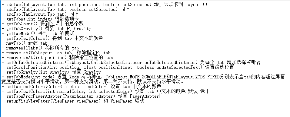
- TabLayout 中的一些方法
先介绍一下 简单的使用方法,这个时候,我先把ActionBar 隐藏掉,隐藏ActionBar 有两种方法,一种是直接选用一个不包含ActionBar 的主题,另一种是在 values/styles.xml 中声明
 <item name="android:windowNoTitle">true</item>
 <item name="windowNoTitle">true</item>

 <item name="android:windowActionBar">false</item>
 <item name="windowActionBar">false</item>
<LinearLayout xmlns:android="http://schemas.android.com/apk/res/android"
xmlns:app="http://schemas.android.com/apk/res-auto"
android:orientation="vertical"
android:layout_width="match_parent"
android:layout_height="match_parent">
<android.support.design.widget.TabLayout
android:id="@+id/tabs"
android:layout_width="match_parent"
android:layout_height="wrap_content"
android:background="@color/colorPrimary"
app:tabTextColor="#000000"
app:tabSelectedTextColor="#beb9b9"
app:tabIndicatorColor="@color/colorAccent">
</android.support.design.widget.TabLayout>
</LinearLayout>只在xml中 添加了一个 TabLayout 控件,这个时候还看不到任何效果,因为还没有给这个控件添加 Tab,接下来到主函数中去获取这个控件,并进行操作。
public class TestActivity extends AppCompatActivity{
private TabLayout mTabLayout;
private List<String> mTitles;
@Override
public void onCreate(Bundle savedInstanceState) {
super.onCreate(savedInstanceState);
setContentView(R.layout.activity_test);
mTabLayout = (TabLayout) findViewById(R.id.tabs);
mTitles = new ArrayList<>();
for (int i = 0; i < 3; i++){
mTitles.add("Tab " + (i+1));
mTabLayout.addTab(mTabLayout.newTab().setText(mTitles.get(i)));
}
}
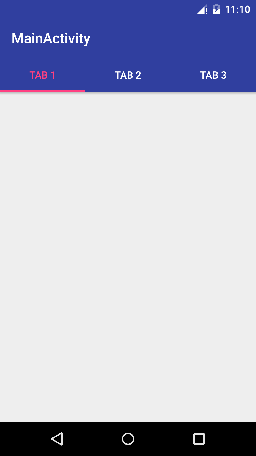
}可见,我们给 TabLayout 设置了三个Tab,并分别命名为 Tab1,Tab2,Tab3,这个时候运行一下程序,看到的结果如下
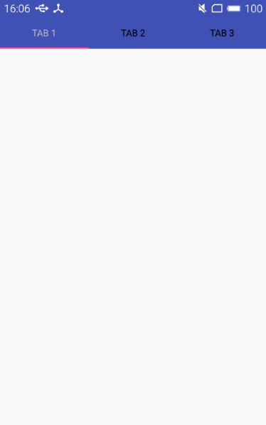
可见这个时候已经能够正常使用了,但是如果当我们点击一个选项卡的时候,能显示出不同的界面,也就是能响应我们的点击就好了。这个效果一般要配合 ViewPager 来使用。
- ViewPager 简介
ViewPager 在一定程度上有点类似AdapterView。AdapterView 需要借助 Adapter 才能提供视图,同样地,ViewPager 也需要 PagerAdapter 的支持。不过相比于 AdapterView 与 Adapter 之间的合作,PagerAdapter 与 ViewPager 之间的合作更加复杂一些。
存在两种 PagerAdapter 的子类供我们直接使用,FragmentStatePagerAdapter 和 FragmentPagerAdapter,这两种adapter的使用方法都是类似的,不同的二者在卸载不再需要的Fragment的处理方式不同。
对于FragmentStatePagerAdapter,在卸载不再需要的Fragment 时,它会将Fragment 彻底移除,但是会使用 onSaveInstanceState() 方法中的Bundle 将Fragment 当前的 状态保存下来,保存下来的状态会用于实例化新的 Fragment。
对于FragmentPagerAdapter,在卸载不需要的Fragment时,它首先会调用事务的 detch(Fragment) 方法,而不是彻底删除Fragment,所以,这种方式只是销毁了视图,真正的Fragment 仍然保存在FragmentManager 中。
如果应用中只包含少量而且固定的Fragment ,那么应当选用FragmenrPagerAdapter,因为这样是可以提高应用的反应速度的。但是,如果一个应用需要创建大量的 Fragment ,而且这些Fragment当中又包含大量的内容,那么这个时候,再用FragmentPagerAdapter 去保存所有信息显然是不合理的,所以这个时候应该选用 FragmentStatePagerAdapter。
下面看一下 FragmentStatePagerAdapter 的简单用法。
  ViewPager viewPager = (ViewPager) findViewById(R.id.viewPager);
  FragmentManager manager = getSupportFragmentManager();
  viewPager.setAdapter(new FragmentStatePagerAdapter(manager) {
            @Override
            public Fragment getItem(int position) {
                return null;
            }

            @Override
            public int getCount() {
                return 0;
            }
 });
只需要在 getItem() 中返回一个Fragment ,在getCount () 方法中返回 fragment 的数目就可以正常使用了。
我们可以使用默认的 FragmentStatePagerAdapter ,很自然的,如果默认的满足不了我们的需求,那么我们可以把它当作父类,自定义PagerAdapter 供我们使用。
- ViewPager + TabLayout
第一步,首先创建一个通用的Fragment 类,代码如下:
public class MyFragment extends Fragment {

    private String mString;
    public static final String KEY = "key";

    @Override
    public void onCreate(@Nullable Bundle savedInstanceState) {
        super.onCreate(savedInstanceState);
        Bundle bundle = getArguments();
        mString = bundle.getString(KEY);
    }

    @Nullable
    @Override
    public View onCreateView(LayoutInflater inflater, @Nullable ViewGroup container, @Nullable Bundle savedInstanceState) {

        View view = inflater.inflate(R.layout.fragment_layout,container,false);
        TextView textView = (TextView) view.findViewById(R.id.text);
        textView.setText(mString);
        return view;
    }

    public static Fragment newInstance(String text){

        MyFragment fragment = new MyFragment();
        Bundle bundle = new Bundle();
        bundle.putString(KEY,text);
        fragment.setArguments(bundle);
        return fragment;
    }
}
然后,定义主函数中的 布局文件
<LinearLayout
    xmlns:android="http://schemas.android.com/apk/res/android"
    xmlns:app="http://schemas.android.com/apk/res-auto"
    android:layout_width="match_parent"
    android:layout_height="match_parent"
    android:orientation="vertical">

    <android.support.design.widget.TabLayout
            android:id="@+id/tab"
            android:layout_width="match_parent"
            android:layout_height="wrap_content"
            app:layout_scrollFlags="scroll|enterAlways"
            app:tabIndicatorColor="@color/colorAccent"
            app:tabSelectedTextColor="@color/colorAccent"
            app:tabTextColor="#ffffff"/>

    <android.support.v4.view.ViewPager
        android:id="@+id/viewPager"
        android:layout_width="match_parent"
        android:layout_height="wrap_content"/>

</LinearLayout>
在使用ViewPager 之前,我们首先自定义一个 PagerAdapter 类
public class FragmentAdapter extends FragmentStatePagerAdapter{
private List<Fragment> mList;
public FragmentAdapter(FragmentManager manager,List list){
super(manager);
mList = list;
}
@Override
public Fragment getItem(int position) {
return mList.get(position);
}
@Override
public int getCount() {
return mList.size();
}
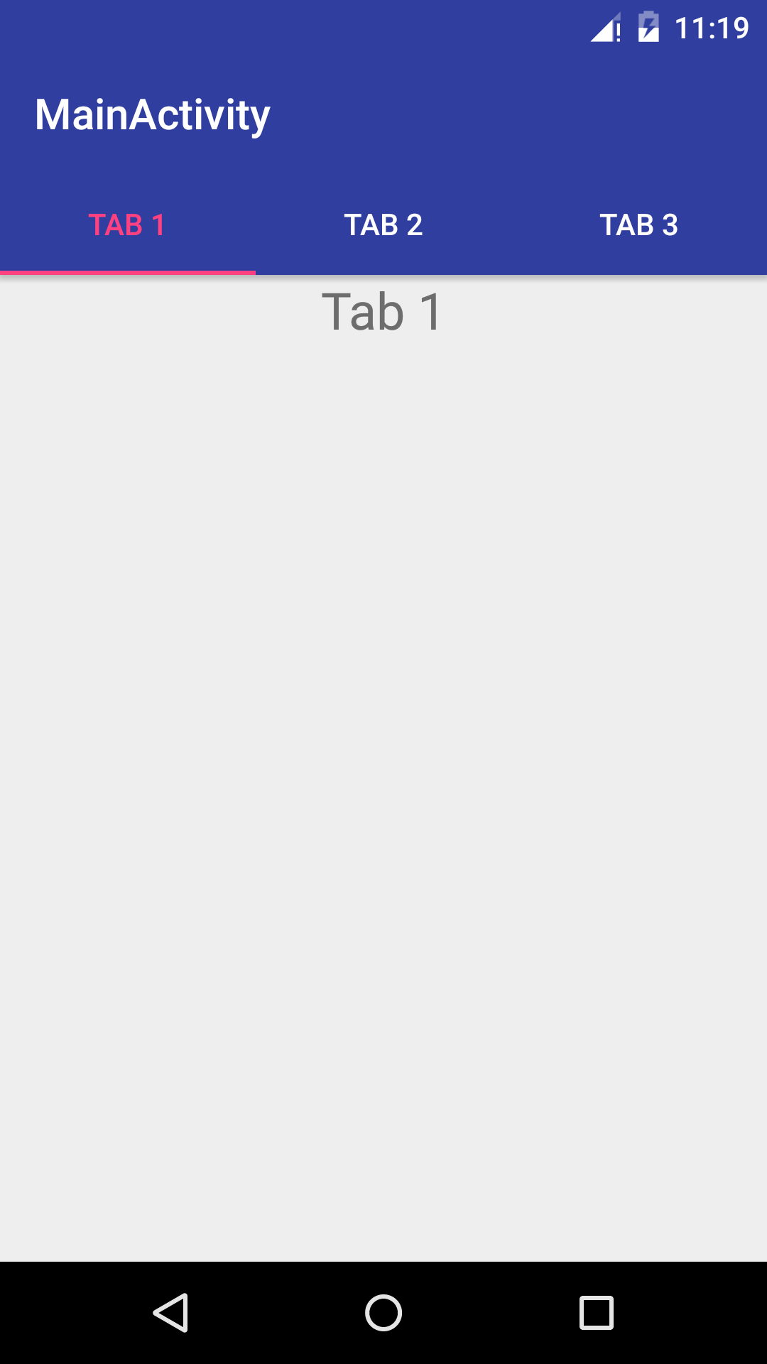
}这样我们在主函数中,只需要调用 TabLayout.setupWithViewPager(mViewPager),就可以实现TabLayut与ViewPager 之间的协调工作了。允许一下,看看结果
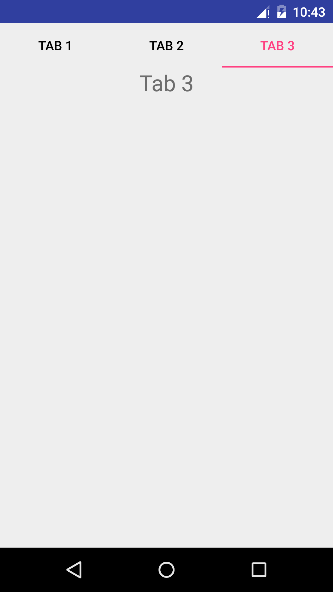
可见这个时候,TabLayout 已经可以和ViewPager 协调使用了,但是,这个时候界面看上去总觉得少了些什么,对,这就是我们上面隐藏掉的ActionBar.
4.ActionBar 的使用问题
在TabLayout的定义 中加上一行属性
android:background="@color/colorPrimary"设置这行代码的原因是,让TabLayout 的背景色和ActionBar 保持一致,来看一看效果图
可见,这个时候,ActionBar 和 TabLayout 之间竟然有一行加了阴影的黑线,非常的难看。当然,我们可以让TabLayout的颜色和ActionBar不同,达到另一种设计效果,自然不用考虑这些问题,但是如果想要ActionBar 和TabLayout看上去浑然一体,那么我们就不得不考虑将这条黑线去掉了。
首先,我们还是要将这个ActionBar 去除,因为我们需要在布局文件中自定义一个 ToolBar ,并且将 这个ToolBar 和 TabLayout 放在一个AppBarLayout中,所以现在的布局文件为
<?xml version="1.0" encoding="utf-8"?>
<android.support.design.widget.CoordinatorLayout
    xmlns:android="http://schemas.android.com/apk/res/android"
    xmlns:app="http://schemas.android.com/apk/res-auto"
    android:layout_width="match_parent"
    android:layout_height="match_parent">

    <android.support.design.widget.AppBarLayout
        android:layout_width="match_parent"
        android:layout_height="wrap_content">

        <android.support.v7.widget.Toolbar
            android:id="@+id/toolbar"
            android:layout_width="match_parent"
            android:layout_height="?attr/actionBarSize"
            android:background="@color/colorPrimaryDark"
            app:titleTextColor="#ffffff">

        </android.support.v7.widget.Toolbar>

        <android.support.design.widget.TabLayout
            android:id="@+id/tab"
            android:background="@color/colorPrimaryDark"
            android:layout_width="match_parent"
            android:layout_height="wrap_content"
            app:layout_scrollFlags="scroll|enterAlways"
            app:tabIndicatorColor="@color/colorAccent"
            app:tabSelectedTextColor="@color/colorAccent"
            app:tabTextColor="#ffffff"/>

    </android.support.design.widget.AppBarLayout>

    <android.support.v4.view.ViewPager
        android:id="@+id/viewPager"
        android:layout_width="match_parent"
        android:layout_height="wrap_content"/>

</android.support.design.widget.CoordinatorLayout>
当然,这个时候还是没有ToolBar 的,因为还没有在主函数中设置它,下面,回到主函数中,添加以下代码。
Toolbar mToolbar = (Toolbar) findViewById(R.id.toolbar);
mToolbar.setTitle("MainActivity");
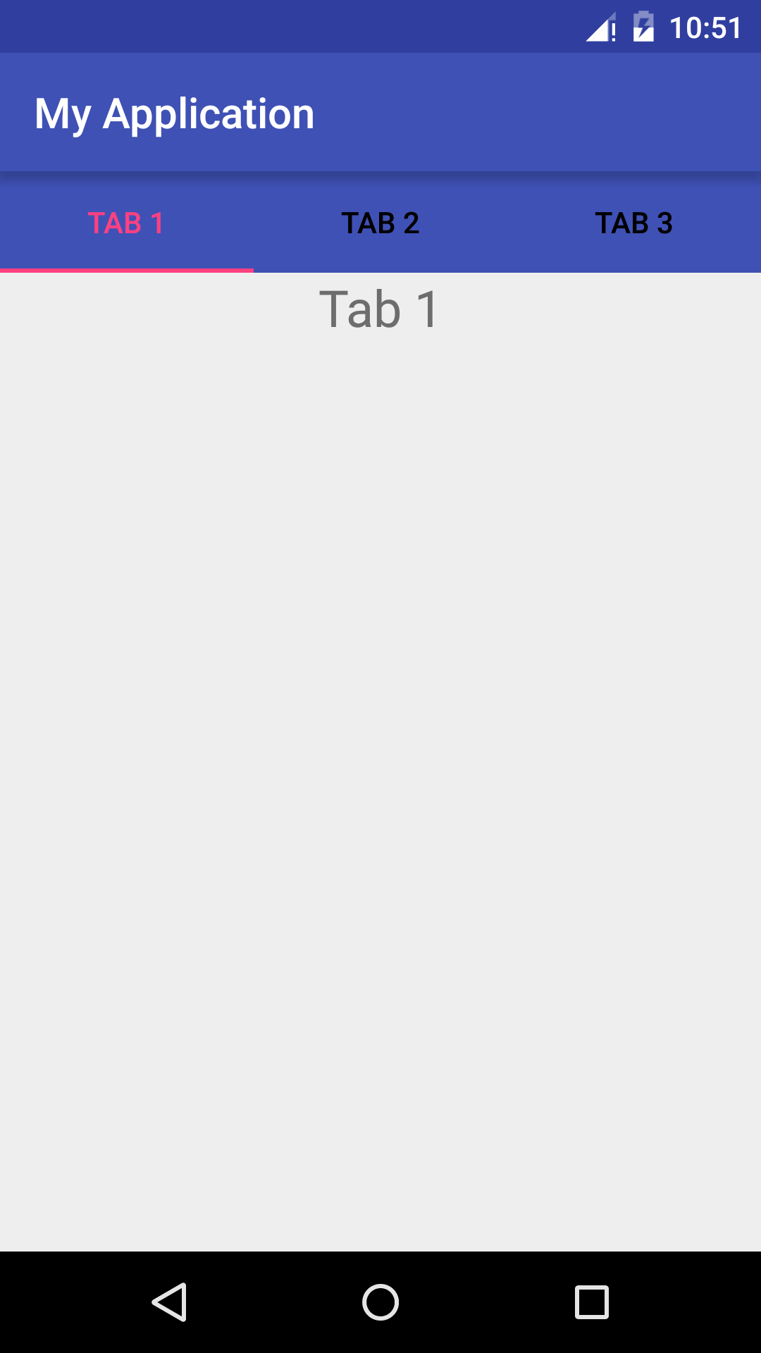
setSupportActionBar(mToolbar);现在的效果为
可见,这个时候ActionBar 已经和 TabLayout 无缝衔接了,但是意外的是,为什么我们想要显示的内容不见了? CoordinatorLayout 实际上是增强版的 FrameLayout ,所以理所当然的认为,我们的内容可能是被 ActionBar 和 TabLayout 的视图挡住了,那么该怎么办呢?
只需要在ViewPager 的定义中添加以下代码,就可以解决这个问题
app:layout_behavior="@string/appbar_scrolling_view_behavior"再来看看效果图
好了,这个时候问题就已经解决了。我们可以在app的顶部添加导航,那么能不能在底部添加呢?
5.底部TabLayout 的实现
想要将TabLayout视图 放置到底部,首先需要在布局中将TabLayout 放置在底部
<LinearLayout
    xmlns:android="http://schemas.android.com/apk/res/android"
    xmlns:app="http://schemas.android.com/apk/res-auto"
    android:layout_width="match_parent"
    android:layout_height="match_parent"
    android:orientation="vertical">

    <android.support.v4.view.ViewPager
        android:id="@+id/viewpager"
        android:layout_width="match_parent"
        android:layout_height="0dp"
        android:layout_weight="1.0">
    </android.support.v4.view.ViewPager>

    <android.support.design.widget.TabLayout
        android:id="@+id/tabs"
        android:layout_width="match_parent"
        android:layout_height="wrap_content"
        android:background="#aba8a8"
        app:tabPaddingEnd="12dp"
        app:paddingStart="12dp"
        app:tabTextColor="#aba8a8"
        app:tabSelectedTextColor="@color/colorPrimary"
        app:tabIndicatorHeight="0dp">
    </android.support.design.widget.TabLayout>
</LinearLayout>
其次,在自定义的PagerAdapter 中,添加一个方法
 public View getTabView(int position){
        View view = LayoutInflater.from(mContext).inflate(R.layout.tab_layout,null);
        TextView mTextView = (TextView) view.findViewById(R.id.tab_tv);
        mTextView.setText(mTitles.get(position));
        ImageView mImageView = (ImageView) view.findViewById(R.id.tab_iv);
        mImageView.setImageResource(R.mipmap.ic_launcher);
        return view;
    }
这个R.layout.tab_layout,是自定义tab布局,可以定制自己想要的结果,这个地方我放置了一个 TextView 和一个 ImageView。
然后,到主函数中添加以下代码
 for (int i = 0; i < mTabLayout.getTabCount(); i++){

            TabLayout.Tab tab = mTabLayout.getTabAt(i);
            if (tab != null){
                tab.setCustomView(adapter.getTabView(i));
            }
        }
这个时候就实现了底部布局,效果如下


 928
928

 被折叠的 条评论
为什么被折叠?
被折叠的 条评论
为什么被折叠?
 到【灌水乐园】发言


