


- 上文 Flutter 多子 Widget 布局之Flex、Expanded、Wrap、Flow,介绍了弹性布局
Flex、Expanded和流式布局Wrap、Flow - 再上文 Flutter 多子 Widget 布局之线性布局 Row、Column,介绍了线性布局
Row、Column组件
层叠 Widget 布局
层叠布局,类似于
Android中的FrameLayout,可以将布局叠加在另一个布局上。
Flutter中可以通过Stack和Positioned来实现相同的效果。
Stack
将控件叠加在另一个控件的上面,比如在一张图片上放置一段文字。
查看构造函数,看看都支持哪些属性:
Stack({
    Key key,
    this.alignment = AlignmentDirectional.topStart,// 定位方向
    this.textDirection,// 和 Row Column 中一致,用于决定控件的摆放方向
    this.fit = StackFit.loose,// 子控件适应 Stack 的大小模式
    this.overflow = Overflow.clip,// 子控件超出 Stack 的显示空间的显示模式
    List<Widget> children = const <Widget>[],// 子控件集合
  })
接下来,详细看看各个参数支持的值。
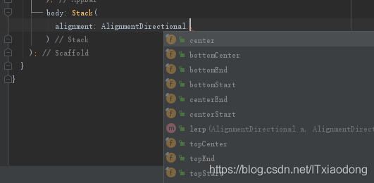
alignment
alignment支持以下值:center, bottomCenter, bottomEnd, bototmStart, centerEnd, centerStart, topCenter, topStart, topEnd,各个参数从字面意思也能理解。
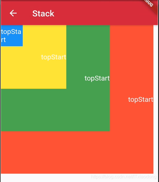
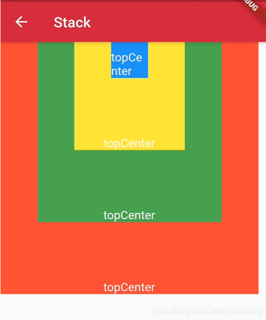
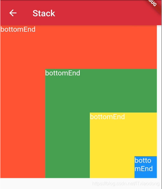
直接上效果图看各参数具体的显示:这里只展示topStart, topCenter, bottomEnd,其他参数的显示效果也是类似。
主要看 四个颜色(蓝黄绿红)方块层叠的位置!
伪代码如下:
Stack(
  alignment: AlignmentDirectional.bottomEnd,
  children: <Widget>[
    Container(
      width: 350,
      height: 350,
      color: Colors.red,
      alignment: Alignment.topLeft,// 改变文本的显示位置,为了展示效果,这个值需要跟随 stack 的 alignment 改变
      child: Text('bottomEnd',style: TextStyle(color: Colors.white),),
    ),
    Container(
      width: 250,
      height: 250,
      color: Colors.green,
      alignment: Alignment.topLeft,
      child: Text('bottomEnd',style: TextStyle(color: Colors.white),),
    ),
    Container(
      width: 150,
      height: 150,
      color: Colors.yellow,
      alignment: Alignment.topLeft,
      child: Text('bottomEnd',style: TextStyle(color: Colors.white),),
    ),
    Container(
      width: 50,
      height: 50,
      color: Colors.blue,
      alignment: Alignment.topLeft,
      child: Text('bottomEnd',style: TextStyle(color: Colors.white),),
    ),
  ],
)
fit
fit支持以下值:expand, loose, passthough
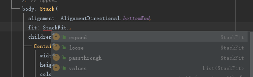
StackFit.loose:默认效果,非Positioned子组件可取最小到最大这个区间内的值,如Stack添加宽高350*600的约束,那么子组件宽取值区间为0-350,高取值区间为0-600。StackFit.expand:子组件取最大尺寸,如Stack添加宽高350*600的约束,那么子组件的宽为350,高为600。StackFit.passthrough:不改变子组件约束条件。
效果示例:
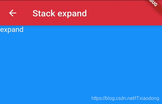
StackFit.expand 效果伪代码实现:
Stack(
  fit: StackFit.expand,
  children: <Widget>[
    Container(
      width: 350,
      height: 350,
      color: Colors.red,
      alignment: Alignment.topLeft,// 改变文本的显示位置,为了展示效果,这个值需要跟随 stack 的 alignment 改变
      child: Text('expand',style: TextStyle(color: Colors.white),),
    ),
    Container(
      width: 50,
      height: 50,
      color: Colors.blue,
      alignment: Alignment.topLeft,
      child: Text('expand',style: TextStyle(color: Colors.white),),
    ),
  ],
)
loose, passthrough字段,暂时没想到示例,就不放效果图了。
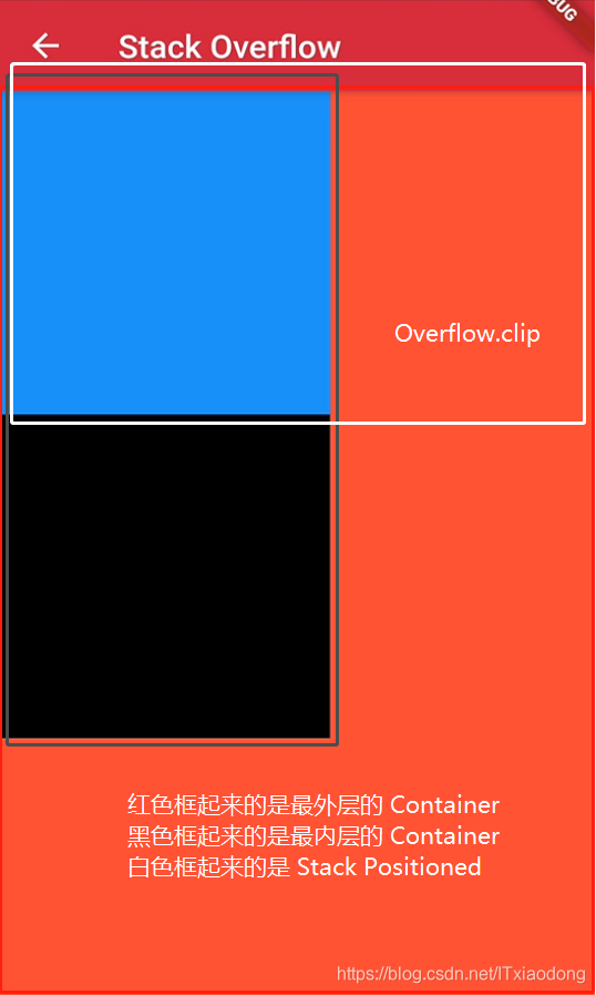
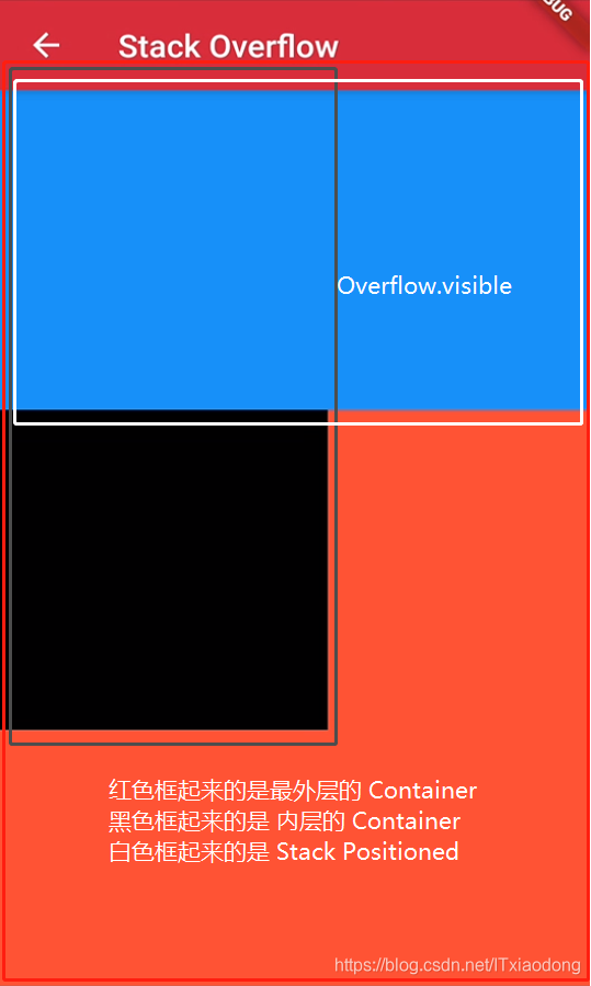
overflow
overflow支持以下值:expand, loose, passthough
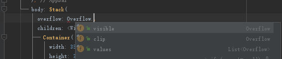
Overflow.clip: 默认效果,超出Stack部分会被剪裁(隐藏),Overflow.visible超出Stack部分不会被剪裁(隐藏)。
示例效果图:
原文源码:在Flutter中,定位的Widget如何在其父Stack区域之外点击?
Positioned
Positioned可以设置子Widget位置
查看构造函数,看看都支持哪些属性:
const Positioned({
    Key key,
    this.left,// 离 Stack 左边的距离
    this.top,// 离 Stack 上边的距离
    this.right,// 离 Stack 右边的距离
    this.bottom,// 离 Stack 底边的距离
    this.width,// child 的宽度
    this.height,// child 的高度
    @required Widget child, // 子控件
  })
示例效果图:
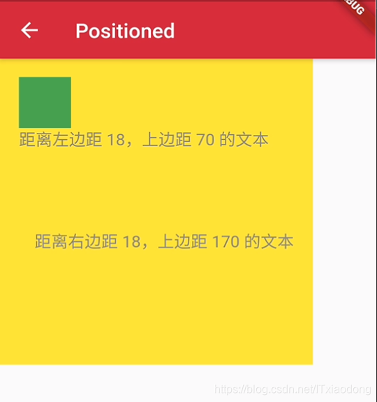
示例伪代码:
Stack(
  children: <Widget>[
    Container(color: Colors.yellow, width: 300, height: 300),//黄色容器
    Positioned(
      left: 18.0,
      top: 18.0,
      child: Container(color: Colors.green, width: 50, height: 50),//叠加在黄色容器之上的绿色控件
    ),
    Positioned(
      left: 18.0,
      top:70.0,
      child: Text("距离左边距 18,上边距 70 的文本"),
    ),
    Positioned(
      right: 18.0,
      top:170.0,
      child: Text("距离右边距 18,上边距 170 的文本"),
    )
  ],
)
完~


 827
827


 被折叠的 条评论
为什么被折叠?
被折叠的 条评论
为什么被折叠?
 到【灌水乐园】发言


