


margin水平垂直居中引发的思考
margin: auto明明设置的上下左右自动,却只能水平方向居中这是为什么?而行内元素却不能使用该方法居中,这又是为什么?
注意:行内级(包括行内块)元素是不能使用此方法居中的
<div class="container">
    <span class="text">我是行内标签</span>
</div>
我们知道:块级子元素宽度的计算,在不考虑子元素外边距的情况下,子元素宽度一定是占据父元素的全部内容区域的(即父元素width的宽度)
当子元素设置了宽度和左右边距时,例如:父元素宽1200px,子元素宽100px,左右边距为100px时,此时子元素的 理想宽度 != 父元素的内容宽度
此时浏览器会优先使左margin为100px,然后子元素宽度为100px,最后我们知道了左边距和宽度之后,此时右边距就不再需要计算,这就是是浏览器的机制
<div class="container">
    <div class="text">我是行块标签</div>
</div>
<style>
.container {
  background-color: #cccccc;
  width: 1200px;

  & > .text {
    @include flex;
    height: 100px;
    width: 100px;
    margin-left: 100px;
    background-color: #20c997;
  }
}
</style>
<script>
const text = document.querySelector(".text")
const style = window.getComputedStyle(text)
console.log(style.marginLeft, style.marginRight)// 100px 0px
</script>
可是即便右侧我们没有设置内容,但是其他元素也能使用,这是为什么?
这是因为,块元素之外还有一个包含块的概念,块元素的包含块的高度由内容撑开,而水平方向(正常情况下)一定是父元素内容宽度
网页上的区块(block)指的是出现在新行上的 HTML元素,即在横向书写模式中位于上一个元素之下,下一个元素之上(通常称为块级元素)。
——MDN
当把margin设置为0 auto时就是把左右外边距自动获取,此时浏览器则会平分父元素的水平方向的剩余 “可用宽度”,如果你已经会使用JS了不妨获取一下他的margin
<style>
.container {
  background-color: #cccccc;
  width: 1200px;

  & > .text {
    @include flex;
    height: 100px;
    width: 100px;
    margin: auto;
    background-color: #20c997;
  }
}
</style>
<div class="container">
    <div class="text">
    </div>
</div>
<script>
const textEl = document.querySelector(".text")
console.log(window.getComputedStyle(textEl).marginLeft,window.getComputedStyle(textEl).marginRight)// 550px 550px
</script>
这就是浏览器的原理,但是要理清楚其中的原因又得从另一个概念——“包含块”说起
包含块
什么是包含块?我的理解就是只有该元素可使用,而其他元素不能使用的内容区域。
因此我们的块元素即使没有占满整个父元素内容的宽度,但是别的元素也不能使用他没使用的宽度。
那我们来看看MDN怎么解释
一个元素的尺寸和位置经常受其包含块(containing block)的影响。大多数情况下,包含块就是这个元素最近的祖先块元素的内容区域,但也不是总是这样。
当一个浏览器展示一个HTML文档的时候,对于每一个元素,它都产生了一个盒子。每一个盒子都被划分为四个区域:
- 内容区
- 内边距区
- 边框区
- 外边距区
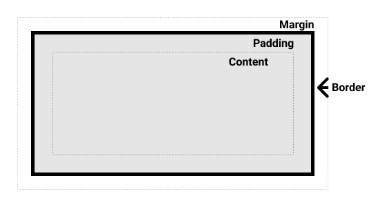
图片取自MDN,而我所理解的包含块就是最外层的虚线
百分比与包含块
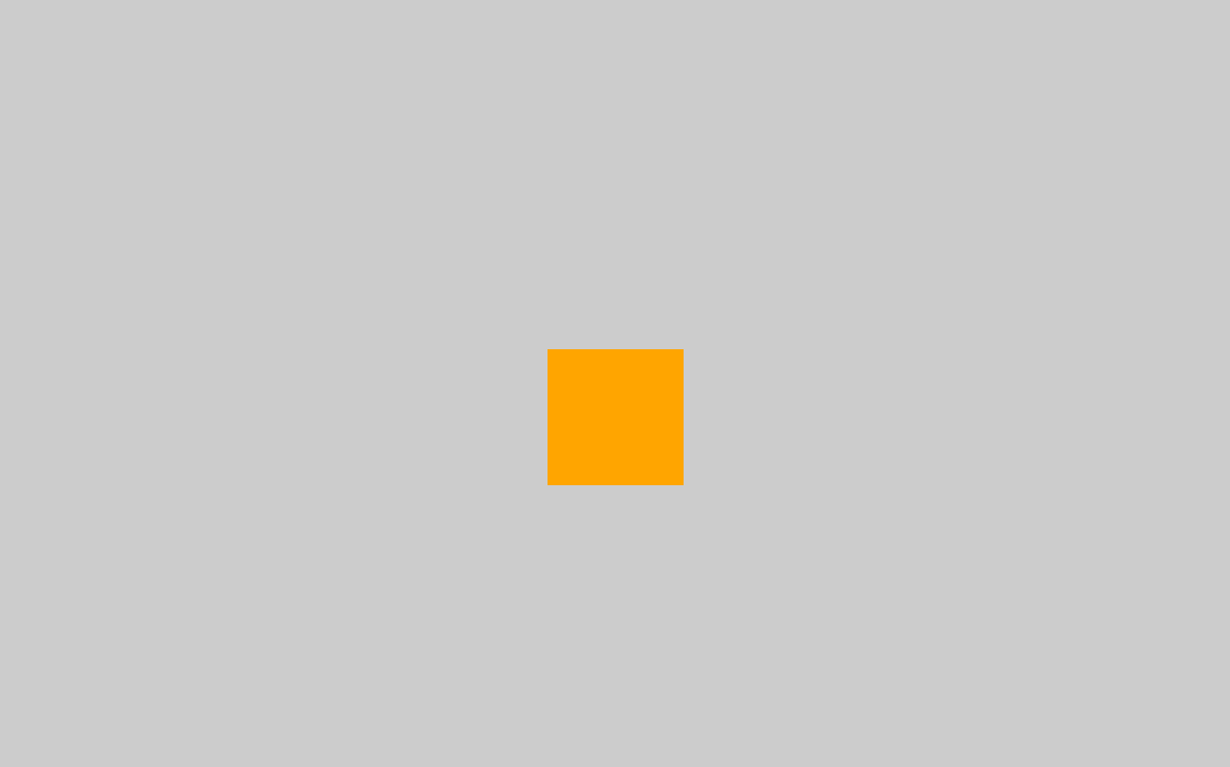
其实我们所理解的百分比都是相对于包含块的大小,而不是父元素的大小,如下例,我们采用border-box
<div class="container">
    <div class="content">

    </div>
</div>
.container {
  width: 1200px;
  position: relative;
  background-color: #cccccc;
  padding: 0 50px;

  & > .content {
    width: 10%;
    height: 100px;
    background-color: orange;
  }
}
我想结论应该很明显了
例如
width,height,padding,margin,绝对定位元素的偏移值(比如position被设置为absolute或fixed),当我们对其赋予百分比值时,这些值的计算值,就是通过元素的包含块计算得来。——MDN
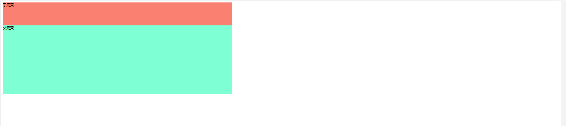
我的猜想
再看看下图一个子块和父块,想一想子元素在水平方向上和垂直方向上有什么不同?——水平方向子块占用父元素的内容区域(或者说父元素的这一行就是只允许这个子块使用的),而垂直方向上却没有。
那么为什么子块元素能占用父元素水平方向的内容区域,而不能占用垂直方向的内容区域呢?因为这一个父块还允许存放其他的内容,当然这是浏览器的机制。
抓住关键点“父块的一行只允许这一个子块使用”,就在这样的机制下我们能使用margin: 0 auto实现水平居中
那么我能不能猜测,如果有这样一个父块,他只存放一个子块,或者说父块的行、列都只允许一个字块使用,那么我就能实现垂直方向上的居中。
果然我猜对了
<div class="container">
    <div class="content">

    </div>
</div>
.container {
  width: 100%;
  height: 100vh;
  position: relative;
  background-color: #cccccc;

  & > .content {
    background-color: orange;
    position: absolute;
    top: 0;
    right: 0;
    bottom: 0;
    left: 0;
    height: 100px;
    width: 100px;
    margin: auto auto;
  }
}
修改包含块
确定包含块
确定一个元素的包含块的过程完全依赖于这个元素的
position属性:
- 如果 position 属性为
static、relative或sticky,包含块可能由它的最近的祖先块元素(比如说 inline-block, block 或 list-item 元素)的内容区的边缘组成- 如果 position 属性为
absolute,包含块就是由它的最近的 position 的值不是static(也就是值为fixed,absolute,relative或sticky)的祖先元素的内边距区的边缘组成。- 如果 position 属性是
fixed,在连续媒体的情况下 (continuous media) 包含块是 viewport ,在分页媒体 (paged media) 下的情况下包含块是分页区域 (page area)。- 如果 position 属性是
absolute或fixed,包含块也可能是由满足以下条件的 最近父级元素 的 内边距区 的 边缘组成的:
transform或perspective的值不是nonewill-change的值是transform或perspectivefilter的值不是none或will-change的值是filter(只在 Firefox 下生效)。contain的值是layout、paint、strict或content(例如:contain: paint;)backdrop-filter的值不是none(例如:backdrop-filter: blur(10px);)- 这一段我是真没看懂,我所知道的fixed的包含块就是视口的宽高
- 根元素(
<html>)所在的包含块是一个被称为初始包含块的矩形。它具有视口(对于连续媒体)或页面区域(对于分页媒体)的尺寸。perspective和filter属性对形成包含块的作用存在浏览器之间的不一致性。——MDN
当然有了这些知识,我们可以确定包含块的最大位置了,现在我们需要 获取包含块的最大位置。
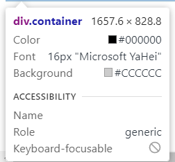
我们使用绝对定位之后,默认是在父元素左上角的位置left: 0;top: 0;,而right: parentWidth - selfWidth; bottom: parentHeight - selfHeight;为什么?我猜测因为定位之后包含块默认为内容大小
.container {
  background-color: #cccccc;
  width: 100vw;
  height: 50vw;
  position: relative;

  & > .text {
    height: 100px;
    width: 100px;
    background-color: #20c997;
    position: absolute;
  }
}
const textEl = document.querySelector(".text")
const style = window.getComputedStyle(textEl)
console.log("left:"+style.left,"right:"+style.right, "top:"+style.top,"bottom:"+style.bottom)
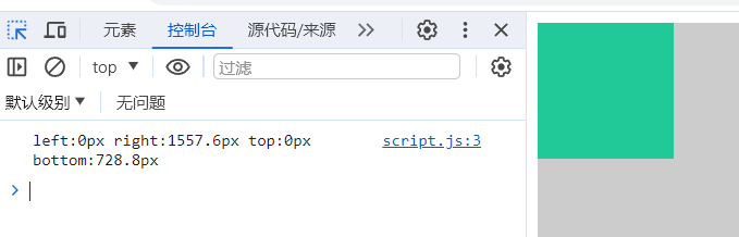
所以我们要手动去设置包含块大小,直接占用整个父元素的区域的包含块大小,获取到使用权,使用下方代码固定包含块的四个角落
left: 0;
right: 0;
top: 0;
bottom: 0;
还需要注意,当我们使用定位后创建新的包含块,如果不设置宽高,默认宽高会是包含块的大小
使用场景
实现一个水平垂直居中的弹窗,只需要用到下面几个属性就能轻松实现相对页面水平垂直居中
position: fixed;
left: 0;
right: 0;
top: 0;
bottom: 0;
margin: auto;
示例:原生代码手搓一个弹窗
<body>
<div class="container">
    <button>弹出弹窗</button>
    <dialog>
        <div class="dialog-title">
            <p>提示</p>
            <span class="closeIcon">✘</span>
        </div>
        <div class="dialog-content">
            <p>弹出了一个提示框</p>
        </div>
        <div class="dialog-footer">
            <button class="closeBtn">关闭</button>
            <button class="enterBtn">确认</button>
        </div>
    </dialog>
</div>
</body>
<script>
    const showBtn = document.querySelector("button")
    const dialogEl = document.querySelector("dialog")
    const closeIcon = document.querySelector(".closeIcon")
    const closeBtn = document.querySelector(".closeBtn")
    const enterBtn = document.querySelector(".enterBtn")
    showBtn.addEventListener("click",()=>{
        dialogEl.showModal()
    })
    closeIcon.onclick =()=>{
        dialogEl.close()
    }
    closeBtn.onclick =()=>{
        dialogEl.close()
    }
    enterBtn.onclick =()=>{
        dialogEl.close()
    }
</script>
* {
  margin: 0;
  padding: 0;
  box-sizing: border-box;
}

.container {
  margin-top: 500px;
  margin-left: 300px;
  position: relative;

  dialog {
    height: fit-content;
    width: 300px;
    padding: 16px;
    border: none;
    border-radius: 4px;
    box-shadow: 0 1px 2px -2px rgba(0, 0, 0, 0.16),
    0 3px 6px rgba(0, 0, 0, 0.12),
    0 5px 12px 4px rgba(0, 0, 0, 0.09);
    position: fixed;
    left: 0;
    right: 0;
    top: 0;
    bottom: 0;
    margin: auto;
    transition: opacity .3s, height .3s;
    transition-behavior: allow-discrete;

    .dialog-title {
      display: flex;
      justify-content: space-between;
      align-content: center;

      p {
        font-family: Helvetica Neue, Helvetica, PingFang SC, Hiragino Sans GB, Microsoft YaHei, SimSun, sans-serif;
        font-weight: 400;
        font-size: 18px;
        line-height: 26px;
      }

      span {
        color: #909399;
        font-size: 16px;
        line-height: 24px;
        cursor: pointer;
        transition: all .3s;

        &:hover {
          color: #409eff;
        }
      }
    }

    .dialog-content {
      padding: 30px 0;
      color: #606266;
      font-size: 14px;
      word-break: break-all;
    }

    .dialog-footer {
      display: flex;
      justify-content: flex-end;

      button {
        font-weight: 500;
        padding: 4px 20px;
        font-size: 14px;
        line-height: 22px;
        background-color: #409eff;
        color: #fff;
        outline: none;
        border: none;
        border-radius: 4px;
        margin-left: 16px;
        cursor: pointer;
        transition: all .3s;

        &:hover {
          opacity: .8;
        }

        &:active {
          background-color: #026FDBFF;
        }

        &:first-child {
          color: #606266;
          border: 1px solid #dcdfe6;
          background-color: transparent;

          &:hover {
            color: #026fdb;
            border-color: #c6e2ff;
            background-color: #ecf5ff;
          }

          &:active {
            color: #026FDBFF;
            border-color: #026FDBFF;
          }
        }
      }
    }
  }

  dialog::backdrop {
    background-color: #333333;
    opacity: .3;
    transition: opacity .3s;
  }

}

@starting-style{
  dialog {
    height: 0;
    opacity: 0;
  }
  dialog::backdrop{
    opacity: 0;
  }
}
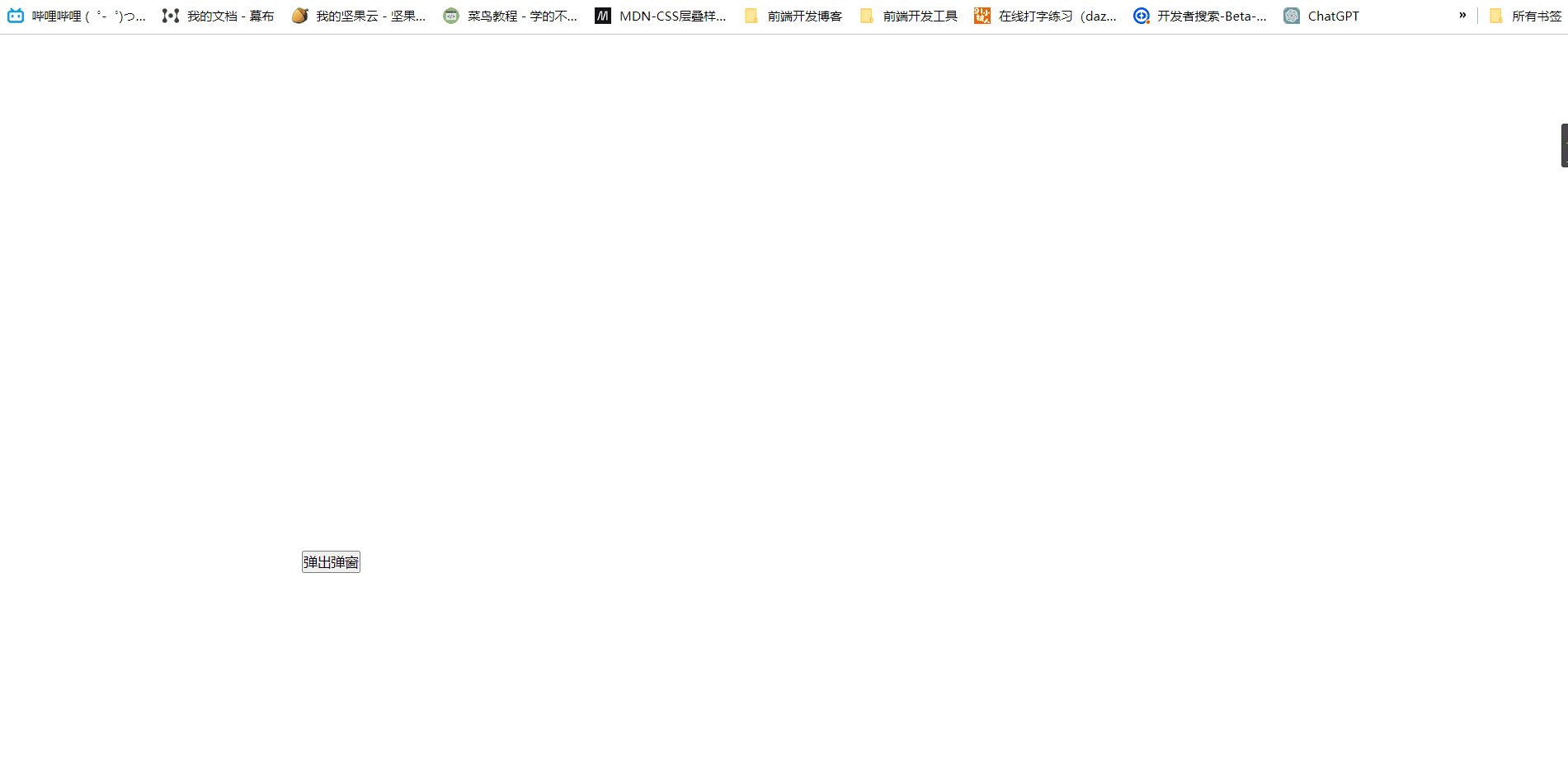
看吧,很简单吧
总结
要另外固定独立包含块的大小要使用position: absolute/ fixed,
要实现margin: auto水平垂直居中,就需要获取单独的包含块,
固定包含块的大小就要使用left, right, top, bottom四个属性。


 6万+
6万+


 被折叠的 条评论
为什么被折叠?
被折叠的 条评论
为什么被折叠?
 到【灌水乐园】发言


