


盒子模型
盒子模型:把HTML页面中的布局元素看作是一个矩型的盒子,也就是盛装内容的容器
包括:边框(border),外边距(margin),内边距(paddig),实际内容(content)
边框(border)
边框的组成:边框宽度,边框样式,边框颜色
border : border-width || border-style || border-color;
| 属性 | 作用 |
|---|---|
| border-width | 定义边框的粗细,单位px |
| border-style | 边框的样式(solid[实线],dashed[虚线],dotted[点线],none[没有边框]) |
| border-color | 边框的颜色 |
边框的简写:border:1px solid red;//没有顺序
边框分开写:
border-top:1px solid red; /*只设置上边框 其余同理(下:-bottom 左:-left 右:-right)*/
表格的细线边框处理
border-collapse:collapse; 表示相邻边框合并在一起!
注意:加了边框是会影响盒子实际大小
内边距(padding)
用于设置内边距,即边框于内容之间的距离
| 属性 | 作用 |
|---|---|
| padding-left | 左内边距 |
| padding-right | 右内边距 |
| padding-top | 上内边距 |
| padding-bottom | 下内边距 |
padding:5px; 代表上下左右都是5px的内边距;
padding:5px 10px; 代表上下内边距5px,左右内边距为10px;
padding:5px 10px 20px; 代表上内边距5px 左右内边距为10px 下内边距为20px;
padding:5px 10px 20px 30px; 上5px 右10px 下20px 左30px;
注意:更改了内边距之后会影响盒子的实际大小,解决方案则让width/height减去多出来的内边距大小,如果盒子本身没有指定width/height属性,则此时padding不会撑开盒子大小.
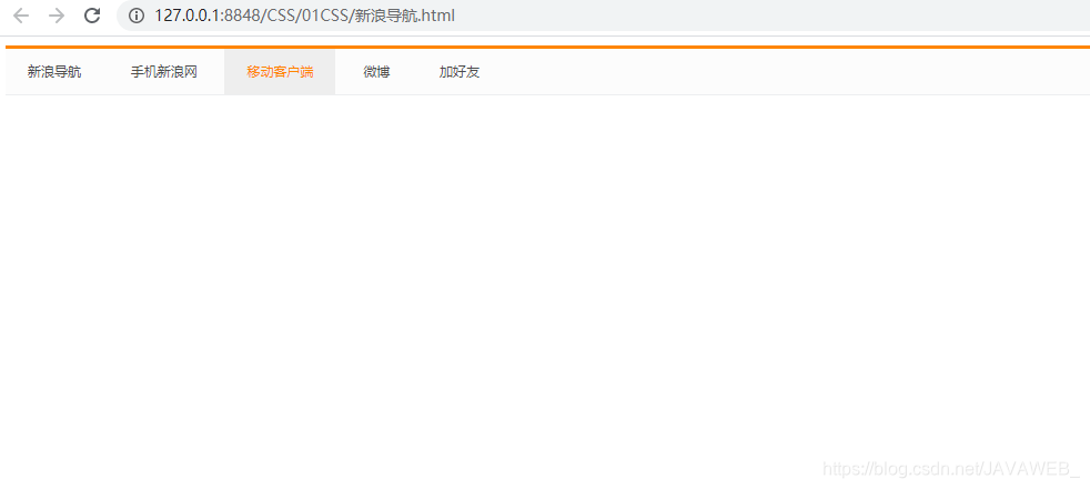
新浪导航案例
<!DOCTYPE html>
<html>
	<head>
		<meta charset="utf-8">
		<title></title>
		<style type="text/css">
			.nav{
				height: 41px;
				border-top: 3px solid #ff8500;
				border-bottom:1px solid #edeef0;
				background-color: #fcfcfc;

			}
			.nav a{
				font-size: 12px;
				display: inline-block;
				color: #4c4c4c;
				text-decoration: none;
				height: 41px;
				padding:0 20px;
				line-height: 41px;
			}
			a:hover{
				background-color: #eee;
				color: #FF8500;
			}
		</style>
	</head>
	<body>
		<div class="nav">
			<a href="#">新浪导航</a>
			<a href="#">手机新浪网</a>
			<a href="#">移动客户端</a>
			<a href="#">微博</a>
			<a href="#">加好友</a>
		</div>
	</body>
</html>
外边距(margin)
margin用于设置外边距,即控制盒子和盒子之间的距离
| 属性 | 作用 |
|---|---|
| margin-left | 左外边距 |
| margin-right | 右外边距 |
| margin-top | 上外边距 |
| margin-bottom | 下外边距 |
margin:5px; 代表上下左右都是5px的内边距;
margin:5px 10px; 代表上下内边距5px,左右内边距为10px;
margin:5px 10px 20px; 代表上内边距5px 左右内边距为10px 下内边距为20px;
margin:5px 10px 20px 30px; 上5px 右10px 下20px 左30px;
外边距可以让块级元素水平居中,盒子必须指定宽度(width),盒子左右外边距都设置为auto
div{width:960px;margin:0 auto;}
行内元素或者行内块元素水平居中给其父元素添加text-align:center 即可!
如果相邻的两个元素相遇时,上面元素有下外边距margin-bottom,下面的元素有上外边距margin-top,则他们之间的垂直间距不是margin-top与margin-bottom之和,而是取两个值中的较大者这种现象被称为相邻元素垂直外边距的合并,所以我们尽量只给一个盒子添加margin值
嵌套块元素垂直外边距的塌陷问题
对于两个嵌套关系的块元素,父元素有上外边距同时子元素也有上外边距,此时父元素会塌陷较大的边距值
解决方案:可以为父元素定义上边框 可以为父元素定义上内边距 可以为父元素添加 overflow:hidden;
案例1:

<!DOCTYPE html>
<html>
	<head>
		<meta charset="utf-8">
		<title></title>
		<style>
			*{
				margin: 0;
				padding: 0;
			}
			body{
				background-color: #f5f5f5;
			}
			a{
				color: #333333;
				text-decoration: none;
			}
			.box{
				width: 298px;
				height: 415px;
				background-color: #fff;
				margin: 50px auto;
			}

			.box img{
				height: 240px;
				width: 100%;
			}
			.review{
				height: 70px;
				font-size: 14px;
				padding: 0 28px;
				margin-top:30px;
			}
			.info{
				font-size: 12px;
				margin-top: 10px;
				padding: 0 28px;
				color: #888888;
			}
			.zh{
				padding: 0 28px;
				font-size: 14px;
				margin-top:15px;
			}
			.zh h4{
				font-weight: 400;
				display: inline-block;
			}
			.zh span{
				color: #FF8500;
			}
			.zh em{
				font-style: normal;
				color: #888888;
				margin: 0 7px 0 15px;
			}
		</style>
	</head>
	<body>
		<div class="box">
			<a href="#"><img src="../img/50649d7b5706f4cd9f658e93db6b6564.webp" /></a>
			<p class="review"><a href="#">快递牛,整体不错蓝牙可以说秒连接。红米给力</a></p>
			<div class="info">
				来自于117384232 的评价
			</div>
			<div class="zh">
				<h4><a href="#">AltDots真元素蓝...</a> </h4>
				<em>|</em><span>99.9元</span>
			</div>
		</div>
	</body>
</html>
案例2:
list-style: none; 用于取消 li 的小园点
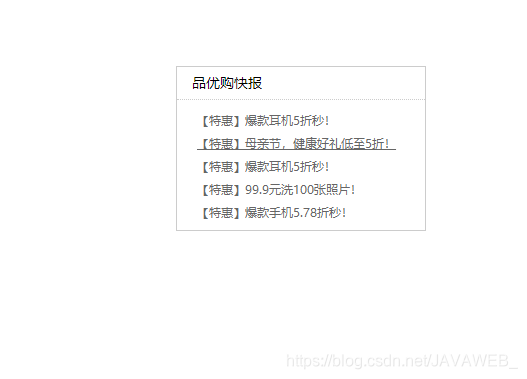
<!DOCTYPE html>
<html>
	<head>
		<meta charset="utf-8">
		<title></title>
		<style type="text/css">
			*{
				padding: 0;
				margin: 0;
			}
			.box{
				width: 248px;
				height: 163px;
				border: 1px solid #ccc;
				margin: 100px auto;
			}
			.box .hh3{
				height: 32px;
				border-bottom: 1px dotted #ccc;
				font-size: 14px;
				font-weight: 400;
				line-height: 32px;
				padding-left: 15px;
			}
			/*取消li的小园点*/
			li {
				list-style: none;
			}
			.box ul li a{
				font-size: 12px;
				color: #666;
				text-decoration: none;
			}
			.box ul li{
				height: 23px;
				line-height: 23px;
				padding-left: 20px;
			}
			.box ul{
				margin-top: 7px;
			}
			.box ul li a:hover{
				text-decoration: underline;
			}
		</style>
	</head>
	<body>
		<div class="box">
			<h3 class="hh3">品优购快报</h3>
			<ul>
				<li><a href="#">【特惠】爆款耳机5折秒!</a></li>
				<li><a href="#">【特惠】母亲节,健康好礼低至5折!</a></li>
				<li><a href="#">【特惠】爆款耳机5折秒!</a></li>
				<li><a href="#">【特惠】99.9元洗100张照片!</a></li>
				<li><a href="#">【特惠】爆款手机5.78折秒!</a></li>
			</ul>
		</div>
	</body>
</html>
圆角边框
在css3中,新增了圆角边框样式,这样我们的盒子就可以变圆角了
语法
border-radius:length;
原理:圆与边框的将领形成圆角效果,length值越大,圆角就越强烈
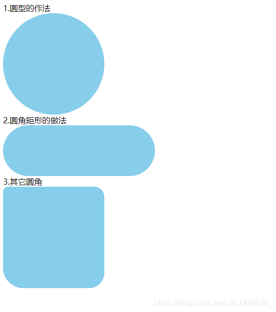
<!DOCTYPE html>
<html>
	<head>
		<meta charset="utf-8">
		<title></title>
		<style>
			.yuanxing{
				width: 200px;
				height: 200px;
				background-color:skyblue;
				/* border-radius: 100px; */
				/* 50% 就是宽度和高度的一半 等价于100px */
				border-radius: 50%;
			}
			.juxing{
				width: 300px;
				height: 100px;
				background-color: skyblue;
				/* 圆角矩形只需要设置为高度的一半就好 */
				border-radius: 50px;
			}
			.redis{
				width: 200px;
				height: 200px;
				background-color: skyblue;
				border-radius: 10px 20px 30px 40px;/*代表 左上角 右上角 右下角 左下角*/
			}
		</style>
	</head>
	<body>
		1.圆型的作法
		<div class="yuanxing"></div>
		2.圆角矩形的做法
		<div class="juxing"></div>
		3.其它圆角
		<div class="redis"></div>

	</body>
</html>
我们也可以一个角一个角的设置:border-top-left-radius\border-top-reight-radius\border-bottom-reight-radius\border-bottom-left-radius
盒子阴影
Css3中新增了盒子阴影,我们可以使用box-shadow 属性为盒子添加阴影
语法:
box-shadow: h-shadow v-shadow blur spread color inset;
| 值 | 描述 |
|---|---|
| h-shadow | 必需。水平阴影的位置,允许负值 |
| v-shadow | 必需。垂直阴影的位置。允许负值 |
| blur | 可选。模糊距离 |
| spread | 可选。阴影的尺寸 |
| color | 可选。阴影的颜色 |
| inset | 可选。将外部阴影(outset)改为内部阴影(inset) |
注意
默认是外阴影(outset),但是不可以写上去否则无效,阴影不占用空间,不会影响排列
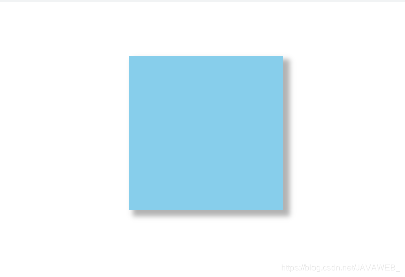
<!DOCTYPE html>
<html>
	<head>
		<meta charset="utf-8">
		<title></title>
		<style>
			div{
				width: 300px;
				height: 300px;
				background-color: skyblue;
				margin: 100px auto;
			}
			div:hover{
				box-shadow: 10px 10px 10px 3px rgb(0,0,0,0.3);
			}
		</style>
	</head>
	<body>
		<div></div>
	</body>
</html>
文字阴影
在css3中,我们可以使用 text-shadow 属性将阴影应用于文本
text-shadow: h-shadow v-shadow blur color;
| 值 | 描述 |
|---|---|
| h-shadow | 必需。水平阴影的位置。允许负值 |
| v-shadow | 必需。垂直阴影的位置。允许负值 |
| blur | 可选。模糊的距离 |
| color | 可选。阴影颜色 |


 扫一扫
扫一扫


 1万+
1万+

 被折叠的 条评论
为什么被折叠?
被折叠的 条评论
为什么被折叠?
 到【灌水乐园】发言


