


纯CSS,不用图片,不用JS,绘制一个走动的时钟。
秒针不用 JS 的定时器,纯css怎么可能呢, 不可能,绝对不可能!!
先看下效果:
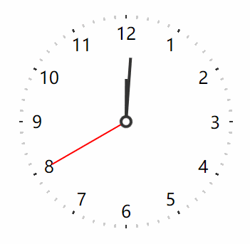
(录制的原因,秒针走过有阴影,实际是没有的)
纯 CSS 能实现一个动态的时钟,真的是颠覆了我的认知。
那教你如何用纯CSS做一动态的时钟, (完整代码在最后)
CSS 绘制这样一个布局有几个难点:
- 环形排列的刻度
- 环形分布的数字
- 自动运行的指针
下面就来一一实现它,相信能学到很多 CSS 绘制和动画的小技巧
一、环形排列的刻度
提到“环形”,可以想到锥形渐变 conic-gradient。假设有这样一个容器
<clock></clock>加上一点锥形渐变
clock{
  width: 300px;
  height: 300px;
  background: conic-gradient(#333 0 15deg, #cddc39 0deg 30deg);
}
可以得到这样的效果

如何做出交错相间的效果呢?可以试试 repeating-conic-gradient
clock{
  /**/
  background: repeating-conic-gradient(#333 0 15deg, #cddc39 0deg 30deg);
}
效果如下

还是看不出和刻度有啥关系?没关系,我们把黑色部分的角度改小一点
clock{
  /**/
  background: repeating-conic-gradient(#333 0 1deg, #cddc39 0deg 30deg);
}
效果如下
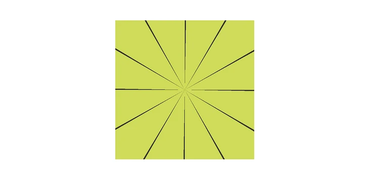
这样绘制出来的几条线是不是刚好可以对应时钟的刻度?
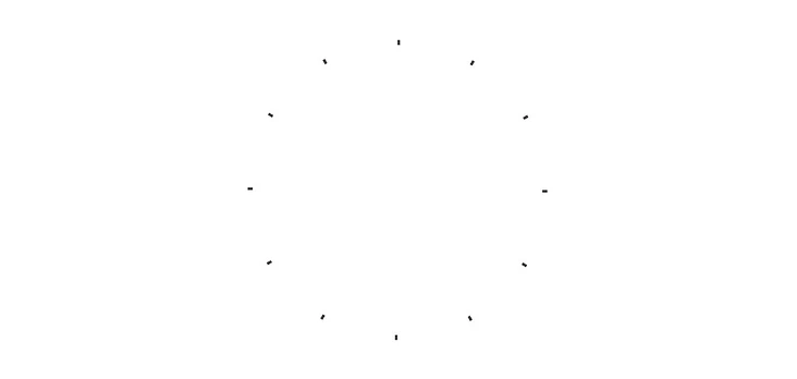
然后将整个形状变成圆环,可以用 MASK 来实现,实现如下
clock{
  /**/
  border-radius: 50%;
  -webkit-mask: radial-gradient(transparent 145px, red 0);
}
效果如下

其实,这里还有一个小细节,黑色部分并不是居中的,需要修正一下(可以更改起始角度,指定 from)。然后,将这个草绿色换成透明就可以了,完整代码如下
clock{
  /**/
  background: repeating-conic-gradient(from -.5deg, #333 0 1deg, transparent 0deg 30deg);
  border-radius: 50%;
  -webkit-mask: radial-gradient(transparent 145px, red 0);
}
最终效果
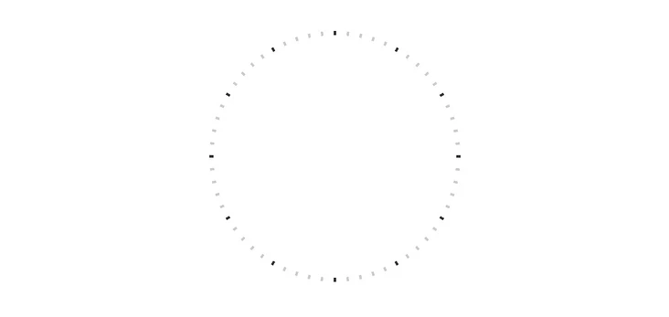
分钟的刻度也是同样的道理,因为共有 60 个刻度,所以最小角度是 6 度(360 / 60),实现如下
clock{
  /**/
  background: repeating-conic-gradient(#333 0 1deg, #cddc39 0deg 6deg);
} 
利用 CSS 背景可以无限叠加的特性,可以将这两个背景绘制在同一个元素下,所以完整代码如下
clock{
  /**/
  background: repeating-conic-gradient(from -.5deg, #333 0 1deg, transparent 0deg 30deg),
    repeating-conic-gradient(from -.5deg, #ccc 0 1deg, transparent 0deg 6deg);
  border-radius: 50%;
  -webkit-mask: radial-gradient(transparent 145px, red 0);
}
最终表盘刻度效果如下
二、环形分布的数字
看到这种布局,我的第一反应其实是 textPath,这个 SVG 元素可以让文本沿着指定路径进行排列,比如下面这个 MDN 上的例子
<svg viewBox="0 0 100 100" xmlns="http://www.w3.org/2000/svg">
  <path id="MyPath" fill="none" stroke="red"
        d="M10,90 Q90,90 90,45 Q90,10 50,10 Q10,10 10,40 Q10,70 45,70 Q70,70 75,50" />
  <text>
    <textPath href="#MyPath">
      Quick brown fox jumps over the lazy dog.
    </textPath>
  </text>
</svg>
效果如下
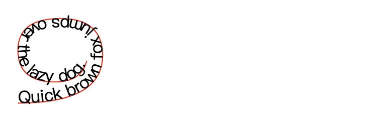
但是,这种方式有一个缺陷,无法改变文字的角度,只能沿着路径垂直方向,而时钟的数字方向都是正常的。
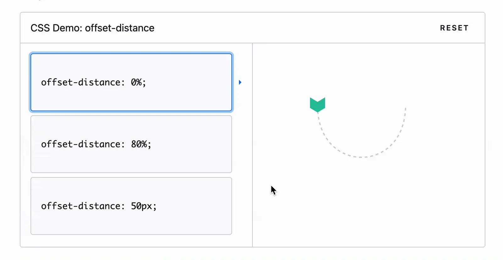
经过一番琢磨,发现还有一种方式也有类似沿着路径的布局方式,那就是 offset-path! 下面是 MDN 上的一个演示效果
那么和环形排列数字有什么关系呢?假设有这样一个布局
<clock-pane>
    <num>1</num>
</clock-pane>
然后将这个数字指定到一个圆形的路径上(目前仅支持 path )
num{
  offset-path: path('M250 125c0 69.036-55.964 125-125 125S0 194.036 0 125 55.964 0 125 0s125 55.964 125 125z');
}
效果如下(起始点是跟随 path 路径的)
然后,可以通过 offset-distance来改变元素在路径上的位置,并且支持百分比
num{
  offset-path: path('M250 125c0 69.036-55.964 125-125 125S0 194.036 0 125 55.964 0 125 0s125 55.964 125 125z');
  offset-distance: 100%
}
下面是从 0 到 100% 的变化

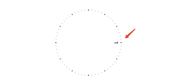
默认情况下元素的角度也是自适应垂直于路径的,和 textPath 比较类似。但是我们可以手动指定固定角度,需要 offset-rotate,指定为 0deg 就行了
num{
  offset-path: path('M250 125c0 69.036-55.964 125-125 125S0 194.036 0 125 55.964 0 125 0s125 55.964 125 125z');
  offset-rotate: 0deg;
  offset-distance: 100%
}
效果如下,角度已经完全归正了

如果有类似的布局需求,是不是可以参考这个案例呢?
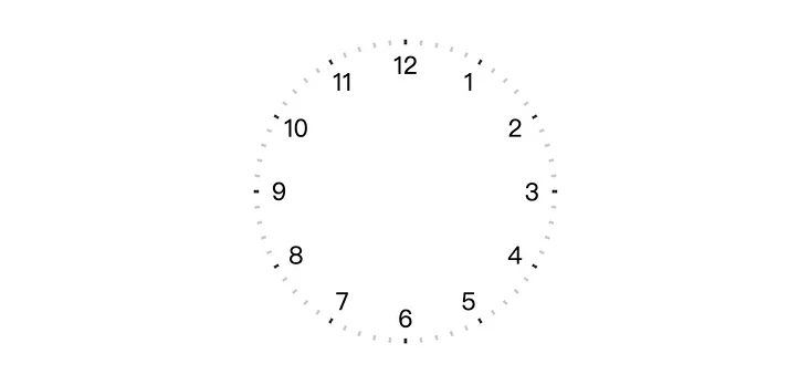
接下来,我们通过 CSS 变量,把 12 个数字自动归位到指定位置
<clock-pane>
  <num style="--i:1">1</num>
  <num style="--i:2">2</num>
  <num style="--i:3">3</num>
  <num style="--i:4">4</num>
  <num style="--i:5">5</num>
  <num style="--i:6">6</num>
  <num style="--i:7">7</num>
  <num style="--i:8">8</num>
  <num style="--i:9">9</num>
  <num style="--i:10">10</num>
  <num style="--i:11">11</num>
  <num style="--i:12">12</num>
</clock-pane>
配合 calc 计算,完整代码如下
num{
  position: absolute;
  offset-path: path('M250 125c0 69.036-55.964 125-125 125S0 194.036 0 125 55.964 0 125 0s125 55.964 125 125z');
  offset-distance: calc( var(--i) * 10% / 1.2 - 25%);
  offset-rotate: 0deg;
}
效果如下
三、自动运行的指针
三个指针的绘制应该没有太大的难度,假设结构如下
<hour></hour>
<min></min>
<sec></sec>
需要注意一下旋转的中心
hour{
  position: absolute;
  width: 4px;
  height: 60px;
  background: #333;
  transform-origin: center bottom;
  transform: translateY(-50%) rotate(30deg);
}
min{
  position: absolute;
  width: 4px;
  height: 90px;
  background: #333;
  transform-origin: center bottom;
  transform: translateY(-50%) rotate(60deg);
}
sec{
  position: absolute;
  width: 2px;
  height: 120px;
  background: red;
  transform-origin: center bottom;
  transform: translateY(-50%) rotate(90deg);
}
sec::after{
  content: '';
  position: absolute;
  width: 10px;
  height: 10px;
  border-radius: 50%;
  left: 50%;
  bottom: 0;
  background: #fff;
  border: 4px solid #333;
  transform: translate(-50%, 50%);
}
效果如下

到这一步静态布局就算完成了,那么如何运行呢?
运行的原理很简单,就是一个无限循环的 CSS 动画,如下
@keyframes clock {
  to {
    transform: translateY(-50%) rotate(360deg);
  }
}
不同的是,时针、分针、秒针的周期不一样,时针转一圈是 12 小时、分针是 60 分钟、秒针是 60 秒,各自需要换算成 秒数(CSS 单位只支持 秒 和 毫秒),为了方便测试,这里将速度调快了 60s → 6s
代码实现就是(--step 是一分钟)
hour{
  /**/
  transform: translateY(-50%) rotate(0);
  animation: clock calc(var(--step) * 60 * 12) infinite;
}
min{
  /**/
  transform: translateY(-50%) rotate(0);
  animation: clock calc(var(--step) * 60) infinite;
}
sec{
  /**/
  transform: translateY(-50%) rotate(0);
  animation: clock var(--step) infinite;
}
效果如下
是不是有些奇怪?秒针在旋转时先慢慢变快,然后又慢慢变慢,这是由于默认的动画函数是ease,所以需要改成linear
sec{
  /**/
  animation: clock var(--step) infinite linear;
}
这样就好多了。不过平时所见的时钟,秒针通常都那种走一下,停下的,还有一种“滴答滴答”的节奏感,并不是这种无缝的。在 CSS 动画中,是不是有点像阶梯状,没错,可以用到 CSS 的 steps 函数,不了解这个的可以参考张老师的这篇文章:CSS3 animation属性中的steps功能符深入介绍,实现如下
sec{
  /**/
  animation: clock var(--step) infinite steps(60);
}
效果如下

好了,一个不停走动的时钟就做好了,代码如下:
<clock id="clock">
    <clock-pane>
        <num style="--i:1">1</num>
        <num style="--i:2">2</num>
        <num style="--i:3">3</num>
        <num style="--i:4">4</num>
        <num style="--i:5">5</num>
        <num style="--i:6">6</num>
        <num style="--i:7">7</num>
        <num style="--i:8">8</num>
        <num style="--i:9">9</num>
        <num style="--i:10">10</num>
        <num style="--i:11">11</num>
        <num style="--i:12">12</num>
    </clock-pane>
    <hour></hour>
    <min></min>
    <sec></sec>
</clock>
<style>
    body{
    display: grid;
    place-content: center;
    height: 100vh;
    margin: 0;
}
clock{
    position: relative;
    display: flex;
    align-items: center;
    justify-content: center;
    width: 380px;
    height: 380px;
    font-size: 24px;
    border-radius: 20px;
    box-shadow: 2px 2px 20px rgba(0,0,0,.1);
    --step: 60s;
}

clock::before{
    content: '';
    position: absolute;
    width: 300px;
    height: 300px;
    border-radius: 50%;
    background: repeating-conic-gradient(from -.5deg,#333 0 1deg, transparent 0deg 30deg), repeating-conic-gradient(from -.5deg,#ccc 0 1deg, transparent 0deg 6deg);
    -webkit-mask: radial-gradient(transparent 145px, red 0);
}
clock-pane{
    width: 250px;
    height: 250px;
    position: absolute;
}
num{
    position: absolute;
    offset-path: path('M250 125c0 69.036-55.964 125-125 125S0 194.036 0 125 55.964 0 125 0s125 55.964 125 125z');
    offset-distance: calc( var(--i) * 10% / 1.2 - 25%);
    offset-rotate: 0deg;
}
hour{
    position: absolute;
    width: 4px;
    height: 60px;
    background: #333;
    transform-origin: center bottom;
    transform: translateY(-50%) rotate(0);
    animation: clock calc(var(--step) * 60 * 12) infinite linear;
}
min{
    position: absolute;
    width: 4px;
    height: 90px;
    background: #333;
    transform-origin: center bottom;
    transform: translateY(-50%) rotate(0);
    animation: clock calc(var(--step) * 60) infinite linear;
}
sec{
    position: absolute;
    width: 2px;
    height: 120px;
    background: red;
    transform-origin: center bottom;
    transform: translateY(-50%) rotate(0);
    animation: clock var(--step) infinite steps(60);
}
sec::after{
    content: '';
    position: absolute;
    width: 10px;
    height: 10px;
    border-radius: 50%;
    left: 50%;
    bottom: 0;
    background: #fff;
    border: 4px solid #333;
    transform: translate(-50%, 50%);
}
@keyframes clock {
    to {
        transform: translateY(-50%) rotate(360deg);
    }
}
</style>
文本可以到此结束了。纯CSS实现了一个转动的时钟。
但如果想要设置始终的 时针、分针、秒针的起始位置,就需要借用JS了。js代码如下:
const d = new Date()
const h = d.getHours();
const m = d.getMinutes();
const s = d.getSeconds();
clock.style.setProperty('--ds', s)
clock.style.setProperty('--dm', m + s/60)
clock.style.setProperty('--dh', h + m/60 + s/3600)
然后 CSS 中可以通过 animation-delay来指定动画的起始位置
hour{
  /**/
  animation: clock calc(var(--step) * 60 * 12) infinite linear;
  animation-delay: calc( -1 * var(--step) * var(--dh) * 60);
}
min{
  /**/
  animation: clock calc(var(--step) * 60) infinite linear;
  animation-delay: calc( -1 * var(--step) * var(--dm));
}
sec{
  /**/
  animation: clock var(--step) infinite steps(60);
  animation-delay: calc( -1 * var(--step) * var(--ds) / 60 );
}
最终完整的代码:
<clock id="clock">
    <clock-pane>
        <num style="--i:1">1</num>
        <num style="--i:2">2</num>
        <num style="--i:3">3</num>
        <num style="--i:4">4</num>
        <num style="--i:5">5</num>
        <num style="--i:6">6</num>
        <num style="--i:7">7</num>
        <num style="--i:8">8</num>
        <num style="--i:9">9</num>
        <num style="--i:10">10</num>
        <num style="--i:11">11</num>
        <num style="--i:12">12</num>
    </clock-pane>
    <hour></hour>
    <min></min>
    <sec></sec>
</clock>
<style>
    body{
    display: grid;
    place-content: center;
    height: 100vh;
    margin: 0;
}
clock{
    position: relative;
    display: flex;
    align-items: center;
    justify-content: center;
    width: 380px;
    height: 380px;
    font-size: 24px;
    border-radius: 20px;
    box-shadow: 2px 2px 20px rgba(0,0,0,.1);
    --step: 60s;
}

clock::before{
    content: '';
    position: absolute;
    width: 300px;
    height: 300px;
    border-radius: 50%;
    background: repeating-conic-gradient(from -.5deg,#333 0 1deg, transparent 0deg 30deg), repeating-conic-gradient(from -.5deg,#ccc 0 1deg, transparent 0deg 6deg);
    -webkit-mask: radial-gradient(transparent 145px, red 0);
}
clock-pane{
    width: 250px;
    height: 250px;
    position: absolute;
}
num{
    position: absolute;
    offset-path: path('M250 125c0 69.036-55.964 125-125 125S0 194.036 0 125 55.964 0 125 0s125 55.964 125 125z');
    offset-distance: calc( var(--i) * 10% / 1.2 - 25%);
    offset-rotate: 0deg;
}
hour{
    position: absolute;
    width: 4px;
    height: 60px;
    background: #333;
    transform-origin: center bottom;
    transform: translateY(-50%) rotate(0);
    animation: clock calc(var(--step) * 60 * 12) infinite linear;
    animation-delay: calc( -1 * var(--step) * var(--dh) * 60);
}
min{
    position: absolute;
    width: 4px;
    height: 90px;
    background: #333;
    transform-origin: center bottom;
    transform: translateY(-50%) rotate(0);
    animation: clock calc(var(--step) * 60) infinite linear;
    animation-delay: calc( -1 * var(--step) * var(--dm));
}
sec{
    position: absolute;
    width: 2px;
    height: 120px;
    background: red;
    transform-origin: center bottom;
    transform: translateY(-50%) rotate(0);
    animation: clock var(--step) infinite steps(60);
    animation-delay: calc( -1 * var(--step) * var(--ds) / 60 );
}
sec::after{
    content: '';
    position: absolute;
    width: 10px;
    height: 10px;
    border-radius: 50%;
    left: 50%;
    bottom: 0;
    background: #fff;
    border: 4px solid #333;
    transform: translate(-50%, 50%);
}
@keyframes clock {
    to {
        transform: translateY(-50%) rotate(360deg);
    }
}
</style>
<script>
    const d = new Date()
    const h = d.getHours();
    const m = d.getMinutes();
    const s = d.getSeconds();
    clock.style.setProperty('--ds', s)
    clock.style.setProperty('--dm', m + s/60)
    clock.style.setProperty('--dh', h + m/60 + s/3600)
</script>
能看到这里的,就是真爱!!! 收藏吧,慢慢把CSS的知识给啃下来!!加油!!!


 2477
2477


 被折叠的 条评论
为什么被折叠?
被折叠的 条评论
为什么被折叠?
 到【灌水乐园】发言


