


Color & Dropdown
颜色
常用的两种表达写法
写在class中用bg和text标记是针对谁的
        <div class="p-1 bg-success-subtle text-success" >
                success is a kind of green color
        </div>
写在style中用属性标记
利用css的属性标记对应的改变内容,采用var()获得颜色
注意,如果需要对边框上色,在class中声明border,然后对--bs-border-color属性修改颜色
    <div class="rounded-1 border"
      style="background-color:var(--bs-info-bg-subtle);
            --bs-border-color: var(--bs-info-border-subtle);
             color: var(--bs-info-text);">
                info is a name of blue
        </div>
颜色的助记
使用助记
从上到下由浅到深,用var包括
--bs-info-bg-subtle
--bs-info-border-subtle
--bs-info
--bs-info-text
种类助记
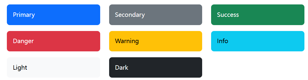
补充Secondary是灰色也是非常常用的
颜色模块
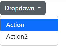
认识这个组件—下拉按钮
dropdown
荧光笔标记最重点
    <div>
        <div class="dropdown">
            <button class="btn dropdown-toggle" type="button"
                    data-bs-toggle="dropdown">
                Dropdown
            </button>
            <ul class="dropdown-menu">
               <li><a class="dropdown-menu" href="">Action</a></li>
            </ul>
        </div>
    </div>
红:负责生成bootstrap样式的button,并实现下拉的标志,一个小三角形
紫:负责生成下拉,没有这个就无法将ul标签的内容涵括在下拉框中
黄:负责生成内容,内容会变成普通ul显示在button下面而不是被下拉展开
介绍颜色模组
data-bs-theme
        <div class="dropdown" data-bs-theme="dark">
            <button class="btn dropdown-toggle" type="button"
                    data-bs-toggle="dropdown" >
                Dropdown
            </button>
            <ul class="dropdown-menu" >
                <li>
                <a class="dropdown-item active" href="">Action</a>
                </li>

                <li><a class="dropdown-item" href="#">Action2</a>
                </li>
            </ul>
        </div>
原先的按钮
添加data-bs-theme="dark"后的按钮模式

效果不言而喻,那还有什么用呢,其实一想就知道黑夜模式
黑夜模式
    <div data-bs-theme="dark" class="p-3 bg-body">
        <nav aria-label="breadcrumb">
            <ol class="breadcrumb">
                <li class="breadcrumb-item">
                  <a href="">Color Mode</a>
                </li>
                <li class="breadcrumb-item active">Dark</li>
            </ol>
        </nav>
    </div>
通过data-bs-theme和class="bg-body"的配合让一段div中背景为黑色
官方实例
<div data-bs-theme="dark" class="p-3 text-body bg-body">
  <nav aria-label="breadcrumb">
    <ol class="breadcrumb">
      <li class="breadcrumb-item"><a href="#">Color modes</a></li>
      <li class="breadcrumb-item active" aria-current="page">Dark</li>
    </ol>
  </nav>

  <p>This should be shown in a <strong>dark</strong> theme at all times.</p>

  <div class="progress mb-4">
    <div class="progress-bar" role="progressbar" aria-label="Basic example" style="width: 25%" aria-valuenow="25" aria-valuemin="0" aria-valuemax="100"></div>
  </div>

  <div class="dropdown mb-4">
    <button class="btn btn-secondary dropdown-toggle" type="button" id="dropdownMenuButtonDark2" data-bs-toggle="dropdown" aria-expanded="false">
      Dark dropdown
    </button>
    <ul class="dropdown-menu" aria-labelledby="dropdownMenuButtonDark2">
      <li><a class="dropdown-item active" href="#">Action</a></li>
      <li><a class="dropdown-item" href="#">Action</a></li>
      <li><a class="dropdown-item" href="#">Another action</a></li>
      <li><a class="dropdown-item" href="#">Something else here</a></li>
      <li><hr class="dropdown-divider"></li>
      <li><a class="dropdown-item" href="#">Separated link</a></li>
    </ul>
  </div>

  <div data-bs-theme="light" class="p-3 text-body bg-body rounded">
    <nav aria-label="breadcrumb">
      <ol class="breadcrumb">
        <li class="breadcrumb-item"><a href="#">Color modes</a></li>
        <li class="breadcrumb-item"><a href="#">Dark</a></li>
        <li class="breadcrumb-item active" aria-current="page">Light</li>
      </ol>
    </nav>

    <p>This should be shown in a <strong>light</strong> theme at all times.</p>

    <div class="progress mb-4">
      <div class="progress-bar" role="progressbar" aria-label="Basic example" style="width: 25%" aria-valuenow="25" aria-valuemin="0" aria-valuemax="100"></div>
    </div>

    <div class="dropdown">
      <button class="btn btn-secondary dropdown-toggle" type="button" id="dropdownMenuButtonLight2" data-bs-toggle="dropdown" aria-expanded="false">
        Light dropdown
      </button>
      <ul class="dropdown-menu" aria-labelledby="dropdownMenuButtonLight2">
        <li><a class="dropdown-item active" href="#">Action</a></li>
        <li><a class="dropdown-item" href="#">Action</a></li>
        <li><a class="dropdown-item" href="#">Another action</a></li>
        <li><a class="dropdown-item" href="#">Something else here</a></li>
        <li><hr class="dropdown-divider"></li>
        <li><a class="dropdown-item" href="#">Separated link</a></li>
      </ul>
    </div>
  </div>
</div>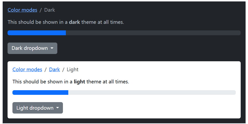


 726
726


 被折叠的 条评论
为什么被折叠?
被折叠的 条评论
为什么被折叠?
 到【灌水乐园】发言


