


rem适配布局苏宁网移动端首页(less+rem+媒体查询)
技术选型
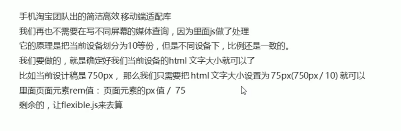
简洁高效的rem适配方案flexble.js
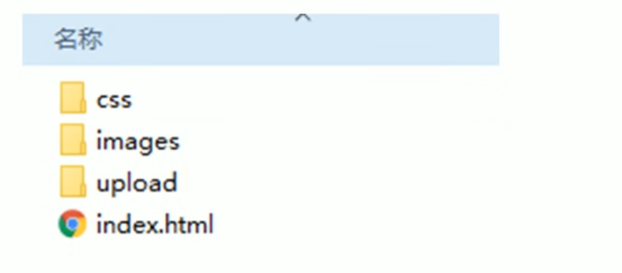
搭建相关文件夹结构
设置视口标签以及引入初始化样式
<meta name="viewport" content="width=device-width, initial-scale=1.0", maximum-scale="1.0", minimum-scale="1.0", user-scalable=no>
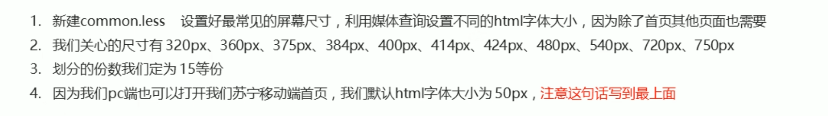
<link rel="stylesheet" href="css/normalize.css">设置公共common.less文件
新建index.less文件
这样一来,在index.html中我们只需要一个link引入index.css,而不需要加上common.css了
index.html
<!DOCTYPE html>
<html lang="en">
<head>
    <meta charset="UTF-8">
    <meta http-equiv="X-UA-Compatible" content="IE=edge">
    <meta name="viewport" content="width=device-width, initial-scale=1.0", maximum-scale="1.0", minimum-scale="1.0", user-scalable=no>
    <title>Document</title>
    <link rel="stylesheet" href="css/normalize.css">
    <link rel="stylesheet" href="css/index.css">
</head>
<body>
    <!-- 顶部搜索框 -->
    <div class="search-content">
        <a href="#" class="classify"></a>
        <div class="search">
            <form action="">
                <input type="search" value="厨卫保暖季 每千减百">
            </form>
        </div>
        <a href="#" class="login">登录</a>
    </div>
    <!-- banner部分 -->
    <div class="banner">
        <img src="upload/banner.gif" alt="">
    </div>
    <!-- 广告部分 -->
    <div class="ad">
        <a href="#">
            <img src="upload/ad1.gif" alt="">
        </a>
        <a href="">
            <img src="upload/ad2.gif" alt="">
        </a>
        <a href="">
            <img src="upload/ad3.gif" alt="">
        </a>
    </div>
    <!-- nav导航栏部分 -->
    <div class="nav">
        <a href="#">
            <img src="upload/nav1.png" alt="">
            <span>爆款手机</span>
        </a>
        <a href="#">
            <img src="upload/nav1.png" alt="">
            <span>爆款手机</span>
        </a>
        <a href="#">
            <img src="upload/nav1.png" alt="">
            <span>爆款手机</span>
        </a>
        <a href="#">
            <img src="upload/nav1.png" alt="">
            <span>爆款手机</span>
        </a>
        <a href="#">
            <img src="upload/nav1.png" alt="">
            <span>爆款手机</span>
        </a>
        <a href="#">
            <img src="upload/nav1.png" alt="">
            <span>爆款手机</span>
        </a>
        <a href="#">
            <img src="upload/nav1.png" alt="">
            <span>爆款手机</span>
        </a>
        <a href="#">
            <img src="upload/nav1.png" alt="">
            <span>爆款手机</span>
        </a>
        <a href="#">
            <img src="upload/nav1.png" alt="">
            <span>爆款手机</span>
        </a>
        <a href="#">
            <img src="upload/nav1.png" alt="">
            <span>爆款手机</span>
        </a>
    </div>
</body>
</html>
index.less
// 首页的样式less文件
// @impore "XXX" 导入一个XXX.less文件
@import "common";
body {
    min-width: 320px;
    width: 15rem;
    margin: 0 auto;
    // line-height: 1.5;
    font-family: Arial, Helvetica;
    background: #F2F2F2;
}
// 顶部搜索框
@baseFont: 50;
.search-content {
    display: flex;
    position: fixed;
    top: 0;
    left: 50%;
    transform: translateX(-50%);
    width: 15rem;
    height: (88rem / @baseFont);
    background-color: #FFC001;
    .classify {
        width: (44rem / @baseFont);
        height: (70rem / @baseFont);
        margin: (11rem / @baseFont) (25rem / @baseFont) (7rem / @baseFont) (24rem / @baseFont);
        background: url(../images/classify.png) no-repeat;
        background-size: (44rem / @baseFont) (70rem / @baseFont);
    }
    .search {
        flex: 1;
        background-color: red;
        input {
            outline: none;
            width: 100%;
            border: 0;
            height: (66rem / @baseFont);
            border-radius: (33rem / @baseFont);
            background-color: #FFF2CC;
            margin-top: (12rem / @baseFont);
            font-size: (25rem / @baseFont);
            padding-left: (55rem / @baseFont);
            color: #757575;
        }
    }
    .login {
        width: (75rem / @baseFont);
        height: (70rem / @baseFont);
        line-height: (70rem / @baseFont);
        margin: (10rem / @baseFont);
        font-size: (25rem / @baseFont);
        text-align: center;
        color: #fff;
    }
}

// banner部分
.banner {
    width: (750rem / @baseFont);
    height: (368rem / @baseFont);
    img {
        width: 100%;
        height: 100%;
    }
}

// 广告部分
.ad {
    display: flex;
    a {
        flex: 1;
        img {
            width: 100%;
        }
    }
}

// nav导航栏部分
.nav {
    width: (750rem / @baseFont);
    a {
        float: left;
        width: (150rem / @baseFont);
        height: (140rem / @baseFont);
        text-align: center;
        img {
            display: block;
            width: (82rem / @baseFont);
            height: (82rem / @baseFont);
            margin: (10rem / @baseFont) auto 0;
        }
        span {
            font-size: (25rem / @baseFont);
            color: #333;
        }
    }
}
index.css
a {
  text-decoration: none;
}
html {
  font-size: 50px;
}
@media screen and (min-width: 320px) {
  html {
    font-size: 21.33333333px;
  }
}
@media screen and (min-width: 360px) {
  html {
    font-size: 24px;
  }
}
@media screen and (min-width: 375px) {
  html {
    font-size: 25px;
  }
}
@media screen and (min-width: 384px) {
  html {
    font-size: 25.6px;
  }
}
@media screen and (min-width: 400px) {
  html {
    font-size: 26.66666667px;
  }
}
@media screen and (min-width: 414px) {
  html {
    font-size: 27.6px;
  }
}
@media screen and (min-width: 424px) {
  html {
    font-size: 28.26666667px;
  }
}
@media screen and (min-width: 480px) {
  html {
    font-size: 32px;
  }
}
@media screen and (min-width: 540px) {
  html {
    font-size: 36px;
  }
}
@media screen and (min-width: 720px) {
  html {
    font-size: 48px;
  }
}
@media screen and (min-width: 750px) {
  html {
    font-size: 50px;
  }
}
body {
  min-width: 320px;
  width: 15rem;
  margin: 0 auto;
  font-family: Arial, Helvetica;
  background: #F2F2F2;
}
.search-content {
  display: flex;
  position: fixed;
  top: 0;
  left: 50%;
  transform: translateX(-50%);
  width: 15rem;
  height: 1.76rem;
  background-color: #FFC001;
}
.search-content .classify {
  width: 0.88rem;
  height: 1.4rem;
  margin: 0.22rem 0.5rem 0.14rem 0.48rem;
  background: url(../images/classify.png) no-repeat;
  background-size: 0.88rem 1.4rem;
}
.search-content .search {
  flex: 1;
  background-color: red;
}
.search-content .search input {
  outline: none;
  width: 100%;
  border: 0;
  height: 1.32rem;
  border-radius: 0.66rem;
  background-color: #FFF2CC;
  margin-top: 0.24rem;
  font-size: 0.5rem;
  padding-left: 1.1rem;
  color: #757575;
}
.search-content .login {
  width: 1.5rem;
  height: 1.4rem;
  line-height: 1.4rem;
  margin: 0.2rem;
  font-size: 0.5rem;
  text-align: center;
  color: #fff;
}
.banner {
  width: 15rem;
  height: 7.36rem;
}
.banner img {
  width: 100%;
  height: 100%;
}
.ad {
  display: flex;
}
.ad a {
  flex: 1;
}
.ad a img {
  width: 100%;
}
.nav {
  width: 15rem;
}
.nav a {
  float: left;
  width: 3rem;
  height: 2.8rem;
  text-align: center;
}
.nav a img {
  display: block;
  width: 1.64rem;
  height: 1.64rem;
  margin: 0.2rem auto 0;
}
.nav a span {
  font-size: 0.5rem;
  color: #333;
}
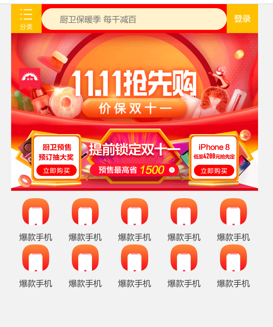
最终效果图


 被折叠的 条评论
为什么被折叠?
被折叠的 条评论
为什么被折叠?
 到【灌水乐园】发言


