


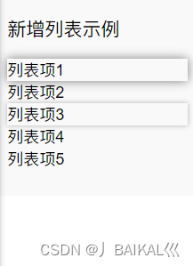
一、最终效果:
选中的数据有阴影效果,鼠标移动时也有阴影效果
二、完整页面代码
list-style-type: none是去掉无序标签前的点的样式
<template>
  <div>
    <div class="my-new-list-container">
      <h3>新增列表示例</h3>
      <ul class="no-bullet">
        <li
          v-for="item in items"
          :key="item.id"
          :class="{ 'selected': selectedItem === item.id }"
          style="cursor: pointer"
          @mouseover="hoveredId = item.id"
          @mouseout="hoveredId = null"
          @click="selectItem(item.id)"
        >
          {{ item.name }}
        </li>
      </ul>
    </div>
  </div>
</template>

<script>
  export default {
    data() {
      return {
        items: [
          { id: 1, name: '地块1' },
          { id: 2, name: '列表项2' },
          { id: 3, name: '列表项3' },
          { id: 4, name: '列表项4' },
          { id: 5, name: '列表项5' }
          // 更多列表项...
        ],
        hoveredId: null, // 用于鼠标悬停时的id
        selectedItem: null, // 记录被选中项的id
      };
    },
    methods: {
      selectItem(id) {
        this.selectedItem = id;
        console.log(this.selectedItem)
      },
    },
  };
</script>

<style>
  .my-new-list-container {
    margin: 20px 0;
    border-radius: 5px;
    padding: 10px;
    background-color: #f9f9f9;
    width: 200px;
  }

  .no-bullet {
    list-style-type: none;
    padding-left: 0;
  }

  li:hover,
  .selected {
    box-shadow: 0 0 5px rgba(0, 0, 0, 0.3);
  }

  /* 如果需要区别悬停和选中状态的阴影效果,可以为.selected单独设置样式 */
  .selected {
    box-shadow: 0 0 10px rgba(0, 0, 0, 0.5); /* 示例:增强选中时的阴影效果 */
  }
</style>


 扫一扫
扫一扫


 1291
1291

 被折叠的 条评论
为什么被折叠?
被折叠的 条评论
为什么被折叠?
 到【灌水乐园】发言


