


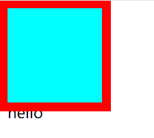
盒子的大小计算


轮廓
<!DOCTYPE html>
<html lang="en">
<head>
    <meta charset="UTF-8">
    <meta http-equiv="X-UA-Compatible" content="IE=edge">
    <meta name="viewport" content="width=device-width, initial-scale=1.0">
    <title>Document</title>
</head>
<style>
    .box1{
        width:100px;
        height:100px;
        background-color: aqua;
        border:10px red solid ;
        /* outline:10px red solid ; */
        /*outline用来设置元素的轮廓线,用法和border一样
        轮廓和边框的不同点,轮廓不会影响到可见框的大小*/

    }
</style>
<body>
    <div class="box1">
    </div>
    <span>hello</span>
</body>
</html>
border的时候,加上边框,hello字样会向下移动
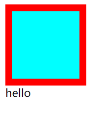
outline的时候,加上轮廓,不会向下移动,而是会盖住hello字样
阴影

圆角和圆


浮动


浮动–文字环绕图片&脱离文档流之后的特点

w3school的导航条
<!DOCTYPE html>
<html lang="en">

<head>
    <meta charset="UTF-8">
    <meta http-equiv="X-UA-Compatible" content="IE=edge">
    <meta name="viewport" content="width=device-width, initial-scale=1.0">
    <title>w3school导航条</title>
    <link rel="stylesheet" href="../css重置样式表/reset.css">
</head>

<style>
    .list {
        width: 1205px;
        height: 50px;
        background-color: aqua;
        margin: 50px auto;
    }

    .list li {

        /*设置lineheight和list一样,就可以填满了,这个时候height写不写就不重要了*/
        /* height: 50px; */
        line-height: 50px;
        float: left;


    }

    .list li a {
        /* 宽度给超链接a,那么不是字的地方也可以点击, */
        /*现在给a设置高度宽度,但是a是行内元素,没办法设置,需要将a设置为块元素*/
        display: block;/*不设置的话,就没有办法点击*/

        color: #777;
        font-size: 18px;
        padding: 0 39px;

    }

    .list li a:hover {

        background-color: blue;

    }
</style>

<body>
    <ul class="list">
        <li><a href="">HTML/CSS</a></li>
        <li><a href="">Browser Side</a></li>
        <li><a href="">Server Side</a></li>
        <li><a href="">Programming</a></li>
        <li><a href="">XML</a></li>
        <li><a href="">Web Building</a></li>
        <li><a href="">Reference</a></li>
    </ul>
</body>

</html>
整体框架构建
<!DOCTYPE html>
<html lang="en">
<head>
    <meta charset="UTF-8">
    <meta http-equiv="X-UA-Compatible" content="IE=edge">
    <meta name="viewport" content="width=device-width, initial-scale=1.0">
    <title>整体框架构建</title>
</head>
<style>
    header,main,footer{
width:1000px;;
margin:0 auto;
    }
    header{
        height:150px;
        background-color: lightblue;
    }
    main{
        height:300px;
        background-color: lightcoral;
        margin:10px auto;
    }
    /*设置左侧的导航*/
    nav{
        width:200px;
        height:100%;
        background-color: lightslategrey;
       /*中间三个元素溢出了,变成了竖直排列,只需要浮动*/
       float:left;
    }
    article{
        width:580px;
        height:100%;
        background-color:mediumpurple;
        float:left;
        /*左右间距10px*/
        margin:0 10px;
    }
    aside{
        width:200px;
        height:100%;
        background-color:rgb(221, 148, 21);
        float:left;
    }
    footer{
        height:150px;
        background-color: lightgreen;
    }
</style>
<body>
    <header></header>
    <main>

        <nav></nav>
        <article></article>
        <aside></aside>
    </main>
    <footer></footer>
</body>
</html>
高度塌陷

清除浮动clear

使用clear完美解决因为浮动引起的高度塌陷问题
<!DOCTYPE html>
<html lang="en">
<head>
    <meta charset="UTF-8">
    <meta http-equiv="X-UA-Compatible" content="IE=edge">
    <meta name="viewport" content="width=device-width, initial-scale=1.0">
    <title>高度塌陷</title>

</head>

<style>
    .box1{
    border:10px  red solid;
   overflow: hidden;
}
.box2{
    height: 300px;
    width: 100px;
    background-color: aqua;
    float:left;

}
.box3{
   clear: left;
}
</style>
<body>

    <div class="box1">
        <div class="box2"></div>
        <div class="box3">aa</div>
    </div>

</body>
</html>
高度塌陷解决方案
<!DOCTYPE html>
<html lang="en">
<head>
    <meta charset="UTF-8">
    <meta http-equiv="X-UA-Compatible" content="IE=edge">
    <meta name="viewport" content="width=device-width, initial-scale=1.0">
    <title>高度塌陷</title>

</head>

<style>
    .box1{
    border:10px  red solid;
   /*overflow: hidden;*/
}
.box2{
    height: 100px;
    width: 100px;
    background-color: aqua;
    float:left;

}
.box1::after{
    content:'';
    display:block;
    clear: both;
}
</style>
<body>

    <div class="box1">
        <div class="box2"></div>

    </div>

</body>
</html>
clearfix可以解决外边距重叠和高度塌陷
<!DOCTYPE html>
<html lang="en">

<head>
    <meta charset="UTF-8">
    <meta http-equiv="X-UA-Compatible" content="IE=edge">
    <meta name="viewport" content="width=device-width, initial-scale=1.0">
    <title>Document</title>
</head>
<style>

    .box1 {
        width: 200px;
        height: 200px;
        background-color: #bfa;
    }
  /*解决外边距重叠问题
    inline-block 把它看做一个字
     .box1::before {
        content: '';
        display: table;
    }*/

    .box2 {
        width: 100px;
        height: 100px;
        background-color: orange;
        margin-top: 100px;
    }
    /* clearfix可以解决外边距重叠和高度塌陷*/
    .clearfix::before,
    .clearfix::after{
        content:'';
        display: table;
        clear:both;
    }
</style>

<body>
    <!-- div.box1>div.box2-->
    <div class="box1">
        <div class="box2"></div>
    </div>
</body>

</html>


 342
342


 被折叠的 条评论
为什么被折叠?
被折叠的 条评论
为什么被折叠?
 到【灌水乐园】发言


