


Seaborn学习
Seaborn在matplotlib上进行了封装,提供了许多画图模板。本文整理自https://www.bilibili.com/video/BV1HF411B72n。
整体布局风格设置
import seaborn as sns
import numpy as np
import matplotlib as mpl
import matplotlib.pyplot as plt
%matplotlib inline
默认的matplotlib的作图风格
def sinplot(flip=1):
    x = np.linspace(0, 14, 100)
    for i in range(1, 7):
        plt.plot(x, np.sin(x + i*5)*(7-i)*flip)
sinplot()

使用seaborn的默认风格:
sns.set()
sinplot()

Seaborn中有五种默认的主题风格,darkgrid, whitegrid, dark, white, tikcs。
sns.set_style("whitegrid") # whitegrid风格
data = np.random.normal(size=(20,6)) + np.arange(6) / 2
sns.boxplot(data=data)
<AxesSubplot:>

sns.set_style("dark") # dark风格
sinplot()

sns.set_style("white") # white风格
sinplot()

sns.set_style("ticks") # ticks风格
sinplot()

风格细节设置
仅保留x,y轴:
sinplot()
sns.despine()

设置图离轴线的距离:
sns.violinplot(data)
sns.despine(offset=10) # 距离为10
d:\develop\Anaconda\lib\site-packages\seaborn\_decorators.py:36: FutureWarning: Pass the following variable as a keyword arg: x. From version 0.12, the only valid positional argument will be `data`, and passing other arguments without an explicit keyword will result in an error or misinterpretation.
  warnings.warn(

隐藏一指定的轴
sinplot()
sns.despine(left=True) # 隐藏y轴

在子图中指定不同的风格:
with sns.axes_style("darkgrid"):
    plt.subplot(211)
    sinplot()
plt.subplot(212)
sinplot(-1)

作图大小风格设置:
sns.set()
sns.set_context("paper")
plt.figure(figsize=(8,6))
sinplot()

sns.set_context("talk")
plt.figure(figsize=(8,6))
sinplot()

sns.set_context("poster")
plt.figure(figsize=(8,6))
sinplot()

sns.set_context("notebook",font_scale=1.5, rc={"lines.linewidth": 2.5})
plt.figure(figsize=(8,6))
sinplot()

set_context()中的参数可以指定粗细,字体大小等。
调色板
- 分类色板
默认的颜色循环主题
current_palette = sns.color_palette()
sns.palplot(current_palette)

- 圆形画板
在一个圆形的空间中画出间隔均匀的颜色(饱和度和亮度不变)
sns.palplot(sns.color_palette("hls", 8))

data = np.random.normal(size=(20,8)) + np.arange(8) / 2
sns.boxplot(data=data, palette=sns.color_palette("hls",8))
<AxesSubplot:>

hls_palette()函数控制颜色的亮度和饱和
sns.palplot(sns.hls_palette(8, l=.3, s=.8))

sns.palplot(sns.color_palette("Paired", 10)) # 成对的

使用xkcd颜色来命名颜色:
plt.plot([0,1], [0,1], sns.xkcd_rgb["pale red"], lw=3)
plt.plot([0,1], [0,2], sns.xkcd_rgb["medium green"], lw=3)
plt.plot([0,1], [0,3], sns.xkcd_rgb["denim blue"], lw=3)
[<matplotlib.lines.Line2D at 0x1ae80b948b0>]

colors = ["windows blue", "amber", "greyish", "faded green", "dusty purple"]
sns.palplot(sns.xkcd_palette(colors))

- 连续色板
sns.palplot(sns.color_palette("Blues"))

sns.palplot(sns.color_palette("BuGn_r"))

- 色调线性变换
饱和度和亮度线性变换
sns.palplot(sns.color_palette("cubehelix",8))

sns.palplot(sns.cubehelix_palette(8, start=.5, rot=-.75))

sns.palplot(sns.cubehelix_palette(8, start=.75, rot=-.15))

light和dark连续调色板
sns.palplot(sns.light_palette("green"))

sns.palplot(sns.dark_palette("purple"))

sns.palplot(sns.light_palette("navy", reverse=True))

x, y = np.random.multivariate_normal([0,0], [[1,-5],[-5,1]], size=300).T
pal = sns.dark_palette("green", as_cmap=True)
sns.kdeplot(x, y, cmap=pal)
C:\Users\MBA\AppData\Local\Temp/ipykernel_12536/1185996389.py:1: RuntimeWarning: covariance is not positive-semidefinite.
  x, y = np.random.multivariate_normal([0,0], [[1,-5],[-5,1]], size=300).T
d:\develop\Anaconda\lib\site-packages\seaborn\_decorators.py:36: FutureWarning: Pass the following variable as a keyword arg: y. From version 0.12, the only valid positional argument will be `data`, and passing other arguments without an explicit keyword will result in an error or misinterpretation.
  warnings.warn(


<AxesSubplot:>

单变量分析绘图
查看特征分布情况:
sns.set(color_codes=True)
np.random.seed(sum(map(ord, "distributions")))
x = np.random.normal(size=100)
sns.distplot(x, kde=False) # kde: 核密度估计
d:\develop\Anaconda\lib\site-packages\seaborn\distributions.py:2619: FutureWarning: `distplot` is a deprecated function and will be removed in a future version. Please adapt your code to use either `displot` (a figure-level function with similar flexibility) or `histplot` (an axes-level function for histograms).
  warnings.warn(msg, FutureWarning)


<AxesSubplot:>

sns.distplot(x, bins=20, kde=False)
<AxesSubplot:>

画出拟合曲线:
from scipy import stats
x = np.random.gamma(6, size=200)
sns.distplot(x, kde=False, fit=stats.gamma)
<AxesSubplot:>

import pandas as pd
mean, cov = [0,1], [(1,.5), (.5,1)]
data = np.random.multivariate_normal(mean, cov, 200) #根据均值和方差生成数据
df = pd.DataFrame(data, columns=["x", "y"])
df
| x | y | |
|---|---|---|
| 0 | 2.190873 | 2.902961 |
| 1 | 0.387901 | 3.441322 |
| 2 | -1.304909 | 0.586173 |
| 3 | -0.016867 | 0.907323 |
| 4 | 0.284953 | 1.189304 |
| ... | ... | ... |
| 195 | -0.804338 | 0.139381 |
| 196 | 1.674393 | 2.735944 |
| 197 | -1.237634 | 0.002766 |
| 198 | -1.044683 | 0.482758 |
| 199 | -0.890160 | 0.042753 |
200 rows × 2 columns
绘制散点图
sns.jointplot(x="x", y="y", data=df)
<seaborn.axisgrid.JointGrid at 0x1ae80972310>

x,y = np.random.multivariate_normal(mean, cov, 1000).T
with sns.axes_style("white"):
    sns.jointplot(x=x, y=y, kind="hex", color="k") # 数据量较大时使用

回归分析绘图
iris = sns.load_dataset("iris")
sns.pairplot(iris)
<seaborn.axisgrid.PairGrid at 0x1ae80b0e040>

sns.set(color_codes=True)
np.random.seed(sum(map(ord, "regression")))
tips = sns.load_dataset("tips")
tips.head()
| total_bill | tip | sex | smoker | day | time | size | |
|---|---|---|---|---|---|---|---|
| 0 | 16.99 | 1.01 | Female | No | Sun | Dinner | 2 |
| 1 | 10.34 | 1.66 | Male | No | Sun | Dinner | 3 |
| 2 | 21.01 | 3.50 | Male | No | Sun | Dinner | 3 |
| 3 | 23.68 | 3.31 | Male | No | Sun | Dinner | 2 |
| 4 | 24.59 | 3.61 | Female | No | Sun | Dinner | 4 |
regplot和lmplot都可以绘制回归关系,推荐使用regplot()
sns.regplot(x="total_bill", y="tip", data=tips)
<AxesSubplot:xlabel='total_bill', ylabel='tip'>

sns.lmplot(x="total_bill", y="tip", data=tips)
<seaborn.axisgrid.FacetGrid at 0x1ae8286f670>

sns.regplot(x="size", y="tip", data=tips, x_jitter=.05) # x_jitter: 增加抖动
<AxesSubplot:xlabel='size', ylabel='tip'>

多变量分析绘图
np.random.seed(sum(map(ord, "categorical")))
titanic = sns.load_dataset("titanic")
sns.stripplot(x="day", y="total_bill",data=tips)
<AxesSubplot:xlabel='day', ylabel='total_bill'>

解决重叠问题:
sns.stripplot(x="day", y="total_bill",data=tips, jitter=True) # 向左右偏离
<AxesSubplot:xlabel='day', ylabel='total_bill'>

sns.swarmplot(x="day", y="total_bill", data=tips)
<AxesSubplot:xlabel='day', ylabel='total_bill'>

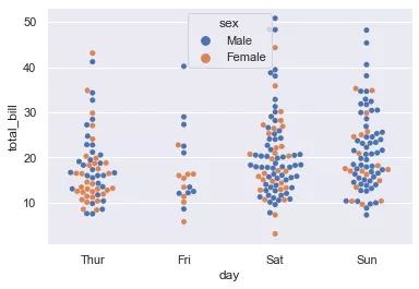
sns.swarmplot(x="day", y="total_bill", hue="sex",data=tips)
<AxesSubplot:xlabel='day', ylabel='total_bill'>
sns.swarmplot(x="total_bill", y="day",hue="time", data=tips)
<AxesSubplot:xlabel='total_bill', ylabel='day'>

盒图
sns.boxplot(x="day", y="total_bill", hue="time", data=tips)
<AxesSubplot:xlabel='day', ylabel='total_bill'>

sns.violinplot(x="total_bill", y="day", hue="time", data=tips)
<AxesSubplot:xlabel='total_bill', ylabel='day'>

sns.violinplot(x="day", y="total_bill", hue="sex", data=tips, split=True)
<AxesSubplot:xlabel='day', ylabel='total_bill'>

sns.violinplot(x="day", y="total_bill", data=tips, inner=None)
sns.swarmplot(x="day", y="total_bill", data=tips, color="w", alpha=.5)
<AxesSubplot:xlabel='day', ylabel='total_bill'>

显示值的集中趋势可以使用条形图
sns.barplot(x="sex", y="survived", hue="class", data=titanic)
<AxesSubplot:xlabel='sex', ylabel='survived'>

点图可以更好地描述变化差异
sns.pointplot(x="sex", y="survived", hue="class", data=titanic)
<AxesSubplot:xlabel='sex', ylabel='survived'>

sns.pointplot(x="class", y="survived", hue="sex", data=titanic, palette={"male":"g", "female":"m"},
markers=["^", "o"], linestyles=["-","--"])
<AxesSubplot:xlabel='class', ylabel='survived'>

多层面板分类图
sns.factorplot(x="day", y="total_bill", hue="smoker", data=tips)
d:\develop\Anaconda\lib\site-packages\seaborn\categorical.py:3717: UserWarning: The `factorplot` function has been renamed to `catplot`. The original name will be removed in a future release. Please update your code. Note that the default `kind` in `factorplot` (`'point'`) has changed `'strip'` in `catplot`.
  warnings.warn(msg)


<seaborn.axisgrid.FacetGrid at 0x1ae82d7d460>

sns.factorplot(x="day", y="total_bill", hue="smoker", data=tips, kind="bar")
d:\develop\Anaconda\lib\site-packages\seaborn\categorical.py:3717: UserWarning: The `factorplot` function has been renamed to `catplot`. The original name will be removed in a future release. Please update your code. Note that the default `kind` in `factorplot` (`'point'`) has changed `'strip'` in `catplot`.
  warnings.warn(msg)


<seaborn.axisgrid.FacetGrid at 0x1ae83fe0940>

sns.factorplot(x="day", y="total_bill", hue="smoker", data=tips, kind="swarm")
d:\develop\Anaconda\lib\site-packages\seaborn\categorical.py:3717: UserWarning: The `factorplot` function has been renamed to `catplot`. The original name will be removed in a future release. Please update your code. Note that the default `kind` in `factorplot` (`'point'`) has changed `'strip'` in `catplot`.
  warnings.warn(msg)


<seaborn.axisgrid.FacetGrid at 0x1ae8406c0d0>

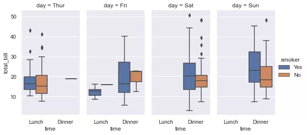
sns.factorplot(x="time", y="total_bill", hue="smoker", col="day", data=tips, kind="box", size=4, aspect=.5)
# size:每个面的高度,aspect:纵横比
d:\develop\Anaconda\lib\site-packages\seaborn\categorical.py:3717: UserWarning: The `factorplot` function has been renamed to `catplot`. The original name will be removed in a future release. Please update your code. Note that the default `kind` in `factorplot` (`'point'`) has changed `'strip'` in `catplot`.
  warnings.warn(msg)
d:\develop\Anaconda\lib\site-packages\seaborn\categorical.py:3723: UserWarning: The `size` parameter has been renamed to `height`; please update your code.
  warnings.warn(msg, UserWarning)


<seaborn.axisgrid.FacetGrid at 0x1ae83fa9be0>
Facegrid
展示数据集中的一部分
g = sns.FacetGrid(tips, col="time") # time包含两个指标,dinner和lunch

g = sns.FacetGrid(tips, col="time")
g.map(plt.hist, "tip") # tip的分布情况
<seaborn.axisgrid.FacetGrid at 0x1ae84305ca0>

g = sns.FacetGrid(tips, col="sex", hue="smoker")
g.map(plt.scatter, "total_bill", "tip", alpha=.7)
g.add_legend() # 添加图例
<seaborn.axisgrid.FacetGrid at 0x1ae84436e80>

g = sns.FacetGrid(tips, row="smoker", col="sex", hue="smoker", margin_titles=True)
g.map(sns.regplot, "size", "total_bill", color=".3", fit_reg=True, x_jitter=.1)
<seaborn.axisgrid.FacetGrid at 0x1ae844499a0>

g = sns.FacetGrid(tips, col="day", size=4, aspect=.5)
g.map(sns.barplot, "sex", "total_bill")
d:\develop\Anaconda\lib\site-packages\seaborn\axisgrid.py:337: UserWarning: The `size` parameter has been renamed to `height`; please update your code.
  warnings.warn(msg, UserWarning)
d:\develop\Anaconda\lib\site-packages\seaborn\axisgrid.py:670: UserWarning: Using the barplot function without specifying `order` is likely to produce an incorrect plot.
  warnings.warn(warning)


<seaborn.axisgrid.FacetGrid at 0x1ae846a11f0>

ordered_days = tips.day.value_counts().index
print(ordered_days)
g = sns.FacetGrid(tips, row="day", row_order=ordered_days, size=1.7, aspect=4)
g.map(sns.boxplot, "total_bill")
CategoricalIndex(['Sat', 'Sun', 'Thur', 'Fri'], categories=['Thur', 'Fri', 'Sat', 'Sun'], ordered=False, dtype='category')


d:\develop\Anaconda\lib\site-packages\seaborn\axisgrid.py:337: UserWarning: The `size` parameter has been renamed to `height`; please update your code.
  warnings.warn(msg, UserWarning)
d:\develop\Anaconda\lib\site-packages\seaborn\axisgrid.py:670: UserWarning: Using the boxplot function without specifying `order` is likely to produce an incorrect plot.
  warnings.warn(warning)


<seaborn.axisgrid.FacetGrid at 0x1ae847ef910>

pal = dict(Lunch="seagreen", Dinner="gray")
g = sns.FacetGrid(tips, hue="time", palette=pal, size=5)
g.map(plt.scatter, "total_bill", "tip", s=50, alpha=.7, linewidth=.5, edgecolor="white")
g.add_legend()
d:\develop\Anaconda\lib\site-packages\seaborn\axisgrid.py:337: UserWarning: The `size` parameter has been renamed to `height`; please update your code.
  warnings.warn(msg, UserWarning)


<seaborn.axisgrid.FacetGrid at 0x1ae846636d0>

g = sns.FacetGrid(tips, hue="sex", palette="Set1", size=5, hue_kws={"marker":["^","v"]})
g.map(plt.scatter, "total_bill", "tip", s=100, linewidth=.5, edgecolor="white")
g.add_legend()
d:\develop\Anaconda\lib\site-packages\seaborn\axisgrid.py:337: UserWarning: The `size` parameter has been renamed to `height`; please update your code.
  warnings.warn(msg, UserWarning)


<seaborn.axisgrid.FacetGrid at 0x1ae85a019a0>

with sns.axes_style("white"):
    g = sns.FacetGrid(tips, row="sex", col="smoker", margin_titles=True, size=2.5)
    g.map(plt.scatter, "total_bill", "tip", color="#334488", edgecolor="white", lw=.5)
    g.set_axis_labels("Total bill (US Dollars)", "Tip")
    g.set(xticks=[10, 30, 50], yticks=[2, 6, 10])
    g.fig.subplots_adjust(wspace=.02, hspace=.02) # 子图与子图之间的间隔
d:\develop\Anaconda\lib\site-packages\seaborn\axisgrid.py:337: UserWarning: The `size` parameter has been renamed to `height`; please update your code.
  warnings.warn(msg, UserWarning)

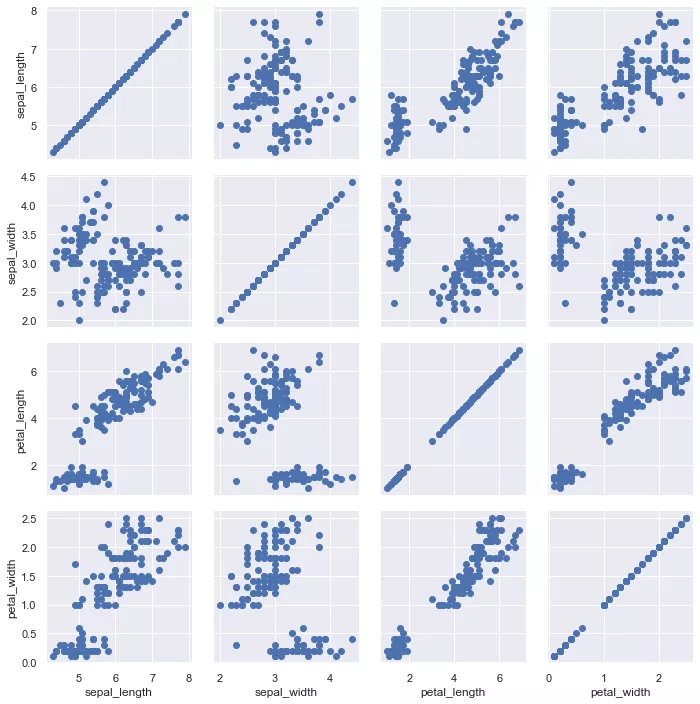
iris = sns.load_dataset("iris")
g = sns.PairGrid(iris)
g.map(plt.scatter)
<seaborn.axisgrid.PairGrid at 0x1ae85980b20>
iris = sns.load_dataset("iris")
g = sns.PairGrid(iris)
g.map_diag(plt.hist) # 对角线
g.map_offdiag(plt.scatter) # 非对角线
<seaborn.axisgrid.PairGrid at 0x1ae86c26ca0>

g = sns.PairGrid(iris, hue="species")
g.map_diag(plt.hist)
g.map_offdiag(plt.scatter)
g.add_legend()
<seaborn.axisgrid.PairGrid at 0x1e1f7886460>

g = sns.PairGrid(tips, hue="size", palette="GnBu_d")
g.map(plt.scatter, s=50, edgecolor="white")
g.add_legend()
<seaborn.axisgrid.PairGrid at 0x1e1f8d30790>

热度图
np.random.seed(0)
sns.set()
uniform_data = np.random.rand(3,3)
print(uniform_data)
heat_map = sns.heatmap(uniform_data)
[[0.5488135  0.71518937 0.60276338]
 [0.54488318 0.4236548  0.64589411]
 [0.43758721 0.891773   0.96366276]]

ax = sns.heatmap(uniform_data, vmin=0.2, vmax=0.5)

normal_data = np.random.randn(3,3)
print(normal_data)
ax = sns.heatmap(normal_data, center=0)
[[ 1.26611853 -0.50587654  2.54520078]
 [ 1.08081191  0.48431215  0.57914048]
 [-0.18158257  1.41020463 -0.37447169]]

flights = sns.load_dataset("flights")
flights.head()
| year | month | passengers | |
|---|---|---|---|
| 0 | 1949 | Jan | 112 |
| 1 | 1949 | Feb | 118 |
| 2 | 1949 | Mar | 132 |
| 3 | 1949 | Apr | 129 |
| 4 | 1949 | May | 121 |
flights = flights.pivot("month","year","passengers")
print(flights)
ax = sns.heatmap(flights)
year   1949  1950  1951  1952  1953  1954  1955  1956  1957  1958  1959  1960
month
Jan     112   115   145   171   196   204   242   284   315   340   360   417
Feb     118   126   150   180   196   188   233   277   301   318   342   391
Mar     132   141   178   193   236   235   267   317   356   362   406   419
Apr     129   135   163   181   235   227   269   313   348   348   396   461
May     121   125   172   183   229   234   270   318   355   363   420   472
Jun     135   149   178   218   243   264   315   374   422   435   472   535
Jul     148   170   199   230   264   302   364   413   465   491   548   622
Aug     148   170   199   242   272   293   347   405   467   505   559   606
Sep     136   158   184   209   237   259   312   355   404   404   463   508
Oct     119   133   162   191   211   229   274   306   347   359   407   461
Nov     104   114   146   172   180   203   237   271   305   310   362   390
Dec     118   140   166   194   201   229   278   306   336   337   405   432

将值显示在热力图上
ax = sns.heatmap(flights, annot=True, fmt='d')

ax = sns.heatmap(flights, linewidths=.5) # 设置格子间距

ax = sns.heatmap(flights, cmap="YlGnBu")

ax = sns.heatmap(flights, cbar=False) # 不显示cbar

Jan     112   115   145   171   196   204   242   284   315   340   360   417
Feb     118   126   150   180   196   188   233   277   301   318   342   391
Mar     132   141   178   193   236   235   267   317   356   362   406   419
Apr     129   135   163   181   235   227   269   313   348   348   396   461
May     121   125   172   183   229   234   270   318   355   363   420   472
Jun     135   149   178   218   243   264   315   374   422   435   472   535
Jul     148   170   199   230   264   302   364   413   465   491   548   622
Aug     148   170   199   242   272   293   347   405   467   505   559   606
Sep     136   158   184   209   237   259   312   355   404   404   463   508
Oct     119   133   162   191   211   229   274   306   347   359   407   461
Nov     104   114   146   172   180   203   237   271   305   310   362   390
Dec     118   140   166   194   201   229   278   306   336   337   405   432
[外链图片转存中…(img-05YSwF71-1662719715340)]
将值显示在热力图上
ax = sns.heatmap(flights, annot=True, fmt='d')
[外链图片转存中…(img-rsFdk0Fg-1662719715340)]
ax = sns.heatmap(flights, linewidths=.5) # 设置格子间距
[外链图片转存中…(img-RSBFxLdM-1662719715341)]
ax = sns.heatmap(flights, cmap="YlGnBu")
[外链图片转存中…(img-n5iRtOj7-1662719715342)]
ax = sns.heatmap(flights, cbar=False) # 不显示cbar
[外链图片转存中…(img-rxk9b7yu-1662719715342)]


 518
518


 被折叠的 条评论
为什么被折叠?
被折叠的 条评论
为什么被折叠?
 到【灌水乐园】发言


