


1.回顾
上篇对已经做的乐逗项目进行了一些优化,但是正要排版的时候,想到,传统的App界面十分难看;看着自己手机里绚丽的app界面,又想到自己写的app界面超级难看,就查询了有关资料;找到了Android Design Support Library 的一些特殊效果,十分漂亮,也就是昨天 经常出错的内容;今天饶有兴趣的学习了些感兴趣的内容.
2.大纲
- FlotingActionButton
- TextInputLayout
- SnackBar
- TabLayout
- NavigationView
- CoordinatorLayout
- AppBarLayout
- CollapsingToolbarLayout
- Toolbar
- NestedScrollView
3.Translucent实现
我这里叫做 合并状态栏, 也有叫做 侵入状态栏的;
开发环境:Android Studio 1.3
注意: 这个效果在Android 4.4 及其以上才有效果的;
实现步揍:
- 第一步: 加载Design Support Library
后面不在重复,一定要引入兼容包;
    compile 'com.android.support:design:22.2.0'
compile 'com.android.support:appcompat-v7:22.2.0'- 第二步: 在style.xml 中配置
<style name="AppTheme" parent="Theme.AppCompat.NoActionBar">
        <!--全屏设置使得,跨越状态栏-->
        <item name="android:windowTranslucentStatus">true</item>

</style>
当然也可以使用这句话:
<item name="android:windowTranslucentNavigation">true</item>- 第三步: 在AndroidMainFest.xml 中使用即可
android:theme="@style/AppTheme"效果图 1 :
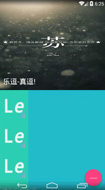
4.FlotingActionButton 实现
如上图所示的紫色浮动按钮所示;
小憩:有什么错误,请指出;
实现步揍 :
第一步: 在 布局 根节点加入
为了使用 app: 开头的布局控制; 通常的为android:开头的
xmlns:app="http://schemas.android.com/apk/res-auto"第二步 : 布局文件实现
使用的是 android.support.design 下的兼容控件
 <android.support.design.widget.FloatingActionButton
         android:id="@+id/btn_floating"
         android:layout_width="wrap_content"
         android:layout_height="wrap_content"
         android:src="@drawable/logo"
         app:elevation="10dp" />
第三步: 使用
其实就是一个按钮,和button的使用方法一样
   final FloatingActionButton btn_floating = (FloatingActionButton) findViewById(R.id.btn_floating);
        btn_floating.setOnClickListener(new View.OnClickListener() {
            @Override
            public void onClick(View v) {

                //这里实现代码
            }
        });
5.SnackBar 实现
SnackBar实现 十分简单,类似与Toast ,但比Toast强大;
- 带点击按钮和事件的SnackBar
 //添加一个按钮
     snackbar.setAction("点击访问", new View.OnClickListener() {
                    @Override
                    public void onClick(View v) {
                        snackbar.dismiss();
                    }
                });
snackbar.show();- 一般的SnackBar
Snackbar.make(float_btn, "你还好吗?", Snackbar.LENGTH_SHORT)
                        .show();
6.TextInputLayout 实现
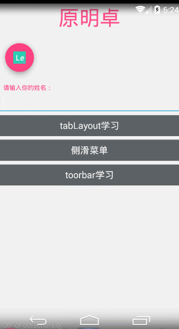
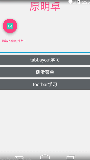
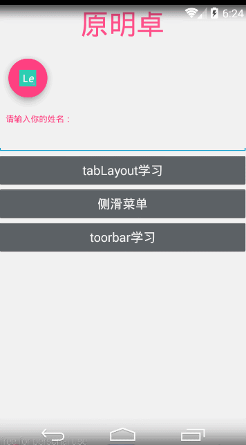
TextInputLayout 是editText的升级版, 提供了非常好的视觉效果和提示;
实现步揍 :
第一步: 布局实现
<android.support.design.widget.TextInputLayout
         android:id="@+id/tv_layout"
         android:layout_width="match_parent"
         android:layout_height="wrap_content">

         <EditText
             android:layout_width="match_parent"
             android:layout_height="wrap_content"
             android:textColor="@color/fu_color"/>

     </android.support.design.widget.TextInputLayout>
第二步 : 监听实现
这里实现 基本和edittext 一样,但是提供的效果不一样
/**
         * TextInputLayout使用
         */
        final TextInputLayout textInputLayout = (TextInputLayout) findViewById(R.id.tv_layout);
        textInputLayout.setHint("请输入你的姓名:");

        EditText editText = textInputLayout.getEditText();
        editText.addTextChangedListener(new TextWatcher() {
            @Override
            public void beforeTextChanged(CharSequence s, int start, int count, int after) {

            }

            @Override
            public void onTextChanged(CharSequence s, int start, int before, int count) {
                if (s.length() > 10) {
                    textInputLayout.setError("姓名长度太长了");
                    textInputLayout.setErrorEnabled(true);
                } else {
                    textInputLayout.setErrorEnabled(false);
                }
            }

            @Override
            public void afterTextChanged(Editable s) {

            }
        });
效果图 2 :
7.TabLayout 实现 tab
tablayout 实现 后就是几个tab, 后绑定 viewpager后 ,才显得好看;
实现步揍 :
第一步 : 布局实现
<RelativeLayout xmlns:android="http://schemas.android.com/apk/res/android"
    xmlns:tools="http://schemas.android.com/tools"
    android:layout_width="match_parent"
    android:layout_height="match_parent"
    tools:context="labelnet.cn.ledou.TestActivity">

    <android.support.design.widget.TabLayout
        android:id="@+id/tabs"
        android:layout_width="match_parent"
        android:layout_height="wrap_content"
        />
    <android.support.v4.view.ViewPager
        android:id="@+id/vp_test"
        android:layout_width="match_parent"
        android:layout_height="match_parent"/>
</RelativeLayout>
第二步 : 实现 viewpager
这里就不实现Fragment了,自己新建个试试;
TabLayout tabs= (TabLayout) findViewById(R.id.tabs);
        final ViewPager vp_test= (ViewPager) findViewById(R.id.vp_test);

        //初始化数据
        List<String> titles=new ArrayList<String>();
        titles.add("笑话");
        titles.add("欣赏");
        titles.add("高考");
        titles.add("不得");

        List<Fragment> fragments=new ArrayList<Fragment>();
        for (int i=0;i<4;i++){
            tabs.addTab(tabs.newTab().setText(titles.get(i)));
            TestFragment testFragment=new TestFragment(titles.get(i));
            fragments.add(testFragment);

        }


        //设置adapter
        FragmentManager fragmentManager =this.getSupportFragmentManager();
        TestFragmentAdapter testFragmentAdapter=new TestFragmentAdapter(fragmentManager,fragments,titles);
        vp_test.setAdapter(testFragmentAdapter);

        //将tablayout 和Viewpager 关联起来
        tabs.setupWithViewPager(vp_test);
        tabs.setTabsFromPagerAdapter(testFragmentAdapter);
第三步 : 实现 pageadapter
package labelnet.cn.ledou.adpater;

import android.support.v4.app.Fragment;
import android.support.v4.app.FragmentManager;
import android.support.v4.app.FragmentPagerAdapter;
import android.view.ViewGroup;

import java.util.List;

/**
 * Created by yuan on 15-10-21.
 */
public class TestFragmentAdapter extends FragmentPagerAdapter {

    private List<Fragment> fragments;
    private List<String> titles;
    public TestFragmentAdapter(FragmentManager fm,List<Fragment> fragments,List<String> titles) {
        super(fm);
        this.fragments=fragments;
        this.titles=titles;
    }

    @Override
    public Object instantiateItem(ViewGroup container, int position) {
        return super.instantiateItem(container, position);
    }

    @Override
    public void destroyItem(ViewGroup container, int position, Object object) {
        super.destroyItem(container, position, object);
    }

    @Override
    public Fragment getItem(int position) {
        return fragments.get(position);
    }

    @Override
    public int getCount() {
        return fragments.size();
    }

    @Override
    public CharSequence getPageTitle(int position) {
        return titles.get(position);
    }
}
8. NavigationView 实现
实现的是侧边栏效果;
NavigationView 实现需要结合
android.support.v4.widget.DrawerLayout 来实现;
效果图 3 :
实现步揍 :
<android.support.v4.widget.DrawerLayout xmlns:android="http://schemas.android.com/apk/res/android"
    xmlns:app="http://schemas.android.com/apk/res-auto"
    android:id="@+id/drawer_layout"
    android:layout_width="match_parent"
    android:layout_height="match_parent"
    android:clipToPadding="true"
    android:background="@color/zhushen_color"
    android:fitsSystemWindows="true"
    >

    <android.support.design.widget.NavigationView
        android:id="@+id/navigation_view"
        android:layout_width="wrap_content"
        android:layout_height="match_parent"
        android:layout_gravity="start"
        android:fitsSystemWindows="true"
        app:headerLayout="@layout/header_layout"
        app:menu="@menu/menu_test" />

</android.support.v4.widget.DrawerLayout>
说明 :
(1) 这个实现只需要 两个布局就行了
(2) headrLagout 设置 布局头部信息
(3) app: menu 实现 加载菜单
(4) drawerLayout 中的 android:fitsSystemWindows=”true” , 是为了满足一;
8. toolbar的实现
如图1所示的效果的效果实现;
效果图 :
涉及的布局文件有:
CoordinatorLayout : 丰富 布局效果
AppBarLayout : 配合 toolbar使用
CollapsingToolbarLayout : 配合 toolbar使用
NestedScrollView : 加强版的 ScrollView
实现步揍 :
第一步: 实现布局文件
中间linearLayout , 可以删除 ,没什么用;
<?xml version="1.0" encoding="utf-8"?>
<android.support.design.widget.CoordinatorLayout xmlns:android="http://schemas.android.com/apk/res/android"
    xmlns:app="http://schemas.android.com/apk/res-auto"
    android:layout_width="match_parent"
    android:layout_height="match_parent"
    android:background="@color/zhushen_color">

    <android.support.design.widget.AppBarLayout
        android:layout_width="match_parent"
        android:layout_height="300dp"
        >


        <android.support.design.widget.CollapsingToolbarLayout
            android:id="@+id/collapsing_toolbarlayout"
            android:layout_width="match_parent"
            android:layout_height="match_parent"
            app:contentScrim="@color/zhu_color"
            app:layout_scrollFlags="scroll|exitUntilCollapsed">

            <ImageView
                android:layout_width="match_parent"
                android:layout_height="match_parent"
                android:scaleType="fitXY"
                app:layout_collapseMode="parallax"
                android:src="@drawable/img_welcome_one"/>


            <android.support.v7.widget.Toolbar
            android:id="@+id/toolbar_bars"
            android:layout_width="match_parent"
            android:layout_height="?attr/actionBarSize"
            android:minHeight="20dp"
            app:layout_collapseMode="pin"
            app:popupTheme="@style/ThemeOverlay.AppCompat.Light"
            app:theme="@style/Theme.AppCompat.Light.DarkActionBar" />

        </android.support.design.widget.CollapsingToolbarLayout>

    </android.support.design.widget.AppBarLayout>

    <android.support.v4.widget.NestedScrollView
        android:layout_width="match_parent"
        android:layout_height="match_parent"
        app:layout_behavior="@string/appbar_scrolling_view_behavior">

        <LinearLayout
            android:layout_width="match_parent"
            android:layout_height="wrap_content"
            android:orientation="vertical">

            <ImageView
                android:layout_width="wrap_content"
                android:layout_height="wrap_content"
                android:src="@drawable/logo" />

            <ImageView
                android:layout_width="wrap_content"
                android:layout_height="wrap_content"
                android:src="@drawable/logo" />

            <ImageView
                android:layout_width="wrap_content"
                android:layout_height="wrap_content"
                android:src="@drawable/logo" />

            <ImageView
                android:layout_width="wrap_content"
                android:layout_height="wrap_content"
                android:src="@drawable/logo" />

            <ImageView
                android:layout_width="wrap_content"
                android:layout_height="wrap_content"
                android:src="@drawable/logo" />

            <ImageView
                android:layout_width="wrap_content"
                android:layout_height="wrap_content"
                android:src="@drawable/logo" />

            <ImageView
                android:layout_width="wrap_content"
                android:layout_height="wrap_content"
                android:src="@drawable/logo" />

            <ImageView
                android:layout_width="wrap_content"
                android:layout_height="wrap_content"
                android:src="@drawable/logo" />

            <ImageView
                android:layout_width="wrap_content"
                android:layout_height="wrap_content"
                android:src="@drawable/logo" />

            <ImageView
                android:layout_width="wrap_content"
                android:layout_height="wrap_content"
                android:src="@drawable/logo" />

            <ImageView
                android:layout_width="wrap_content"
                android:layout_height="wrap_content"
                android:src="@drawable/logo" />

            <ImageView
                android:layout_width="wrap_content"
                android:layout_height="wrap_content"
                android:src="@drawable/logo" />
        </LinearLayout>

    </android.support.v4.widget.NestedScrollView>


    <android.support.design.widget.FloatingActionButton
        android:id="@+id/float_btn"
        android:layout_width="wrap_content"
        android:layout_height="wrap_content"
        android:layout_gravity="bottom|right"
        android:src="@drawable/abc_textfield_search_material"
        app:fabSize="normal" />

</android.support.design.widget.CoordinatorLayout>
第二步 : 代码实现
如果前面的学习了,后面的实现就很简单了;
package labelnet.cn.ledou;

import android.os.Bundle;
import android.support.design.widget.CollapsingToolbarLayout;
import android.support.design.widget.FloatingActionButton;
import android.support.design.widget.Snackbar;
import android.support.v7.app.AppCompatActivity;
import android.support.v7.widget.Toolbar;
import android.view.View;

/**
 * Created by yuan on 15-10-22.
 */
public class toobarActivity extends AppCompatActivity {
    @Override
    protected void onCreate(Bundle savedInstanceState) {
        super.onCreate(savedInstanceState);
        setContentView(R.layout.activity_toobar);


        //浮动按钮
        final FloatingActionButton float_btn = (FloatingActionButton) findViewById(R.id.float_btn);
        float_btn.setOnClickListener(new View.OnClickListener() {
            @Override
            public void onClick(View v) {
                Snackbar.make(float_btn, "你还好吗?", Snackbar.LENGTH_SHORT)
                        .show();
            }
        });


        //toolbar
        final Toolbar toolbar_bars= (Toolbar) findViewById(R.id.toolbar_bars);
        setSupportActionBar(toolbar_bars);


        CollapsingToolbarLayout collapsing_toolbarlayout= (CollapsingToolbarLayout) findViewById(R.id.collapsing_toolbarlayout);
        collapsing_toolbarlayout.setTitle("乐逗-真逗!");

    }
}
10 . 总结
虽然效果实现了,但是 没有用到 实际当中,所以后面还有很多要注意的地方;
GitHub 地址 :
https://github.com/LABELNET/AndroidStudioDemo/tree/master/LeDou


 扫一扫
扫一扫
 1500
1500

 被折叠的 条评论
为什么被折叠?
被折叠的 条评论
为什么被折叠?
 到【灌水乐园】发言


