


 背景样式 背景图片只会在当前的元素中显示
   background-color 背景颜色
   background-image: url("images/02.jpg"); 背景图片url("图片路径")
   background-repeat:    平铺四个值
                  repeat(默认值) 平铺
                  no-repeat 不平铺
                  repeat-x;  只有x轴方向平铺
                  repeat-y;  只有y轴方向平铺
   background-position: 值有三种写法(三种方法可以搭配使用 但是不推荐)
            1. 200px 200px; 背景图片定位 第一个值是x轴 第二个值是y轴
            2.  left right top bottom center 可以两两搭配使用 如果只给了一个值 另一个值就是默认center
            3. 百分比 百分比是根据盒子的宽高-背景图片的宽高来计算的
   background-attachment: 有两个值
            1. scroll背景图片随着页滚动而滚动
            2. fixed   这个时候背景图片的position是相对于body去定位的
   background-size: 有四种写法
               400px 400px     第一个值代表x轴  第二个值代表y轴
               300px  只给一个值代表x轴 第二个值auto 自适应 图片按比例缩小
               cover  按比例将盒子铺满
               contain  铺满一个方向就停止
               20% 20%  第一个x轴 第二个是y轴  是按照盒子宽高计算百分比
   复合样式:
   background: deeppink url("images/02.jpg") no-repeat fixed 0 0/cover;
   background: color image repeat attachment position/size;
         背景颜色 背景图片 是否平铺 是否固定 背景定位 背景尺寸
   其他值都可以省略 但是0 0/cover一定要搭配使用
background-attachment:fixed可以用来制作小特效
使背景图片固定,转动盒子

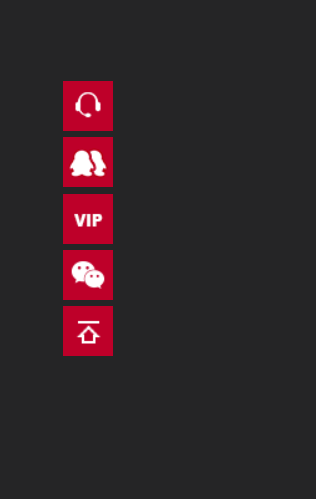
效果图如下 div的背景图片只会在div的盒子内部显示,超出部分将隐藏
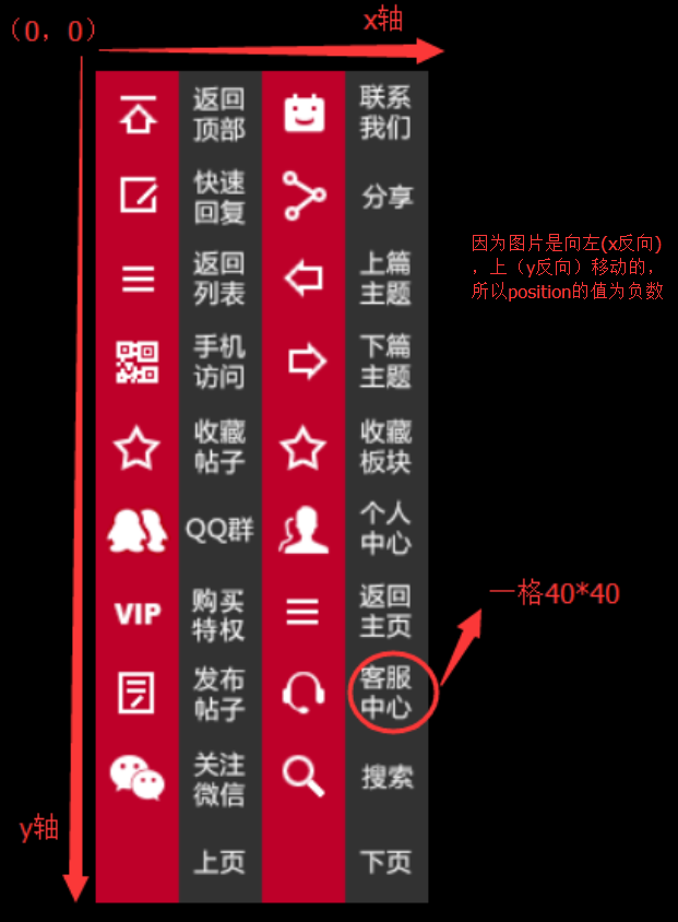
background-position:后面的值为负数
   body{
            background: #252526;
        }
        div.wrap{
            width: 40px;
            margin: 100px;
        }
        .wrap ul li{
             width: 40px;
             height: 40px;
             background: red url("images/1.png") no-repeat;
             margin-bottom: 5px;
         }
        .wrap ul li:nth-child(1){
             background-position: -80px -280px;
        }
        .wrap ul li:nth-child(2){
            background-position: 0 -200px;
        }
        .wrap ul li:nth-child(3){
            background-position: 0 -240px;
        }
        .wrap ul li:nth-child(4){
            background-position: 0 -320px;
        }
        .wrap ul li:nth-child(5){
            background-position: 0 0;
        }
        </style>
</head>
<body>
    <div class="wrap">
        <ul>
            <li></li>
            <li></li>
            <li></li>
            <li></li>
            <li></li>
        </ul>
    </div>


 扫一扫
扫一扫
 513
513

 被折叠的 条评论
为什么被折叠?
被折叠的 条评论
为什么被折叠?
 到【灌水乐园】发言


