源代码:
<!DOCTYPE html>
<html lang="en">
	<head>
		<meta charset="UTF-8">
		<title>按钮</title>
		<style>
			* {
				margin: 0;
				padding: 0;
			}

			body {
				display: flex;
				justify-content: center;
				background: black;
				align-items: center;
				width: 100%;
				height: 600px;
			}

			button {
				width: 300px;
				height: 80px;
				border-radius: 40px;
				background: linear-gradientlinear-(60deg, #03a9f4, #f441a5, #ffeb3b, #03a9f4);
				text-transform: uppercase;
				font-size: 30px;
				color: white;
				background-size: 400%;
				position: relative;
			}

			button::before {
				content: "";
				position: absolute;
				left: -5px;
				top: -5px;
				bottom: -5px;
				right: -5px;
				background: linear-gradient(60deg, #03a9f4, #f441a5, #ffeb3b, #03a9f4);
				z-index: -1;
				border-radius: 40px;
				filter: blur(20px);
				background-size: 400%;
			}

			button:hover::before {
				animation: hello 8s infinite;
			}

			button:hover {
				animation: hello 8s infinite;
				cursor: pointer;
			}

			@keyframes hello {
				100% {
					background-position: -400% 0;
				}
			}
		</style>
	</head>
	<body>
		<button>button</button>
	</body>
</html>
演示:
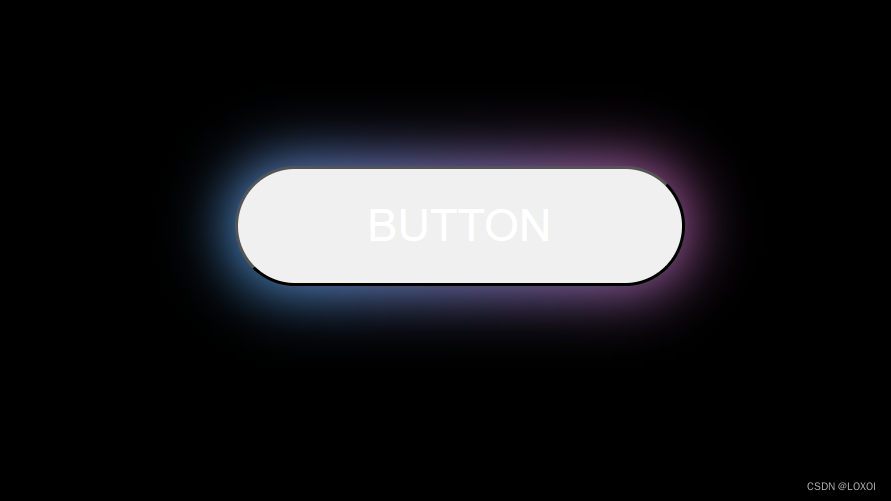
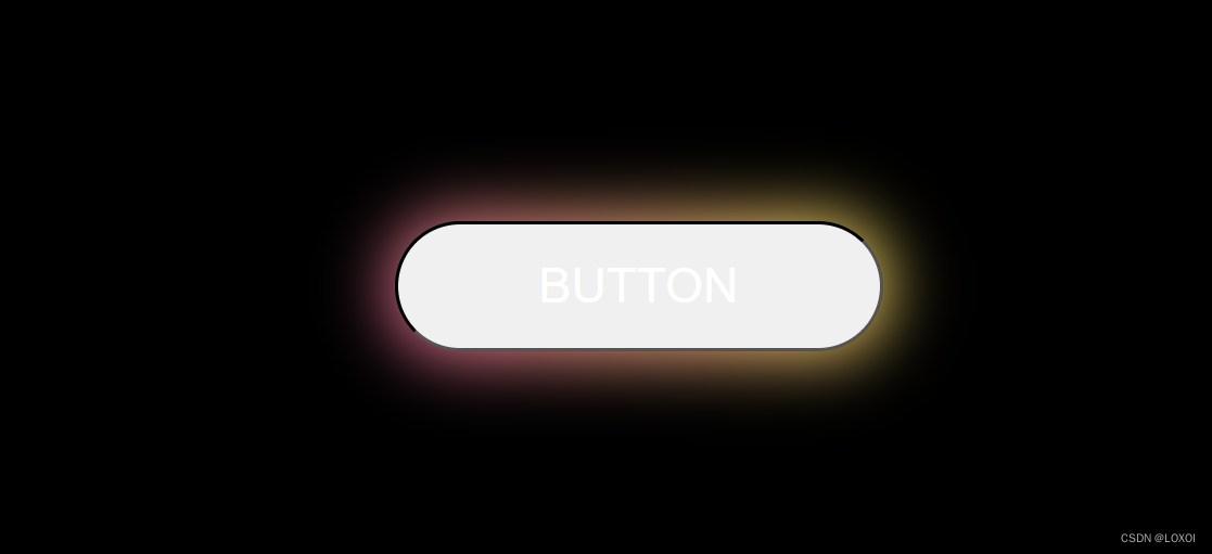


 本文详细描述了如何使用HTML和CSS创建一个带有动态线性渐变背景和hover效果的按钮,同时展示了JavaScript在关键帧动画中的应用。


 2366
2366


 被折叠的 条评论
为什么被折叠?
被折叠的 条评论
为什么被折叠?
 到【灌水乐园】发言


