


目录
条形图
条形图表示矩形条中的数据,条的长度与变量的值成比例。
R语言使用**函数barplot()**创建条形图。 R语言可以在条形图中绘制垂直和水平条。 在条形图中,每个条可以给予不同的颜色。
barplot()函数语法
barplot(H, xlab, ylab, main, names.arg, col)
H:包含在条形图中使用的数值的向量或矩阵
xlab:x轴的标签
ylab:y轴的标签
main:条形图的标题
names.arg:每个条下出现的名称的向量
col:用于向图中的条形提供颜色
示例:
使用输入向量和每个条的名称创建一个简单的条形图。
创建并保存当前R语言工作目录中的条形图。
输入:
# Create the data for the chart.
H <- c(7,12,28,3,41)

# Give the chart file a name.
png(file = "barchart.png")

# Plot the bar chart.
barplot(H)

# Save the file.
dev.off()
输出:
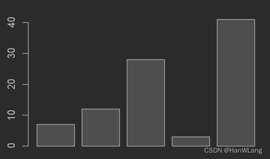
生成了.png文件:

注:
因R 4.2.2 运行代码没有图形出现,故下载了pycharm,使用的是R 3.6.3版本。
条形图标签,标题和颜色
可以通过添加更多参数来扩展条形图的功能。 主要参数用于添加标题。 col参数用于向条形添加颜色。 args.name是具有与输入向量相同数量的值的向量,以描述每个条的含义。
示例:
在当前R语言工作目录中创建并保存条形图。
输入:
# Create the data for the chart.
H <- c(7,12,28,3,41)
M <- c("Mar","Apr","May","Jun","Jul")

# Give the chart file a name.
png(file = "barchart_months_revenue.png")

# Plot the bar chart.
barplot(H,names.arg = M,xlab = "Month",ylab = "Revenue",col = "blue",
main = "Revenue chart",border = "red")

# Save the file.
dev.off()
输出:
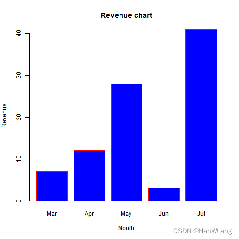
生成的.png文件:
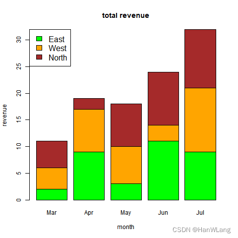
组合条形图和堆积条形图
使用矩阵作为输入值,在每个条中创建条形图和堆叠组的条形图。
超过两个变量表示为用于创建组合条形图和堆叠条形图的矩阵。
示例:
输入:
# Create the input vectors.
colors <- c("green","orange","brown")
months <- c("Mar","Apr","May","Jun","Jul")
regions <- c("East","West","North")

# Create the matrix of the values.
Values <- matrix(c(2,9,3,11,9,4,8,7,3,12,5,2,8,10,11),nrow = 3,ncol = 5,byrow = TRUE)

# Give the chart file a name.
png(file = "barchart_stacked.png")

# Create the bar chart.
barplot(Values,main = "total revenue",names.arg = months,xlab = "month",ylab = "revenue",
   col = colors)

# Add the legend to the chart.
legend("topleft", regions, cex = 1.3, fill = colors)

# Save the file.
dev.off()
输出:
箱线图
箱线图是数据集中的数据分布良好的度量。 它将数据集分成三个四分位数。 此图表表示数据集中的最小值,最大值,中值,第一四分位数和第三四分位数。 它还可用于通过绘制每个数据集的箱线图来比较数据集之间的数据分布。
R语言中使用boxplot()函数来创建箱线图。
boxplot()函数语法
boxplot(x, data, notch, varwidth, names, main)
x:向量或公式
data:数据帧
notch:逻辑值,设置为TRUE以绘制凹口
varwidth:逻辑值,设置为TRUE以绘制与样本大小成比例的框的宽度
names:将打印在每个箱线图下的组标签
main:图表标题
示例:
我们使用R语言环境中可用的数据集“mtcars”来创建基本箱线图。 让我们看看mtcars中的列“mpg”和“cyl”。
输入:
input <- mtcars[,c('mpg','cyl')]
print(head(input))
输出:
                   mpg cyl
Mazda RX4         21.0   6
Mazda RX4 Wag     21.0   6
Datsun 710        22.8   4
Hornet 4 Drive    21.4   6
Hornet Sportabout 18.7   8
Valiant           18.1   6
注:
head() 函数用于获取向量、矩阵、表、 DataFrame 或函数的第一部分
创建箱线图
示例:
以下脚本将为mpg(英里/加仑)和cyl(气缸数)之间的关系创建箱线图。
输入:
# Give the chart file a name.
png(file = "boxplot.png")

# Plot the chart.
boxplot(mpg ~ cyl, data = mtcars, xlab = "Number of Cylinders",
   ylab = "Miles Per Gallon", main = "Mileage Data")

# Save the file.
dev.off()
输出:
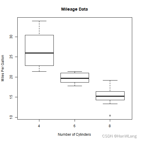
同样的,在文件夹中也会有相应的.png文件生成。
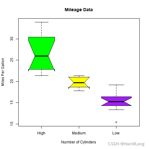
带槽的箱线图
我们可以绘制带槽的箱线图,以了解不同数据组的中值如何相互匹配。
以下脚本将为每个数据组创建一个带缺口的箱线图。
示例:
输入:
# Give the chart file a name.
png(file = "boxplot_with_notch.png")

# Plot the chart.
boxplot(mpg ~ cyl, data = mtcars,
   xlab = "Number of Cylinders",
   ylab = "Miles Per Gallon",
   main = "Mileage Data",
   notch = TRUE,
   varwidth = TRUE,
   col = c("green","yellow","purple"),
   names = c("High","Medium","Low")
)
# Save the file.
dev.off()
输出:
直方图
直方图表示被存储到范围中的变量的值的频率。 直方图类似于条形图,但不同之处在于将值分组为连续范围。 直方图中的每个柱表示该范围中存在的值的数量的高度。
R语言使用hist()函数创建直方图。 此函数使用向量作为输入,并使用一些更多的参数来绘制直方图。
hist()函数语法
hist(v,main,xlab,xlim,ylim,breaks,col,border)
v:包含直方图中使用的数值的的向量
main:图表的标题
xlab:x轴的描述
xlim:指定x轴上的值的范围
ylim:指定y轴上的值的范围
breaks:用于提及每个条的宽度
col:用于设置条的颜色
border:设置每个条的边框的颜色
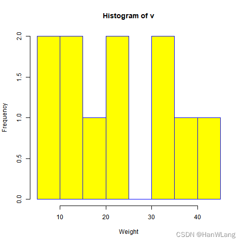
示例:
输入:
# Create data for the graph.
v <-  c(9,13,21,8,36,22,12,41,31,33,19)

# Give the chart file a name.
png(file = "histogram.png")

# Create the histogram.
hist(v,xlab = "Weight",col = "yellow",border = "blue")

# Save the file.
dev.off()
输出:
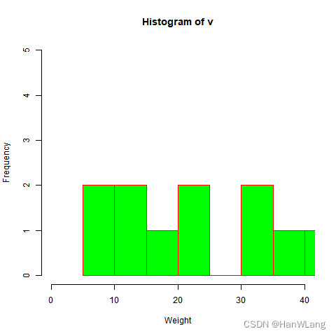
X和Y值的范围
使用参数 xlim 和 ylim 指定X轴和Y轴允许的值的范围。
每个条的宽度可以通过使用间隔来确定。
示例:
输入:
# Create data for the graph.
v <- c(9,13,21,8,36,22,12,41,31,33,19)

# Give the chart file a name.
png(file = "histogram_lim_breaks.png")

# Create the histogram.
hist(v,xlab = "Weight",col = "green",border = "red", xlim = c(0,40), ylim = c(0,5),
   breaks = 5)

# Save the file.
dev.off()
输出:
折线图
折线图是通过在各点之间绘制线段来连接一系列点的图。 这些点在它们的坐标(通常是x坐标)值之一中排序。 折线图通常用于识别数据中的趋势。
R语言中的plot()函数用于创建折线图。
plot()函数语法
plot(v,main,type,col,xlab,ylab)
v:包含数值的向量
main:图表的标题
type:一个字符的字符串,用于给定绘图的类型。可选值:
p:绘制点
l:绘制线
b:同时绘制点和线
c:仅绘制参数b所示的线
o:同时绘制点和线,且线穿过点
h:绘制出点到横坐标轴的垂直线
s:绘制出阶梯图(先横后纵)
S:绘制出阶梯图(先纵后横)
n:作空图
col:用于给点和线颜色
xlab:x轴的标签
ylab:y轴的标签
示例:
使用输入向量和类型参数“o”创建简单的折线图。
以下脚本将在当前R工作目录中创建并保存折线图。
输入:
# Create the data for the chart.
v <- c(7,12,28,3,41)

# Give the chart file a name.
png(file = "line_chart.jpg")

# Plot the bar chart.
plot(v,type = "o")

# Save the file.
dev.off()
输出:
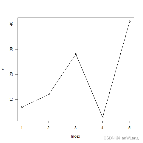
与之前类似,此处会生成.jpg文件。
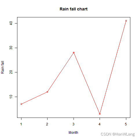
折线图标题,颜色和标签
线图的特征可以通过使用附加参数来扩展。 我们向点和线添加颜色,为图表添加标题,并向轴添加标签。
示例:
输入:
# Create the data for the chart.
v <- c(7,12,28,3,41)

# Give the chart file a name.
png(file = "line_chart_label_colored.jpg")

# Plot the bar chart.
plot(v,type = "o", col = "red", xlab = "Month", ylab = "Rain fall",
   main = "Rain fall chart")

# Save the file.
dev.off()
输出:
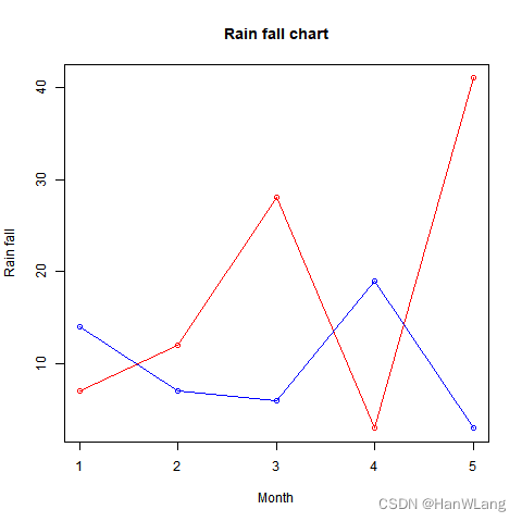
多线型折线图
通过使用lines()函数,可以在同一个图表上绘制多条线。
在绘制第一行之后,lines()函数可以使用一个额外的向量作为输入来绘制图表中的第二行。
示例:
输入:
# Create the data for the chart.
v <- c(7,12,28,3,41)
t <- c(14,7,6,19,3)

# Give the chart file a name.
png(file = "line_chart_2_lines.jpg")

# Plot the bar chart.
plot(v,type = "o",col = "red", xlab = "Month", ylab = "Rain fall",
   main = "Rain fall chart")

lines(t, type = "o", col = "blue")

# Save the file.
dev.off()
输出:
散点图
散点图显示在笛卡尔平面中绘制的许多点。 每个点表示两个变量的值。 在水平轴上选择一个变量,在垂直轴上选择另一个变量。
使用plot()函数创建简单散点图。
plot()函数语法
plot(x, y, main, xlab, ylab, xlim, ylim, axes)
x:水平坐标的数据集
y:垂直坐标的数据集
main:图形的标题
xlab:水平轴上的标签
ylab:垂直轴上的标签
xlim:用于绘图的x的值的极限
ylim:用于绘图的y的值的极限
axes:指示是否应在绘图上绘制两个轴
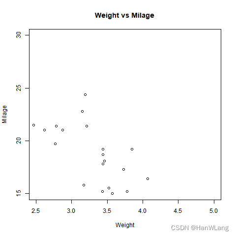
示例:
我们使用R语言环境中可用的数据集“mtcars”来创建基本散点图。 让我们使用mtcars中的“wt”和“mpg”列。
输入:
input <- mtcars[,c('wt','mpg')]
print(head(input))
输出:
                     wt  mpg
Mazda RX4         2.620 21.0
Mazda RX4 Wag     2.875 21.0
Datsun 710        2.320 22.8
Hornet 4 Drive    3.215 21.4
Hornet Sportabout 3.440 18.7
创建散点图
以下脚本将为wt(重量)和mpg(英里/加仑)之间的关系创建一个散点图。
示例:
输入:
# Get the input values.
input <- mtcars[,c('wt','mpg')]

# Give the chart file a name.
png(file = "scatterplot.png")

# Plot the chart for cars with weight between 2.5 to 5 and mileage between 15 and 30.
plot(x = input$wt,y = input$mpg,
   xlab = "Weight",
   ylab = "Milage",
   xlim = c(2.5,5),
   ylim = c(15,30),
   main = "Weight vs Milage"
)

# Save the file.
dev.off()
输出:
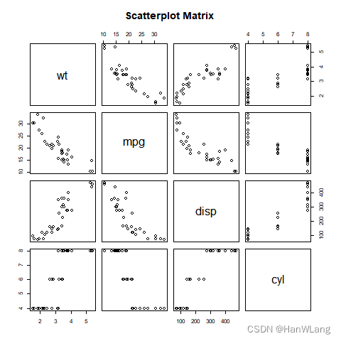
散点图矩阵
当我们有两个以上的变量,我们想找到一个变量和其余变量之间的相关性,我们使用散点图矩阵。 我们使用pairs()函数创建散点图的矩阵。
pairs()函数语法
pairs(formula, data)
formula:表示成对使用的一系列变量
data:表示将从其获取变量的数据集
示例:
每个变量与每个剩余变量配对。 为每对绘制散点图。
输入:
# Give the chart file a name.
png(file = "scatterplot_matrices.png")

# Plot the matrices between 4 variables giving 12 plots.

# One variable with 3 others and total 4 variables.

pairs(~wt+mpg+disp+cyl,data = mtcars,
   main = "Scatterplot Matrix")

# Save the file.
dev.off()
输出:
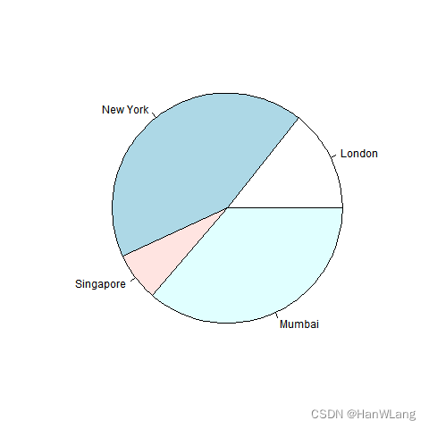
饼状图
饼图是将值表示为具有不同颜色的圆的切片。 切片被标记,并且对应于每个片的数字也在图表中表示。
在R语言中,饼图是使用pie()函数创建的,它使用正数作为向量输入。 附加参数用于控制标签,颜色,标题等。
pie()函数语法
pie(x, labels, radius, main, col, clockwise)
x:饼状图中使用的数值的向量
labels:给出切片的描述
radius:饼状图圆的半径(值 -1 和 +1 之间)
main:图表的标题
col:表示调色板
clockwise:指示片段是顺时针还是逆时针绘制的逻辑值
示例:
使用输入向量和标签创建一个非常简单的饼图。 以下脚本将创建并保存当前R语言工作目录中的饼图。
输入:
# Create data for the graph.
x <- c(21, 62, 10, 53)
labels <- c("London", "New York", "Singapore", "Mumbai")

# Give the chart file a name.
png(file = "city.jpg")

# Plot the chart.
pie(x,labels)

# Save the file.
dev.off()
输出:
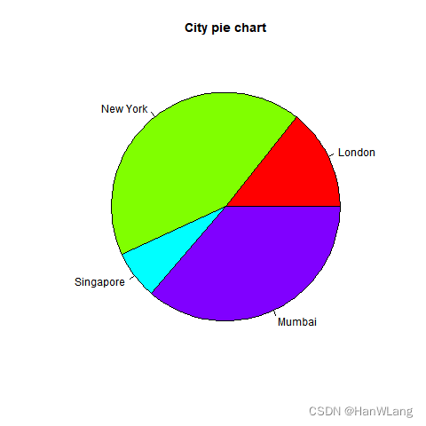
饼状图标题和颜色
我们可以通过向函数中添加更多参数来扩展图表的功能。 我们将使用参数main向图表添加标题,另一个参数是col,它将在绘制图表时使用彩虹色板。 托盘的长度应与图表中的值的数量相同。 因此,我们使用length(x)。
示例:
以下脚本将创建并保存当前R语言工作目录中的饼图。
输入:
# Create data for the graph.
x <- c(21, 62, 10, 53)
labels <- c("London", "New York", "Singapore", "Mumbai")

# Give the chart file a name.
png(file = "city_title_colours.jpg")

# Plot the chart with title and rainbow color pallet.
pie(x, labels, main = "City pie chart", col = rainbow(length(x)))

# Save the file.
dev.off()
输出:
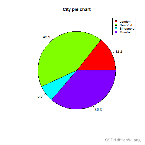
切片百分比和图表图例
通过创建其他图表变量来添加切片百分比和图表图例。
示例:
输入:
# Create data for the graph.
x <-  c(21, 62, 10,53)
labels <-  c("London","New York","Singapore","Mumbai")

piepercent<- round(100*x/sum(x), 1)

# Give the chart file a name.
png(file = "city_percentage_legends.jpg")

# Plot the chart.
pie(x, labels = piepercent, main = "City pie chart",col = rainbow(length(x)))
legend("topright", c("London","New York","Singapore","Mumbai"), cex = 0.8,
   fill = rainbow(length(x)))

# Save the file.
dev.off()
输出:
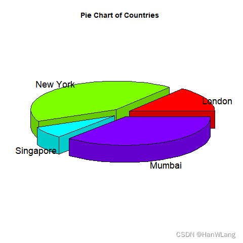
3D饼状图
可以使用其他软件包绘制具有3个维度的饼图。 软件包plotrix有一个名为pie3D()的函数,用于此。
示例:
输入:
# Get the library.
library(plotrix)

# Create data for the graph.
x <-  c(21, 62, 10,53)
lbl <-  c("London","New York","Singapore","Mumbai")

# Give the chart file a name.
png(file = "3d_pie_chart.jpg")

# Plot the chart.
pie3D(x,labels = lbl,explode = 0.1, main = "Pie Chart of Countries ")

# Save the file.
dev.off()
输出:


 3420
3420


 被折叠的 条评论
为什么被折叠?
被折叠的 条评论
为什么被折叠?
 到【灌水乐园】发言


